|
| Group |
Round |
C/R |
Comment |
Date |
Image |
| 49 |
Nov 23 |
Comment |
Hi Peggy,
Thanks for sharing your image, it is such a photogenic scene and you have done a great job of capturing the old building.
I agree with previous comments in that the top of the barn is uncomfortably close to the top of the frame, but I also think there is a portion of ground in front of the barn that could be cropped out too. Just an opinion, but I think the image should be more about the barn, not the grass in front of it.
Im just curious about your camera settings ... Im not sure if F/22 has added anything, I would think F/11 or so would have done the trick, and given you a faster shooting speed which is always nice to have if shooting hand held.
I think Craig's comments above are very worthwhile ... I know I try to do the same thing, ie. take in the full view available to you before pulling out the camera.
A very pleasing story, nicely done!
|
Nov 19th |
| 49 |
Nov 23 |
Comment |
Hi Alan,
I agree with Josh regarding the tree breaking the line of the horizon. I think it works well too, and if anything I perhaps would have gotten even lower/closer to further emphasize the distinction between tree and hill line.
I think the composition is strong and the light completes the story.
Personally I would crop in ( retaining the same aspect ) from the top right to get rid of both the tree branch on the right and a small portion of the cloudless sky.
One thing that is a bit curious, at F/16 I would have expected more of the background to be sharper than it appears.
Cheers Stephen |
Nov 19th |
| 49 |
Nov 23 |
Comment |
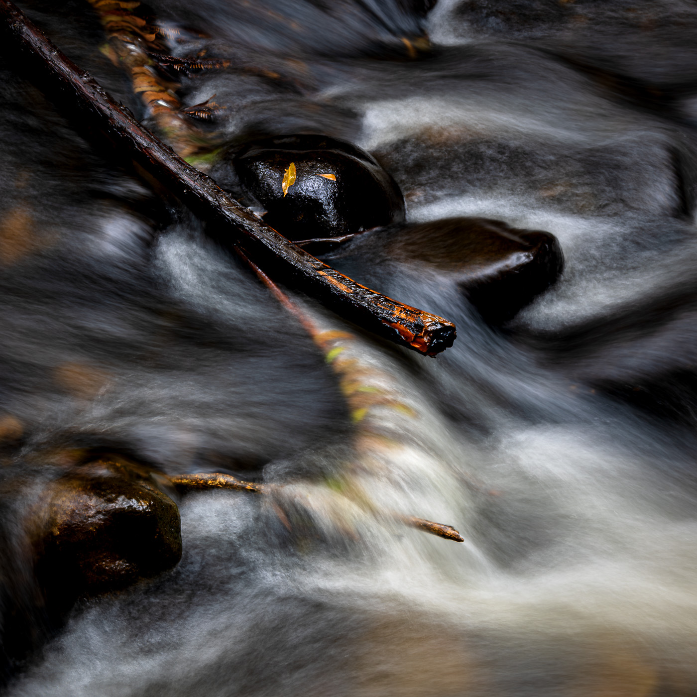
Hi David,
Love the colours, the flow of the water captured really well and the overall balance of the image.
I find though that the large deep black areas on the left and right of the image are distracting ( I'm afraid I disagree with Craig that they are "mysterious" )
I think the image benefits from lifting the shadows and the whites and contrast, but decreasing exposure. Just a personal taste thing, but this also brings out more of that fabulous colour.
Cheers |
Nov 18th |
| 49 |
Nov 23 |
Comment |
Hi Josh,
Have to say that I agree with everything that Craig has suggested. I think his edits have added some excellant subtle finishes to an already strong image. If anything perhaps, I would also have cropped down a fraction from the top.
With the arm taken away from the right side, we are left with a strong composition of three elements ( I think the guy in the background is a bonus as he is looking at the main subject, and is blurred just enough not to interfere with the main subject but support the overall story )
The obvious emotion of the player is well captured.
Cheers
|
Nov 18th |
| 49 |
Nov 23 |
Comment |
Hello Craig,
I think I am going to go against the tide here and agree with you about the original image.
Yes, it is busy, and the eye is drawn around the entire image looking at the different graffitti, but, there is a lot to like in the different areas of colour.
I find that I am looking around and inside the image ( I am not drawn out of the image at all ) so my attention keeps returning to the subject. The graffitti. Which is the whole point of the image in the first place.
The reflection in the water is a huge bonus, and could only have been improved if you had perhaps shot from a lower angle to get more reflection and lose a fraction of the higher wall which is not scrawled on.
Looking at your two cut down shots above, I think they do not tell the bigger story that the original does.
Just a thought, but if the image was darkened overall ( with some selective highlighting ) and sharpened a fair bit, I think this would add to the "grittiness" of the scene.
Cheers, Stephen |
Nov 18th |
| 49 |
Nov 23 |
Reply |
Hi Craig, many thanks foryour thoughts. I take your suggestion regarding the fill-in flash,and agree it would have been desirable to do that, unnfortunately the circumstances at the time just did not allow for that sort of setup.
Cheers, Stephen |
Nov 18th |
| 49 |
Nov 23 |
Reply |
Hi David,
I did take the suggestions from Josh and Alan and reposted the image with those changes ( re the background ) which I thought had made a difference. I will have another play with this though as you suggest. Thanks. |
Nov 18th |
| 49 |
Nov 23 |
Reply |
Alan,
Please see my reply above.
Cheers |
Nov 16th |
| 49 |
Nov 23 |
Reply |
Alan / Josh,
Many thanks for your constructive comments, very much appreciated.
Josh, I was trying for that 'industrial' feel, so I am very happy that you saw that.
I have taken all your suggestions and reworked it a bit.
Glass has been brightened, the artist's head has been darkened and the background has been blurred and highlights reduced.
Cheers |
Nov 16th |
 |
5 comments - 4 replies for Group 49
|
5 comments - 4 replies Total
|