|
| Group |
Round |
C/R |
Comment |
Date |
Image |
| 49 |
Oct 23 |
Comment |
Thanks David, good point ... certainly the white board behind him could be made less distracting !
Cheers |
Oct 24th |
| 49 |
Oct 23 |
Reply |
Thanks Craig ...
I think they would more likely be speeding tickets !
But no, they were just some boring old receipts for some parts he had just purchased. It's a full time job keeping 13 old cars on the road !
Cheers |
Oct 19th |
| 49 |
Oct 23 |
Reply |
Hi David,
Obviously this is a very personal choice, as are most things in photography, but I think I would even go further. I had a play with you image, and by selectively lightening parts of the foreground even more, I found that the eye was pulled even more to the stars as the foreground became less of a drawcard and became the "support act" to the main story.
This is just my take on the image of course. Cheers |
Oct 15th |
| 49 |
Oct 23 |
Comment |
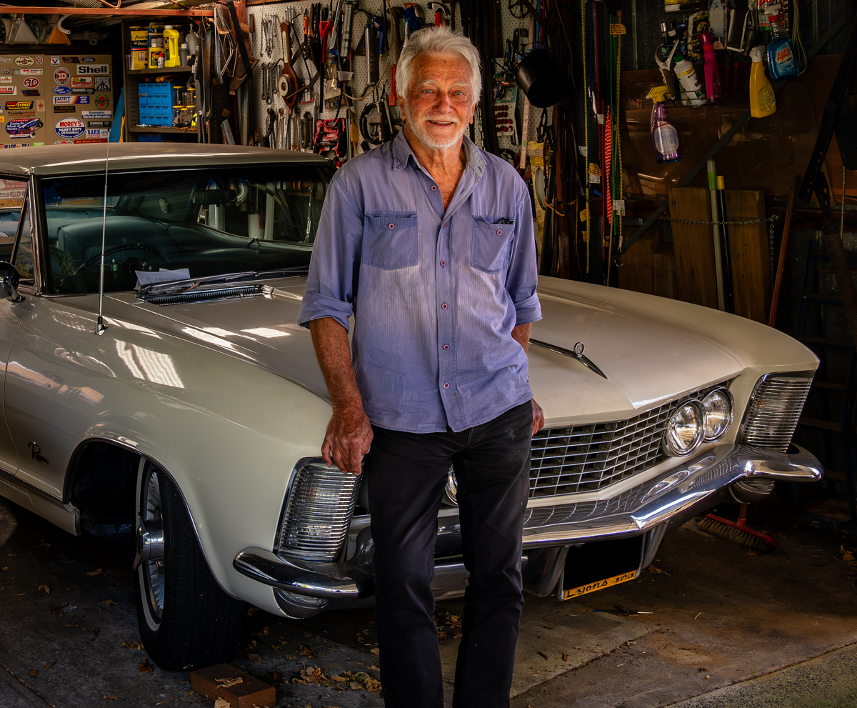
Hi Craig,
I think Owen's comments pretty much cover this image.
A really nice environmental portrait that beautifully captures the narative so well. Composition, colour and depth all add to the story.
The light is really nice, especially on the subjects face and draws the viewer into the image.
Agree with Owen that perhaps the black and brown objects at the bottom of the image could be cloned out. Also being a bit picky now, but would it be possible to crop in from the right just enough to remove the gap between the wooden window box and the edge of the frame?
A really pleasing image, nicely handled.
Cheers
|
Oct 13th |
| 49 |
Oct 23 |
Comment |
Hi Peggy,
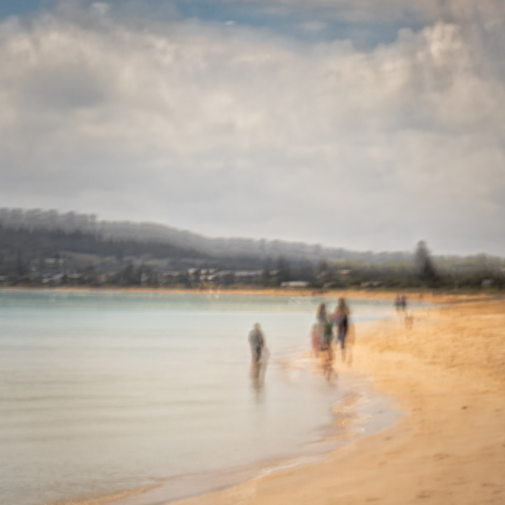
Love your image.
I think it has immediate viewer interest thanks to the noteworthy subject and the eye-catching angle from where you took the shot. I think that if you could shoot this again, I would suggest taking it from behind the trees if that is possible. This would make the building "soar" even higher from the cliff face adding even more drama while re-enforcing the strength of the mountain.
The light appears very harsh, which normally is difficult to work with, but in this instance I think it adds a lot to the story of the hot desert environment.
I do not think the image is too dark at all! In fact, I would suggest you look at boosting the overall contrast of the image including the mountain, building and sky, and then take the highlights down a fraction, especially on the rockface to the left of the building.
Overall a well composed strong image. Congrats.
Stephen |
Oct 13th |
| 49 |
Oct 23 |
Comment |
Hi David,
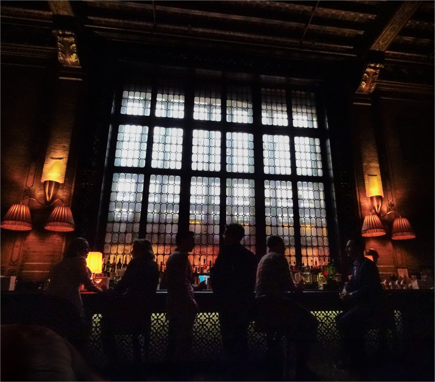
Absolutely agree with Owen ... a lovely shot of the Milky Way, and especially so with the foreground of a very interesting rock formation. Such a strong impact with the stars behind and the frame created by the rocks. Even the inclusion of the cloud formation that intersects with the Milky Way adds another point of interest.
I do think the image would benefit greatly by selectively lightening the rocks a fair bit. I take your point about wanting them to appear as "moon lit", but as it is, the bottom half of the image is very dark, and I think this pulls the viewer's gaze down away from the main subject of the stars. Also, the rock formation is quite interesting too, so a balanced luminance across the image would be a good look I think.
Well done on the post processing work to bring the image together. I have been meaning to try this type of thing myself for a while but haven't been able to do so. You have encouraged me to go out there and shoot. Cheers !
|
Oct 13th |
| 49 |
Oct 23 |
Comment |
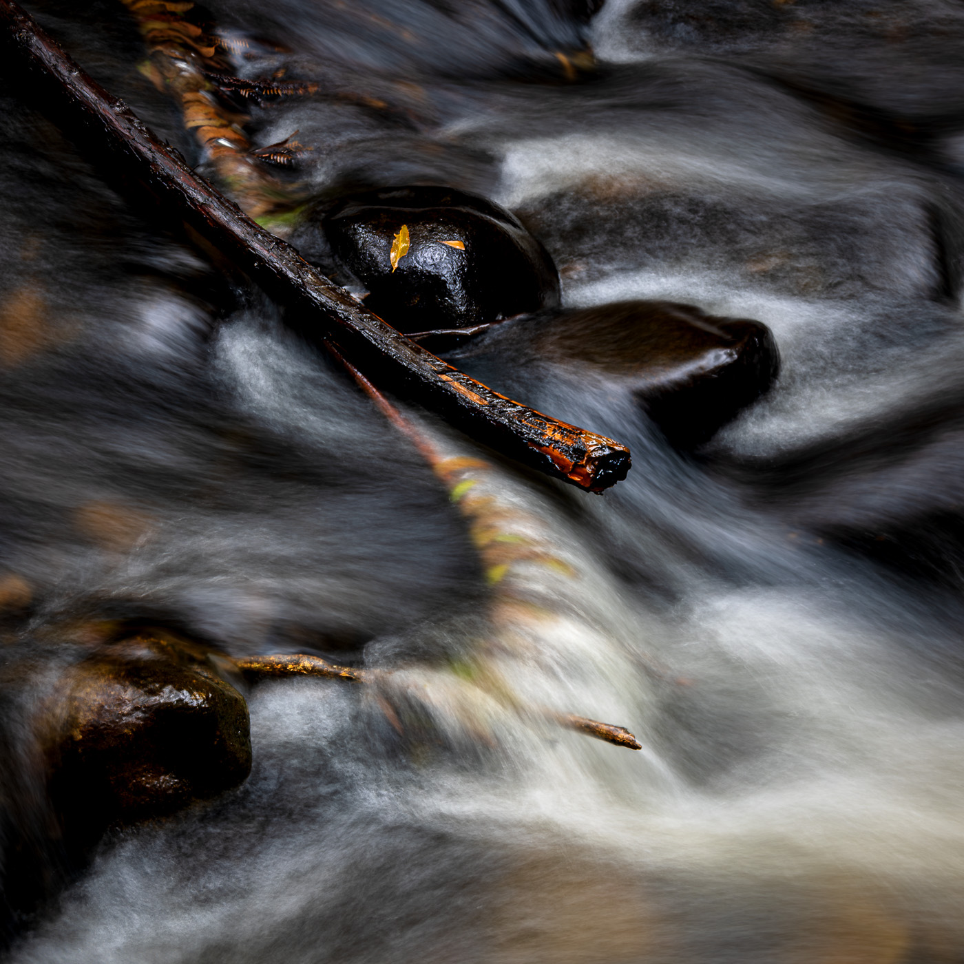
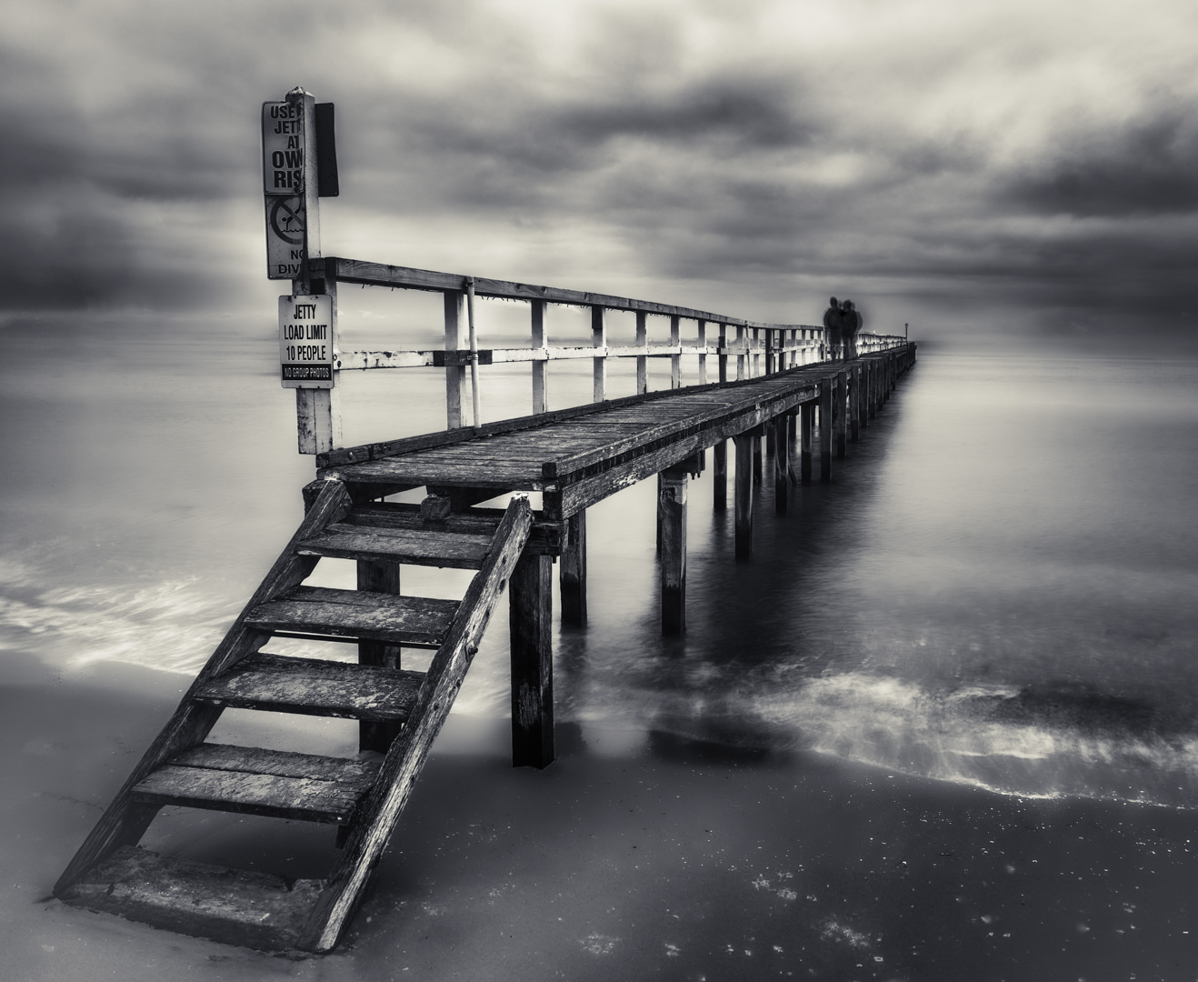
Hi Owen,
You have a very strong image here. Partly because of the feeling of "weight' imparted in the image, but also very much down to the strong, almost abstract shapes of the subject matter and its shadow. Certainly an original scene, well done for "seeing" it and making the effort to shoot it. Twice !
I think the image could have posibly been even stronger if you had been able to shoot from just a few inches lower. This would have removed the line of the water ( now hidden behind the log ). Without that detail, I think it would have been cleaner and more powerful. Just a thought.
The eye is very much drawn to the bright area between the log and its shadow ( your converging angles ), which is an interesting shape. Perhaps, further post work to crop in a bit, and dodge and burn further to bring out the shapes could be worth a go.
I think the intent of the image is very clear, so a successful shot.
Cheers !
|
Oct 13th |
| 49 |
Oct 23 |
Reply |
Many thanks Owen ! |
Oct 13th |
5 comments - 3 replies for Group 49
|
5 comments - 3 replies Total
|