|
| Group |
Round |
C/R |
Comment |
Date |
Image |
| 10 |
Oct 24 |
Comment |
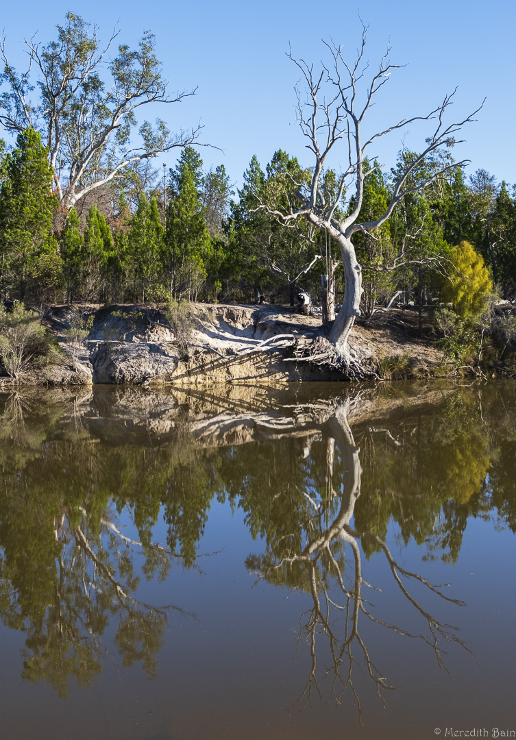
What a great misty, moody image Peter. You have done some attractive to the eye layering which engaged me as I roamed around it.
Good foreground (enjoy the reflection), mid ground and background.
Well seen and photographed. |
Oct 16th |
| 10 |
Oct 24 |
Comment |
Good travel image Rich. Have you thought about brightening the fish/lion slightly so that it stands out as the main subject a little more?
I too, would crop in from the right and also from the bottom to keep the viewer focussed where you intend. |
Oct 16th |
| 10 |
Oct 24 |
Comment |
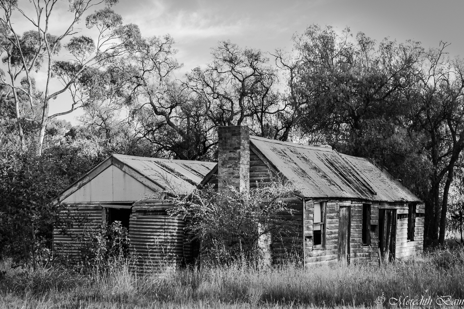
Hi Doug, you have spotted what many would not and created a striking image.
The contrast is harsh in the black and white and could be softened to make it easier to spend more time looking at it.
I do like the original as well, just a little more than the black and white I think. |
Oct 15th |
| 10 |
Oct 24 |
Comment |
An excellent action shot Mark. Perfect for photo journalism.
The facial expression of the rider and the position of the horse tell a great story.
Your focus is sharp throughout and you have edited it well. |
Oct 15th |
| 10 |
Oct 24 |
Comment |
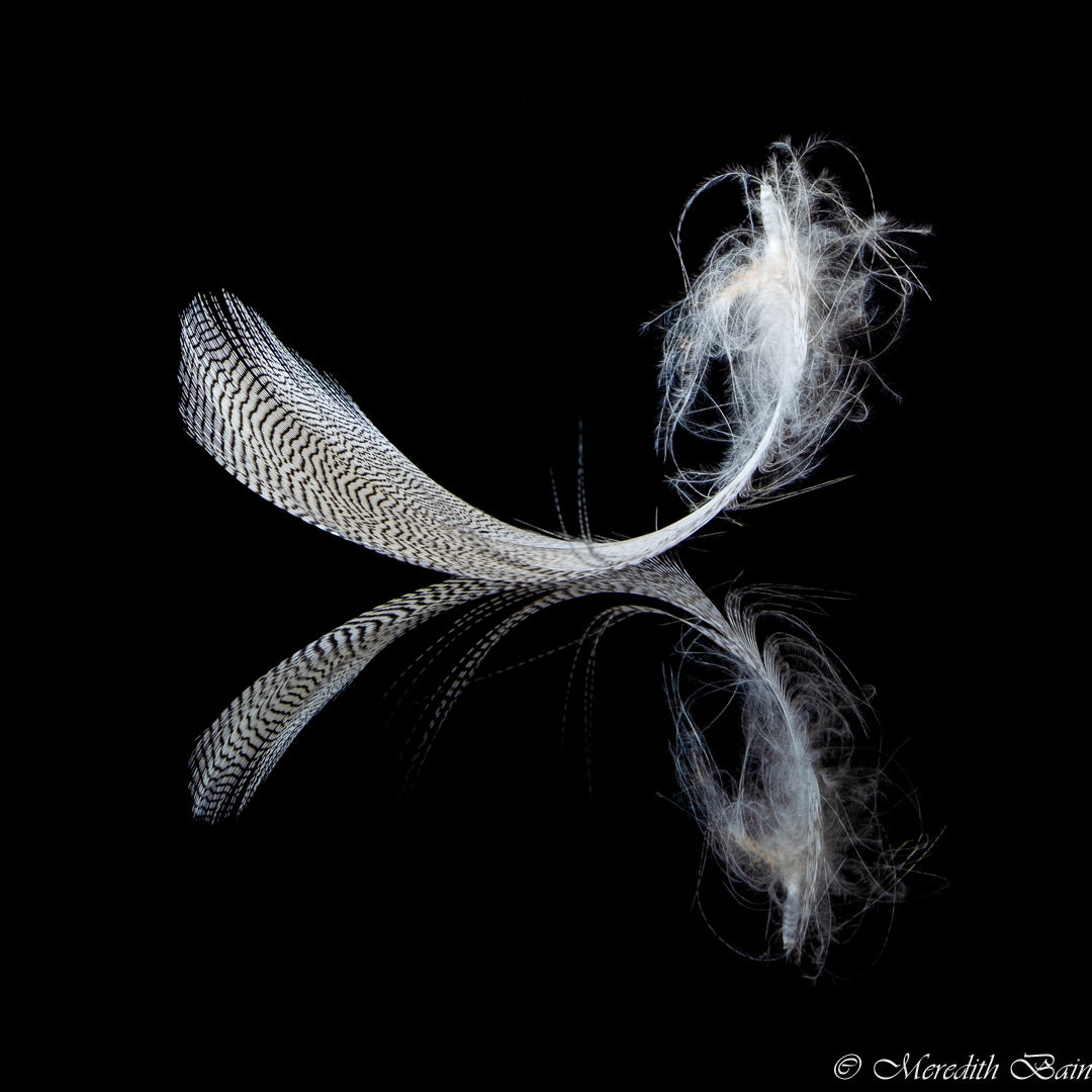
Diana, this is a lovely image. The trouble you took with the set up has paid off in spades. The colours are delicate and the focus is crisp. Lovely to look at.
Pardon my ignorance, but what is a KC texture? |
Oct 15th |
| 10 |
Oct 24 |
Comment |
Hi Donna, this is gorgeous. I like the grading to orange in the centre of the rose. Your skills with editing have come to the fore when adjusting the background. If anything, I would play with a few different colour backgrounds but it is beautiful as is. |
Oct 15th |
6 comments - 0 replies for Group 10
|
| 37 |
Oct 24 |
Comment |
I would say the wait for people to board the bus was worth it Napoleon. You have created a unique view of the church.
The sun star is extremely bright on my screen which draws my eye away from the rest of the image. Would you consider reducing its brightness so that the rest of the image is more viewable? |
Oct 16th |
| 37 |
Oct 24 |
Comment |
A nice front on shot Howard.
The front half in in focus but it drops away for the back half. That is not necessarily a bad thing - it depends on the effect you are wanting to create. Personally, I don't mind a flower image in which the focus falls away to the rear.
The front half is crisp and clear and holds my attention before my eyes wander to the back half.
You have created a soft background which enhances the overall flower image. |
Oct 16th |
| 37 |
Oct 24 |
Comment |
A really enjoyable image Bob.
Your treatment of it has made it very pleasing viewing. |
Oct 16th |
| 37 |
Oct 24 |
Comment |
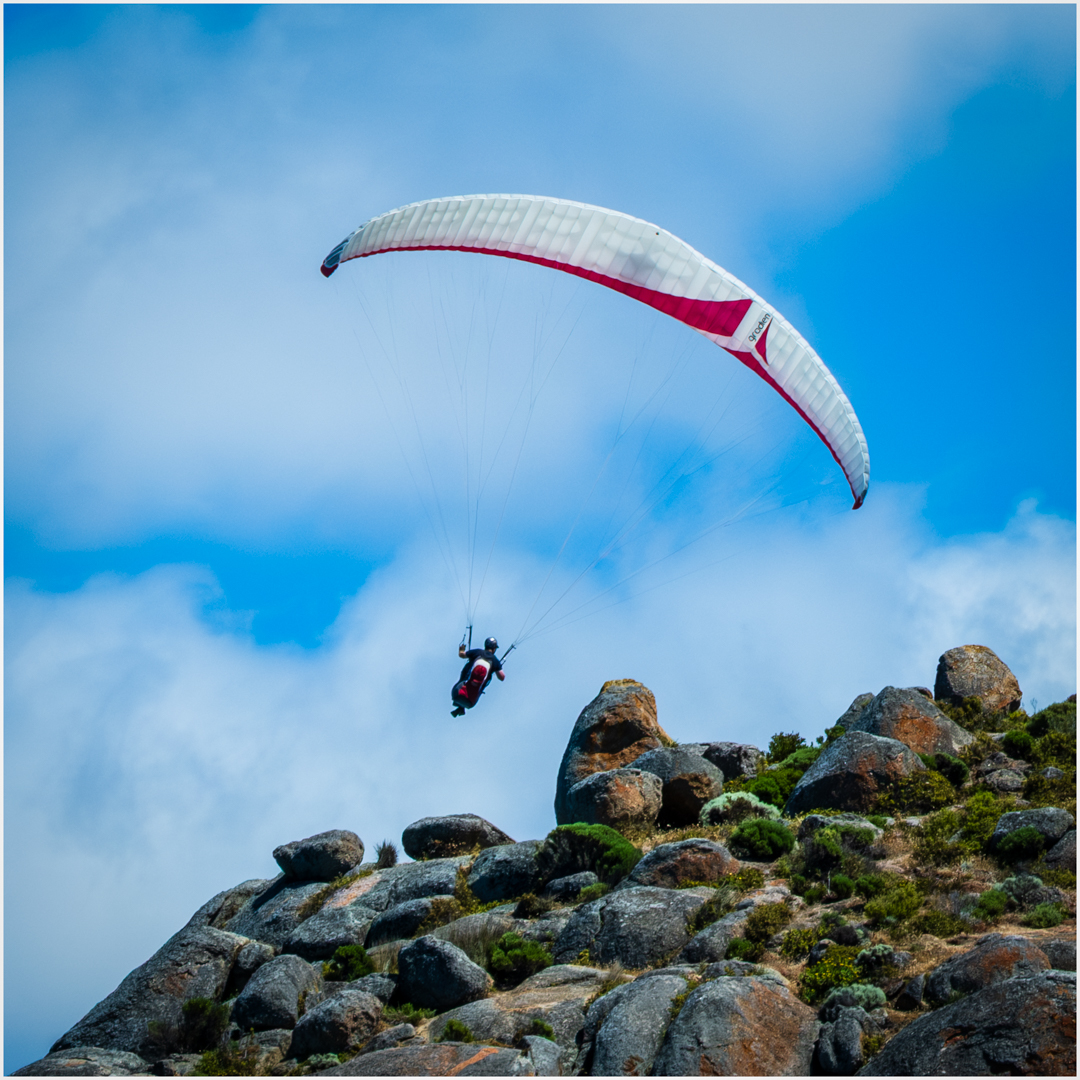
Good shot of an athlete's concentration before taking off Delian.
It may be worth cropping a small strip from the right of the image so the viewer is not distracted by the number on the ground. Alternatively you could edit it out (if not entering a photo journalism competition).
Well caught with your Pen-F. |
Oct 16th |
| 37 |
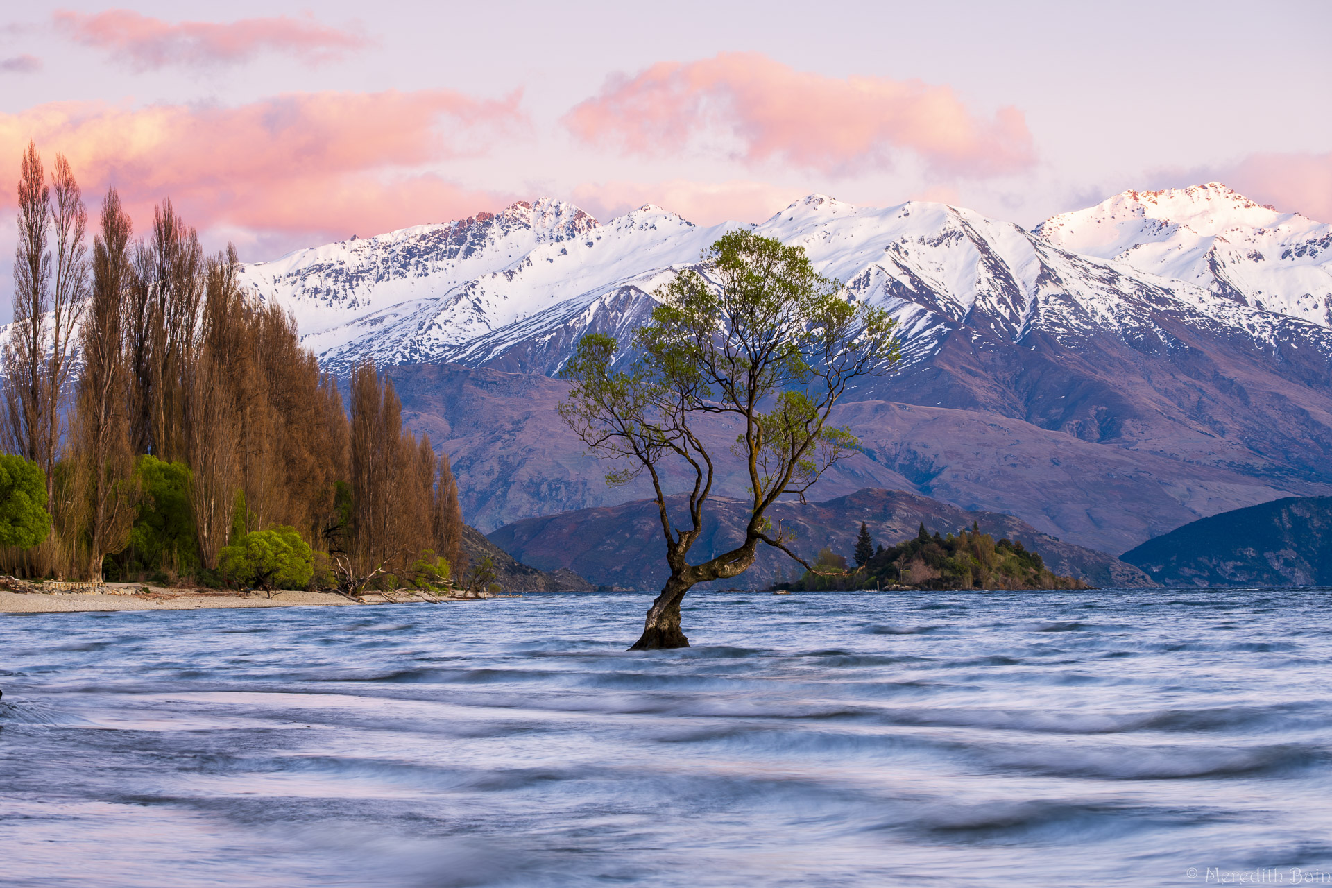
Oct 24 |
Comment |
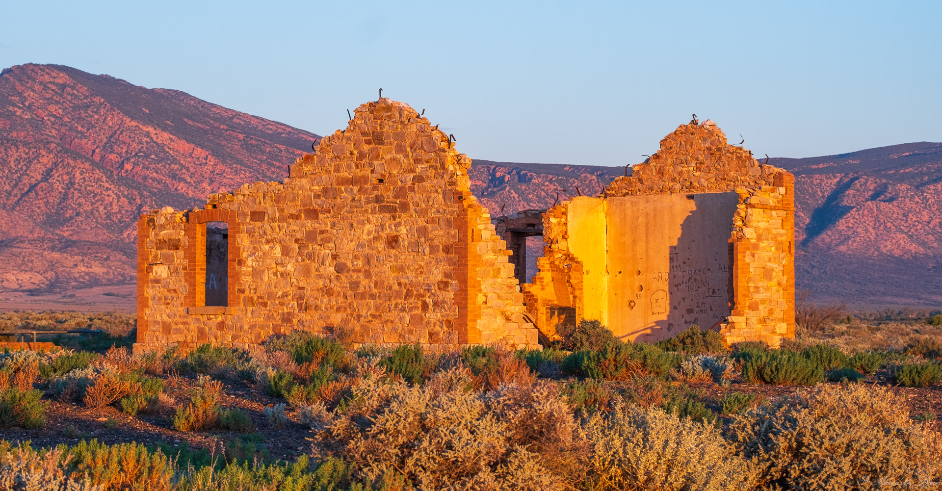
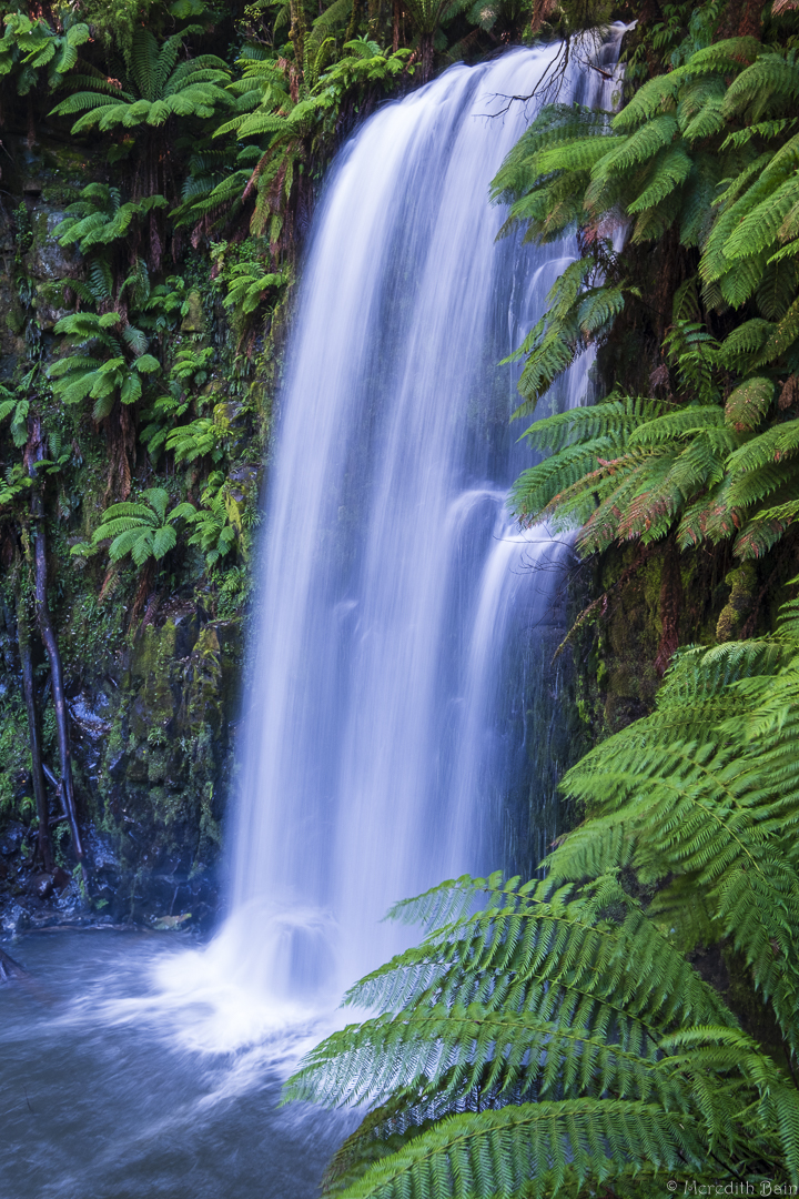
Such a beautiful reflection landscape Peter caught at exactly the right moment. No wonder you had to share it with other people and thank goodness for the technology to remove them.
You could potentially crop a small strip from the left hand side to reduce the greyness that is not making a positive contribution to the rest of the image.
The golden sunlight on the mountain peaks and clouds and in the reflection, along with that strip of trees between the two, make for a glorious image. |
Oct 16th |
5 comments - 0 replies for Group 37
|
11 comments - 0 replies Total
|