|
| Group |
Round |
C/R |
Comment |
Date |
Image |
| 10 |
Dec 23 |
Reply |
Thanks Diana. |
Dec 17th |
| 10 |
Dec 23 |
Reply |
Not just you Rich. It is a strange angle. because I tilted the image in post. I'll try a few options with the angle including how I photographed it, crouching and photographing on the diagonal. |
Dec 17th |
| 10 |
Dec 23 |
Reply |
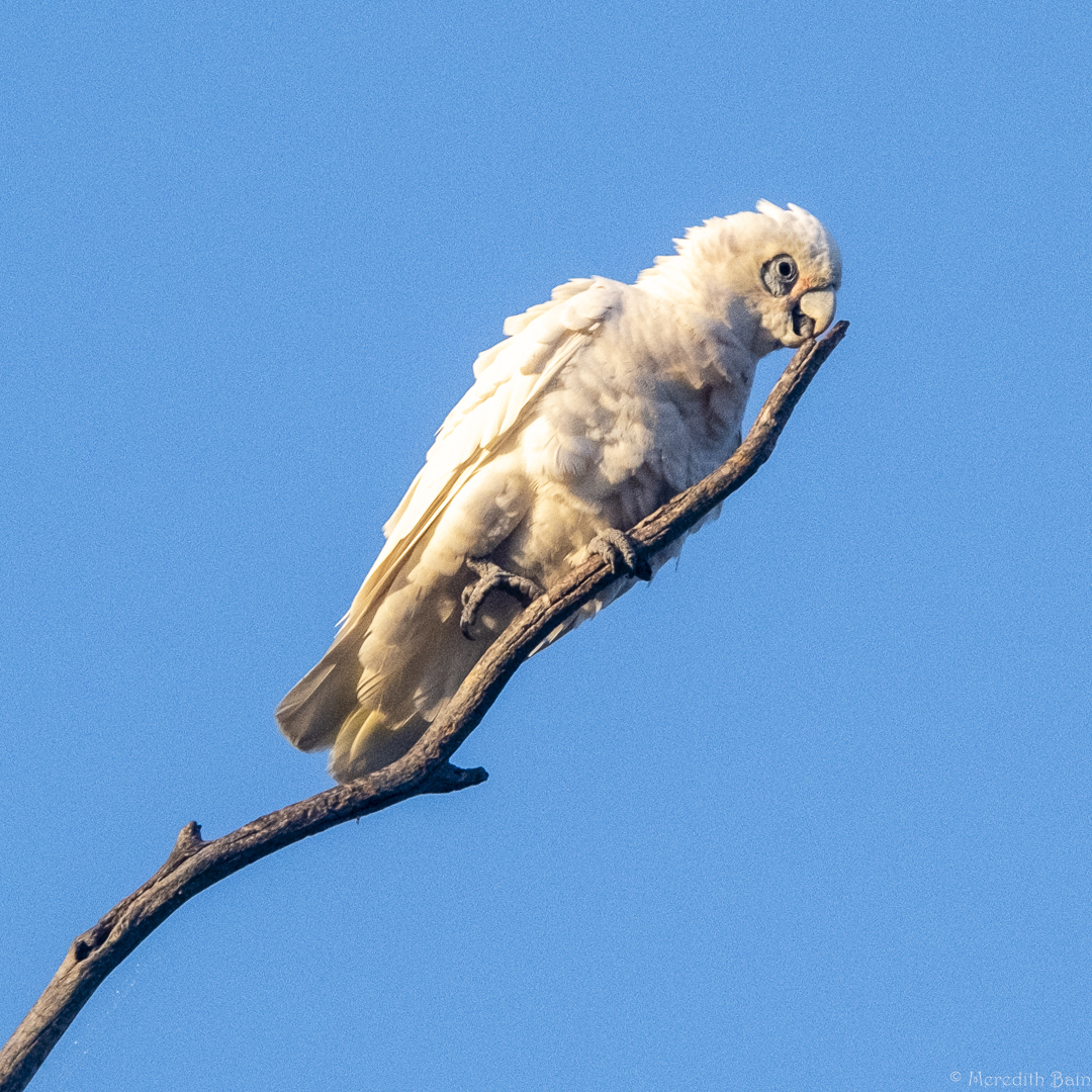
Thanks Peter. I will see how I like it with the leaf removed. |
Dec 17th |
| 10 |
Dec 23 |
Reply |
I like your processing Donna. It's gritty which suits the subject matter well. |
Dec 17th |
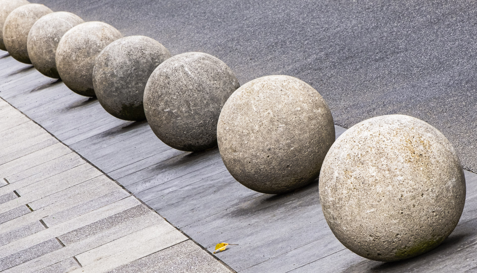
| 10 |
Dec 23 |
Reply |
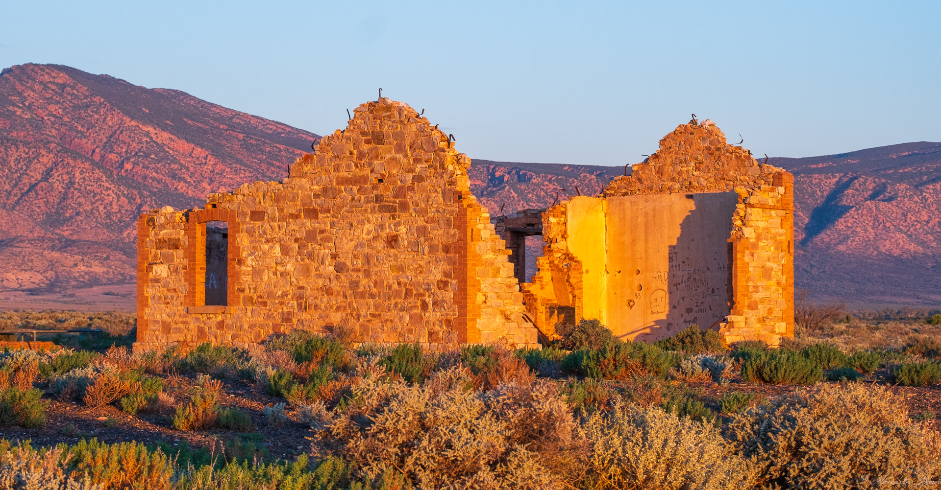
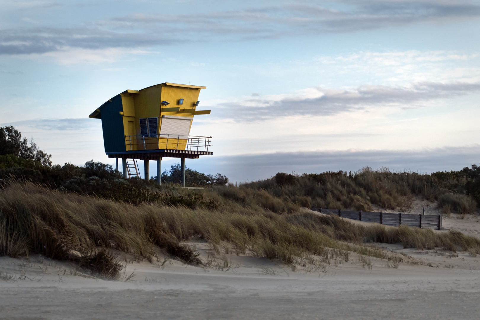
Thanks for your thoughts Donna. I was standing straight when I photographed the balls but I wanted to see the corner to corner composition which of course tilts the ground. There's many ways to photograph these and I shall check my other images taken at the same time but from approximately the same angle. I shall also revisit the location and have another go. |
Dec 17th |
| 10 |
Dec 23 |
Comment |
I'm envious Peter. Venice is such an interesting place with so many photo opportunities. This image has captured a typical Venice 'street' scene really well with the colourful buildings, gondolas, umbrellas and flags.
A sparing addition of saturation might add to the energy of your image but it would need to be done with a light hand.
I wonder if you crop a tiny sliver from the left hand side, whether that would tighten up the composition in the top left hand corner a little. My guess is that you considered the crop line really carefully to include the tips of the two black gondolas parked and a further crop may detract rather than enhance. |
Dec 7th |
| 10 |
Dec 23 |
Comment |
A soft and pretty image of a gerbera Diana (your signature style?).
The focus in the centre of the flower is just right as is the way it falls away towards the edges.
I wonder if a different coloured background would make a positive difference by giving the flower more impact. The existing colour is so similar to the flower that they almost morph into each other.
Using light from a window is a choice that works well to give soft light with no shadow.
|
Dec 7th |
| 10 |
Dec 23 |
Comment |
This is an impressive travel memory. You have captured the detail of the DOM well.
So that it takes centre stage it would be good if you could remove the poles in front and even some of the cars. It would be difficult I think because there is a lot of detail but it might be worth using Photoshop Generative Fill if you have it, to give it a go. If you were intending to show the hustle and bustle in the front of the cathedral, ignore my suggestion.
You travel to some amazing places and are taking us vicariously with you. Thank you. |
Dec 7th |
| 10 |
Dec 23 |
Comment |
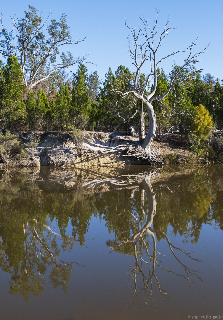
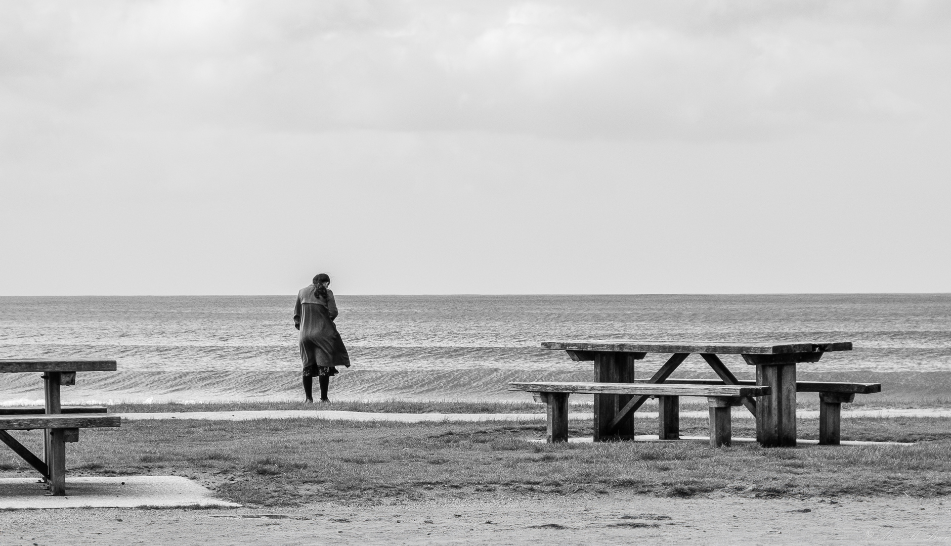
This is a lovely, calming shot with beautiful light. That you have captured their reflections makes it doubly so.
The birds seem quite soft which you may have intended but perhaps by increasing the contrast in them you will emphasise their plumage and face colours which as a viewer, I would like. It is also possible that a crop on the right hand side to inside the horizontal dark line in the water, will remove the distraction of the line and still keep, even improve, the essence of the image.
Bird photography is notoriously difficult but you have caught these three in a lovely pose. |
Dec 7th |
4 comments - 5 replies for Group 10
|
| 37 |
Dec 23 |
Comment |
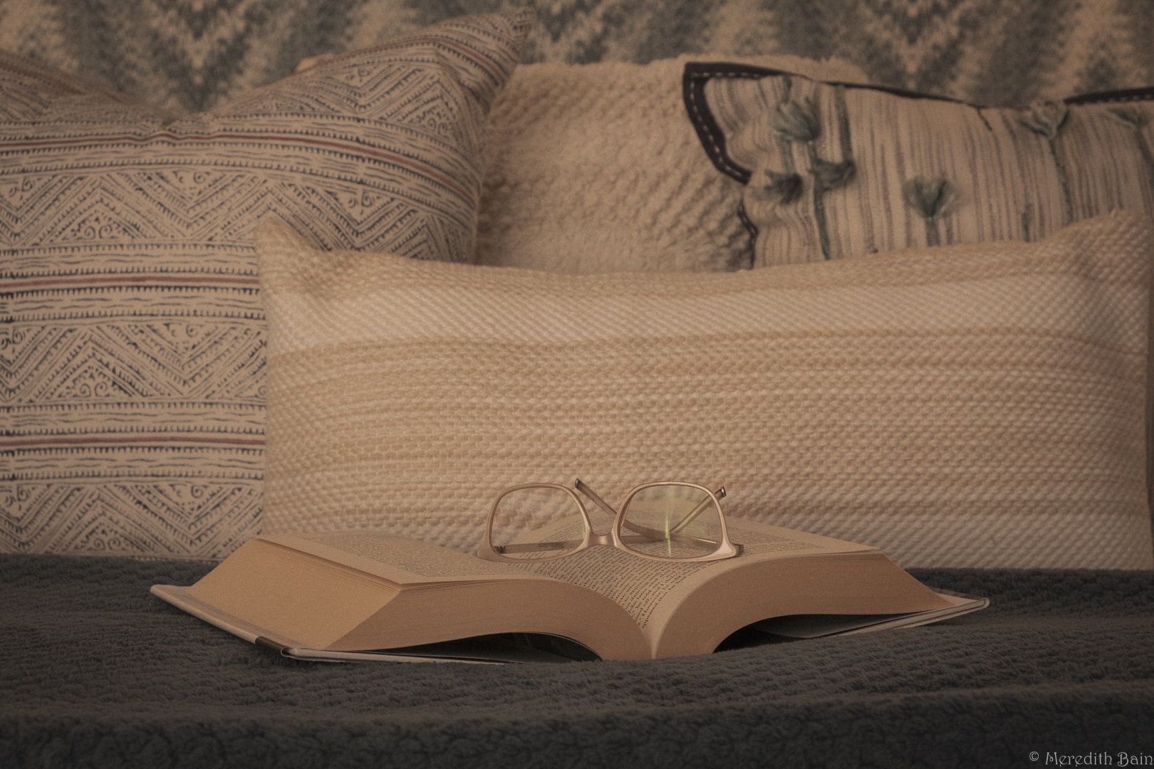
Thanks Ricarda - and for your suggestions for my image and I shall try to keep the aged feel whilst increasing the clarity and sharpness. I'll also work on removing that white reflection line in the spectacles. |
Dec 26th |
| 37 |
Dec 23 |
Reply |
Thanks Napoleon and for your suggestions. I shall try this again with a change of perspective/composition. |
Dec 26th |
| 37 |
Dec 23 |
Comment |
Hi Ricarda. The lighting on your water lily is superb.
Like your other commenters, I think the background needs to have less definition and colour so that the flower itself stands out. The flower really is the star of the show. |
Dec 26th |
| 37 |
Dec 23 |
Comment |
Hi Napoleon. I'm no portrait expert, so will not attempt to critique your image with any real expertise but the lighting is most effective and the features of your model absolutely clear. Well done. |
Dec 26th |
| 37 |
Dec 23 |
Comment |
What a stunning capture Howard. It is a beautiful building with a pretty sky behind it and both work together to produce a whole that is bigger than the sum of its parts.
The lines of the building are sharp and the angle at which you captured them showcases its unique design well.
Would you consider desaturating the greens a little so that the foreground doesn't pull the viewer's eye away from the building and sky? |
Dec 26th |
| 37 |
Dec 23 |
Reply |
Thanks Howard. I did wonder if increasing the clarity and sharpness would make a positive difference. It was a bit of a balancing act to keep the softness of age and make the image more clear. I will try what you suggest. |
Dec 26th |
| 37 |
Dec 23 |
Comment |
Hi Bob. What a great way to practice shooting people in a studio setting. The lighting and colour are superb and your minimal processing has produced a clear and sharp subject. I am guessing that at some future point you may try a few different backgrounds to so that you have a single background which would make your beautiful subject stand out even more. |
Dec 26th |
| 37 |
Dec 23 |
Comment |
Hi Delian - it is an interesting view. The metal grate dominates because it is in focus and so the sky reflection becomes a background piece rather than what caught your eye (and therefore ours as viewers). Using manual focus if your camera has it, would give you control over what part of the image is in focus. Part of the fun of photography is to revisit the same locations and make a different image with it. |
Dec 24th |
6 comments - 2 replies for Group 37
|
10 comments - 7 replies Total
|