|
| Group |
Round |
C/R |
Comment |
Date |
Image |
| 7 |
Apr 26 |
Reply |
So many options! Thanks! All good fun and grist to the mill....I will play more and maybe even end up with a 'final' image! :) |
Apr 17th |
| 7 |
Apr 26 |
Comment |
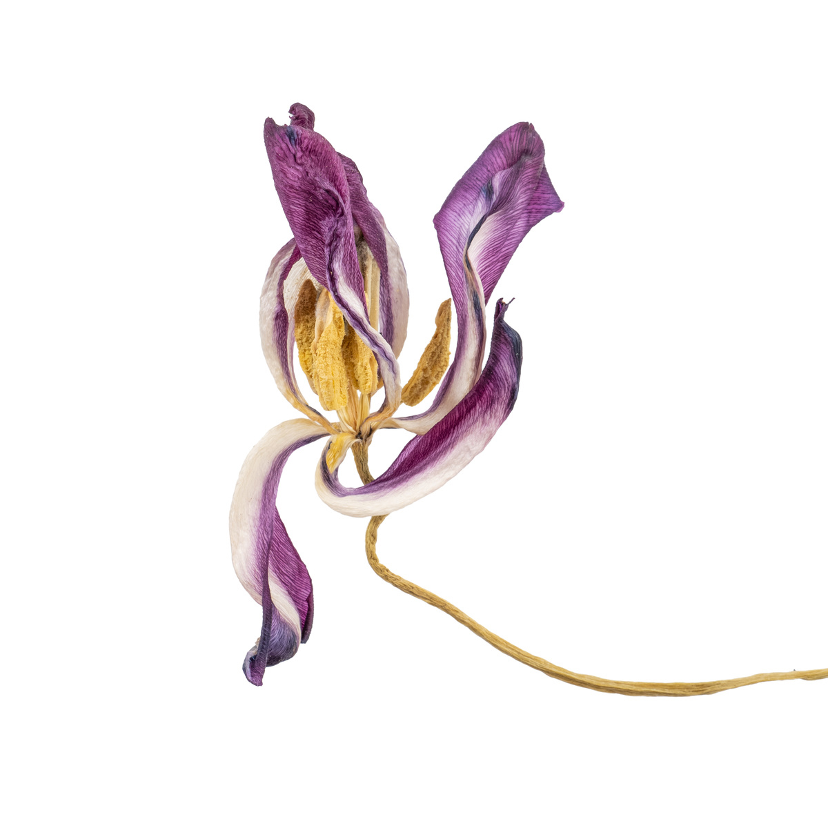
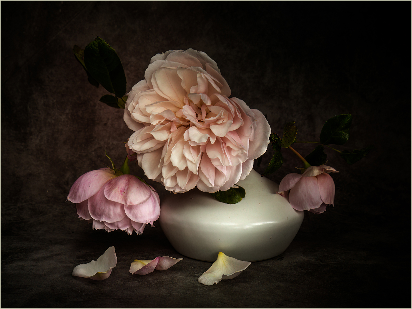
Beautiful and striking image. Love it. I can't see anything I'd change - so I haven't. It seems the perfect composition, balance of light and shade etc. I accept the comments regarding raindrops but would be wary they would complicate the view: I don't mind that it isn't totally realistic in this sense. Such a good image! |
Apr 16th |
| 7 |
Apr 26 |
Comment |
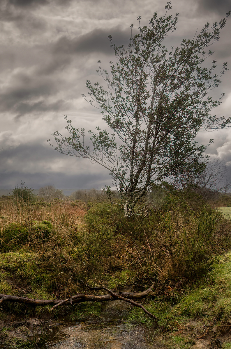
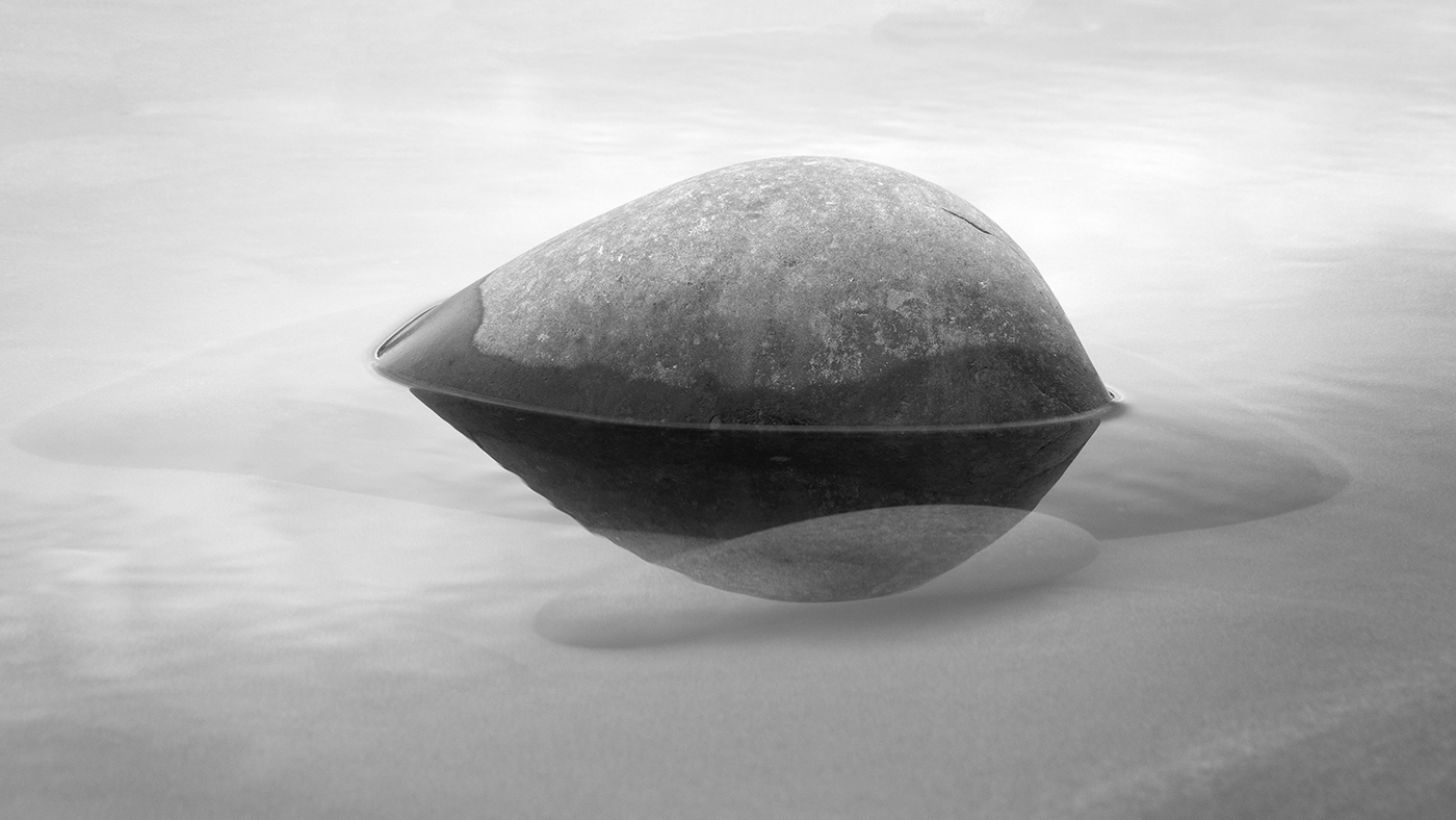
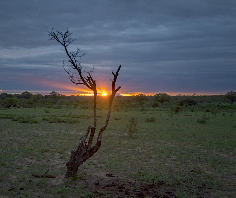
I had a play with this image before reading comments, as I could see there was a really good image in there which just needed bringing out. So I messed around with the Light sliders in ACR (I think Lightroom is the same) to reduce highlights, raise shadows and adjust black and white points. I then copied this layer in PS and put it is a Screen mode, opacity 90%, over everything but lightly masked out around the edges to make a vignette. I then brought back the original tree to make it dark and more separate from the background. I rather like it....! |
Apr 16th |
 |
| 7 |
Apr 26 |
Comment |
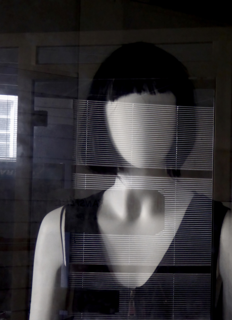
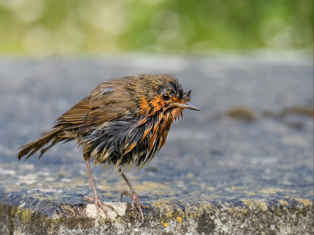
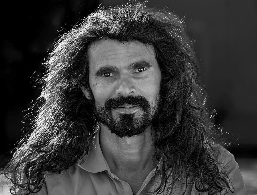
Great image - good interesting subject and well handled exposure. Great monochrome going all the way from black to white. I just tinkered with lightening midtones everywhere except that left hand side, which I actually made a little bit darker. I think this draws the eye more into the face? B |
Apr 16th |
 |
| 7 |
Apr 26 |
Comment |
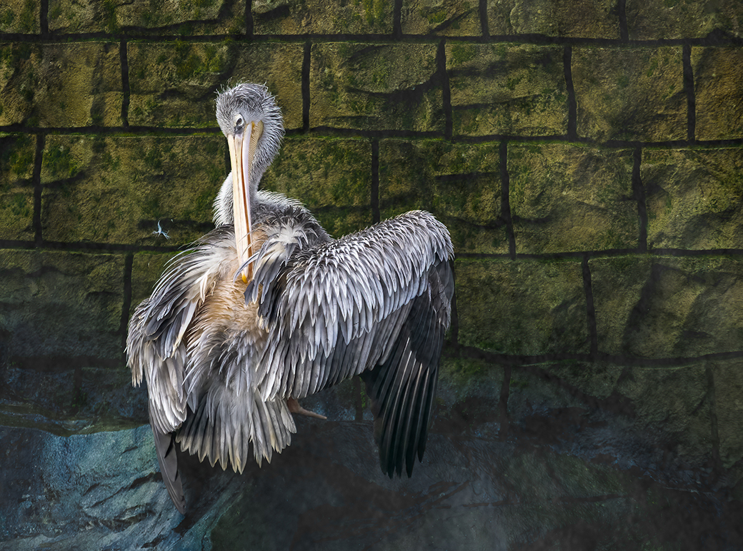
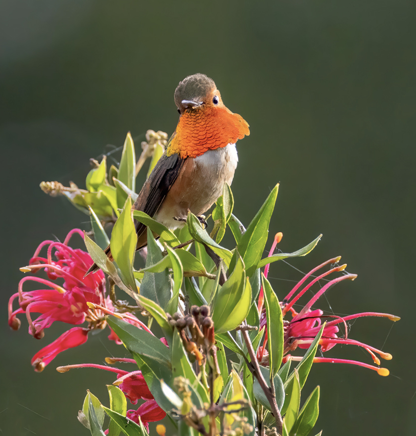
Ok, assuming this isn't for a Nature competition I'd do even more radical on the crop. By trimming a few bits of leaves, the bird is now the top of a triangle so much more the star of the show. Just a thought! |
Apr 16th |
 |
| 7 |
Apr 26 |
Comment |
Beautiful image. Love the minimalism. Yes, background 'stripe' first appeared a bit strange but thanks for explanation. And, evidently it doesn't make too much of an impact given the great detail and frozen action of the subject! Nice!!! |
Apr 16th |
| 7 |
Apr 26 |
Comment |
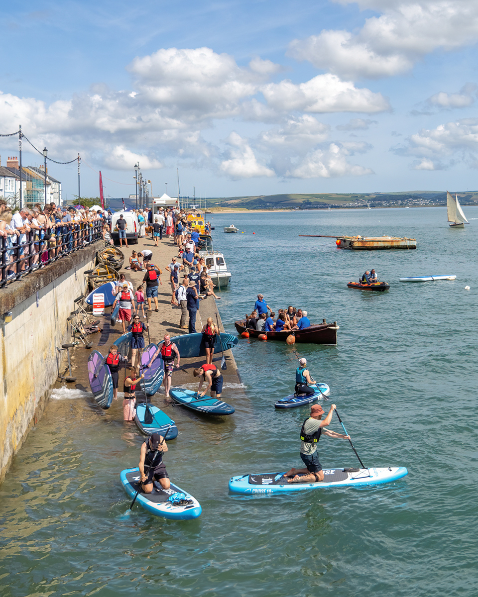
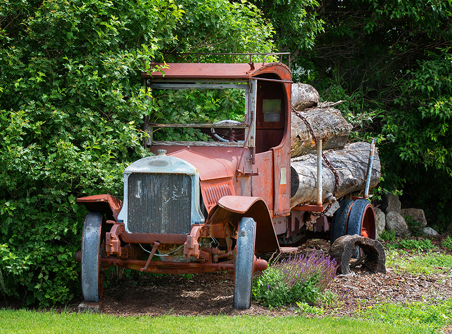
I have not a lot of interest in trucks, but did like this image. The poor old wagon just sinking into the environment... Leaf reduction works well and the version posted 04/02/2026 21:04:55 much improves it. I, personally, don't think it needs a crop on the left as it give the vehicle space to breathe. I love the fact it has turned to face the viewer but looks unlikely to ever head in that directions again. I just tinkered with contrast to darken the background and lighten/add a bit of saturation to the truck. I do hope you go back in a year or two to see what progress has been made. Unfortunately, I tinkered with the first image posted but in case it is useful will post here. |
Apr 16th |
 |
| 7 |
Apr 26 |
Comment |
So interesting - different thoughts! Appreciated. :) |
Apr 14th |
| 7 |
Apr 26 |
Reply |
Interesting.... Never sure of how dark to go. Here the curves look great brought out but I will look at more graphic/black. Ta. :) |
Apr 5th |
| 7 |
Apr 26 |
Comment |
Thanks so much for this. Great! :) |
Apr 2nd |
8 comments - 2 replies for Group 7
|
8 comments - 2 replies Total
|