|
| Group |
Round |
C/R |
Comment |
Date |
Image |
| 7 |
Dec 25 |
Reply |
Yes, thanks. Moving it DID look better! :) |
Dec 30th |
| 7 |
Dec 25 |
Comment |
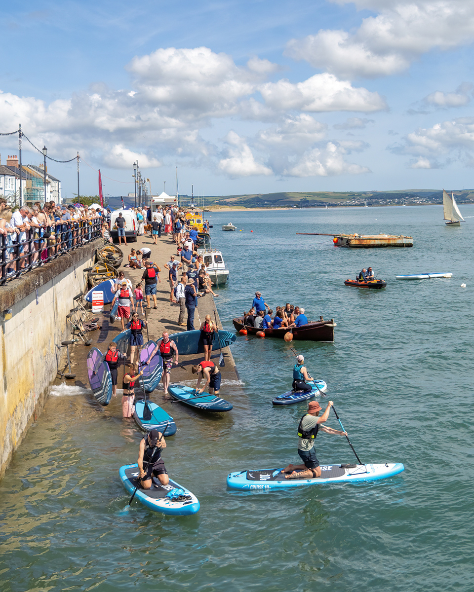
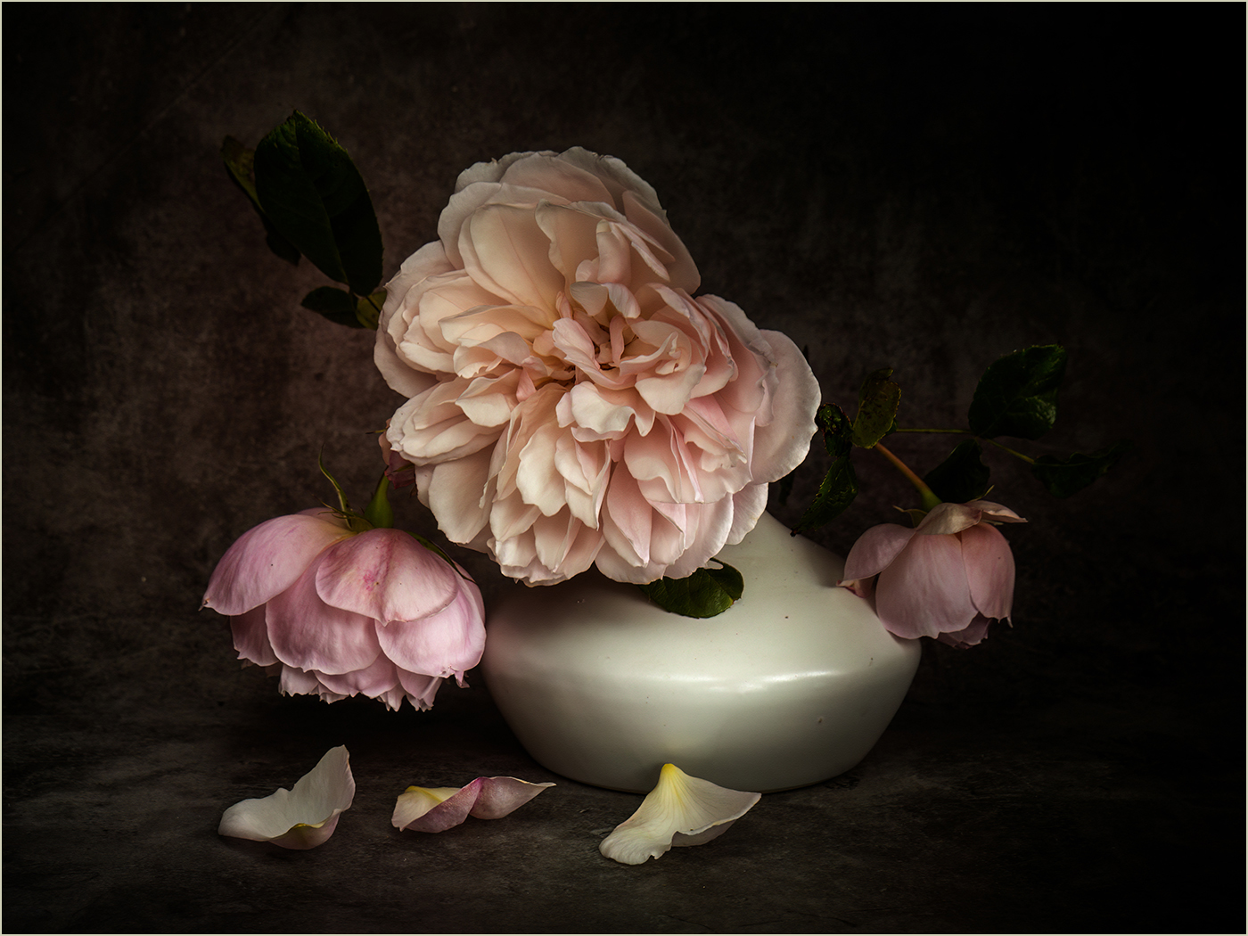
Nice!!! I know I tend to comment on the images as images (technical, composition etc) and perhaps neglect the story that they show, but here I have both and I love it! Great composition, fab movement - maybe a tad overlightened judging from the colours but that's quite possibly just my taste. No animals cropped in half at the edges, sharp.... Great! And what a sight to see!!! |
Dec 24th |
| 7 |
Dec 25 |
Comment |
Hmmmm...nice scene but I'm not sure what the subject is. Light draws the eye to the very nice clouds. But the subject from the title is the pier which is small and dark and on the edge of the frame. Plus rocks....
I think I'd crop the image to remove the front rocks which add little. Consider letterbox crop of the pier (lightened) and the (excellent) clouds. Worth a try?
|
Dec 24th |
| 7 |
Dec 25 |
Comment |
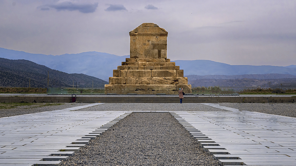
Great shot and perspective. I darkened the sky a bit and then also decided to add a curves layer to darken everything, which I then removed over the main monument and 'triangle' area so these remained lighter. My aim was to draw the eye up and into the main subject while creating a sort of vignette effect. You obviously did well to include just one person also taking a photo. |
Dec 24th |
 |
| 7 |
Dec 25 |
Reply |
Interesting thought. Thanks! |
Dec 24th |
| 7 |
Dec 25 |
Comment |
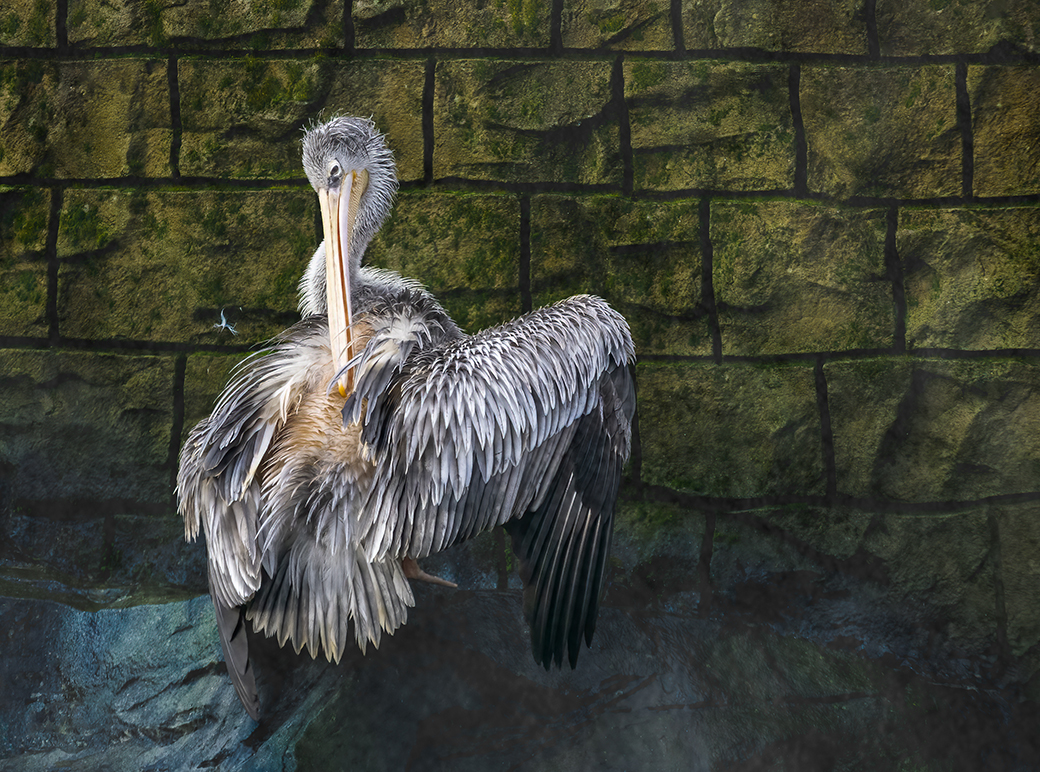
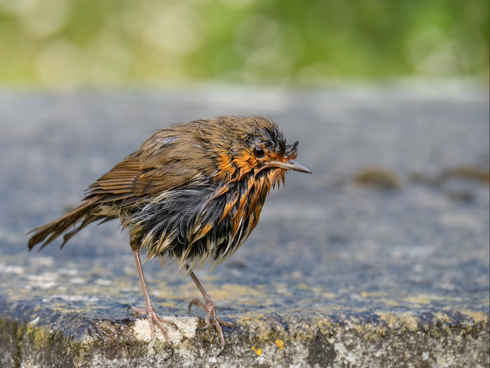
Yes, window glass is never good, so you did well to capture a shot. It doe come across as a bit oversharpened to my mind on the chest especially, and I'm not sure what those fine lines are around the beak. But sometimes you've just got to get the shot you can! :) |
Dec 24th |
| 7 |
Dec 25 |
Comment |
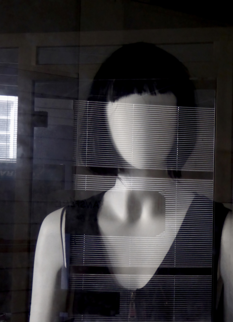
I really like this image, but maybe a bit more contrast would have helped? Or a bit of lighten effect in the centre of the V so that area draws the eye to what is, I fancy, the main area of interest. |
Dec 24th |
| 7 |
Dec 25 |
Comment |
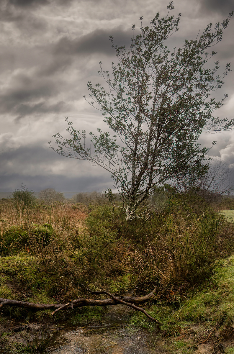
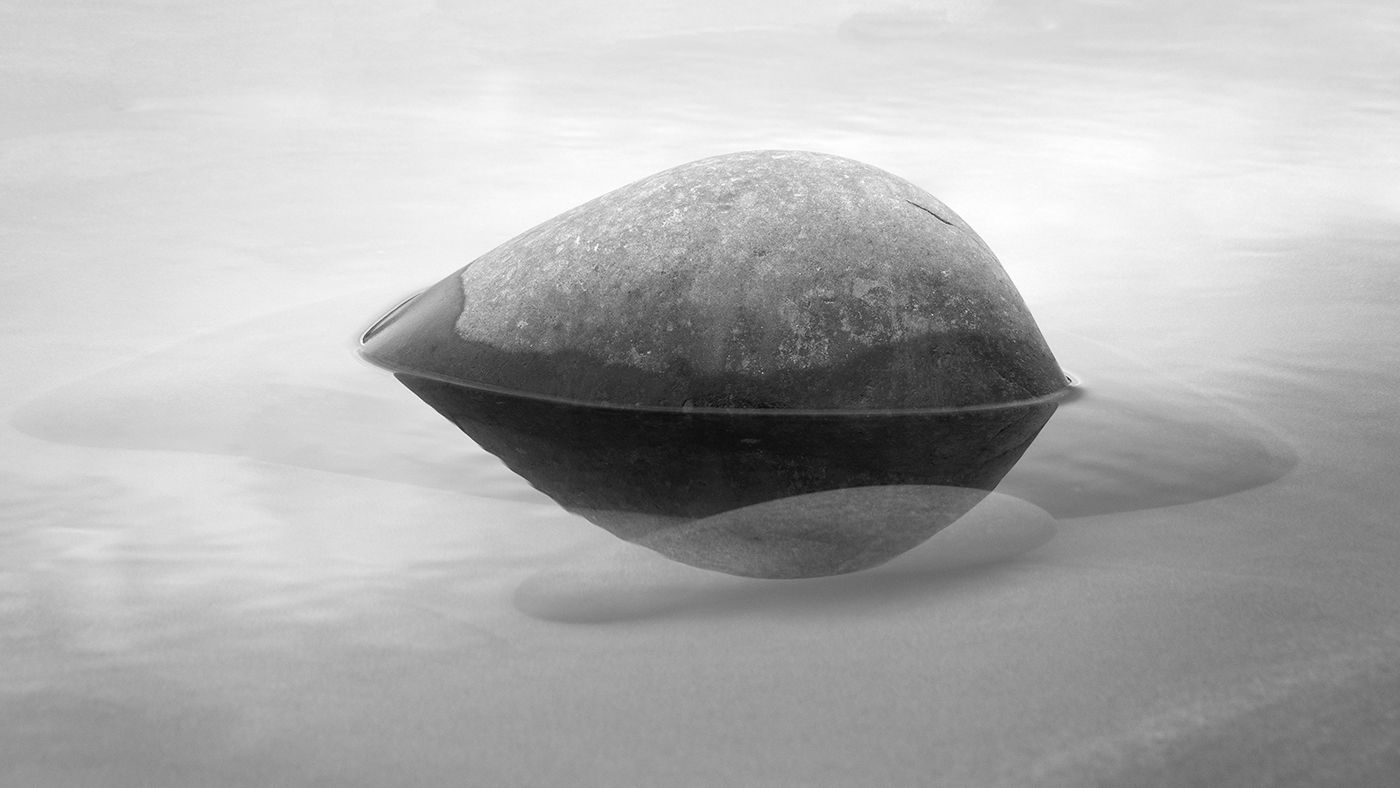
Sorry - but not understanding perhaps the concept, I find this image difficult to evaluate. The ripples are great and a crop of them would have worked. But the flat green area with the shadows adds little interest. The top area with the bases of the trees is also interesting and would make an interesting image on its own I fancy. For me, this image comes across as several images in one and I'm left not sure what the subject is or where to focus. The symbolism and the environment may be unique but as a single photo I'm not sure it works. |
Dec 24th |
| 7 |
Dec 25 |
Reply |
Thanks. Yes, I made it in photoshop. Tricky to explain but you can see the 'sections', some of which I lightened, others I darkened. |
Dec 11th |
6 comments - 3 replies for Group 7
|
6 comments - 3 replies Total
|