|
| Group |
Round |
C/R |
Comment |
Date |
Image |
| 7 |
Jan 25 |
Reply |
Still life is great fun! Problem-solving features highly! :) Look forward to seeing what you do! |
Jan 30th |
| 7 |
Jan 25 |
Reply |
I just darkened the edges, especially the right hand front corner, so the brightest part was top left and the darkest part bottom right. I just thought it guided the eye more... As I said, just my twopennyworth and, as you said, sometimes you use the kit you have as well as you can! It does look wonderful there I must say....! :) |
Jan 30th |
| 7 |
Jan 25 |
Comment |
Okey doke....and just to be different....I think it is an interesting shot and love the placement of the figures. However, I am disturbed by the colours which I find too saturated and make me think the image has been overprocessed (there does also seem to be a surprising amount of noise/grain at this size and resolution). The stars on the flag are barely visible and there is a strong streak of yellow across the sun which also seems odd. I notice that the cloning seems to have left repeated elements at the bottom of the image, too, and a definite zigzag shape which would need to be sorted bottom right. If I was being really picky, there seem to be two tiny bright flags on the beach which I would remove. Sorry, Butch. Intended to be helpful - just my reaction - I know you take some great images. |
Jan 23rd |
| 7 |
Jan 25 |
Comment |
OK. Beautiful place and image looks technically good. I am no landscape expert so do feel free to disregard my comments. Immediately when I opened the photo I didn't know what the subject was meant to be: there were three. Trees on the left, trees on the right and a lot of sunset sky (albeit dramatic and beautiful). The almost-half-way up crop also felt unnatural. Sooo....I took the liberty of getting the horizon on the 2/3 line, and then added a vignette rather more on the right than on the left to make the left hand side more clearly the main focus on the image, which we can then 'read' in the usual left-to- right way.... See below. |
Jan 23rd |
 |
| 7 |
Jan 25 |
Comment |
Looks technically good and I love the 'texture' on the water. Nice one! |
Jan 23rd |
| 7 |
Jan 25 |
Comment |
Quirky shot and well seen. Nice! I do think the shadows everywhere could benefit from a bit of a 'lift' even though we are talking backlight here, but top left already has highlights blown.... No idea if you have the means to correct this in Photoshop....one way or another? |
Jan 23rd |
 |
| 7 |
Jan 25 |
Comment |
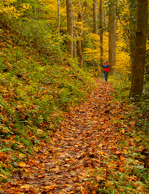
Looks like a lovely place and the photographer is in a good place in the scene. However, trees are not vertical. When I made them do, this left a very strange and distracting piece of tree trunk top left. So I cropped in a bit. This also removes just some of the foreground which is perhaps unhelpful in that the front pieces of grass are very sharp and rather draw the eye. See what you think.... |
Jan 23rd |
 |
| 7 |
Jan 25 |
Reply |
I do hope to get to commenting on other pics later today....Plan A. We'll see how it goes! :) |
Jan 21st |
| 7 |
Jan 25 |
Reply |
Thanks Barbara. You aren't the only one to suggest that and I will have a look! Have a nice day and all that! :) |
Jan 21st |
| 7 |
Jan 25 |
Reply |
Thanks Tom. I will definitely have to try a few options before submitting it anywhere. Just still not sure what though I do like your tweaks! Onwards! :) |
Jan 21st |
| 7 |
Jan 25 |
Reply |
Thanks for your thoughts. I will have to tinker further with this image! :) |
Jan 21st |
| 7 |
Jan 25 |
Reply |
Thanks Butch. Appreciated. I will tinker with brightening a little. I do like what you did! :) |
Jan 13th |
| 7 |
Jan 25 |
Reply |
Thankyou! |
Jan 13th |
| 7 |
Jan 25 |
Reply |
Well hello there! Fancy meeting you here! You might see this pic again in Creative Competition - or you may not! NOw let me find you..... :) PS Interesting image this week from you but couldn't think of much to add. So I didn't! Have a good day! |
Jan 9th |
5 comments - 9 replies for Group 7
|
5 comments - 9 replies Total
|