|
| Group |
Round |
C/R |
Comment |
Date |
Image |
| 7 |
Sep 24 |
Comment |
Thanks for taking the trouble!
I will definitely play with this image again, taking into account comments here. :) |
Sep 29th |
| 7 |
Sep 24 |
Reply |
I share that concern....hmmm....mulling..... |
Sep 22nd |
| 7 |
Sep 24 |
Reply |
Hi - I can't see the 'comment' image at the moment - will it appear? |
Sep 22nd |
| 7 |
Sep 24 |
Comment |
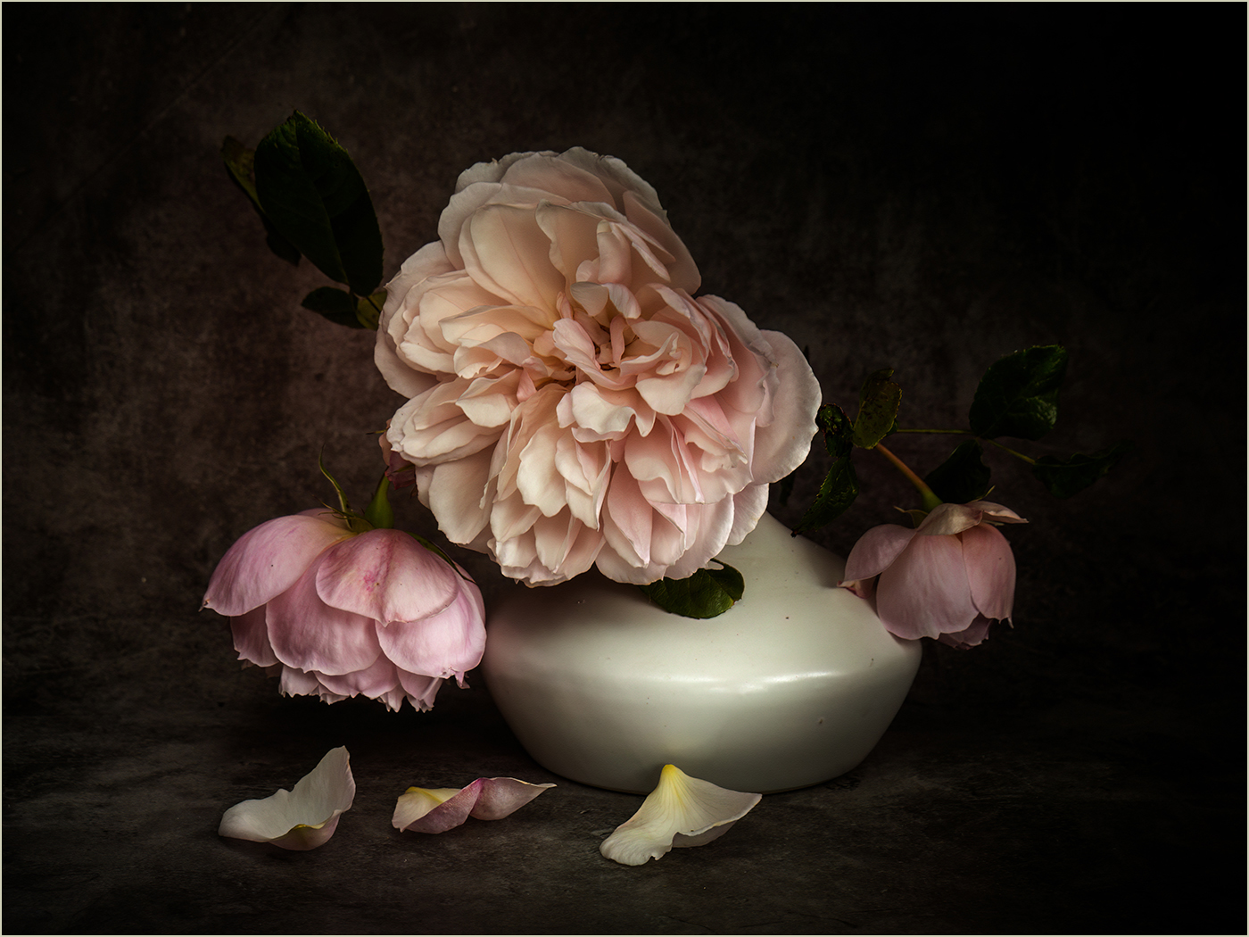
Wow! I can't imagine EVER setting up such a complicated lighting setup - even if it 'was actually pretty simple after that'!!!
The composition is 3:2 ie 6:4 so I don't see the issue there - to me, the bird (especially its wing) and the flower fit well.
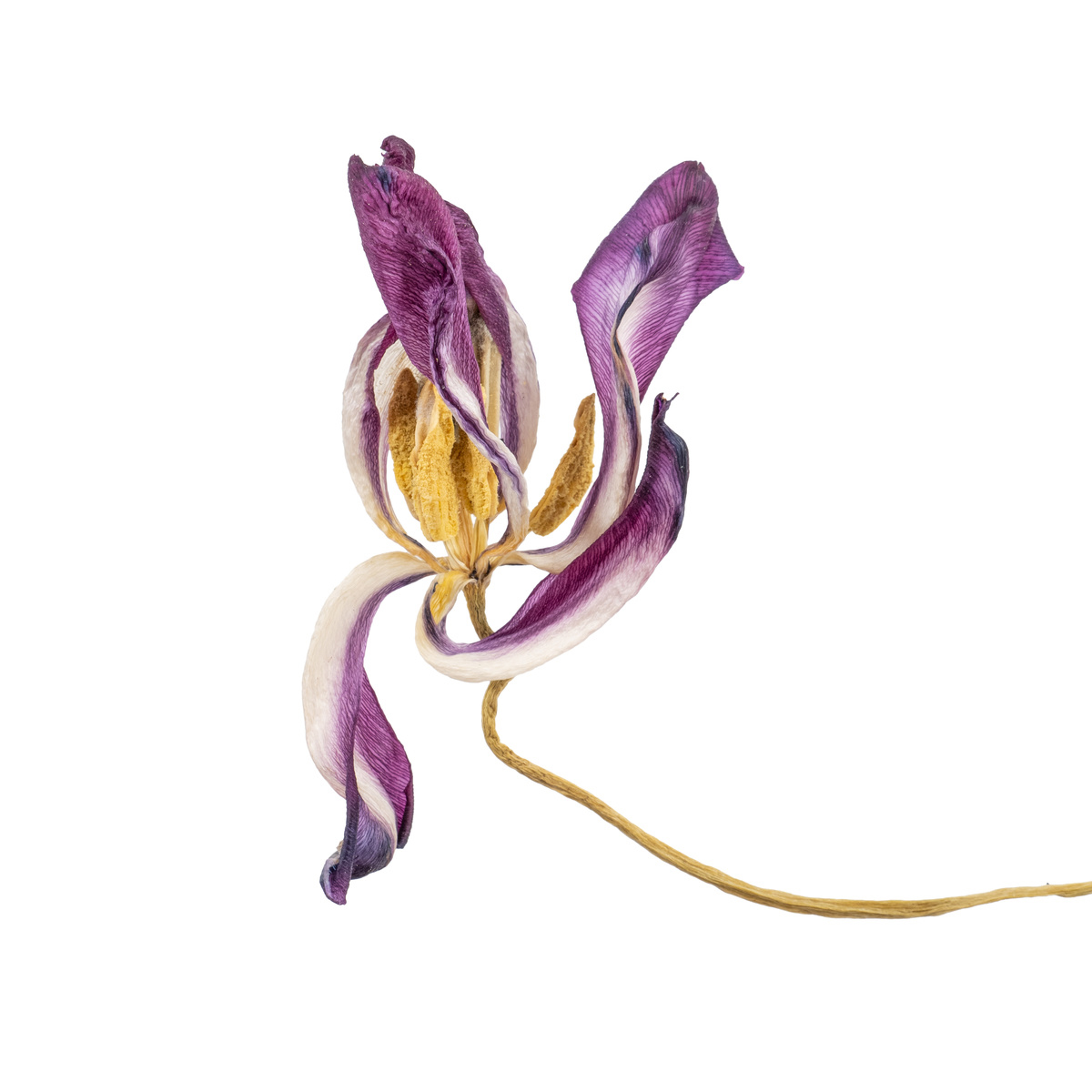
I also admit that I don't understand all the niceties of the many different photo competition categories, but there is always an issue with cropping flowers like these, where the leaves are near the flowers and not down the stem. The missing piece of leaf on the right doesn't bother me too much. However, the other 'bits' of leaves do, not least as they break an otherwise nice diagonal. I fancy that by removing these leaves, what remains is an even better leafy diagonal, mirroring crop either side, perhaps.
Finally, I also find the background rather magenta and that it doesn't show off the subject as well as it might. See what I did - lightening and tweaking to more neutral. (Still appears a bit streaky here - done, obviously, fairly quickly!)
Still - an amazing shot to have got at all!!! |
Sep 22nd |
 |
| 7 |
Sep 24 |
Comment |
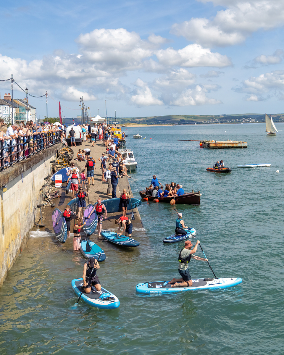
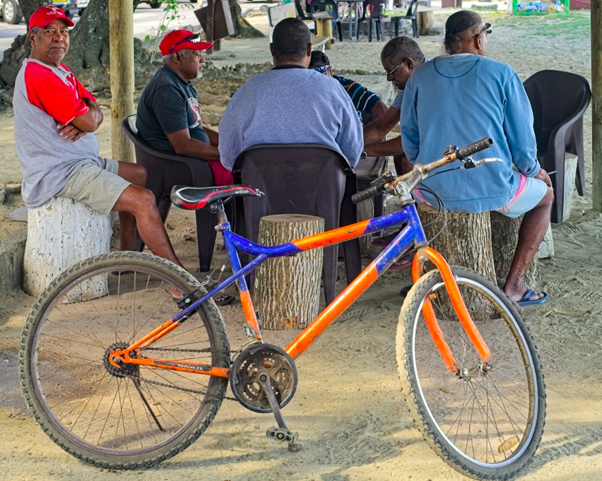
I really enjoyed this image - the matching shape of the group of men and the bike (alternative title: Six men and a bike?), and the similar colours. Because this is where the interest is for me, I'd crop in even tighter on this. Such a shame about the missing part of the bike wheel! |
Sep 22nd |
 |
| 7 |
Sep 24 |
Comment |
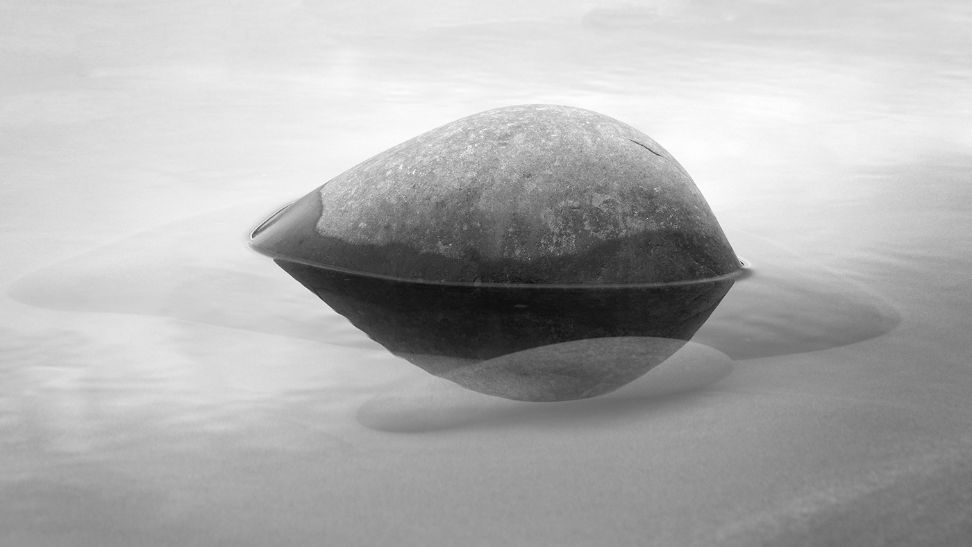
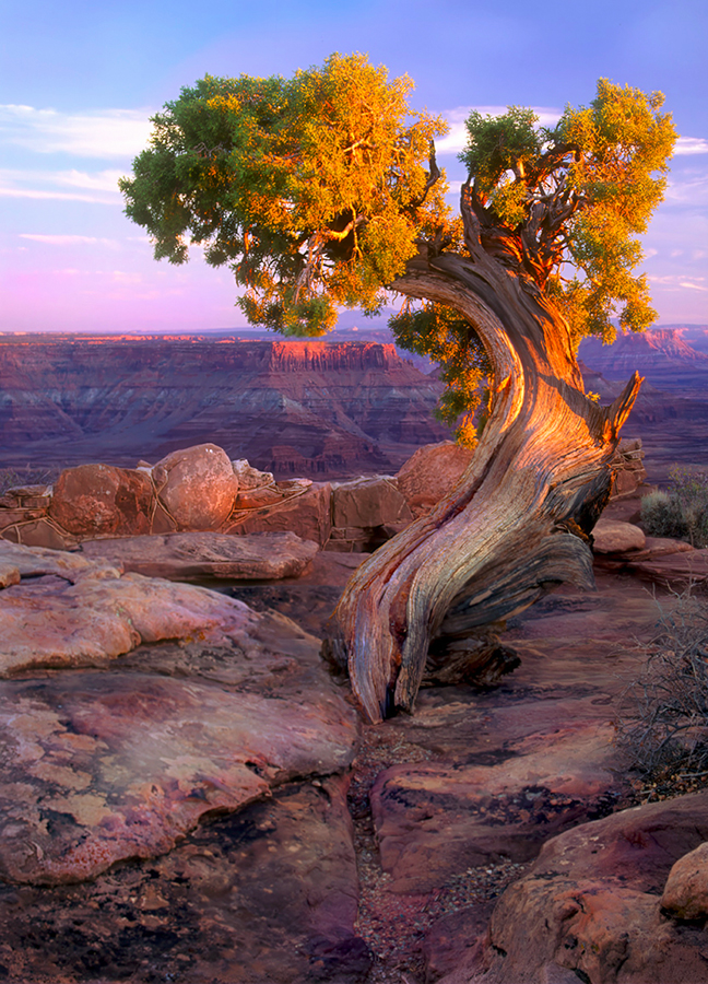
Beautiful image, if a bit oversaturated magenta for my taste. Purely theoretical I know, but I wonder if a slightly lower angle would have give even better separation from the background? If I was entering this is a competition where it was allowed, I'd remove that horizontal slice of rock in the centre front too, as it rather interrupts the composition I find. |
Sep 22nd |
 |
| 7 |
Sep 24 |
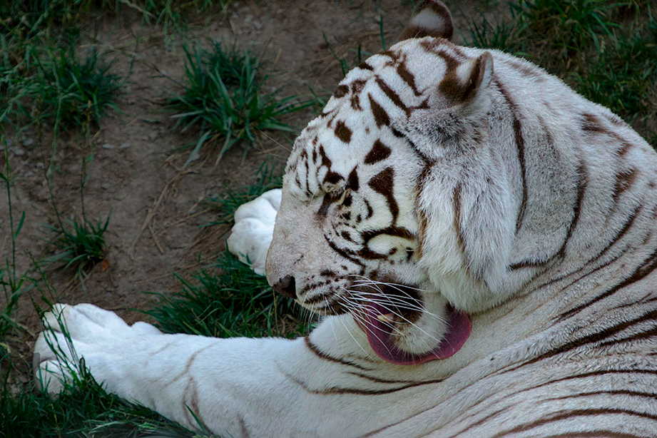
Comment |
Hmmm...yes....interesting shot but I found the composition a bit odd - I had to take a moment to understand the image. Maybe crop even tighter so the tongue is pretty much on the thirds lines? I also brightened the head/tongue area. I also notice that something odd is happening on that leftmost paw - grey - some reminder of post processing maybe? |
Sep 22nd |
 |
| 7 |
Sep 24 |
Comment |
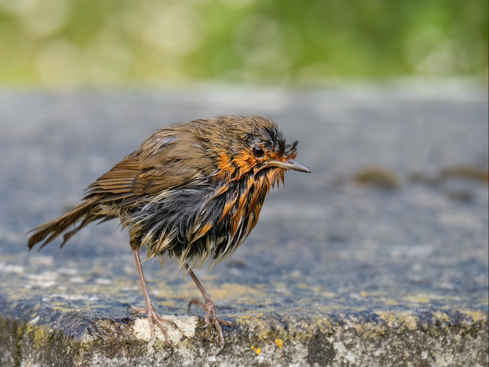
Nice! Great separation snow from snow, and all seems well exposed. I wonder if the red is a tad over-saturated, though, as there is interesting texture detail there which is not visible as it is. Still, simple, nice and well done. |
Sep 22nd |
| 7 |
Sep 24 |
Comment |
Sorry, but I see several issues with this. Yes, her right leg appears distorted but also, it seems, mega hairy. She is very thin, maybe verging on anorexic, and the bright 'white' area of lighting exaggerates this. The background is rather messy and the line from front right to her knee is a distraction, if you care to look. Above all, though, she is just 'placed' there, like a bunch of grapes or something in a still life. An object. As Tom said, if she was doing something, or draped in beautiful fabric or....well anything really...it would, in my view, make a more pleasant photo. |
Sep 22nd |
7 comments - 2 replies for Group 7
|
7 comments - 2 replies Total
|