|
| Group |
Round |
C/R |
Comment |
Date |
Image |
| 7 |
Apr 24 |
Reply |
Thank Barbara. :) |
Apr 26th |
| 7 |
Apr 24 |
Reply |
Thankyou. |
Apr 26th |
| 7 |
Apr 24 |
Reply |
Thanks! |
Apr 26th |
| 7 |
Apr 24 |
Reply |
Thanks Paul. :) |
Apr 26th |
| 7 |
Apr 24 |
Comment |
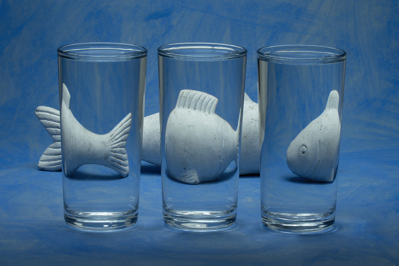
Nice. Good composition and directional light. Good colours. And even the dark side of the bottle visible! :) |
Apr 15th |
| 7 |
Apr 24 |
Comment |
Nicely seen and good composition but a bit soft. Also, the green seems very vivid - are they that colour? I think they are conifers in which case most are darker in my experience. |
Apr 15th |
| 7 |
Apr 24 |
Comment |
Really excellent shot of the aircraft. Tack sharp, good angle and great sky. Not so keen on the birds. Were they really there? They just seem very sharp above/behind a superfast aircraft? I appreciate your thoughts on nature, just not sure if it works here. PS I know nothing of aircraft - and not that much about birds! |
Apr 15th |
| 7 |
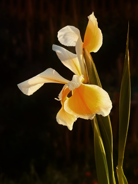
Apr 24 |
Comment |
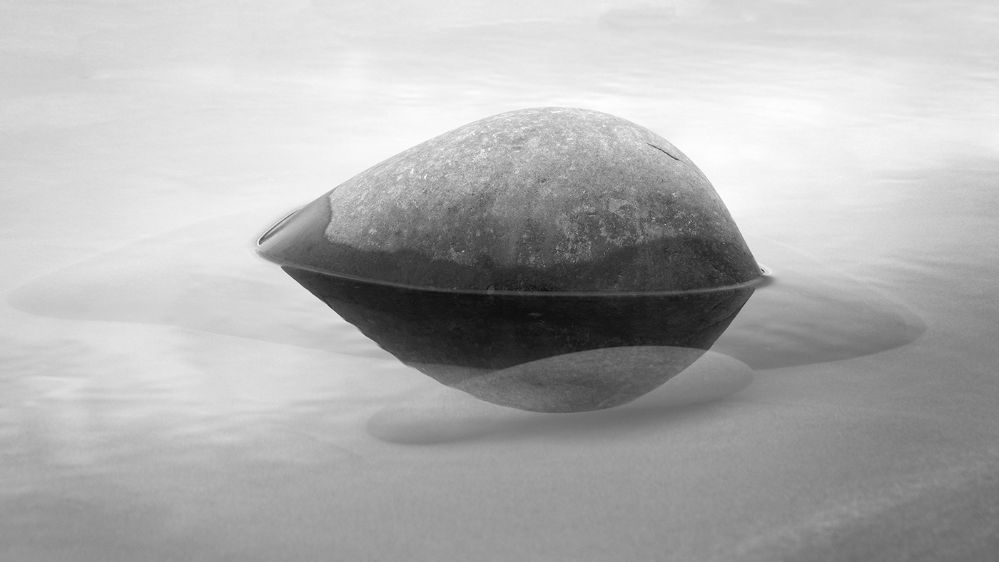
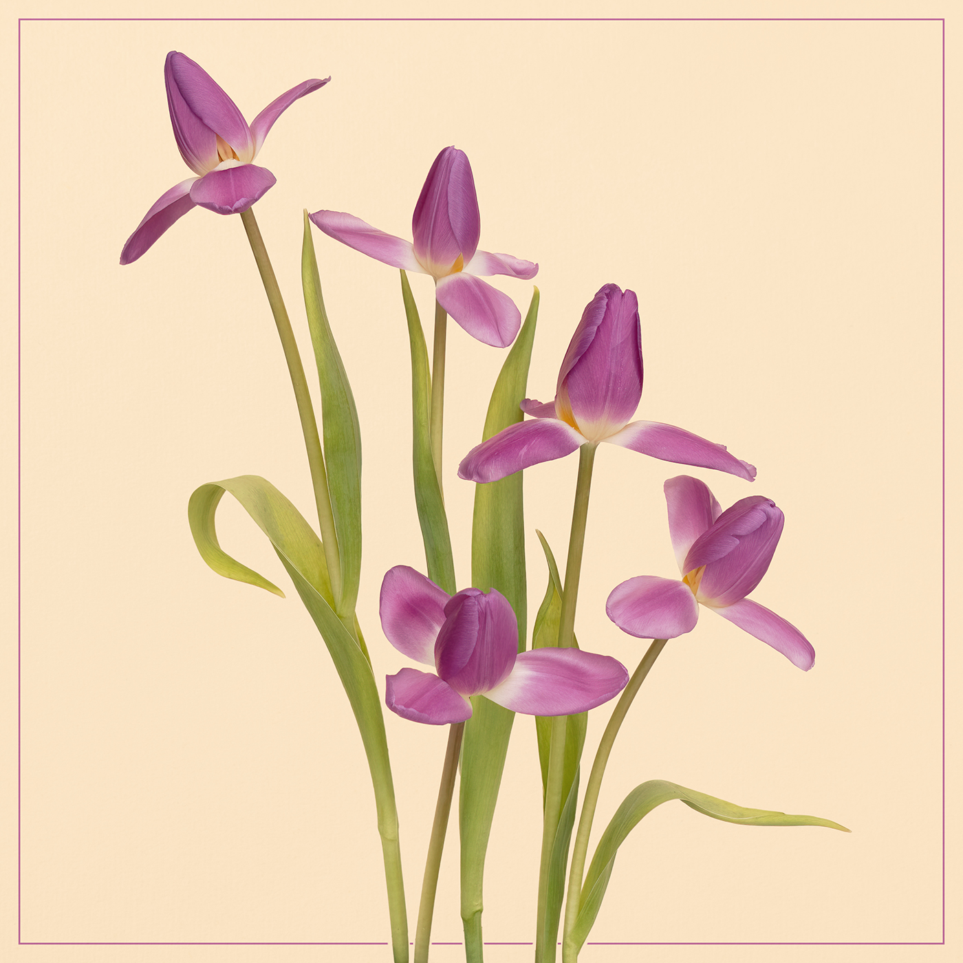
Lovely iris with great background blur. So excellent starting point but with a bit of tweaking.....could be even better!
Personally I find the image a bit over-saturated which makes the background overwhelm a tad the iris - which is rather harshly lit.
So.....
I have desaturated the whole photo a little and done a curves layer over everything to darken it. Then I took another copy of the resulting pic, blurred it at about 25-30%, put it in blend mode soft light and popped that as the top layer.
A touch of soft light layer often makes many flower photos better, I find. See what you think! :) |
Apr 15th |
 |
| 7 |
Apr 24 |
Comment |
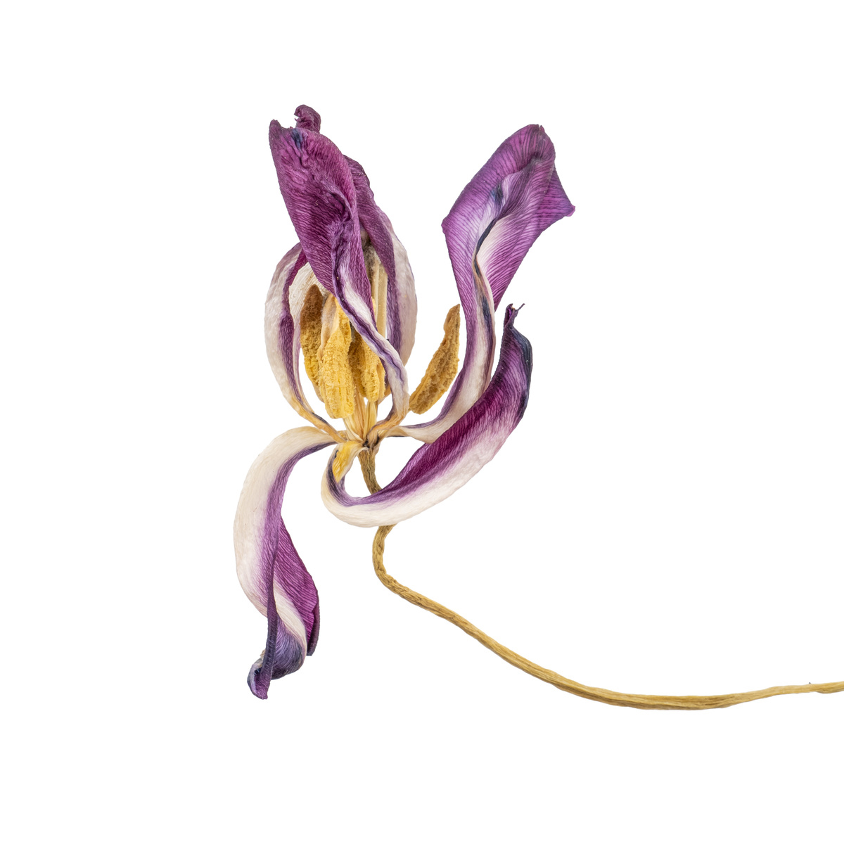
A nice try and lovely orchid - but the overall effect is a bit complicated. What layer styles did you use and what opacity? I often have the topmost texture layer softlight or normal with reduced or very reduced opacity, the next layer down in the stack is usually the isolated subject at - say - 90% with often the same texture underneath which, therefore shows through just a little on the subject. Some texture affecting the subject is usually good, but not too much.
Sometimes, you don't want the subject isolated, though, as there are interesting other elements there - in which case the whole 'main photo' can go in the 'texture sandwich'.
Having said that, I sometimes do an isolation of the subject in addition to the above, which, if necessary, I can move to the absolute top of the stack for masking to ensure just the correct amount of the subject is visible.....
Does that help? Good luck! :) |
Apr 15th |
| 7 |
Apr 24 |
Comment |
Intriguing image - what is this place and where does it go? Very nice subdued colours - presumably bracketed? With such flat light I imagine it could also be the basis of some amazing composite(s), which somebody entering or leaving with interesting, eerie lighting plus bats etc. But maybe not your style! |
Apr 15th |
6 comments - 4 replies for Group 7
|
6 comments - 4 replies Total
|