|
| Group |
Round |
C/R |
Comment |
Date |
Image |
| 14 |
Oct 25 |
Reply |
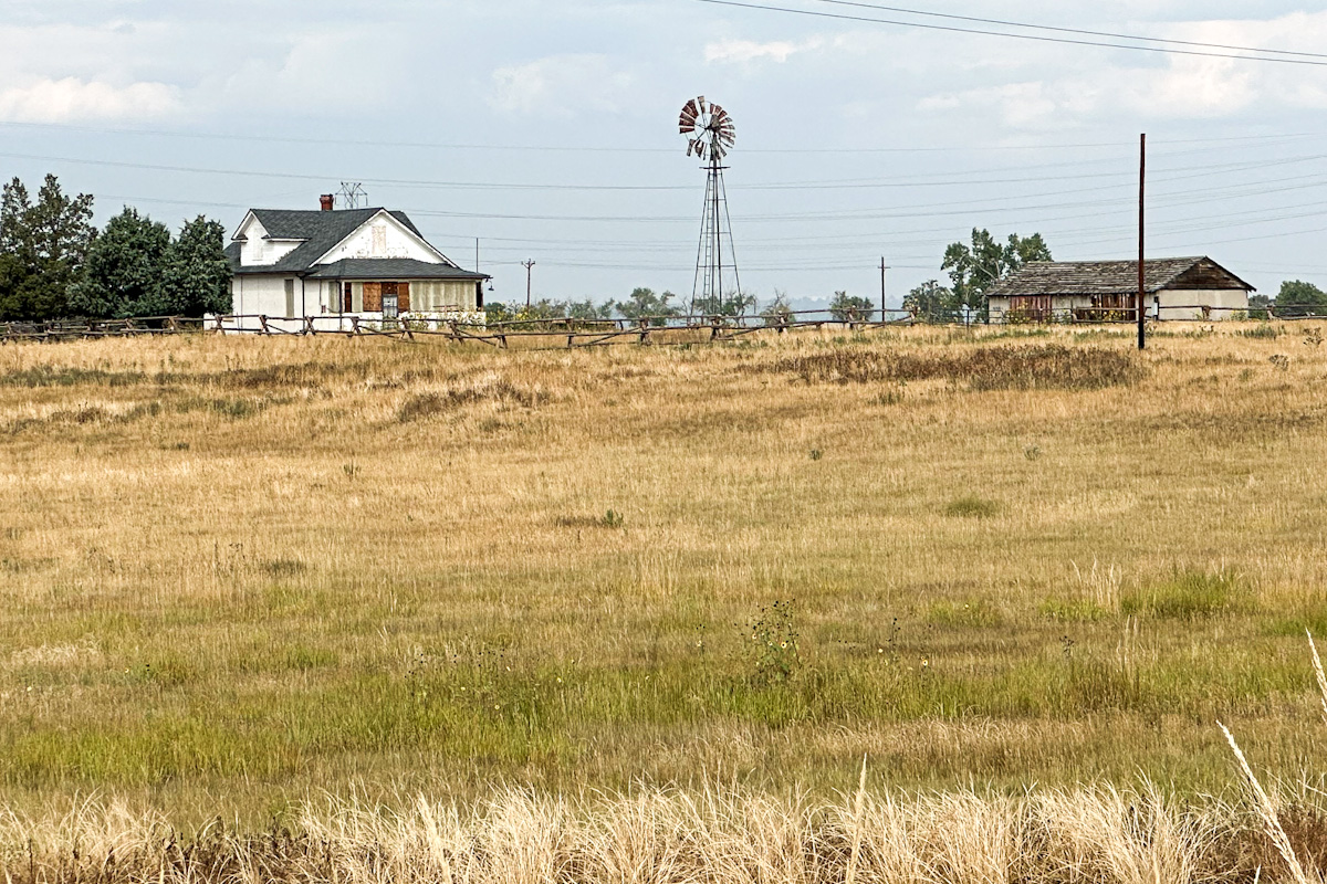
Thanks Darcy -
Somehow I didn't even notice the one pole in the foreground so I'll definitely remove it and the transition tower. I agree this is a good image to keep working with especially with all this feedback |
Oct 21st |
| 14 |
Oct 25 |
Reply |
Thanks Tom -
yes I'm going to use this as a project piece in Photoshop to work on removing the lines. I have used gradients before but it didn't occur to me here, I may try that too |
Oct 21st |
| 14 |
Oct 25 |
Reply |
Hi Greg-
I didn't even think of converting to B/W - definitely a possibility! I had worked in lightroom to remove the power lines and I didn't like the result, but I may take some more time to work with it in Photoshop and try. |
Oct 21st |
| 14 |
Oct 25 |
Reply |
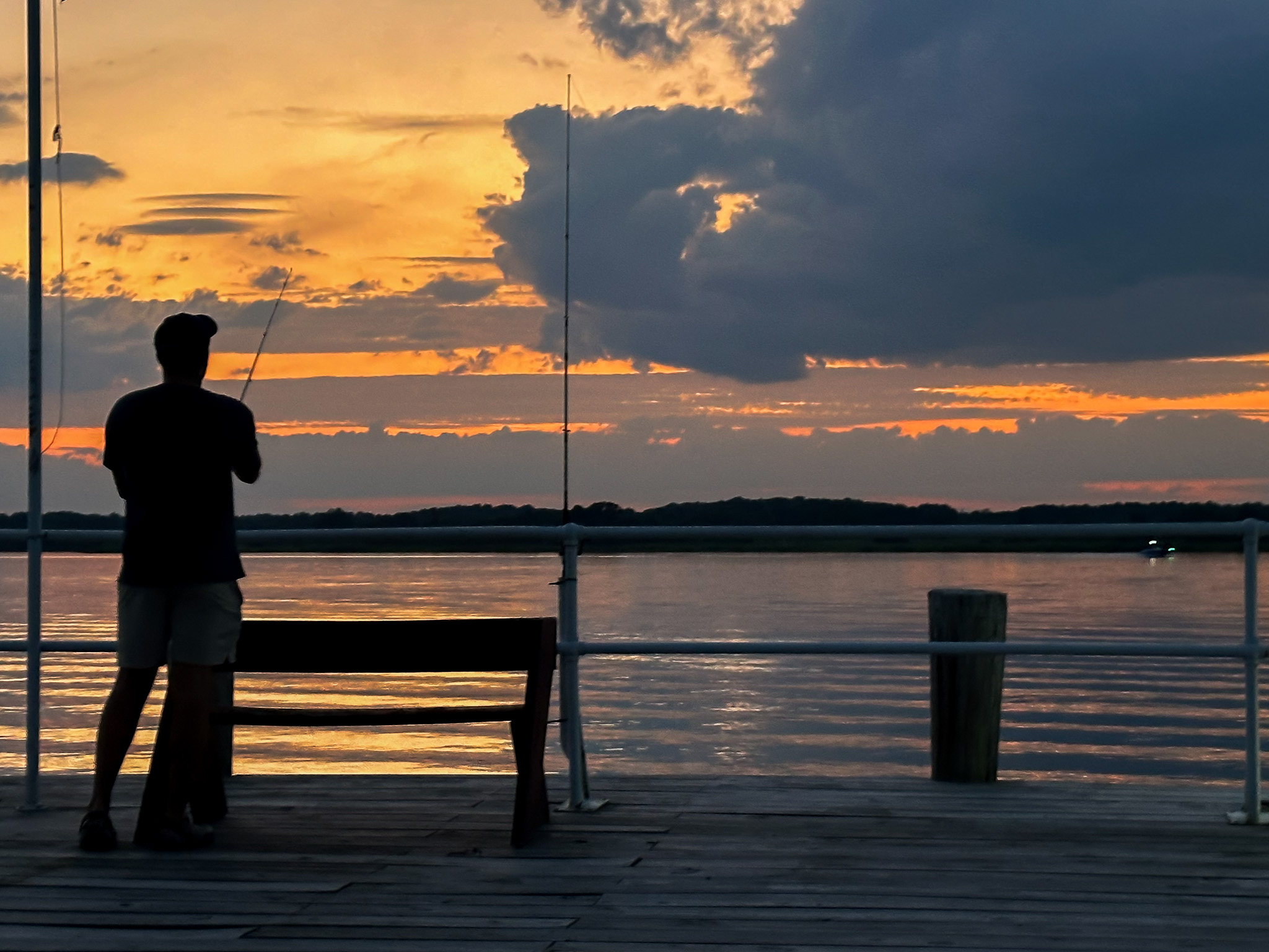
Thanks Ingrid!
I only had a 24-105 and it was so far off the road I wasn't able to zoom in, but I also thought the foreground grass added more to the framing than having a lot of sky. |
Oct 21st |
| 14 |
Oct 25 |
Comment |
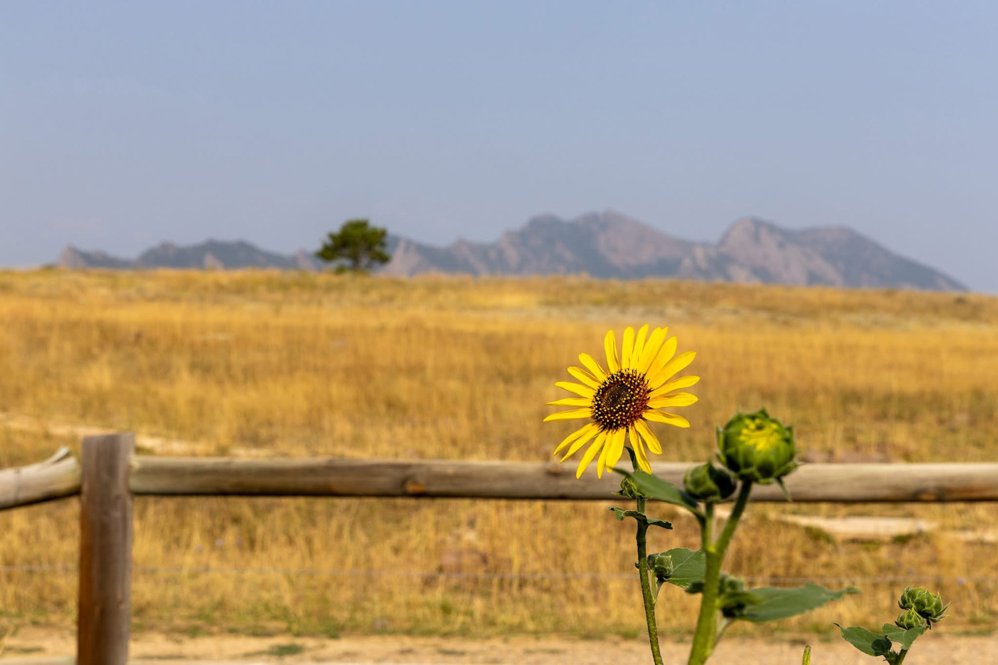
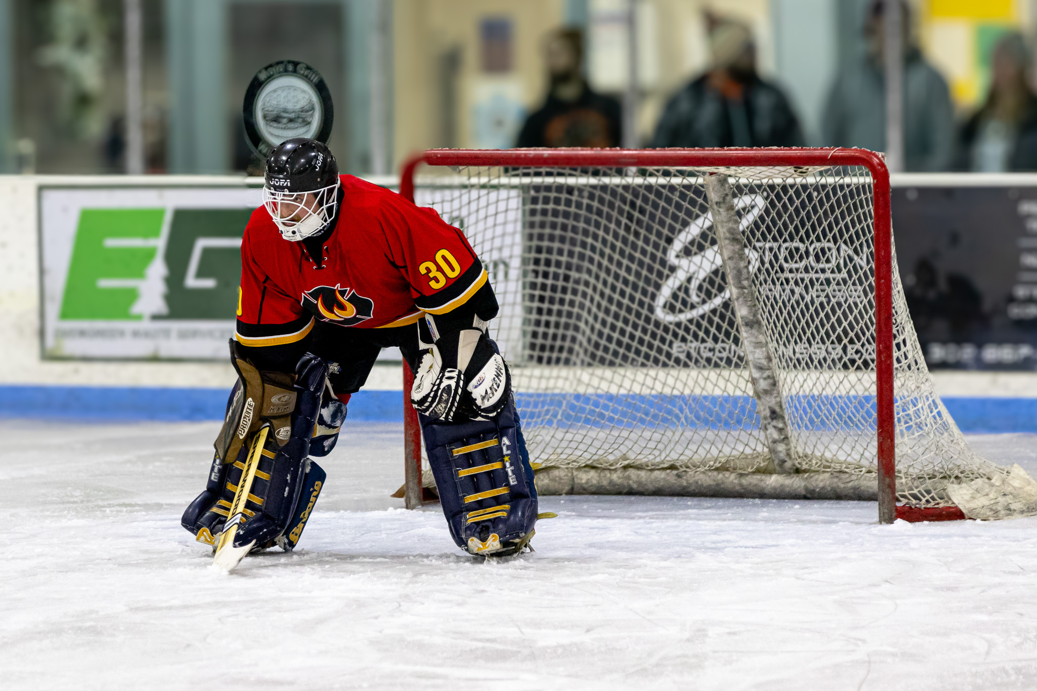
Hi Kamal -
I think the composition of this is lovely - being off center adds so much to the feel for me. The bright contrast of the reds with the white structure works well. |
Oct 21st |
| 14 |
Oct 25 |
Comment |
Hi Tom -
I think its a very fitting image for October - I think the lighting works well to create a moody photo. It makes me feel like it will come alive any second. I wish there was a bit more light or definition on the arm just to give it a little edge, as it seems to completely disappear after the bend, but I do love the contrast of the dark shadows with your lighting |
Oct 21st |
| 14 |
Oct 25 |
Comment |
Hi Greg-
I think the crop from the original works very well to bring the focus back to the cowboy and bull. The colors work well too, and I agree that the Auto Painter level is more than I would do as a personal preference, but I think it works well for a rodeo clown cowboy for the scene |
Oct 21st |
| 14 |
Oct 25 |
Comment |
Hi Darcy-
I can imagine how lovely the whole field looked like with those colors! I agree with Ingrid that the buds in foreground are a bit distracting as they are darker, and your edit from Tom's suggestion works well. The composition is lovely |
Oct 21st |
| 14 |
Oct 25 |
Comment |
Hi Karen -
I also agree that its a great composition and looks like a lovely place to sit for a while. I would agree with maybe trying to bring out the reds and oranges to really accent the fall colors but well done. |
Oct 21st |
| 14 |
Oct 25 |
Comment |
Hi Ingrid -
What a lovely capture! I think the sky replacement works very well - I agree with the movement of the horizon line a bit and your comment with the edit looks lovely.
I also agree that a darker vignette may work better if thats what's causing the coloring in the bottom corners. |
Oct 21st |
6 comments - 4 replies for Group 14
|
6 comments - 4 replies Total
|