|
| Group |
Round |
C/R |
Comment |
Date |
Image |
| 96 |
Oct 25 |
Reply |
Thank you Pinaki for your comment about the tilt correction which I will work on. |
Oct 11th |
| 96 |
Oct 25 |
Reply |
Thank you Stephen for your useful comments |
Oct 11th |
| 96 |
Oct 25 |
Comment |
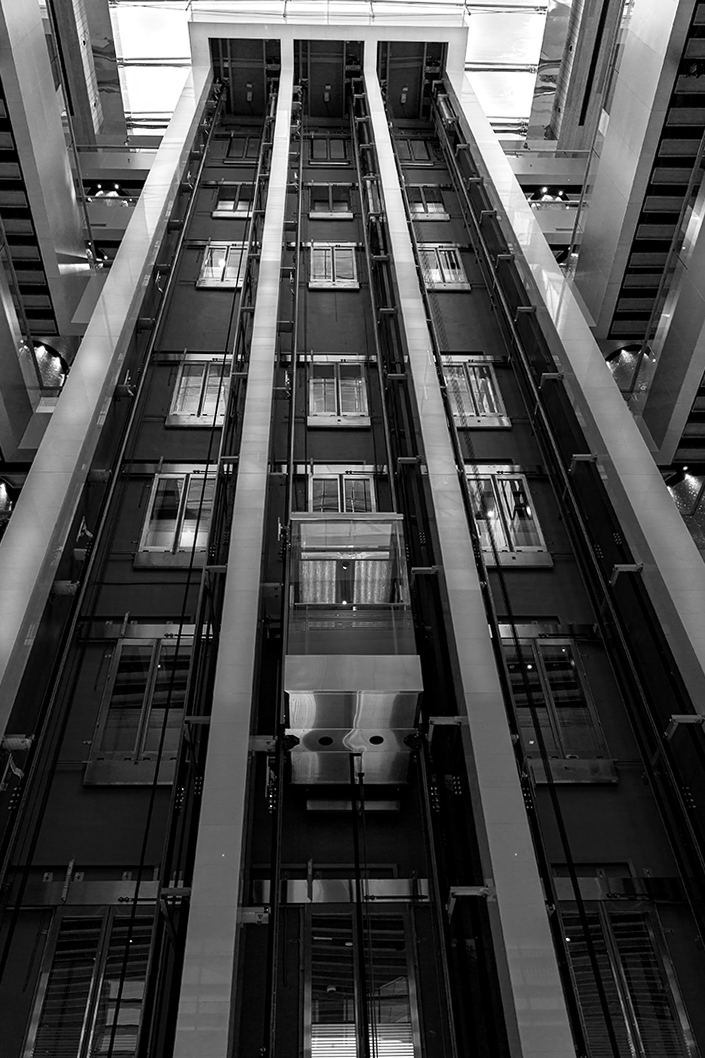
Hi Robert I like both the images though I like the original more because of the contract in the colors. |
Oct 8th |
| 96 |
Oct 25 |
Comment |
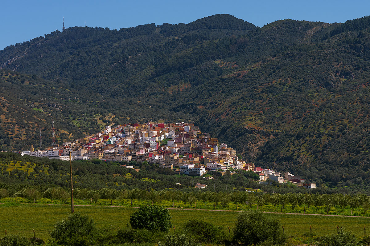
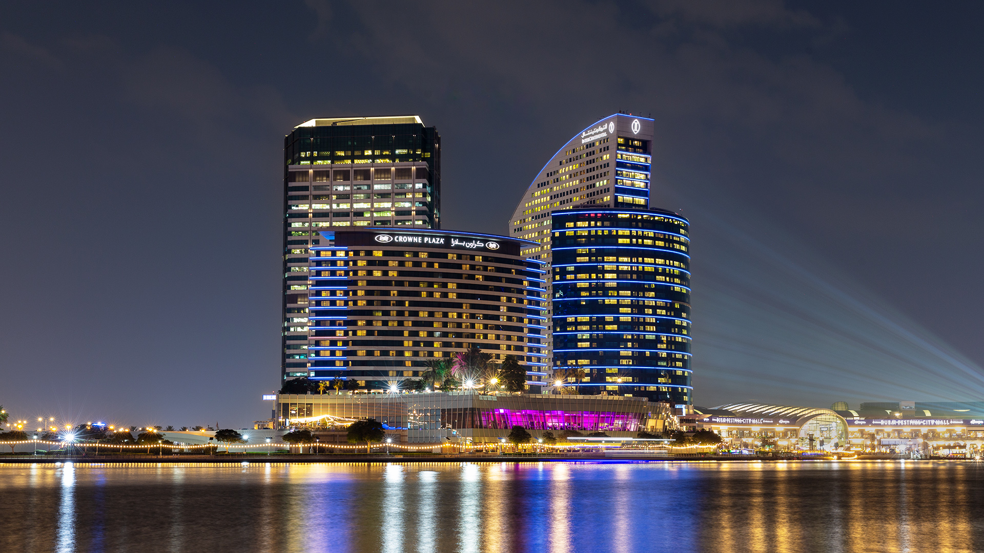
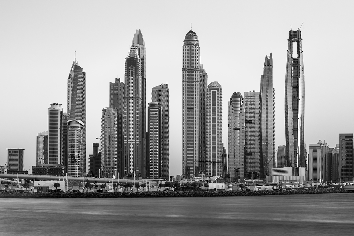
Hi Bruce. This image works well as a part of a travelogue. I see a lot of banding and negative space on the right. You might want to crop the negative part a bit. |
Oct 8th |
| 96 |
Oct 25 |
Comment |
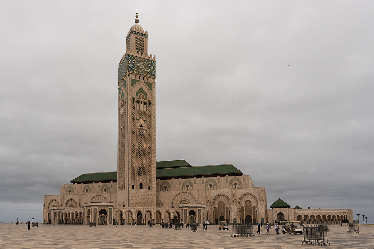
Hi Kenneth. When a photographer takes an image, s/he needs to have some thought in mind as to why s/he is taking that image. I note that you document the changes that have taken place in the structures over a period of time which defines your purpose. But I still feel that there needs to be that photographer's touch in a photo rather than a snapshot. |
Oct 8th |
| 96 |
Oct 25 |
Comment |
It looks like the image was taken during mid-day as the light seems to be quite harsh. Technically the image has been taken using appropriate specs. It might work to use the transform tool in photoshop to correct the perspective as you can see the lamp post on the left of the image is leaning inwards. A human element would also enhance the image. Try black and white instead of sephia and compare both to see which one looks better. |
Oct 8th |
4 comments - 2 replies for Group 96
|
4 comments - 2 replies Total
|
