|
| Group |
Round |
C/R |
Comment |
Date |
Image |
| 9 |
Feb 26 |
Comment |
Hi Jim,
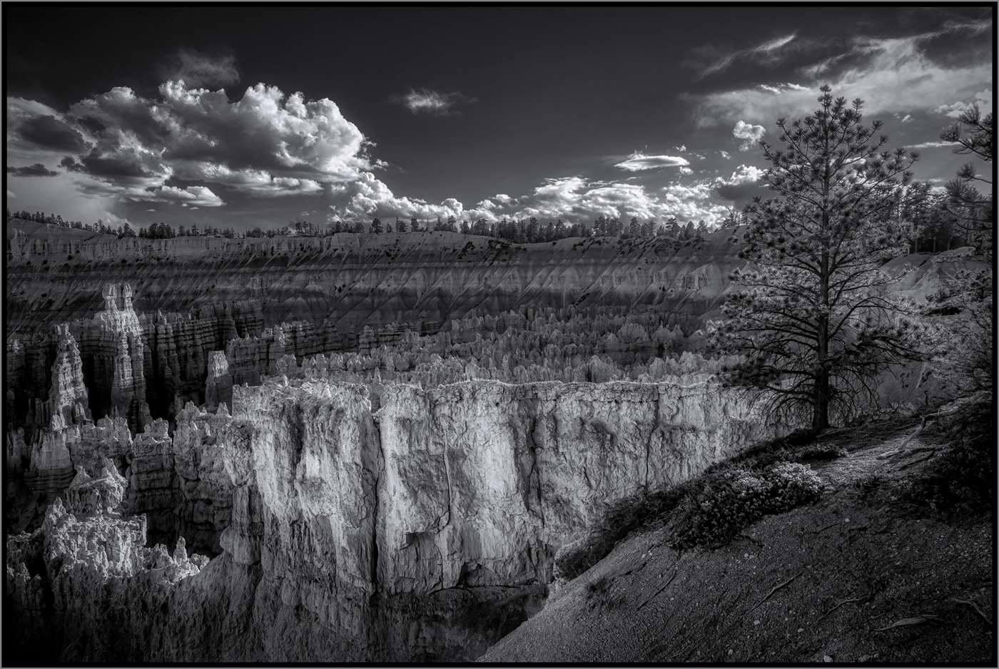
I think that shooting into the sun has caused the image to lack contrast. I'm guessing that the "color speckles" might be chromatit abberation, but I'm no expert in that area. If that is the case that can be removed in Camera RAW. That's an interesting tree; i can see why it caught your eye. |
Feb 7th |
1 comment - 0 replies for Group 9
|
| 11 |
Feb 26 |
Reply |
Thanks, Nenette. I appreciate yor comments. |
Feb 21st |
| 11 |
Feb 26 |
Reply |
Thanks, Nenette. I appreciate yor comments. |
Feb 21st |
| 11 |
Feb 26 |
Reply |
Thanks, Sheldon. I'm going to give that a try. |
Feb 11th |
| 11 |
Feb 26 |
Reply |
Hi Murphy-Thanks for your comments. I actually tried to remove the building on the right using the Remove tool, but it kept on replacing it with similar structures. I thought about cloning clouds, but I didn't think it would look right with them going all the way to the ground. I suppose I should try it and see how it looks. |
Feb 10th |
| 11 |
Feb 26 |
Reply |
Thanks, Henry. I appreciate your comments. |
Feb 7th |
| 11 |
Feb 26 |
Reply |
Thanks, Peter. The subject is the building, but I like dramatic skies. |
Feb 7th |
| 11 |
Feb 26 |
Comment |
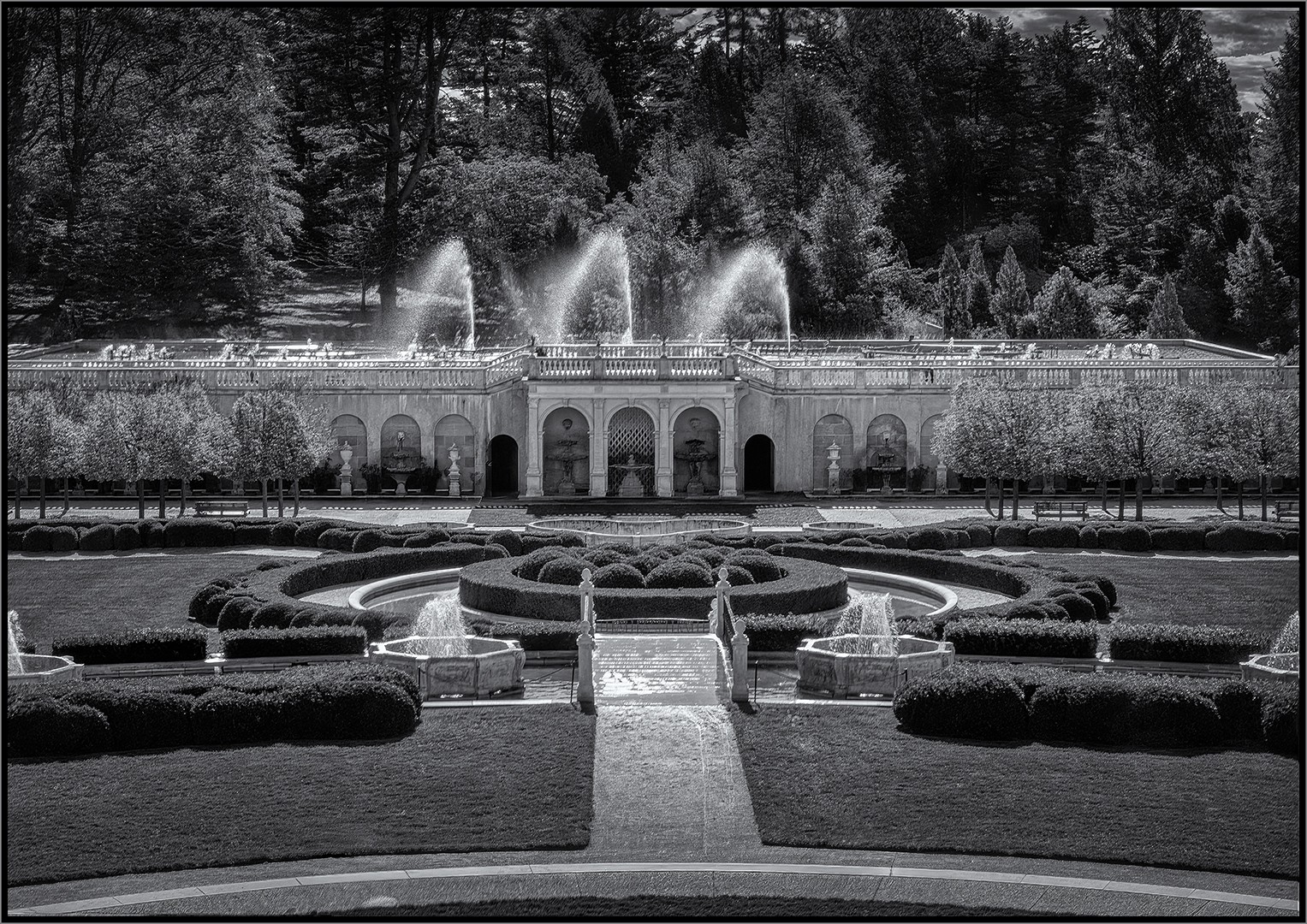
This is a very dynamic image. The symmetry is perfect, especially for a hand-held shot. My only suggestion might be to try and bring more contrast into the clouds. Great image! |
Feb 5th |
| 11 |
Feb 26 |
Comment |
Thanks for your comments, Don.I have difficuty avoiding the halos in my processing. I like the monochrome skies rendered very dramatic. I realize many people don't. But, yeah, it could be overdone somewhat. |
Feb 4th |
| 11 |
Feb 26 |
Comment |
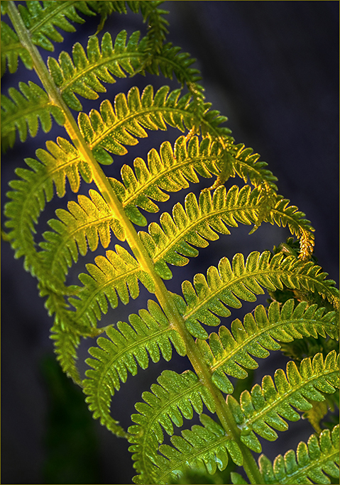
I think you did well keeping the entire feather sharp, and the exposure is right on. You've captured a lot of interesting detail in this feather. My only suggestion is to have the feather more on a diagonal rather than straight up and down. But it is still a great image just as it is. |
Feb 4th |
| 11 |
Feb 26 |
Comment |
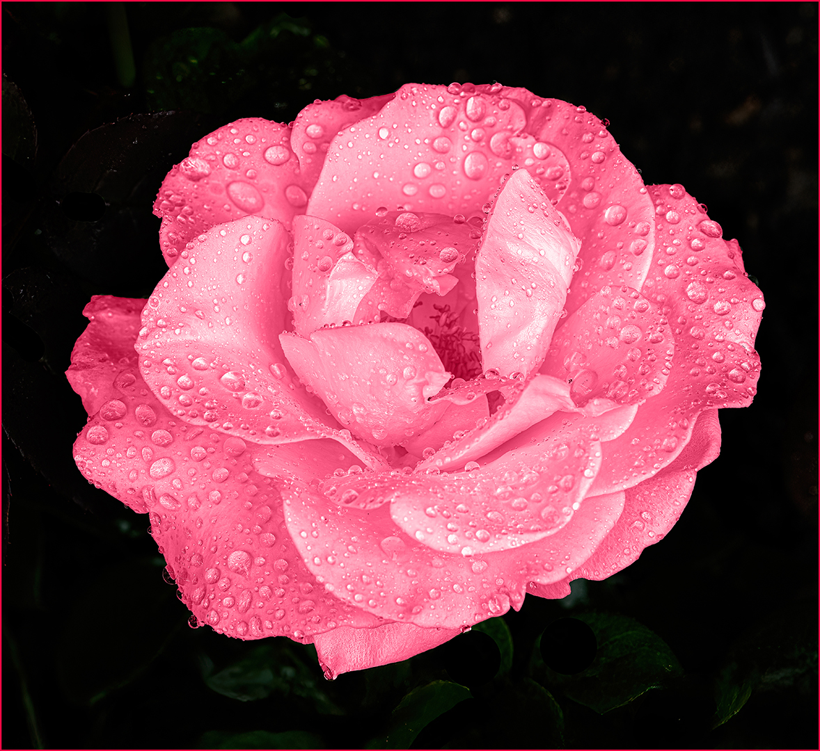
A very nice waterfalls image, Murphy. One of my favorite things to photograph are waterfalls. I think the long exposure that gives the water a "wispy" look is great. The image has nice contrast without overexposing the highlights. I think the color image looks pretty good, also. |
Feb 4th |
4 comments - 6 replies for Group 11
|
| 42 |
Feb 26 |
Reply |
Thanks for the nice comments, Tom. The lens that I used is very old and not particularily expensive, but it is surprisingly sharp. |
Feb 7th |
| 42 |
Feb 26 |
Reply |
Michael, I'm really sorry to hear that. Thankfully, you're doing well now. |
Feb 5th |
| 42 |
Feb 26 |
Reply |
Thanks, Bev. As you know, Europe has many great churches worth photographing. I'm looking forward to going back some time. |
Feb 5th |
| 42 |
Feb 26 |
Reply |
Thanks, Jim. I appreciate your comments. I'm glad you enjoyed the article in the PSA Journal. |
Feb 5th |
| 42 |
Feb 26 |
Reply |
Considering the wide angle, the distortion was unavoidable. Thanks, Michael. |
Feb 5th |
| 42 |
Feb 26 |
Reply |
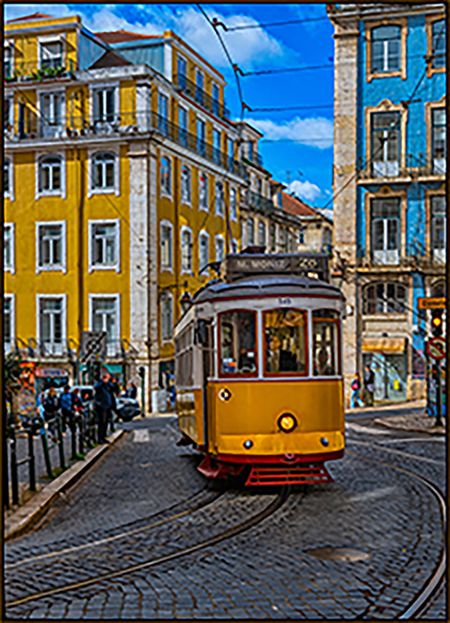
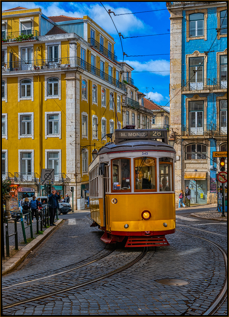
Basically, it was a grab shot with a wide angle lens. I straightened it as much as I could without losing most of the image. Thanks for you comments, Sharlana. |
Feb 5th |
| 42 |
Feb 26 |
Comment |
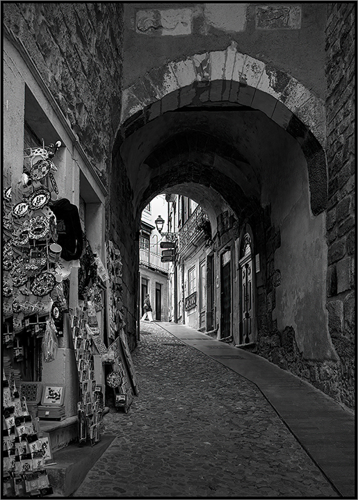
A very interesting image, Tom. I would have liked to see it more symmetrical. The saturared colors work well. I think the lighting on the chair at the end of the corrodor is great. The depth of field and sharpness work well. |
Feb 4th |
| 42 |
Feb 26 |
Comment |
I agree with Michael. The overgrowth takes away from the subject. Would it have been possible to pull some of it aside for the photo? It wouldn't be right to remove it, but maybe another person sould have held it aside while you took the photo. I think the crop works very well for this image. |
Feb 4th |
| 42 |
Feb 26 |
Comment |
Hi Michael. I wasn't aware that you were laid up for a while. I wondered why you hadn't submitted any images in a while. Anyway, I'm happy to hear that you're getting better. Your image is exceptional, as usual. My only suggestion might be to bring down the bright areas under the two arched bridges, since they are the brightest parts in the image and attract the eye more that the rest of the image. |
Feb 4th |
| 42 |
Feb 26 |
Comment |
Terry: You did a great job with the exposure on the chrome hood ornament. Usually, the reflections are quite distracting, but not so in your image. The composition is just right for thhis image. The very back of the greyhound goes a bit out of focus, but that is not bothersome in this image. I attend many car shows in my area. I've been showing my Camaro for over 20 years and I am not very good at capturing images like yours. |
Feb 4th |
| 42 |
Feb 26 |
Comment |
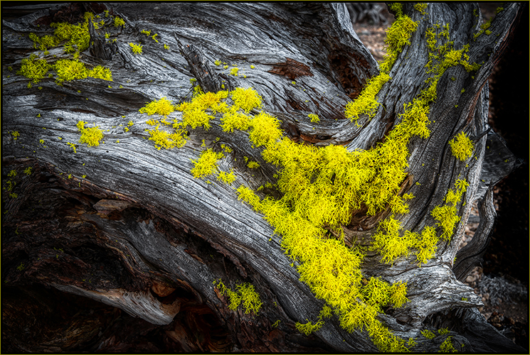
A very nice image, Sharlana. It is a great example of "less is more". The fact that you have some yellow shrubs at the bottom gives the tree a nice optical base. The lighter colored trees in the background are a nice addition to the image. I'm not normally fond of subjects in the center of the frame, but this image works perfectly as it is centered and nicely framed by its surrounding trees. |
Feb 4th |
5 comments - 6 replies for Group 42
|
| 97 |
Feb 26 |
Comment |
Hi Jeremy,
This is a great nature capture. The lighing really makes this shot. If anything, I'd like to see a bit more room on the left-hand side of the image. |
Feb 7th |
1 comment - 0 replies for Group 97
|
11 comments - 12 replies Total
|