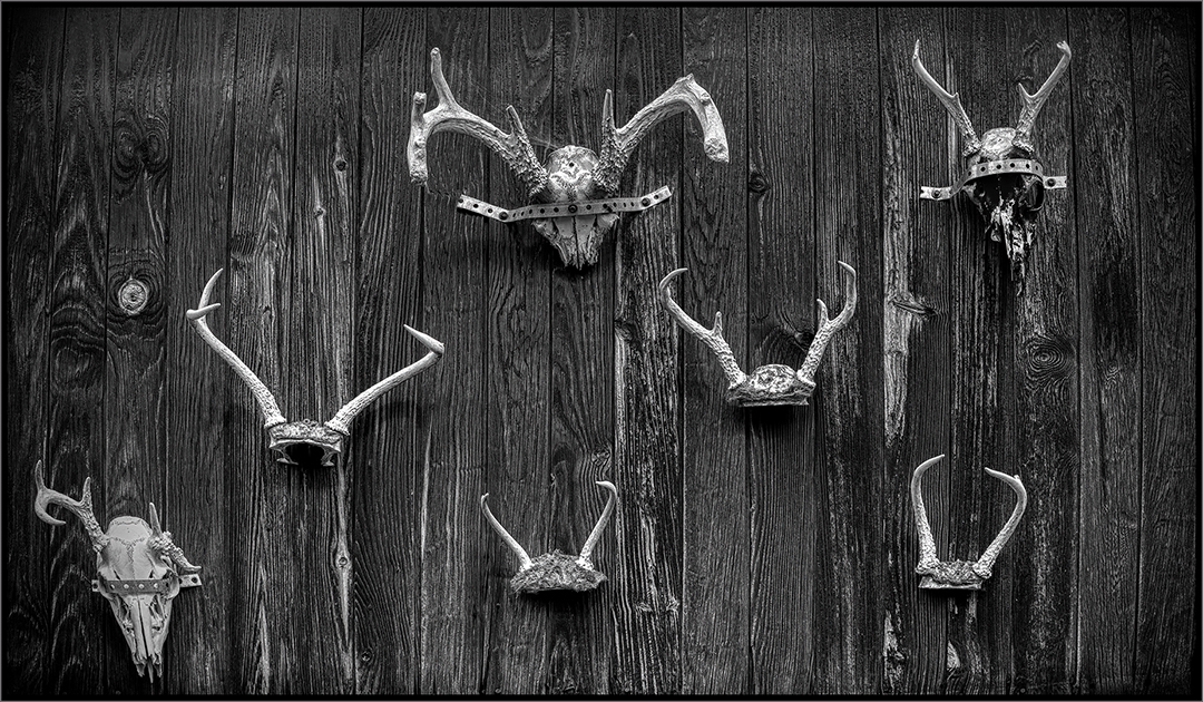
|
| Group |
Round |
C/R |
Comment |
Date |
Image |
| 9 |
Jan 26 |
Comment |
Hi Jim: Nice job zooming during the exposure. I've never goten the hang of that process myself. I might try cropping so the the image is not so centered. Just an idea. The ccolors relly make it sparkle. |
Jan 10th |
1 comment - 0 replies for Group 9
|
| 11 |
Jan 26 |
Reply |
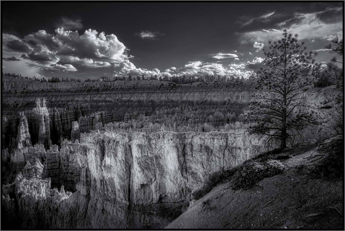
Thanks, Henry. So it's agreed the clouds are overdone. Now the task is to bring them down. |
Jan 12th |
| 11 |
Jan 26 |
Comment |
I agree with you Peter; the clouds are a bit overdone. |
Jan 12th |
| 11 |
Jan 26 |
Reply |
Peter: As you probably know areas that ate blown out are really hard to bring back. Bracketing the exposures and merging them in HDR software works, but it is not often that we think to do this when we're taking the shots. |
Jan 12th |
| 11 |
Jan 26 |
Comment |
Henry: I like how your processing brought out the moubtain in the background. The image has the classic foreground, middle ground, and background. |
Jan 10th |
| 11 |
Jan 26 |
Comment |
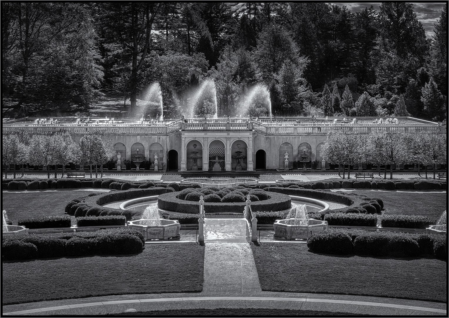
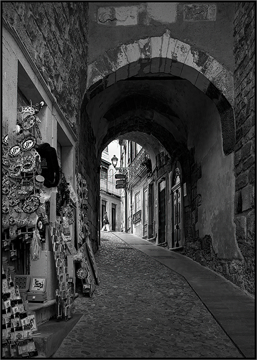
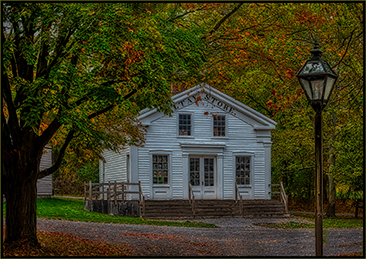
Sheldon: This is a stunning image. You've done a nice job at keeping the buildings level. There's so much detail and texture in the image. If I were to get nit-picky, I'd say to remove the two people walking down the path on the left, but they aare so small they don't really affect the image. I'd be curious to see what this image would look like if everything in the image except the building werea little darker. This is a great capture. (Question: Did you do a little HDR on it?) |
Jan 10th |
| 11 |
Jan 26 |
Comment |
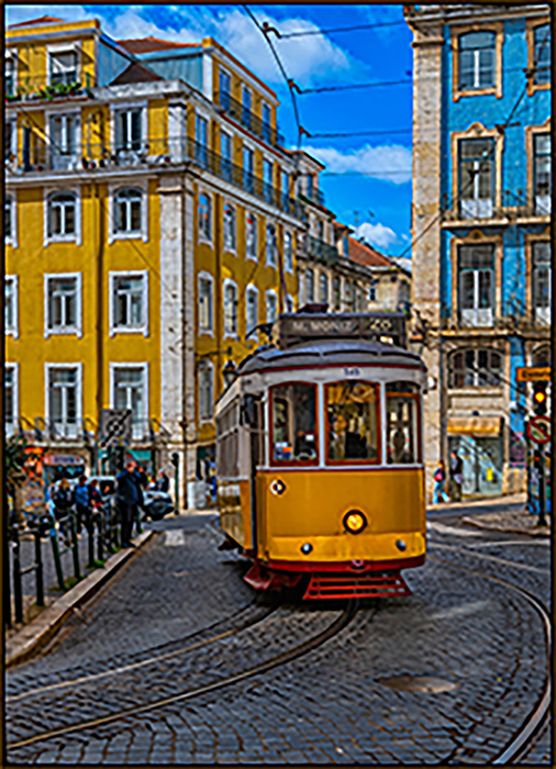
Peter: I tink yu've captured a lot of interesting detail in that vehicle. The image has a lot of nice texture. My only comment is that the highlights are a bit overexposed, especially the windows. There appears to be some detail there that could possibly be brought down in processing. |
Jan 10th |
| 11 |
Jan 26 |
Comment |
Hi Ed: I really like your image of the humpback whale. As Murphy said the tonality is exceptional, it has great contrast, the composition is right on, and it is sharp. Other than adding a slight vignette to the image, I wouldn't change anything. |
Jan 10th |
| 11 |
Jan 26 |
Comment |
Hi Murphy,
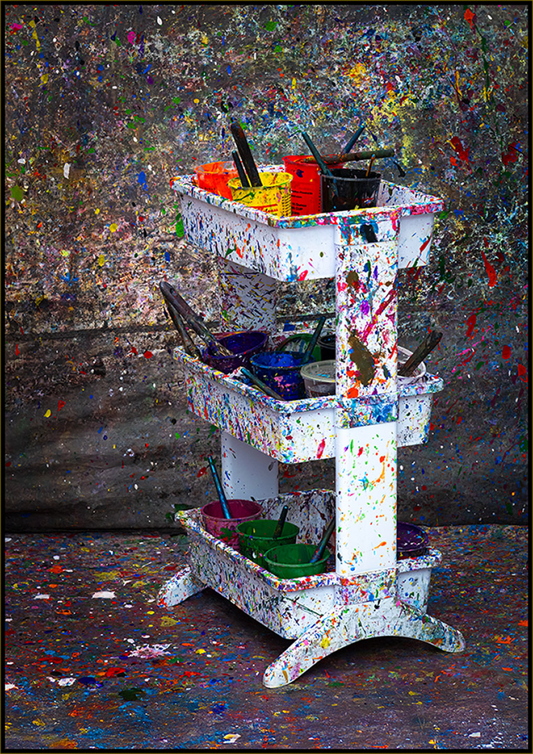
I think you enhanced the composition by positioning the camera roght on the centerline of the row of desks. The sepia tone brings back the realistic look of the old time setting. I'd comsider removing the white globe over the ceiling light since it is the brightest partof the image and draws the viewer's eye away from the interesting details in the room. The exposure is right on and the image is sharp throughout. Nice job. (Thanks for the compliments on my aricle in the PSA Journal.) |
Jan 10th |
6 comments - 2 replies for Group 11
|
| 42 |
Jan 26 |
Reply |
Thanks, Jim. |
Jan 14th |
| 42 |
Jan 26 |
Reply |
Tom: You've done a good job with it. You did well with the cloning. |
Jan 12th |
| 42 |
Jan 26 |
Reply |
Tom:The different texture in the street is noticeable, but not too bothersome. I'm a big fan of the Clone (Stamp) tool. I would try some cloning of the pebbled texture over the part that you replaced to make it more uniform. It would be some work, but not impossible. But again, it is an improvement over the original. |
Jan 12th |
| 42 |
Jan 26 |
Reply |
Thanks, Tom. |
Jan 12th |
| 42 |
Jan 26 |
Reply |
I think that looks better. |
Jan 8th |
| 42 |
Jan 26 |
Comment |
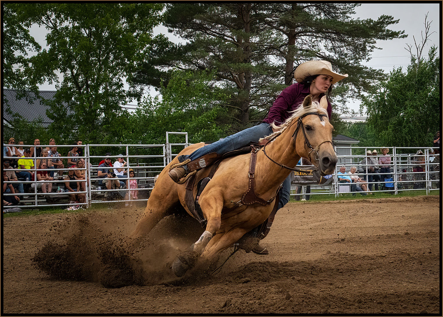
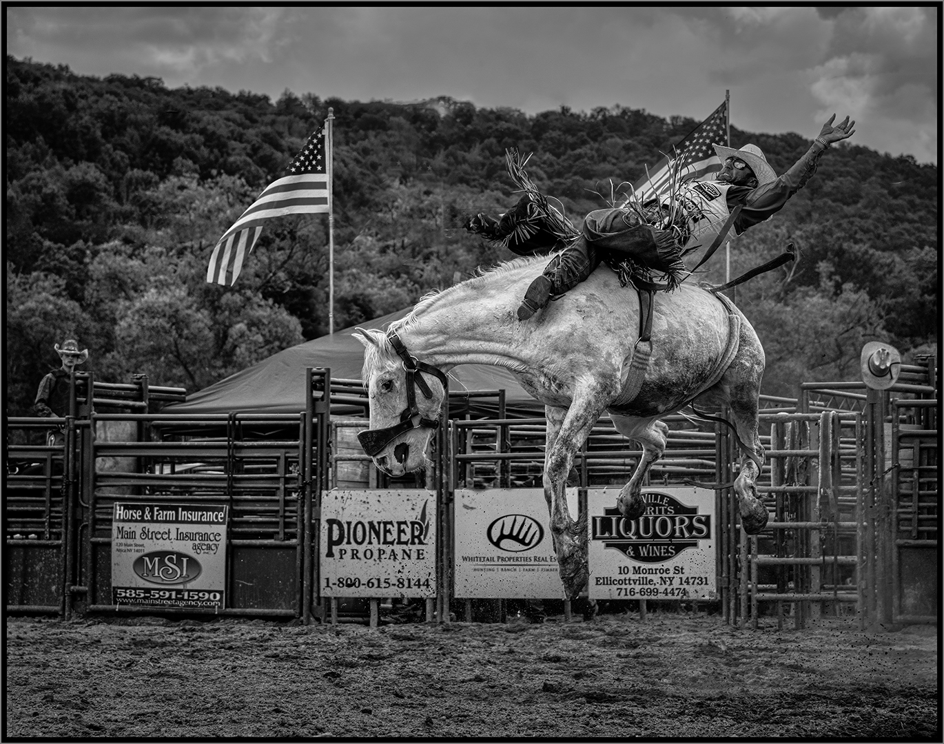
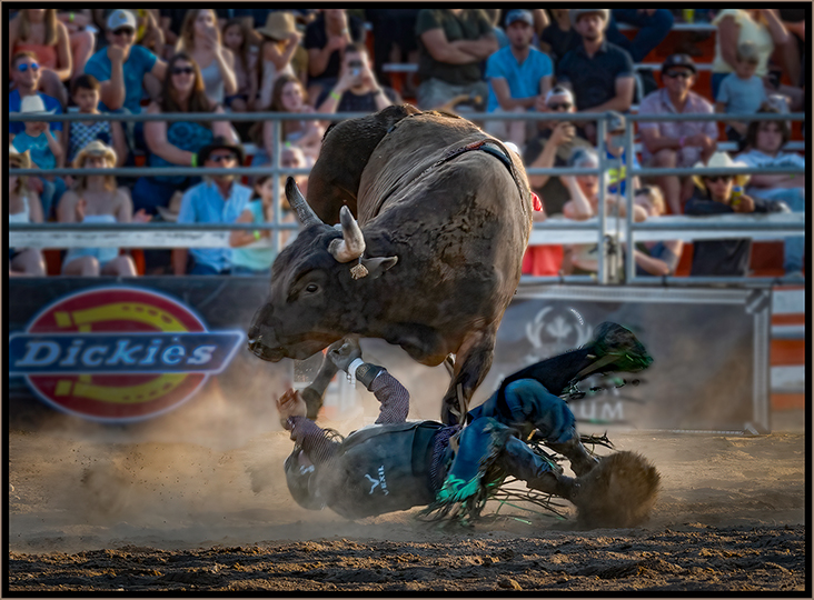
Nice job with the blur. And a good crop to remove tha person at the lower-right. The dirt track is very bright and drawing my eye to it rather than the horse and rider. I'd consider burning it down so that it doesn't draw your eye to it. |
Jan 7th |
| 42 |
Jan 26 |
Comment |
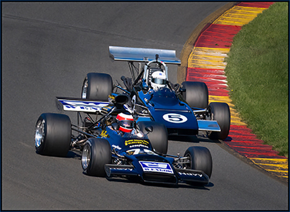
A well exposed and sharp image. The composition works well. The image has a lot of interest. My only suggestion would be to slightly darken that large triangular section of pavement at the bottom of the image. |
Jan 7th |
| 42 |
Jan 26 |
Comment |
What a great expression on this little guy. The colors are really vibrant and eye-catching. Do you think you could get a little more detail on the underside of his chin? |
Jan 7th |
| 42 |
Jan 26 |
Comment |
You have a nicely exposed image with nice soft light. I think the catch light in the bison's eye adds a lot to the image. You might consider a slight vignette to darken the edges of the image. Yellowstone NP is a great place. I've been ther three times, and I look forward to going again. |
Jan 7th |
| 42 |
Jan 26 |
Comment |
I agree with Sharlana. It would have been nice to see some faces. You might want to see if you can bring some detail in that white cloud of smoke. An adjustment in Camera RAW might do it. |
Jan 7th |
| 42 |
Jan 26 |
Reply |
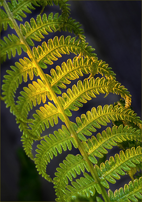
Thank you, Sharlana. I agree with your comment on the color contrast. Tht's what drew my eye to the flower. |
Jan 7th |
5 comments - 6 replies for Group 42
|
12 comments - 8 replies Total
|