|
| Group |
Round |
C/R |
Comment |
Date |
Image |
| 32 |
Dec 25 |
Reply |
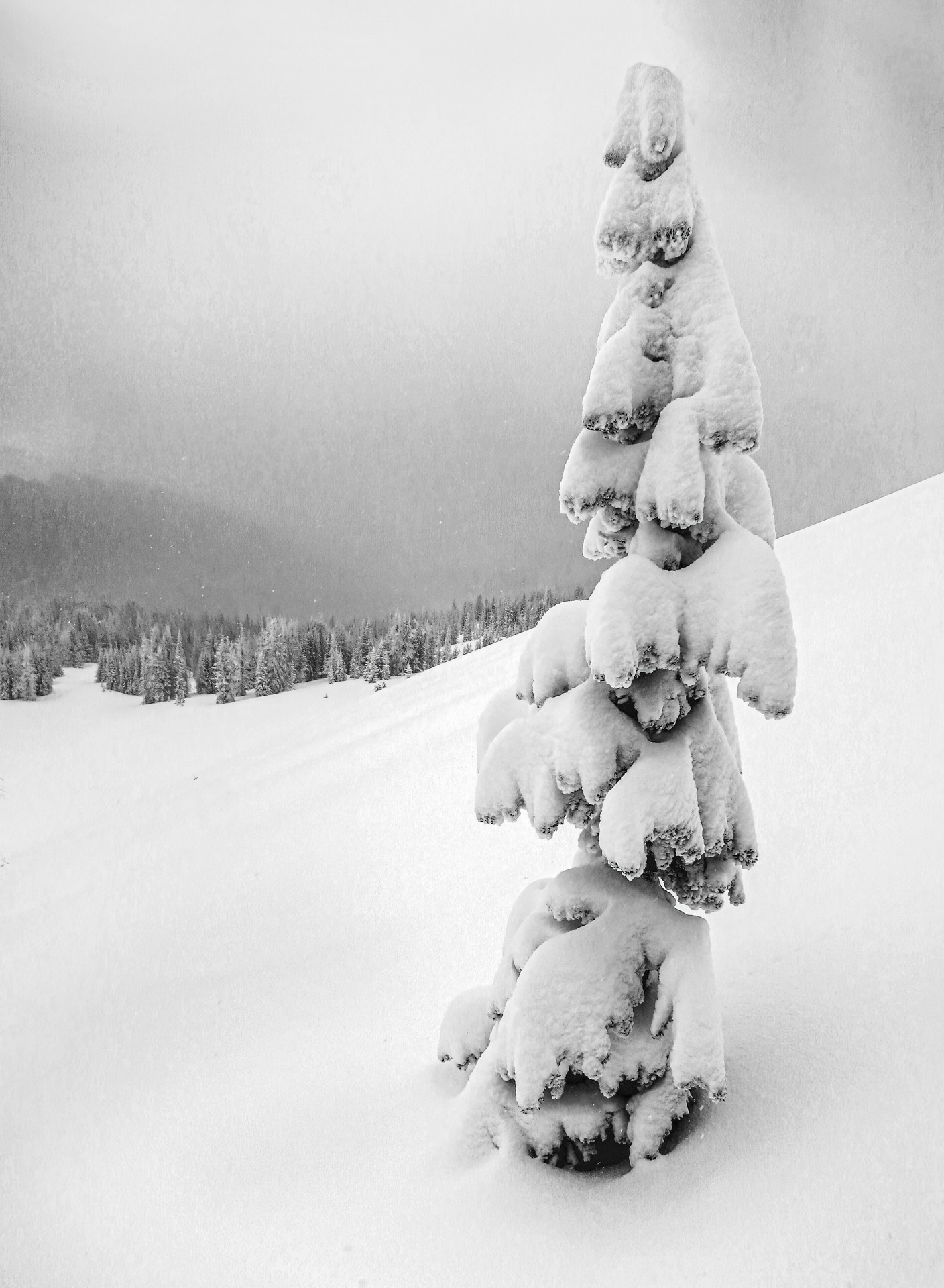
This is nice and I like having the tower perfectly vertical but if you look at the horizon on the left it is sloping down. The actual horizon is perfectly horizontal. |
Dec 19th |
| 32 |
Dec 25 |
Reply |
I like this version better. This is a really nice photo. |
Dec 19th |
| 32 |
Dec 25 |
Comment |
I love the lighting. |
Dec 13th |
| 32 |
Dec 25 |
Comment |
Nice image and a great subject. I don't have anything to add except that I want to go there some day. |
Dec 6th |
| 32 |
Dec 25 |
Comment |
I really like this photo. I edited it the way I would have starting with your original. What do you think? |
Dec 6th |
 |
| 32 |
Dec 25 |
Comment |
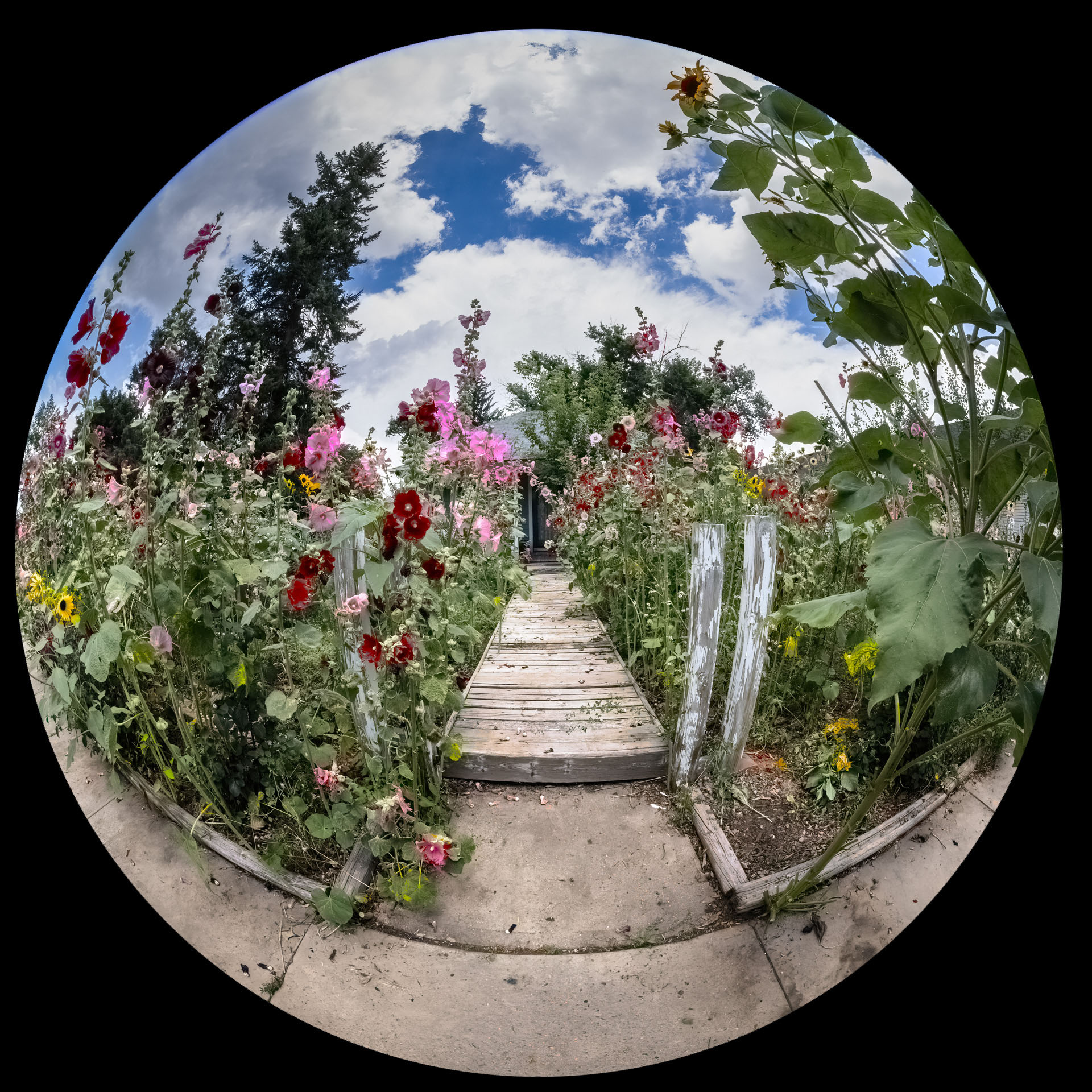
Nice idea. Have you thought about making a mandala out of it? |
Dec 6th |
| 32 |
Dec 25 |
Reply |
Cole Thompson was my inspiration to tell you the truth. |
Dec 2nd |
4 comments - 3 replies for Group 32
|
| 78 |
Dec 25 |
Reply |
You probably won't get this in time but how I do it is I use the brush tool set to 5000 which is it largest setting and create a mask that's perfectly round with it. |
Dec 30th |
| 78 |
Dec 25 |
Reply |
Try giving it a tiny bit of greenish tone to the BW and see how you feel about it. That's a technique used in cinema is scenes like this. |
Dec 21st |
| 78 |
Dec 25 |
Comment |
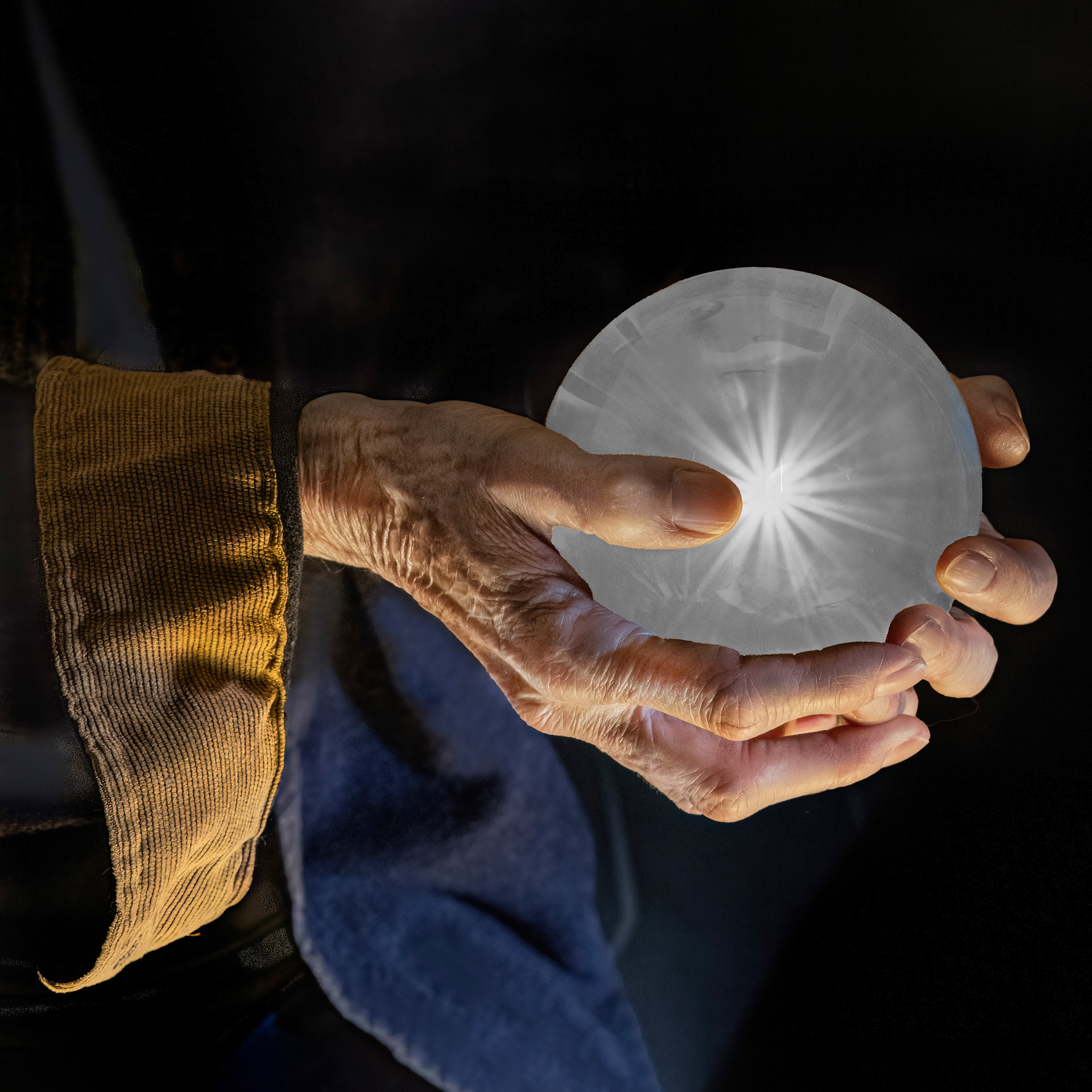
This is a really cool concept photo. The geometry of the reflection doesn't match the rest of the image and if the reflection were from water then it would be slightly darker than the rest of the image. Here's a suggestion: Why don't you put the mirror on the other side of the picture frame. Also I might consider drill a hole in the side of the frame and inserting a small rod to suspend it above the ground and then edit out the rod in post processing. This way the frame wouldn't have to be stuck in the sand and it would appear to be over the mirror. |
Dec 6th |
| 78 |
Dec 25 |
Comment |
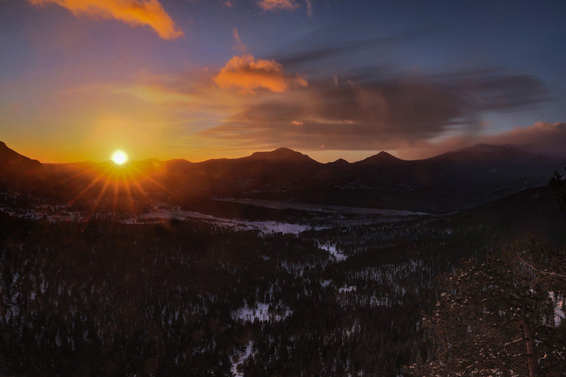
I really like this and it reminds me of a shot I got just a few days ago in Denver. I didn't like the brown sky and I had the same problem so I edited your original and used a deep blue filter on the sky. I also lightened up the row of building on the far right side to give the image more depth. What do you think? |
Dec 6th |
 |
| 78 |
Dec 25 |
Comment |
I agree with Jean that in this case it's too symmetrical plus I don't like to cut people's legs and feet off unless it's a close up face shot. I also think the whole image is too blue which gives it a cold tone. |
Dec 6th |
| 78 |
Dec 25 |
Comment |
I really like the composition. It's almost a monochrome so I processed your original as a black and white. What do you think??? |
Dec 6th |
 |
| 78 |
Dec 25 |
Comment |
This is a great action shot. I really can't think of any suggestions for you. |
Dec 6th |
| 78 |
Dec 25 |
Comment |
Nice combination of red and green. I really don't have anything else to add. |
Dec 6th |
6 comments - 2 replies for Group 78
|
10 comments - 5 replies Total
|