|
| Group |
Round |
C/R |
Comment |
Date |
Image |
| 32 |
Nov 25 |
Comment |
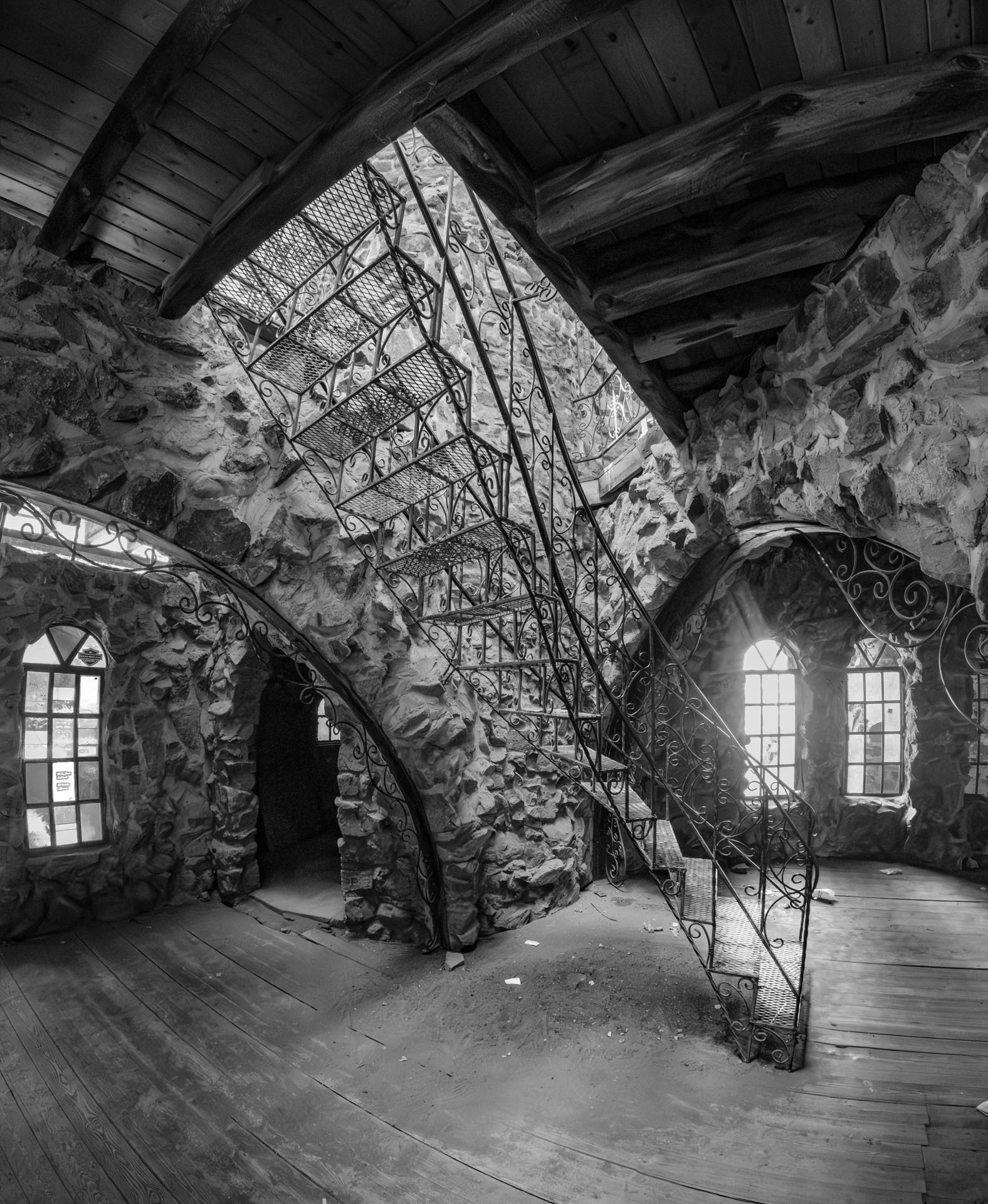
I really liked your suggestions about the bright areas in this image. So I did it over and added a touch of focus blur and a touch of glare to the two windows on the right. I think this is a real improvement, what do you think?? |
Nov 7th |
 |
| 32 |
Nov 25 |
Comment |
This is interesting. I like how the low contrast larger image helps frame the insert image. I'm not sure why others have a problem with it. |
Nov 7th |
| 32 |
Nov 25 |
Comment |
Very nice work, I really like it. Nice leading lines also. I can't think of any suggestions for you. |
Nov 7th |
| 32 |
Nov 25 |
Comment |
This is an excellent image! I do think the background is a little bright. |
Nov 7th |
| 32 |
Nov 25 |
Comment |
I really like the angles in this image. I would have liked to see the original image. |
Nov 7th |
| 32 |
Nov 25 |
Comment |
A very interesting image. In a way it reminds me of a Gothic Cathedral. I love photographing the old mining structures here in the West. I really don't have any suggestions for this image but I'm wondering if you got a better perspective in other images you took of this place. And that's not that the perspective is bad, it's just not exactly how I would have shot this. |
Nov 7th |
| 32 |
Nov 25 |
Comment |
This has interesting composition - I would call it street photography. There is quite a bit of halos around all the subjects where they meet the sky. |
Nov 7th |
7 comments - 0 replies for Group 32
|
| 78 |
Nov 25 |
Comment |
I added a bit of texture to the aspens. I forgot to mention that. The way it was in the original they showed up as a homogeneous blob of yellow.
Also it is a 6 second exposure. Not sure where the 1/125 came from. This is why the water looks like it does because there was some wind. |
Nov 7th |
| 78 |
Nov 25 |
Comment |
It's seems to be a bit over saturated and the color is a bit too yellow to me. But like a lot of photographers say, "saturation sells." The composition is great. |
Nov 7th |
| 78 |
Nov 25 |
Comment |
Wow you all are making my review time this month very easy. I love this image and wouldn't change a thing. You should get an award for this one... |
Nov 7th |
| 78 |
Nov 25 |
Comment |
I like this image. I like everything about it. The use of black and white is perfect. I took the PSA street photography and history of photography classes myself and did a bunch of photos like this. |
Nov 7th |
| 78 |
Nov 25 |
Comment |
I love dark images. I think the upper right is a little distracting. I cropped this image to remove the steps on the right and make it look more like a dark forest. I am offering this just as an idea. |
Nov 7th |
 |
| 78 |
Nov 25 |
Comment |
I love the depth that this image captures. I really have no suggestions for you other than maybe a tiny bit of vignette to emphasize the subjects. |
Nov 7th |
| 78 |
Nov 25 |
Comment |
This is a very nice image. The color of the sky is very nice. I also like that you managed to preserve the color of the stars rather than having them all blown out to pure white like most people do. I also like the effect of having the stars brighter near the end of their trails.
There are a couple of things. The sky seems stretched up so the stars seem to be moving in an oval rather than a circle. Also there is some weirdness going on on the left side which might be due to the wind blowing. And on the right side there is a whole bunch of purple fringing in the trees.
When I do photos like this I photograph the foreground before it gets completely dark and then blend it with the photo of the sky as a composite. |
Nov 7th |
7 comments - 0 replies for Group 78
|
14 comments - 0 replies Total
|