|
| Group |
Round |
C/R |
Comment |
Date |
Image |
| 32 |
Oct 25 |
Comment |
Wow! Very creative. You have inspired me, |
Oct 12th |
| 32 |
Oct 25 |
Comment |
Excellent shot!!! I really like this and I think you do need the feet in the image. It looks like the image you have submitted as the original has had quite a lot of post-processing. I really like how they all have what appears to be exactly the same helmet. |
Oct 3rd |
| 32 |
Oct 25 |
Comment |
Wow, how similar to my image that I submitted this month. I like it a lot and I like the sky. I find the tree on the left to be a little bit of a distraction. |
Oct 3rd |
| 32 |
Oct 25 |
Comment |
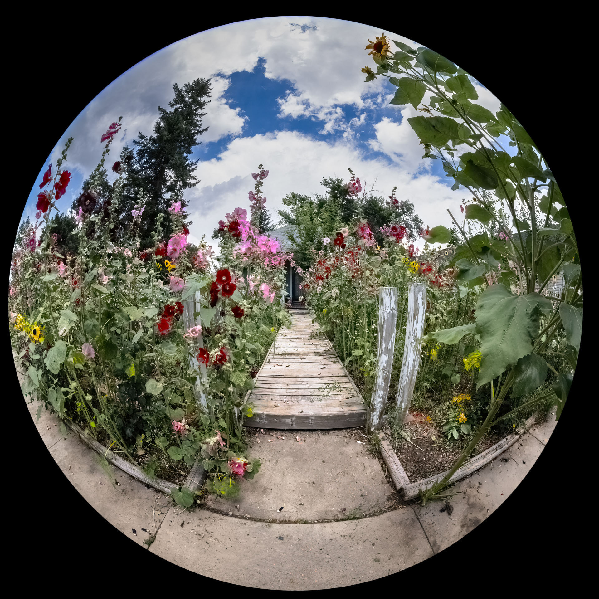
This is an interesting composition. I kind of don't like how the bowls on the edges are cut off. Maybe shoot this with just 3 or 4 bowls placed randomly in the field of view. |
Oct 3rd |
| 32 |
Oct 25 |
Comment |
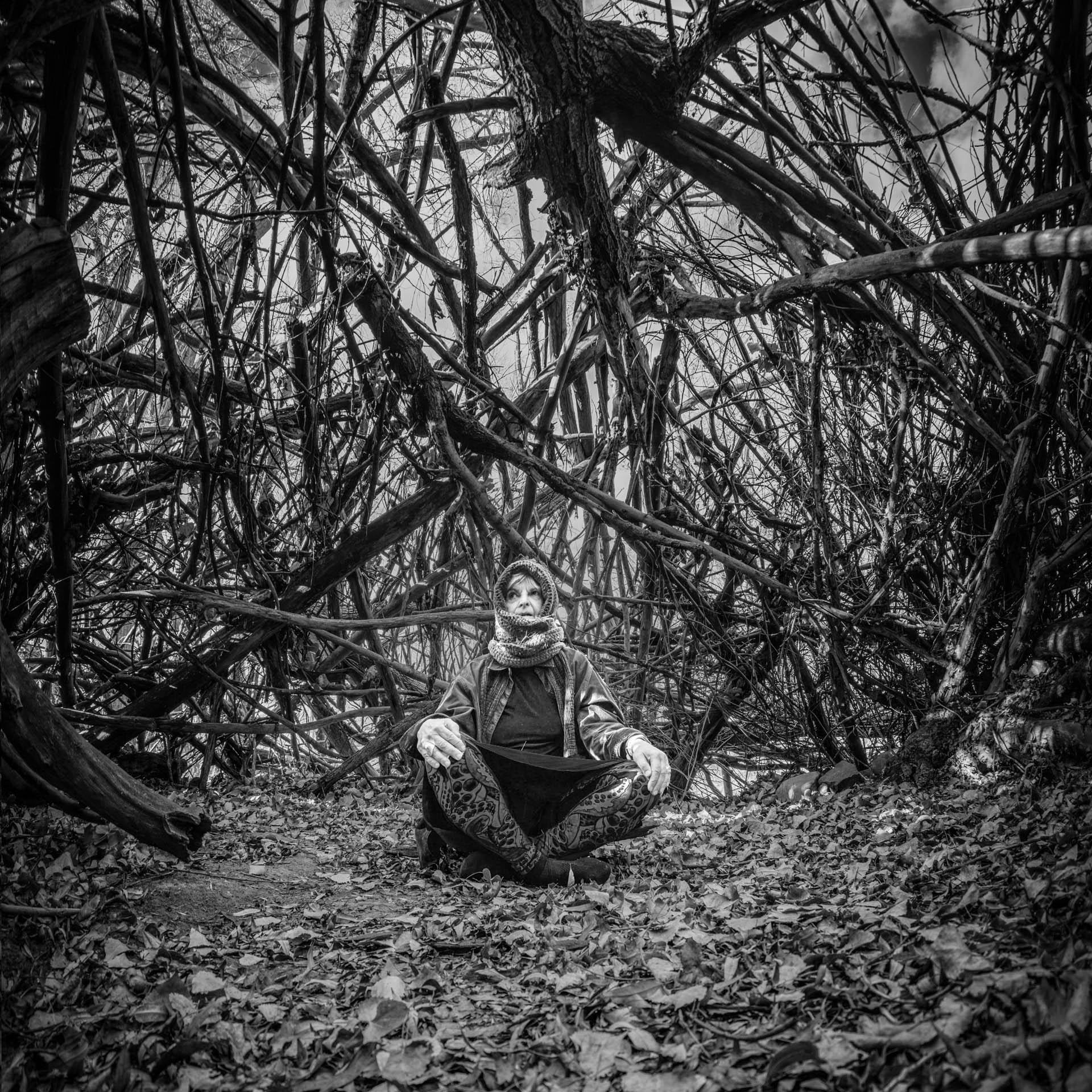
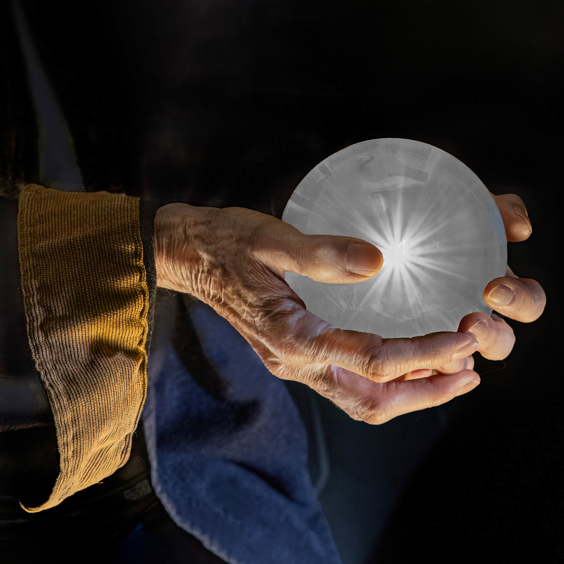
This is a great image - very magical looking.
Your friend is right. The shadow of the wizard doesn't match the shadows of the trees. It looks like it was a cloudy day so shadows should be very faint. Also the bottom of the cloak has too much separation between it and the shadow.
Finally, I would add a bit more transparency to the ghost and blur it a bit. |
Oct 3rd |
5 comments - 0 replies for Group 32
|
| 78 |
Oct 25 |
Comment |
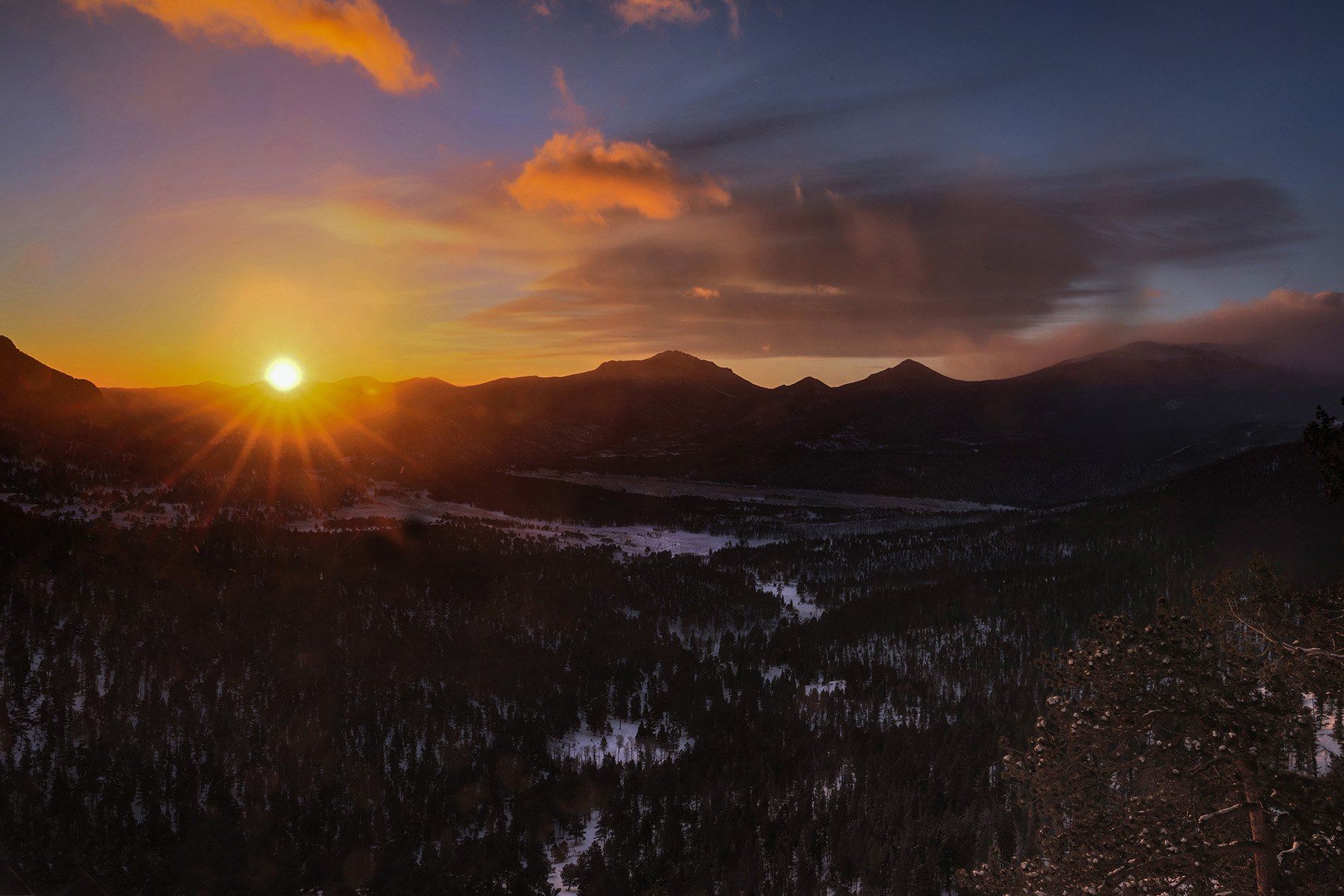
I would have metered directly on the Sun using the smallest aperture that the lens will allow. Then I would have pulled up the brightness of the foreground in post processing. Otherwise it's an interesting shot. |
Oct 12th |
| 78 |
Oct 25 |
Comment |
I like to create images that I like. Sometimes I like to not concern myself with PSA's rules and competitions and just make images that express my personal artistic aesthetic. |
Oct 12th |
| 78 |
Oct 25 |
Reply |
It looks really good. I have to look really hard to find anything that I remotely see as a problem with the reflection. Maybe there is a small amount at the rear of the truck, |
Oct 8th |
| 78 |
Oct 25 |
Comment |
PS: I removed the people also. |
Oct 3rd |
| 78 |
Oct 25 |
Comment |
OK, don't get mad at me, but this image doesn't look realistic to me at all. The background is too dark and the flowers are over saturated. The good thing is you meetered on the sky so the sky isn't blown out (take note Brenda).
Here's my edit. |
Oct 3rd |
 |
| 78 |
Oct 25 |
Comment |
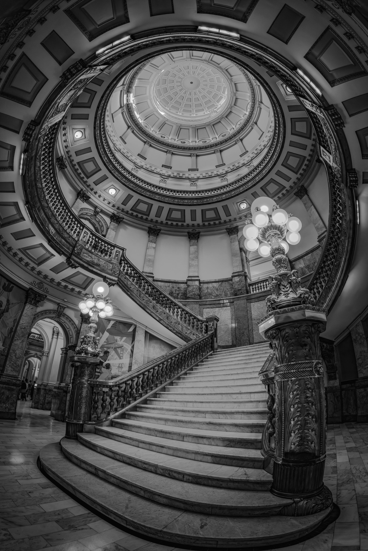
Nice subject for black and white. I like how effectively you removed the cars.
I did notice that there is a halo around the church. I edited it to remove it, just a quick edit. What I did was do an object select in PS and put just the church into a second layer. I then used the new remove tool to remove the church from the base layer. Then I used the burn tool to darken out the halo.
Then as a second edit I used the dodge tool to lighten the steeple a bit. |
Oct 3rd |
 |
| 78 |
Oct 25 |
Comment |
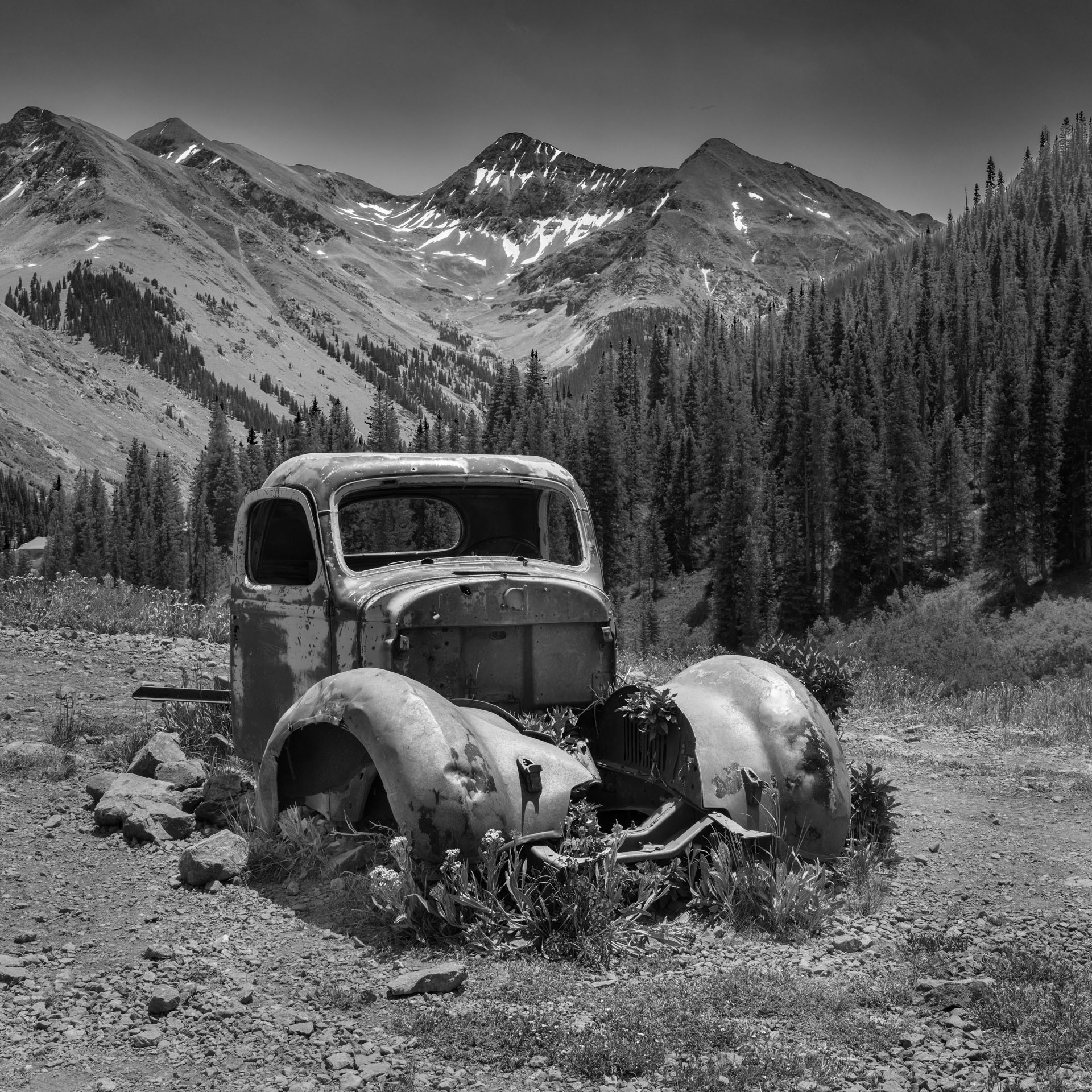
I think this is a really nice composition. It's obvious you have put a lot of work into it. That said I do have some comments.
First, you have vegetation floating in the air. This should have been corrected by metering on the sky rather than the fire truck. The result is that the sky is over exposed. It's easier to fix a dark area then an over exposed area. I've submitted a sample of what I'm talking about below. Or maybe you did a sky replacement which can cause 'floating vegetation'.
Second, the reflection doesn't match the subject. Look at the front end of the truck and it's reflection. |
Oct 3rd |
 |
| 78 |
Oct 25 |
Comment |
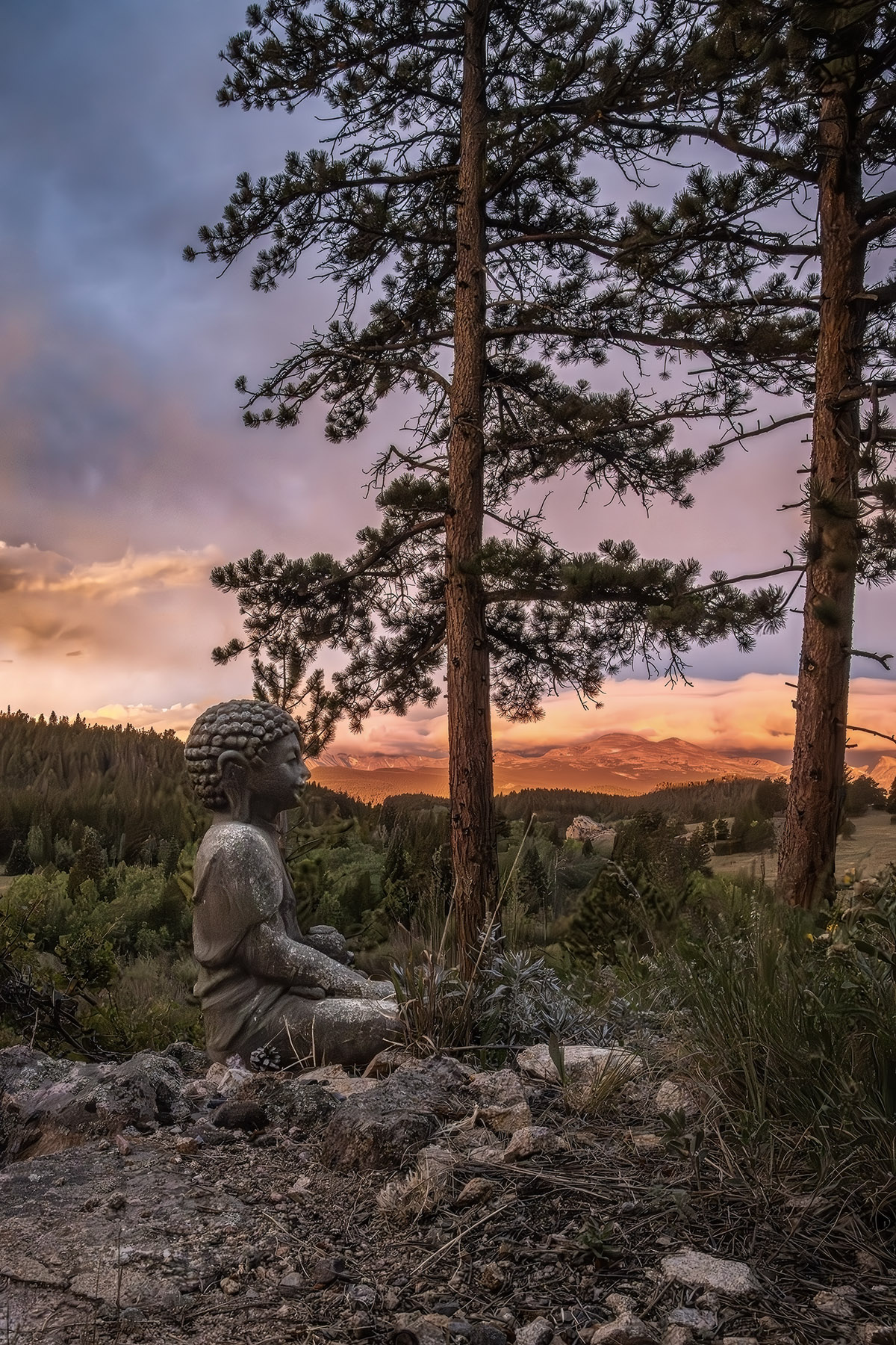
I like the contrast between the warm background and cool foreground. I would have liked to see a little more of the scene at the bottom and on the left. |
Oct 3rd |
| 78 |
Oct 25 |
Comment |
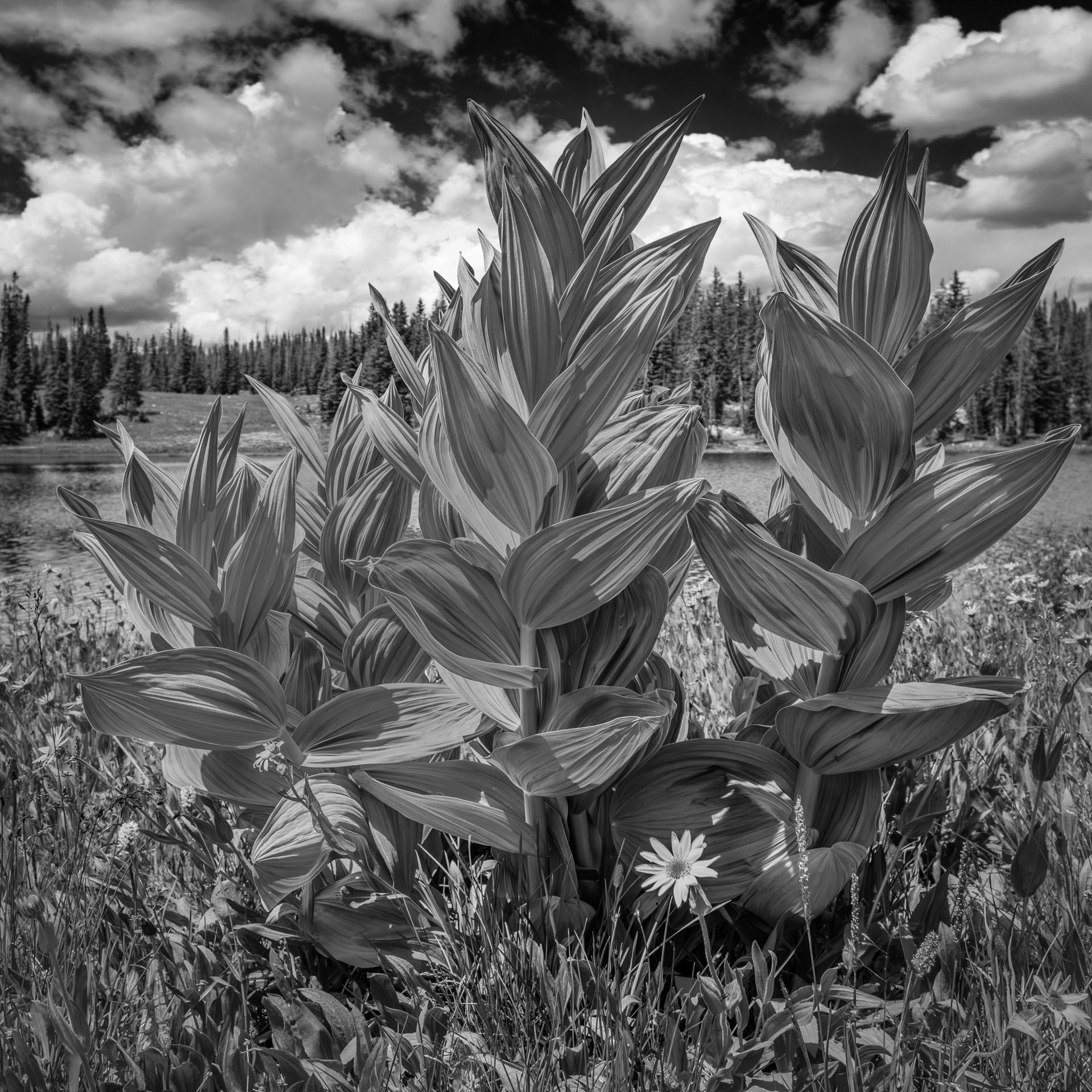
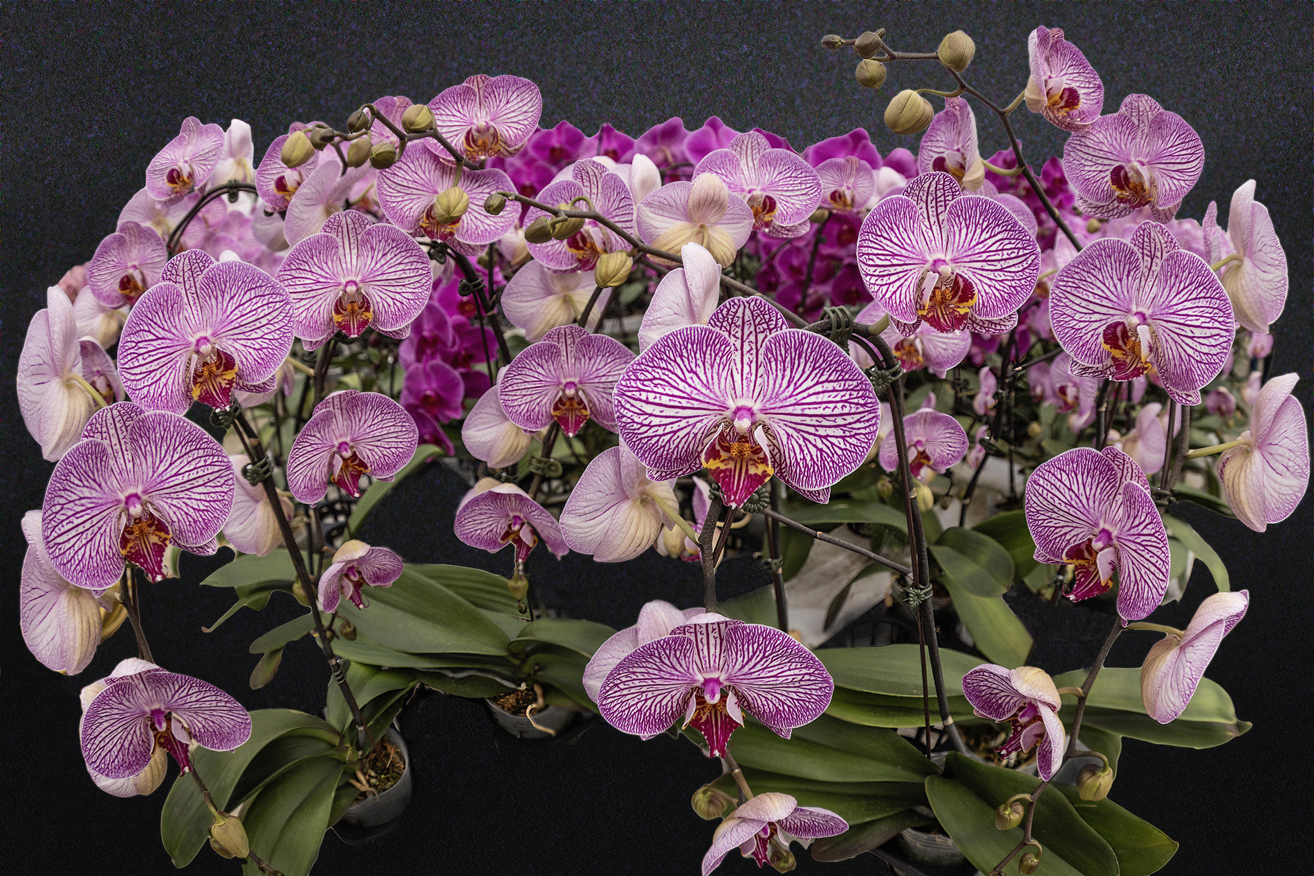
Nice Photo and nice composition. There is something magical about 3's in photography. It would have been nice if you had submitted one of the stack images as an original. I would like to see if the green stems have that blueish green color. |
Oct 3rd |
8 comments - 1 reply for Group 78
|
13 comments - 1 reply Total
|