|
| Group |
Round |
C/R |
Comment |
Date |
Image |
| 32 |
May 25 |
Comment |
I really liked Stephen's suggestion so I darkened all the really bright spots. I really didn't care that much for Diana's suggestion. So I reprocessed the photo are I really like this. What do you think? |
May 10th |
 |
| 32 |
May 25 |
Comment |
Nice framing composition. I think the sky is too bright and blown out. I edited you BW version and changed a few things including adding a gradient to the sky. |
May 5th |
 |
| 32 |
May 25 |
Comment |
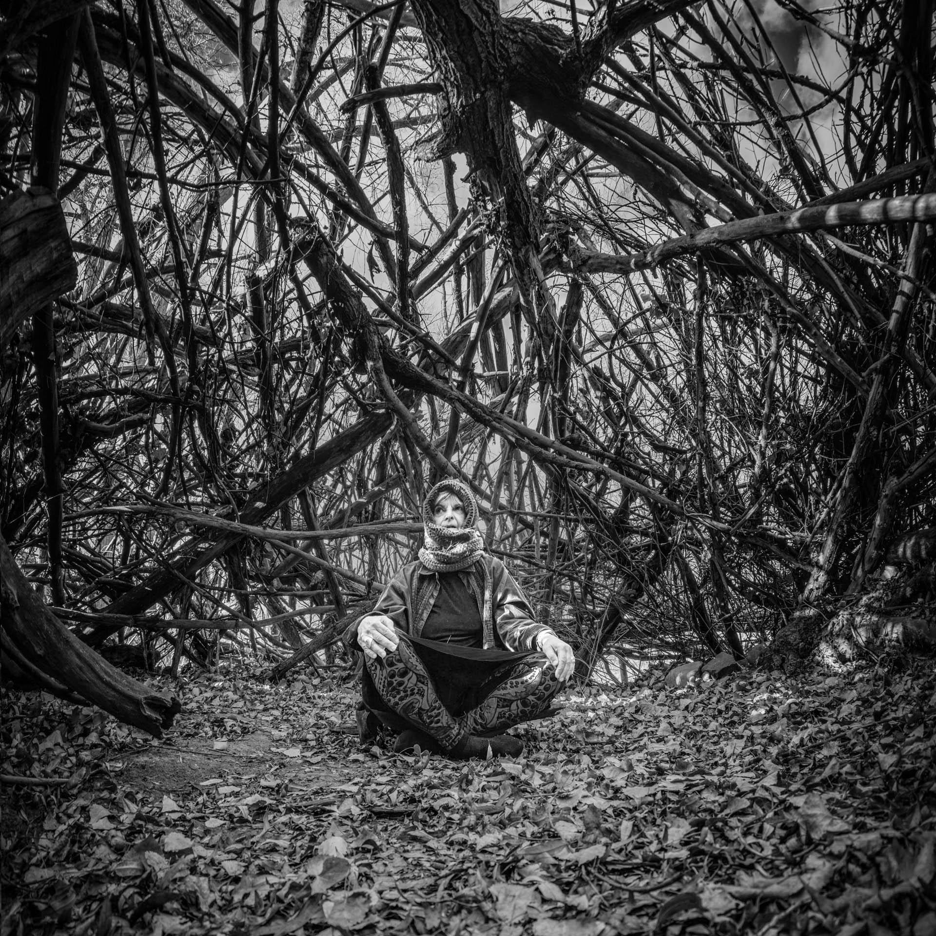
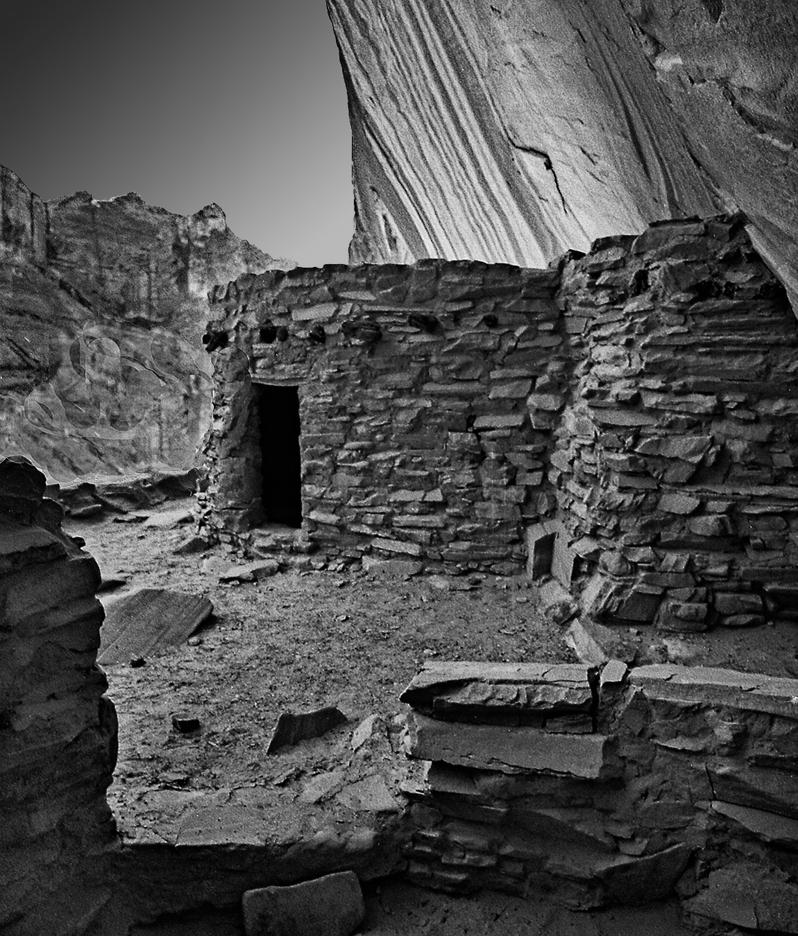
Nice black and white. I would brighten and sharpen the eyes just as you probably would do for a real live animal. I would probably remove the black spot on top of the head. The background is great. |
May 5th |
| 32 |
May 25 |
Comment |
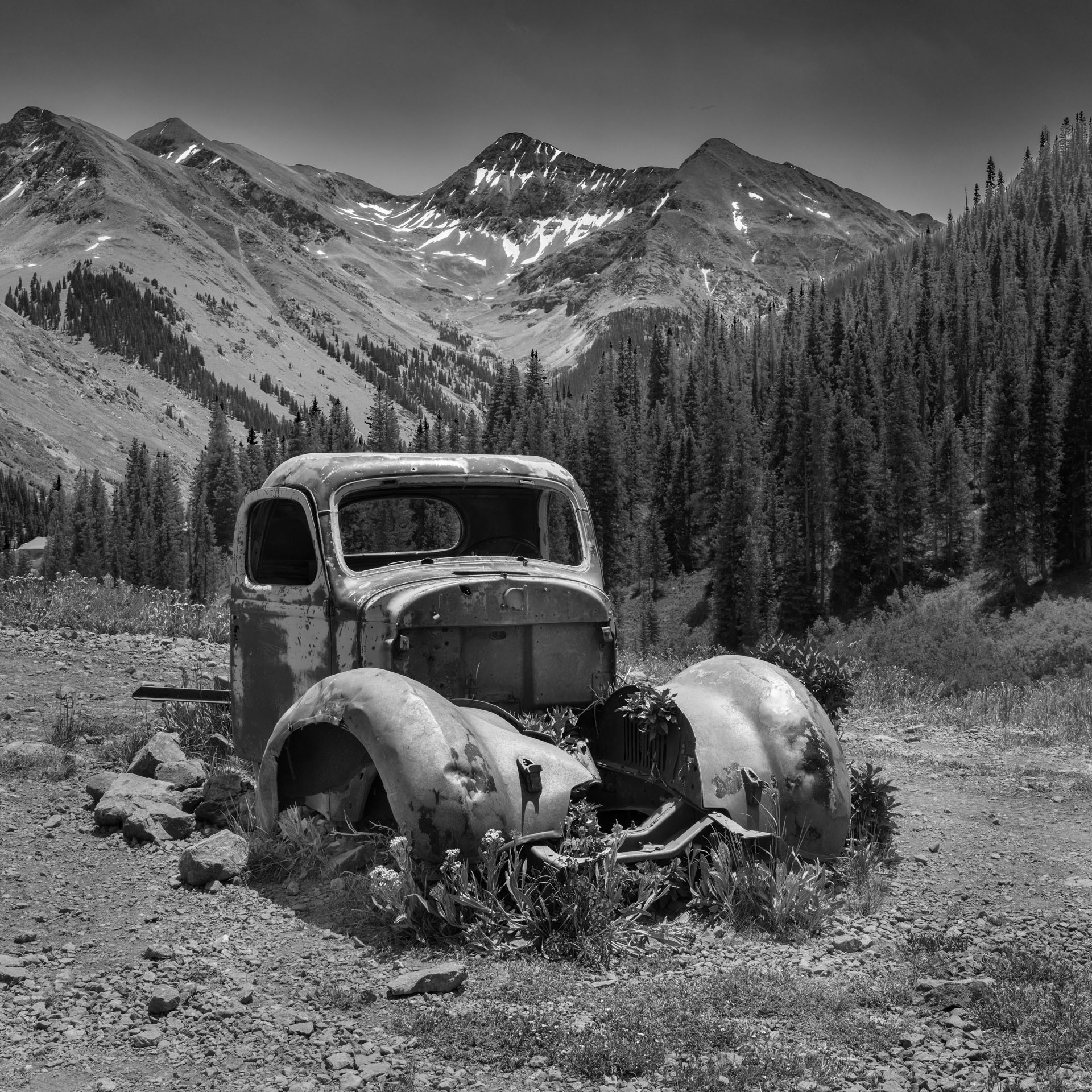
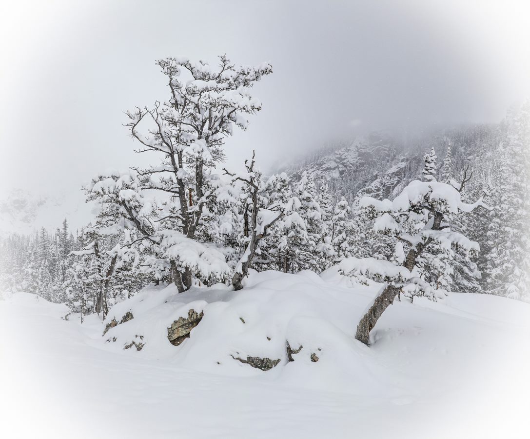
Interesting image. I love square crops. I felt that you needed more of the tree on the left so I reedited it to show what I think. |
May 5th |
 |
| 32 |
May 25 |
Comment |
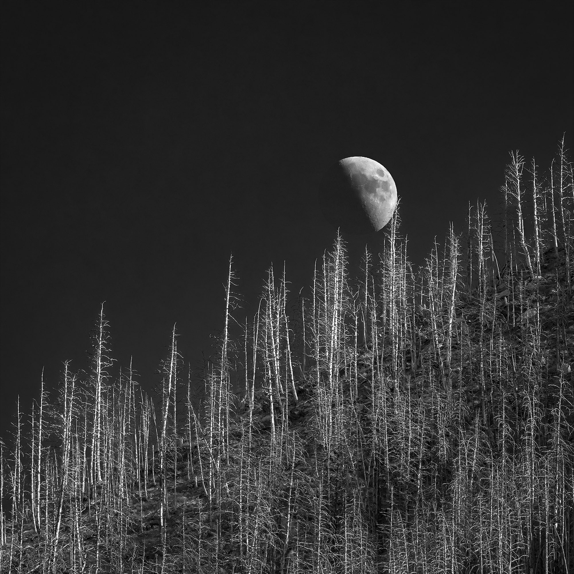
This image is fantastic. I like the square crop a lot. I have no suggestions for improving it. |
May 5th |
| 32 |
May 25 |
Comment |
Nice shot. I would brighten the eyes and sharpen them. Also since it's so close to a square crop I would make it square. See my edit. |
May 5th |
 |
6 comments - 0 replies for Group 32
|
| 78 |
May 25 |
Reply |
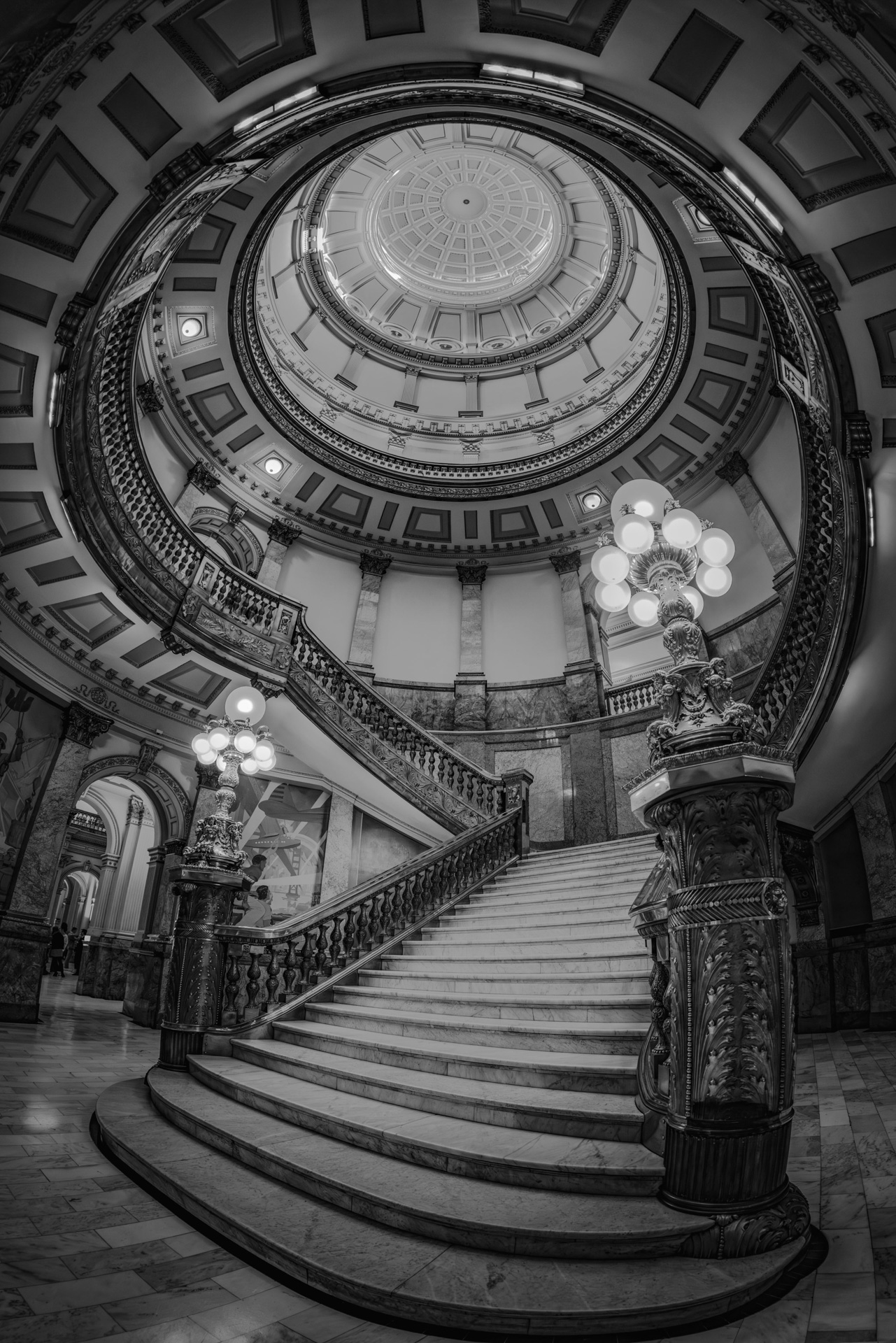
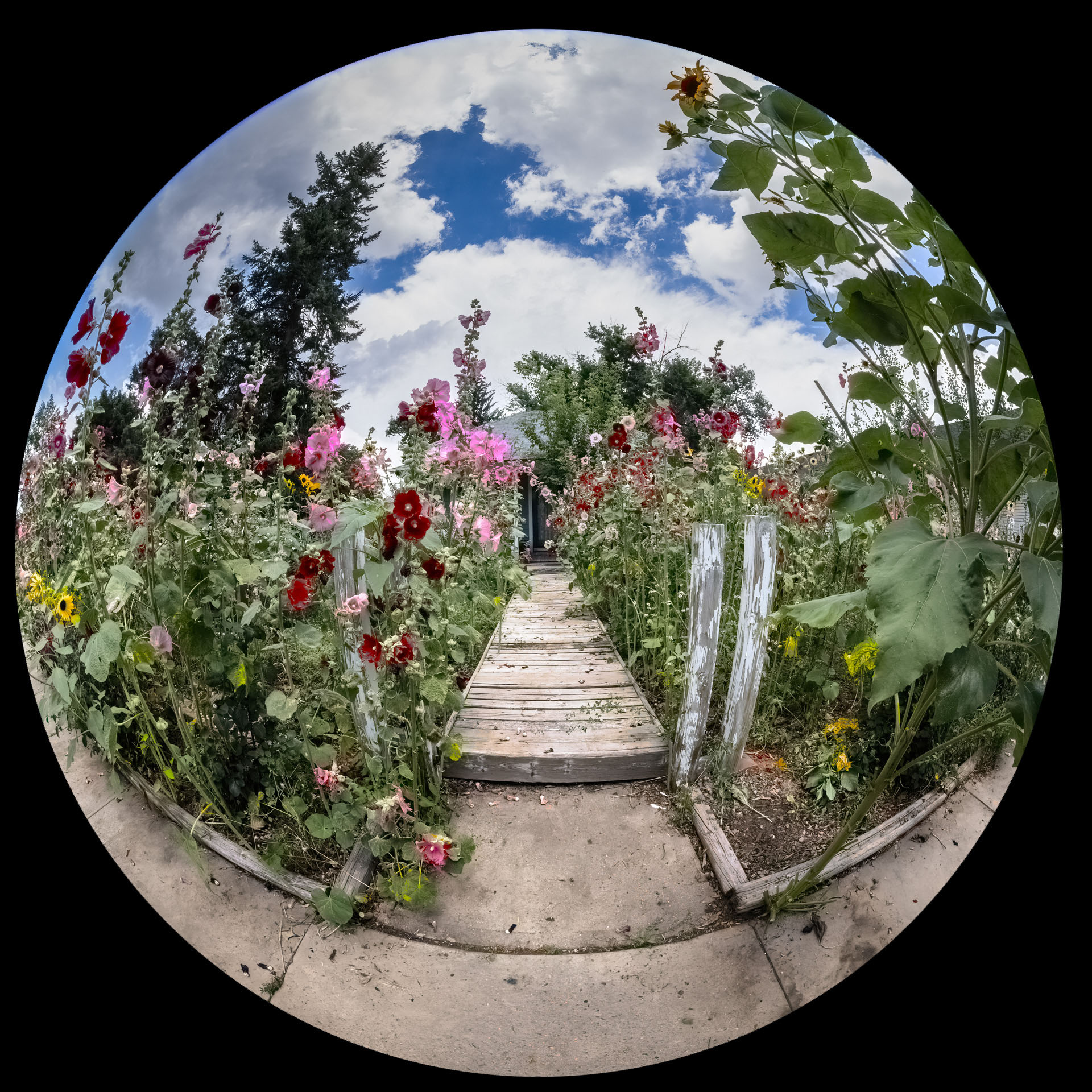
Are you referring to the round image from the camera or my edited version? |
May 7th |
| 78 |
May 25 |
Reply |
Good idea!!!! |
May 5th |
| 78 |
May 25 |
Comment |
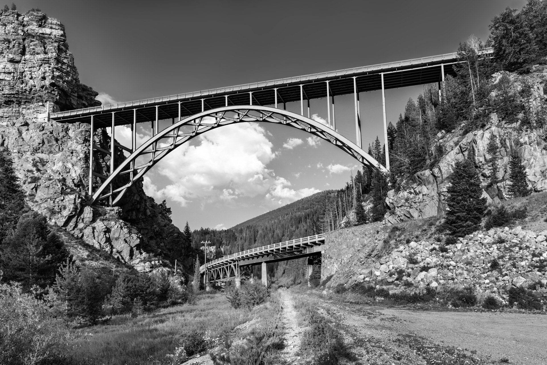
Nice use of leading lines. |
May 5th |
| 78 |
May 25 |
Comment |
Excellent composition. The green foliage in the foreground is perfect. The triangle formed in red of the frisbee, dog and man is perfect. |
May 5th |
| 78 |
May 25 |
Comment |
NICE! I'm going to go to the store and get a garlic bulb myself because I like this so much... |
May 5th |
| 78 |
May 25 |
Comment |
Nice image. I would call this street photography. I don't have any suggestions. It's easy to critique images when people post their really good shots. I always submit images that I think have problems. |
May 5th |
| 78 |
May 25 |
Comment |
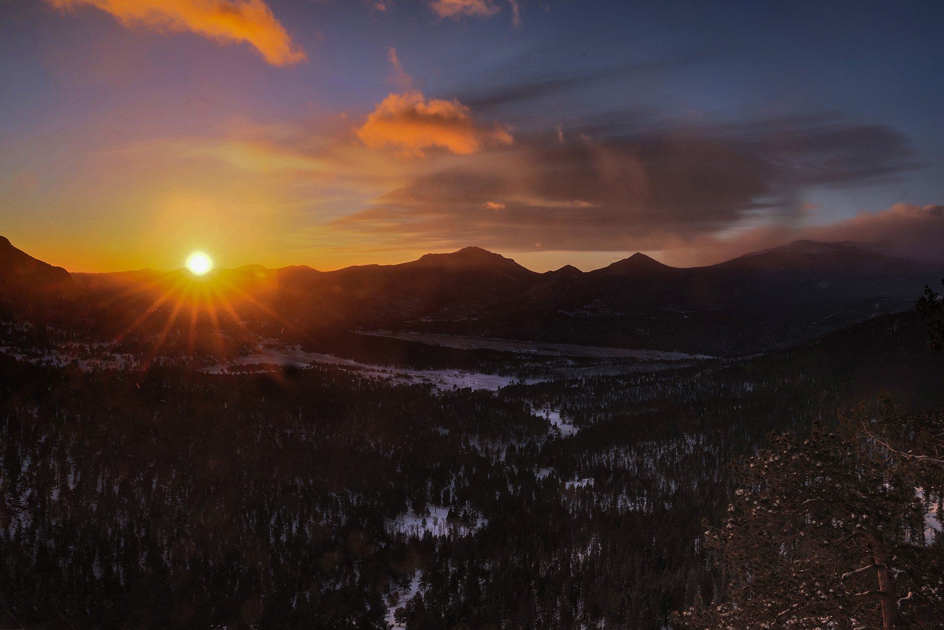
I like this photo. It looks like you are trying to simulate a sunset so I used a luminosity mask with a red, violet and orange filter to add the color to the highlights like with a real sunset. I also changed to perspective. |
May 5th |
 |
| 78 |
May 25 |
Comment |
Very nice. I believe this is called Rembrandt lighting. The light area on the cheeks form a triangle which is the look Rembrandt went for in his paintings. Nicely done! |
May 5th |
| 78 |
May 25 |
Reply |
This is a really nice image also. How exactly did you create it? |
May 5th |
| 78 |
May 25 |
Reply |
I really like you version. In fact how about I email the original to you and you run this software on it. |
May 5th |
6 comments - 4 replies for Group 78
|
12 comments - 4 replies Total
|