|
| Group |
Round |
C/R |
Comment |
Date |
Image |
| 26 |
Mar 26 |
Comment |
So many options with a very nice image |
Mar 14th |
| 26 |
Mar 26 |
Reply |
Interesting comment Stephen. I had to download the image and try the crop. I see the difference in the tension. I agree that there is a big difference in the feel of the image. |
Mar 12th |
| 26 |
Mar 26 |
Reply |
Yes, Perhaps my take is too traditional while your images tend to be more free and experimental. |
Mar 11th |
| 26 |
Mar 26 |
Comment |
I tried this, warped the top, and pasted it back on to the original without the bright line. T. |
Mar 7th |
 |
| 26 |
Mar 26 |
Comment |
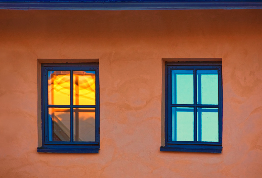
I love the colors and textures in this image. I agree with the above comments. I would crop down to eliminate the small top portion of the window frame, clone out the two spots mentioned above and probably darken or crop the thin sliver of lighter blue on the mid left of the image. Well done. |
Mar 7th |
| 26 |
Mar 26 |
Comment |
I agree on opening up the trees some, and I think maybe George has a better idea on the crop in on the right than my idea to crop in on the left. |
Mar 7th |
| 26 |
Mar 26 |
Comment |
I had though about Jose's idea about cropping from the top, but I do think it adds some drama to the image, so I'd have to seem them side by side.
|
Mar 7th |
| 26 |
Mar 26 |
Comment |
Thanks ALL for the comments
I did crop those elements out for a non-nature competition image and printed it 16x24 for me. I may have done a little more contrast on this one too. |
Mar 7th |
 |
| 26 |
Mar 26 |
Comment |
Technically a great image with full depth of field and good exposure for deep rich colors. Although it's a pretty picture, I'm missing the WOW, that makes me want to go there, or hang the picture on my wall. |
Mar 4th |
| 26 |
Mar 26 |
Comment |
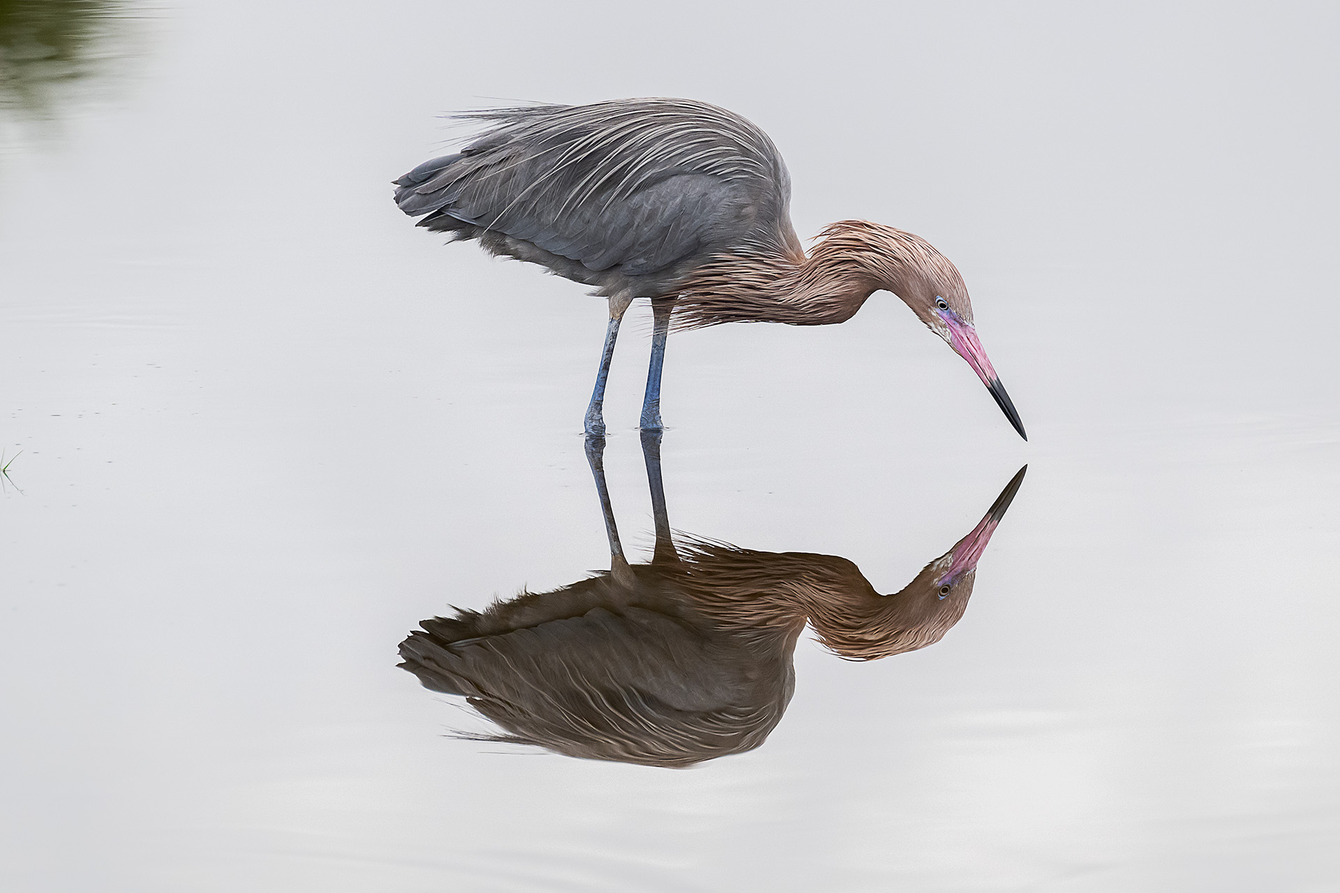
I like minimalist images although I don't take a lot of them. Given the choice, I might have put this a little off center and tried to capture more of the lamp shadow. I'd probably try to brighten the colored oval in the lamp to bring out a little color there, perhaps even lighten the darker areas of the lamp itself. Good exposure with good texture in the wall. |
Mar 4th |
| 26 |
Mar 26 |
Comment |
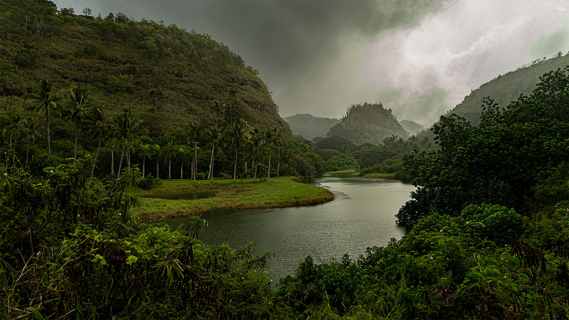
Nice image that easily sets us in the place. The gradually lighter and less saturated mountains are striking and really make this a memorable image. From my view that the mountains are the subject, I might have cropped in from the left removing the first double peak. I might even think about darkening the water a little but I'd have to try that to make a decision |
Mar 4th |
| 26 |
Mar 26 |
Comment |
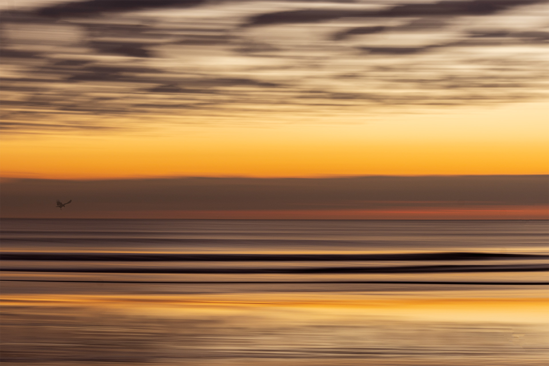
Iconic light houses are always great subjects and you've done this justice. The colors are all believable and work well. The leading lines of the cliffs and the walk way take us to the subject. The textured clouds are a nice background. My eye went to the bright vertical edge on the dark cloud in the upper left that flows into the top right of the lighter cloud below. I might have darkened slightly one of those two clouds to take away that vertical line. |
Mar 4th |
| 26 |
Mar 26 |
Comment |
Ha Ha, I do windows too (photos, not cleaning :) I like the treatment, the color change I think it really makes a striking image, particularly with the two distinctly different windows.
With all the corrections it still has a bit of un-reality that makes me think. I'm mixed on the smiley gutter though. I might crop below the brighter line ? maybe ? well done. |
Mar 4th |
11 comments - 2 replies for Group 26
|
11 comments - 2 replies Total
|