|
| Group |
Round |
C/R |
Comment |
Date |
Image |
| 26 |
Apr 25 |
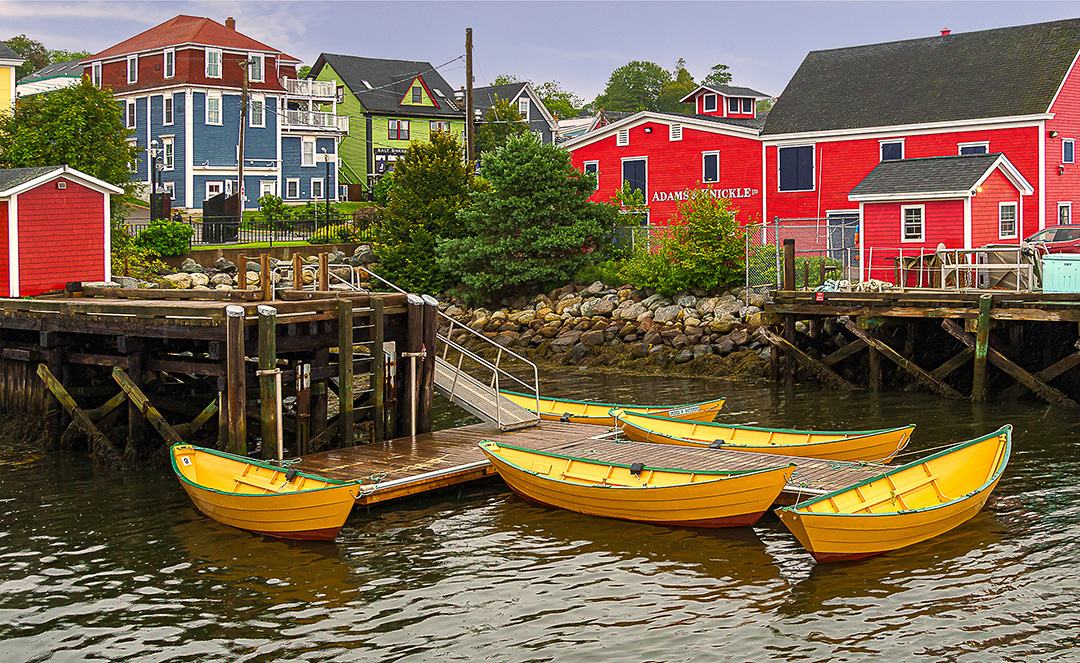
Reply |
Got it. I'll give it a try. There was a lot of ocean, but I may have cropped too much |
Apr 30th |
| 26 |
Apr 25 |
Reply |
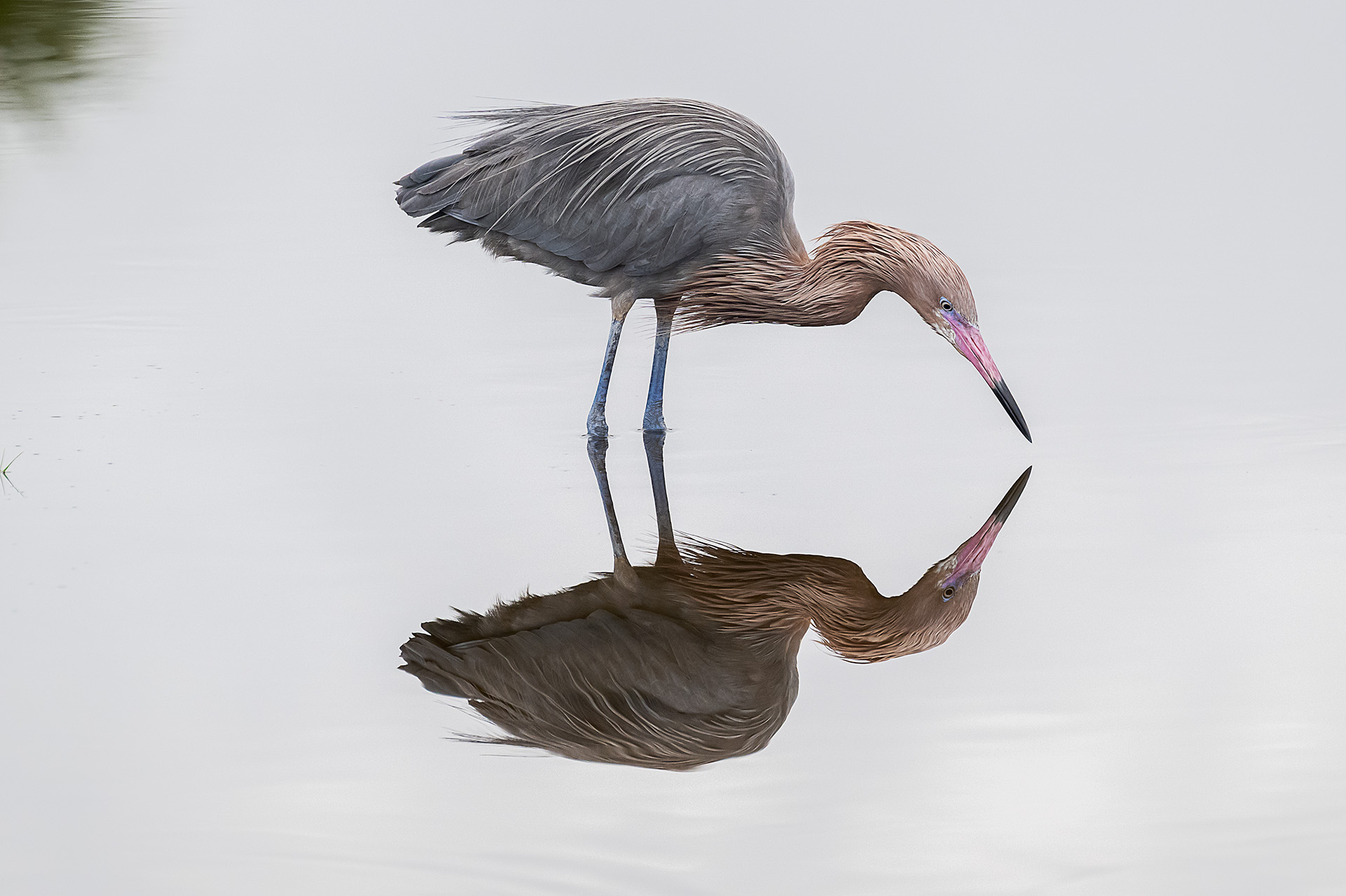
Tony,
Are you referring to the area of "calm" water where a slight reflection of the red boat house can be seen ?
|
Apr 29th |
| 26 |
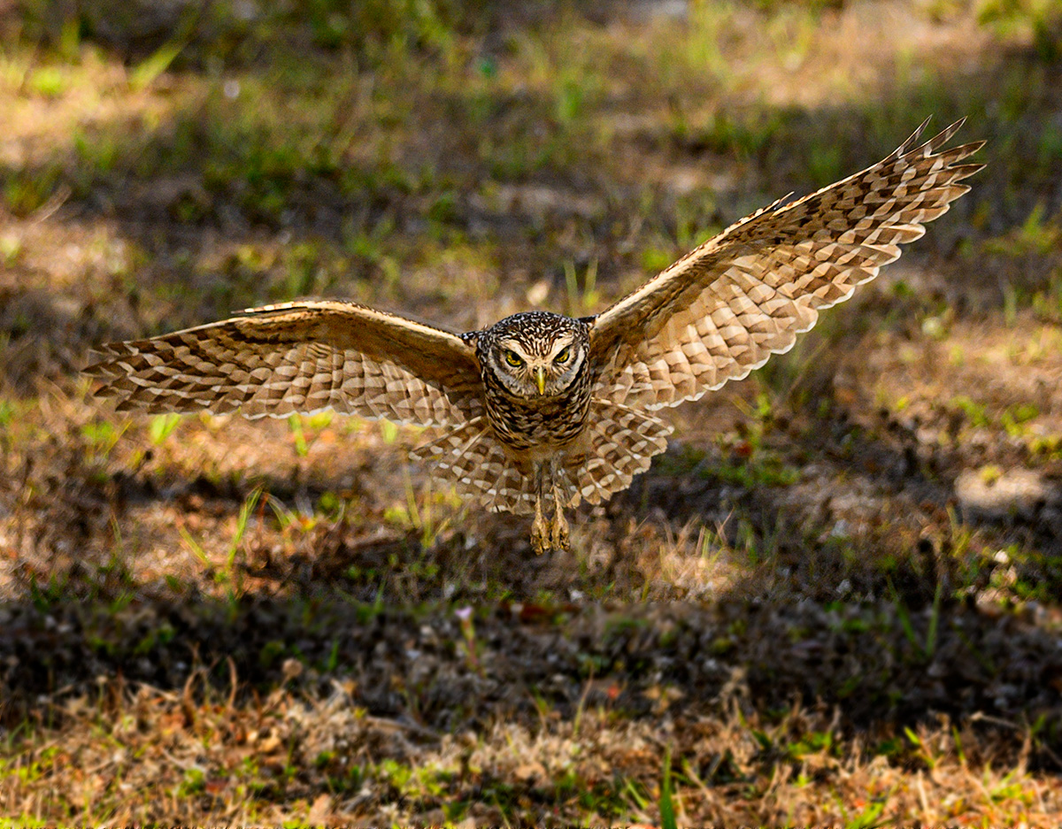
Apr 25 |
Reply |
Kirsti, Yes I agree. When I was looking through this months submissions, I felt that my sky was a not quite right. Thanks. T. |
Apr 11th |
| 26 |
Apr 25 |
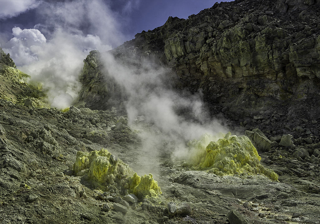
Comment |
An interesting image of something not everyone gets to see. I agree that the light is a little harsh, and the blue sky a little overpowering for my taste. I selected the color of the sky then desaturated and lightened slightly. I burned in the brighter earth primarily on the lower left. I also opened up the rocks on the right both above and below the brighter band of rock in the middle. I cropped in slightly on the left to remove the disconnect puff of steam and added a slight mid-tone contrast boost to the entire image. |
Apr 9th |
 |
| 26 |
Apr 25 |
Comment |
Nice processing on this image. It's nice to have the DOF on the flowers and then blur the background. I use your process fairly often to control DOF in post processing. Even bringing out the big camera and lens, I think you would have to do similar processing unless you did focus stacking. Well done. |
Apr 9th |
| 26 |
Apr 25 |
Comment |
I have played a bit with the Pep Ventosa process and understand the amount of work involved in putting an image like this together. This in my opinion is a very subtle example of that process and I think it works well with the subject. I like that you kept the fallen petals without ghost images. I agree with Bob that you might want a little more mid-tone contrast on the subject. |
Apr 9th |
| 26 |
Apr 25 |
Comment |
Great capture of this street scene. The colors blend well and add to the feeling of this image. I might have tried to eliminate the motorcycle since I don't feel it adds to this image. |
Apr 9th |
| 26 |
Apr 25 |
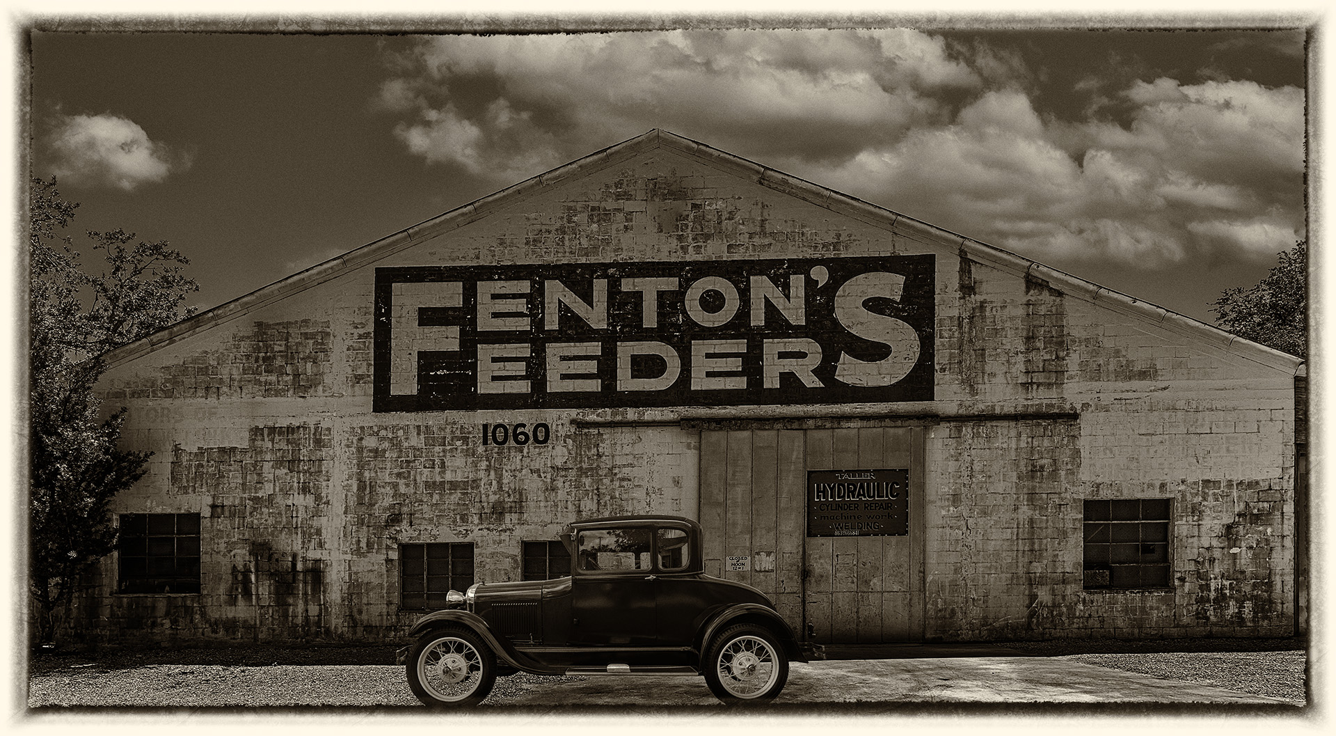
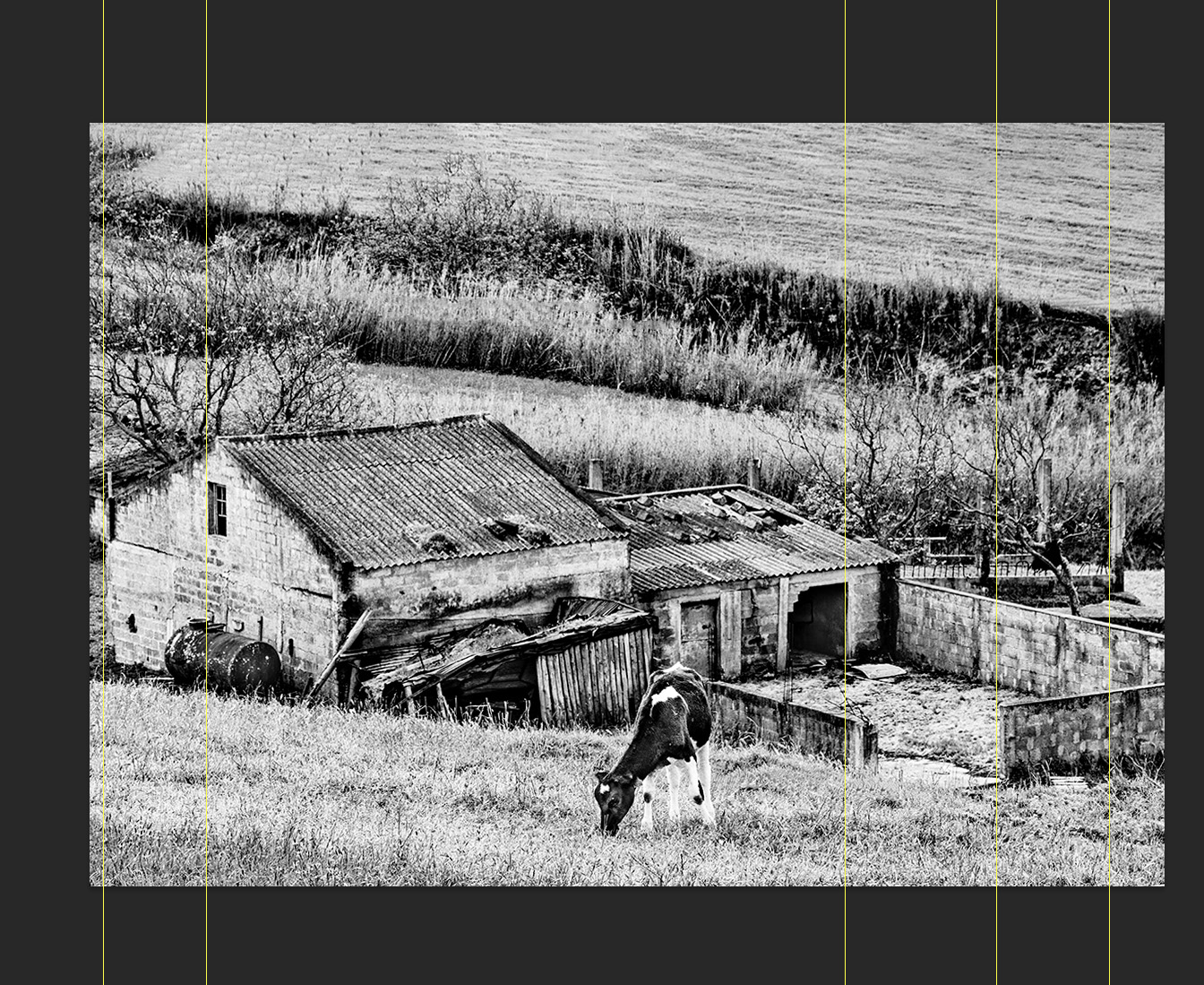
Comment |
I think your image has a nice "B&W film" look. In a scene like this I would probably remove the power lines. A personal taste, but I think it is more fitting the period look without the distraction. I would straighten the verticals as seen in the attached. I used the Skew function and pulled the top of both the left and right corners out to get close to the guides. I did a quick Heal of the power lines and also added a little more room on the top as I felt a little crowded in your original. The image tells a nice story and transports me to that place and a time. I think the cow is a very important part of this image and brings life to this old structure. Nice image. |
Apr 9th |
 |
5 comments - 3 replies for Group 26
|
5 comments - 3 replies Total
|