|
| Group |
Round |
C/R |
Comment |
Date |
Image |
| 26 |
Jun 23 |
Comment |
Good point Mervyn. It might be worthwhile to do a slight blur on the background to get the best of dreamy and original. I'll give that a try. |
Jun 14th |
| 26 |
Jun 23 |
Reply |
Thanks Tony. I did briefly look at cropping down from the top and agree that the flower need to hand from the branch even though that forces the flower somewhat low in the image
|
Jun 14th |
| 26 |
Jun 23 |
Comment |
I like the side view of musicians, a view not normally seen by the audience. I think the guitarist and his fingers are less of a distraction in the color version, but do become more noticeable in the B&W and that is intensified by the crop at his nose. I would try to tone down those two areas. The image does seem a little soft to me. |
Jun 12th |
| 26 |
Jun 23 |
Comment |
Great color and focus. We've had debates about image titles with judges, even when they were told to ignore the titles. In this case, your title points us to the obvious. Good processing on the background that from the original looks to be a uniform green. Only suggestion I have are two dark spots on the background to the right of the bottom of the left most flower, that give the look of dust spots. |
Jun 12th |
| 26 |
Jun 23 |
Comment |
I'm a fan of vertical verticals and you were able to accomplish that in this image. The B&W treatment, contrast and tonal values work well with this subject. It amazes me that you were able to get good separation between the tower of the old building and the bright areas of the new building while moving. I will sometimes blur, darken, or delete words from buildings. I'm sure that people that know this building would not be happy with the missing name, but I think it is a little eye catching for my taste. |
Jun 12th |
| 26 |
Jun 23 |
Comment |
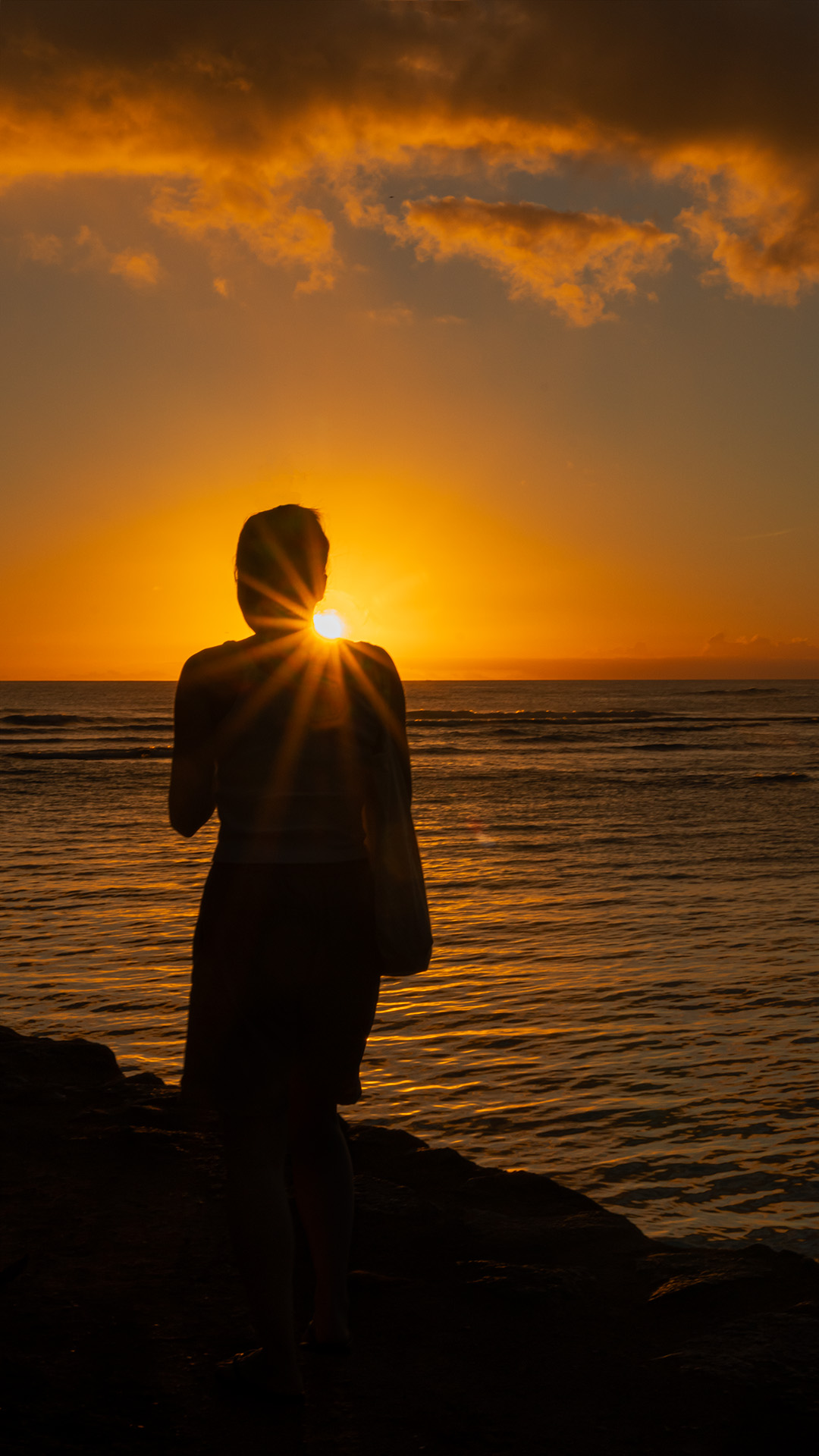
I find abstract or creative images to be very difficult to judge (and often understand) In looking at your image, I did see a ghost, but without your explanation, probably would have missed the espresso cup. You have a great eye to catch these fleeting images and I feel that your bold color treatment serves this image well. I find that the bright arc to the right of the ghost is somewhat distracting and in the very rare chance that I would have ever gotten this image, I would probably darken it. As for the artist reference it is a value and influence for you and my lack of knowledge is not a problem in viewing your image. Perhaps I should do some research. |
Jun 12th |
| 26 |
Jun 23 |
Comment |
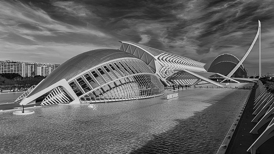
Great range of tones throughout the image. I find the differing representation of the window lines from building to building to be very interesting. My first thought was that I would like to see more of the bottoms of the buildings |
Jun 12th |
| 26 |
Jun 23 |
Comment |
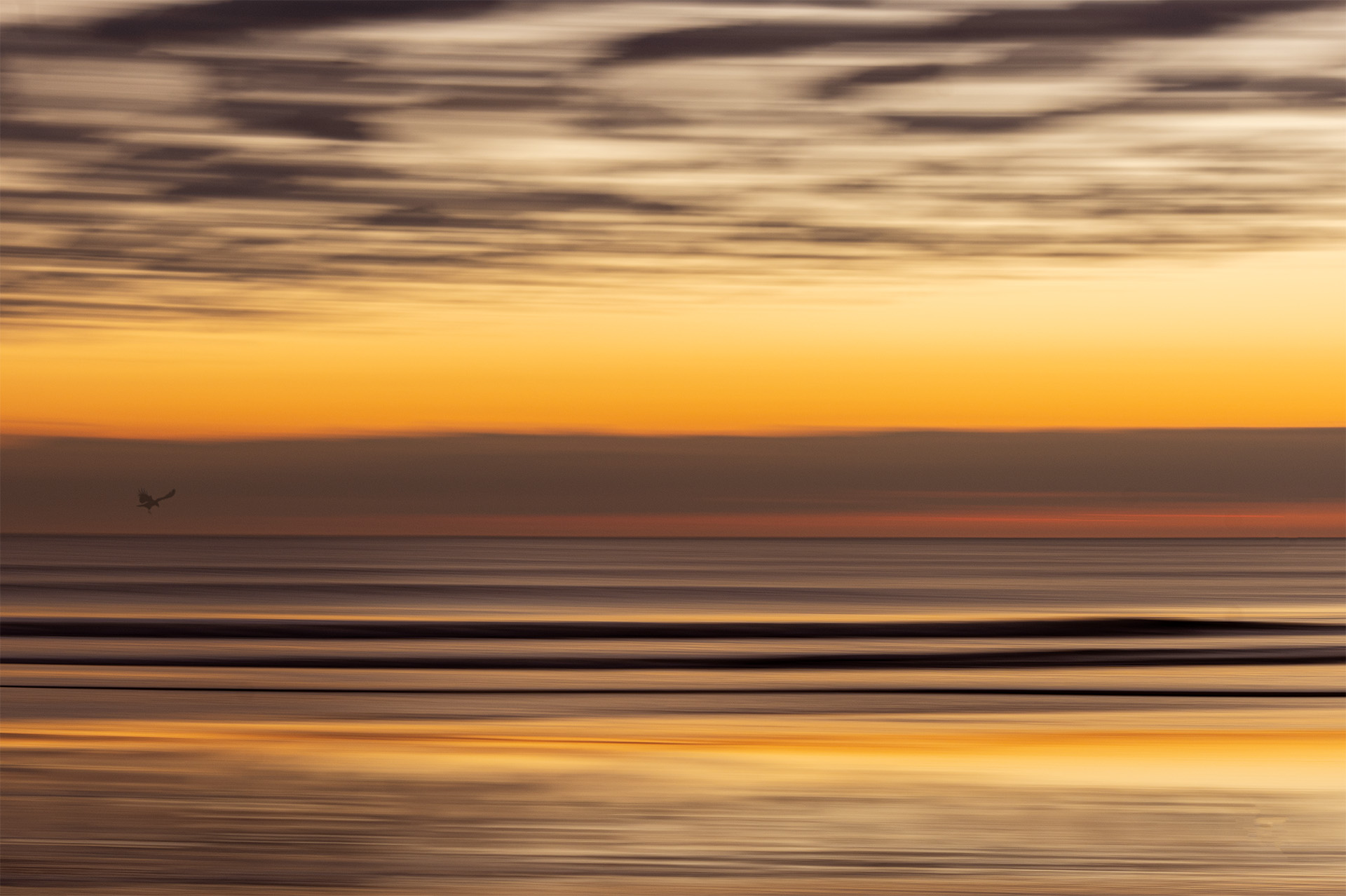
Both the B&W and Original have a great peaceful feeling. I wonder what the color would look like with a little less sky to put more emphasis on the muted colors at the bottom. To my eye, keeping the first tree on the left in the B&W image forces the second tree to be seen as itself, while in the color image, the second (now first) tree blends somewhat with the third |
Jun 12th |
| 26 |
Jun 23 |
Reply |
I do like that treatment although it seems to introduce some noise / grain. Not sure if that's an intended part of the dreamy look preset or a side effect. When I processed this, I went to a super real look - not HDR, but bold. I think a case can be made for both treatments. |
Jun 12th |
| 26 |
Jun 23 |
Comment |
Thanks Jose. I agree the bright spot is distracting. I'll try to tone it down a bit.
|
Jun 12th |
8 comments - 2 replies for Group 26
|
8 comments - 2 replies Total
|