|
| Group |
Round |
C/R |
Comment |
Date |
Image |
| 26 |
May 23 |
Reply |
Kirsti, I think both of these re-worked images work and I'm glad you have the originals available to make the changes. On color vs B&W, I think I prefer this image in B&W. |
May 13th |
| 26 |
May 23 |
Reply |
Thanks Tony. I prefer the natural bokeh / blur from the lens rather than adding blur in post, but I'll add blur when I think the image would be improved. However, this image was taken with the Sigma 150-600 and I have never really liked the bokeh from this lens. It looks to me to be a little harsh. |
May 13th |
| 26 |
May 23 |
Comment |
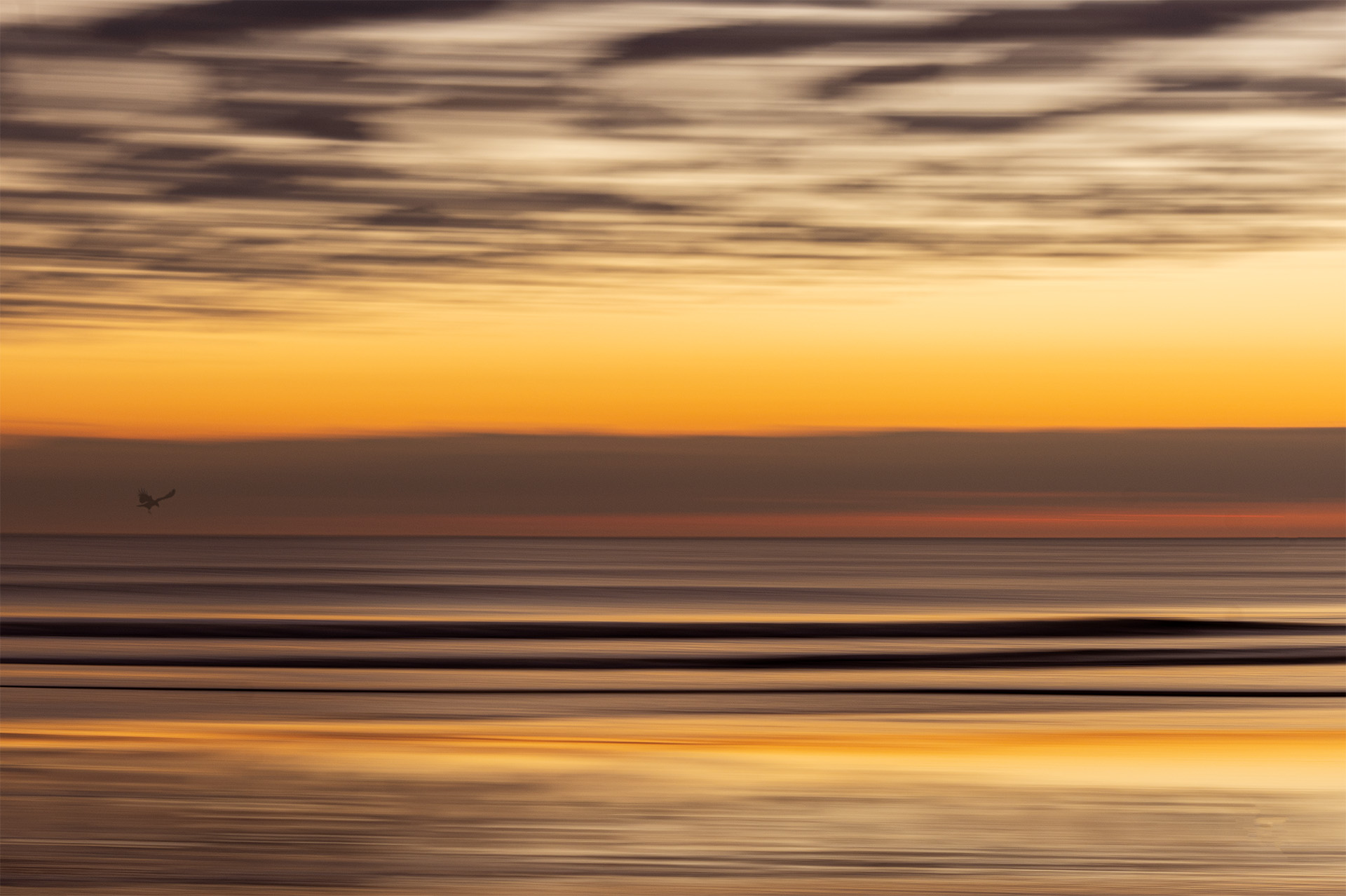
I'm with the prior comments, a couple of areas seem a little too hot, but it is unique composition that I think works for this subject |
May 12th |
| 26 |
May 23 |
Comment |
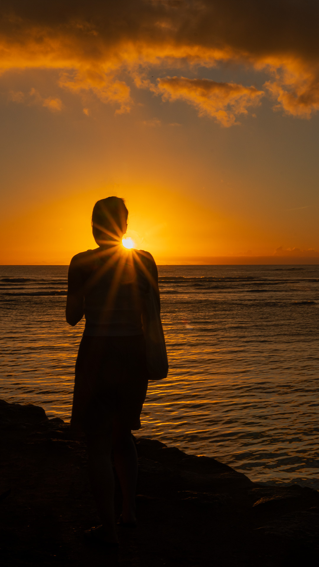
I agree that this is more of a mood image. I think in competition you might hear "what is the subject" On the other hand, this is the kind of image that I think people would purchase to hang on their wall where many competition images are too much "in your face" I tried cropping in from both the left and right. Doing this, you loose the flowers on the left, but I think you invite your viewer into the "window" between the dark trees. |
May 12th |
 |
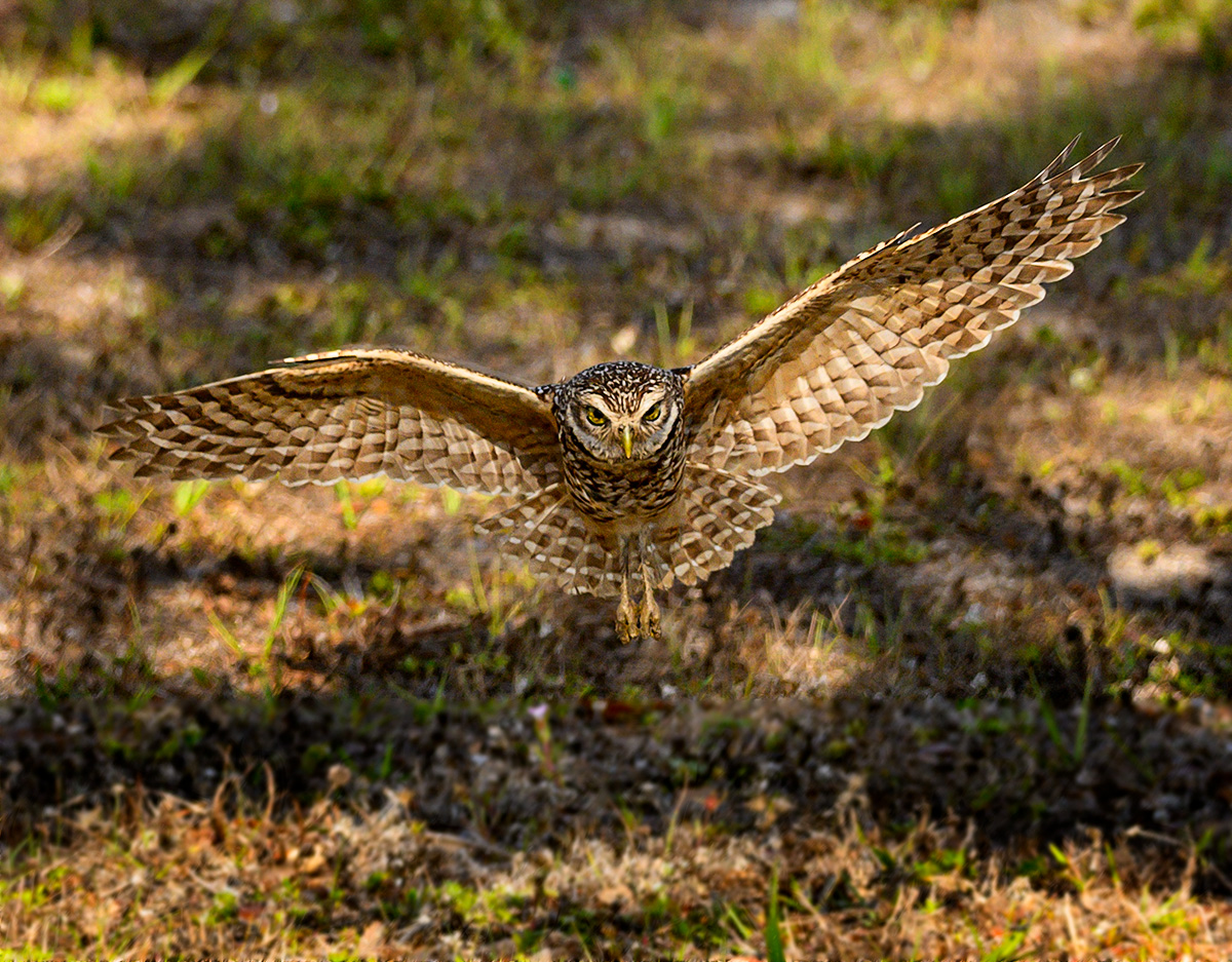
| 26 |
May 23 |
Comment |
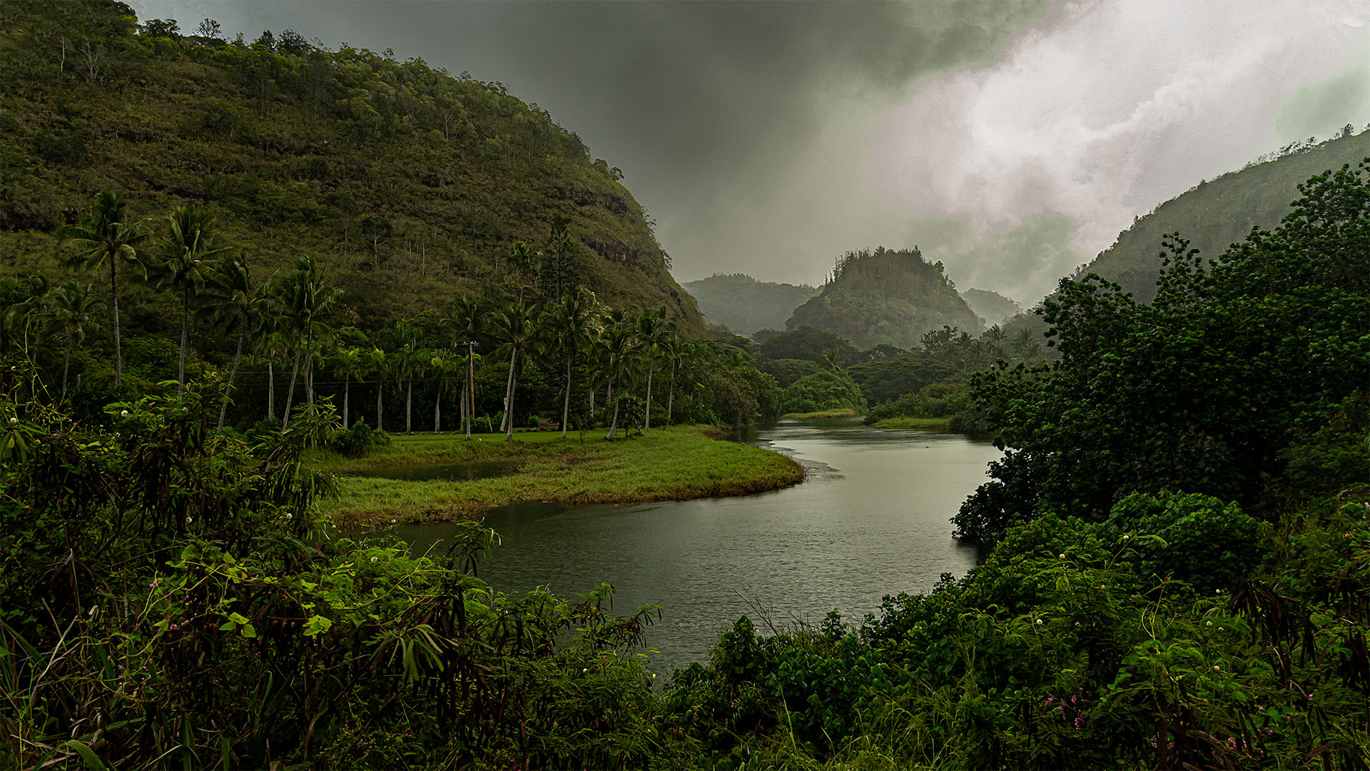
Here is an updated image with your suggestions. I darkened / cloned some of the bright spots and desaturated the yellows in all but the owl. I think those changes improve the image. Thanks. BTW, Thanks to all for the Welcoming comments. T. |
May 12th |
 |
| 26 |
May 23 |
Comment |
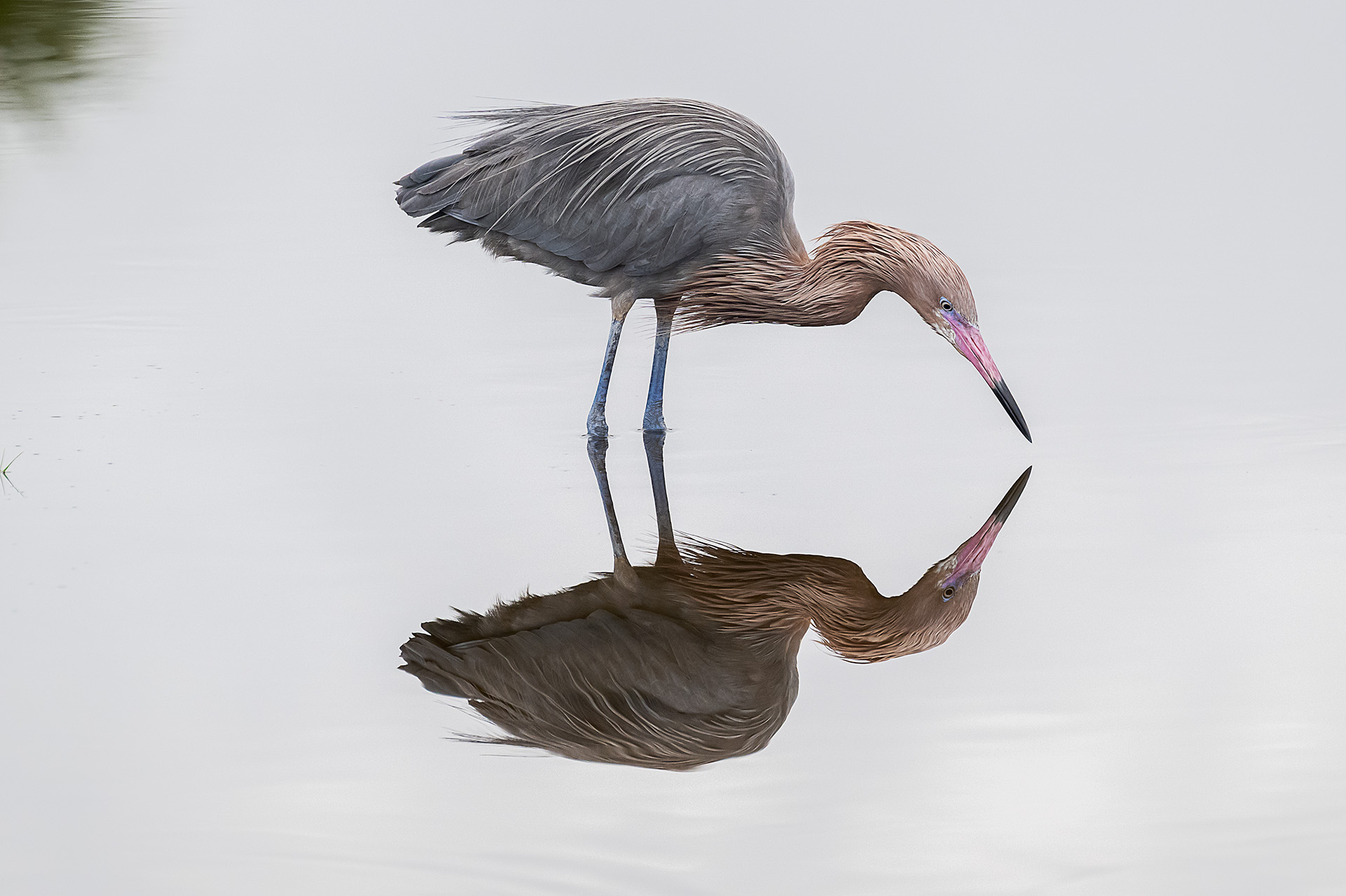
I've heard this in the past and try to remember when I'm shooting that people will ignore noise if the image is sharp, but won't ignore a fuzzy or out of focus image. I think that the main focus of this image is the lighthouse and the light going out. I think this capture took very good planning and execution. I might darken the ship a little since I feel that it is slightly overpowering the lighthouse. |
May 12th |
| 26 |
May 23 |
Comment |
I like the way you processed this image. I think there is just a little too much blur / lack of clarity at the lamp area (perhaps just the one shoe form) for my taste. The thing I see is the person looking into the scene looks to me like he has one or both artificial legs. I think this interpretation takes this image to another level. |
May 9th |
| 26 |
May 23 |
Comment |
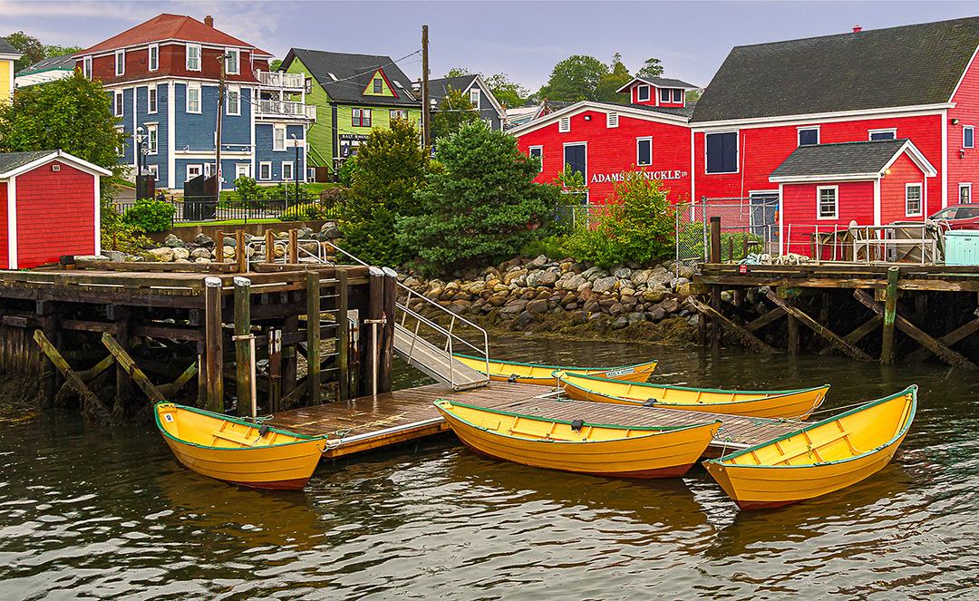
This image immediately draws me in to the bright area at the center and the people shopping. I then wander back through the image looking at all of the detail. There is a lot to explore. I agree with the previous comments and I find the silver pipe and air conditioner distracting. I think I prefer Kirsti's solution that pushes those items more into darkness, but doesn't take away any of the other details at the top. I would probably clone out the bright object in the bricks just along the left edge however. |
May 9th |
| 26 |
May 23 |
Comment |
I find this be be a very dramatic image. My eye goes to the warm tones on the roof of the church against the cool tones of the mountain behind. The stream / waterfall is a nice counterpoint to the rest of the image and keeps my eye moving around the image. I agree with Jose that I might remove the poles to the right of the church and I find the small building (?) on the left edge a little distracting. I might have cropped in from the left or used the clone or heal tools. It's hard to tell from this image, but I'm wondering if you could get more detail on the church steeple. |
May 9th |
| 26 |
May 23 |
Reply |
Thanks Kirsti I would almost like to separate him more from the background, but with the coloring, it seems very difficult, maybe desaturate the background a little along your suggestions of stronger blur / vignette. Something to try. |
May 9th |
| 26 |
May 23 |
Reply |
Thanks for the comments. Good catch on the bright spots. I'll give that a try. I very rarely enter my photos in nature since I'd rather process to a striking image rather than to a natural documentation. In this case, the selective adjustments of the eyes, blurring of the foreground, probably the vignette would not be acceptable in nature. |
May 9th |
7 comments - 4 replies for Group 26
|
7 comments - 4 replies Total
|