|
| Group |
Round |
C/R |
Comment |
Date |
Image |
| 2 |
Jun 23 |
Reply |
I love the cropped version. |
Jun 9th |
| 2 |
Jun 23 |
Reply |
I just reread my description and realize that my description is disjointed. Wondering if I deleted something that should be there.
When I sit down to do my next Lightroom tutorial, I will attempt some of your suggestions. Will hopefully get to that over the weekend. Thanks. |
Jun 5th |
| 2 |
Jun 23 |
Reply |
Thank you for the information about what shallow depth of field does to post-processing of the sky. I wondered why I had success in the Lightroom exercise I had done previously and then couldn't seem to get similar results on my own photo. I have other photos I will need to play around with. |
Jun 5th |
| 2 |
Jun 23 |
Reply |
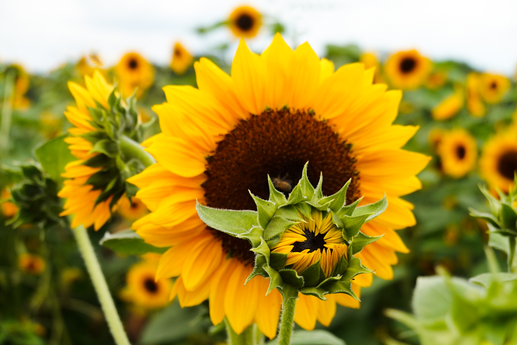
I went back to the sunflowers, but what should have been the peak of the season was disappointing compared to opening day when this photo was taken.
I'm brand new to Lightroom and did try to eliminate the unfocused flower in the back, but each time I did I, I get something lingering which just looked sloppy. So I left it alone. Definitely need to work on post-processing a lot more. I see what you mean about the flowers in the front. I didn't even notice them. |
Jun 5th |
| 2 |
Jun 23 |
Comment |
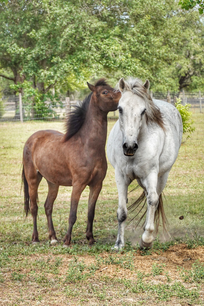
It looks like she was posing for you!
Such clarity and well done on eliminating the parts of the background that were taking attention away from her. |
Jun 5th |
| 2 |
Jun 23 |
Comment |
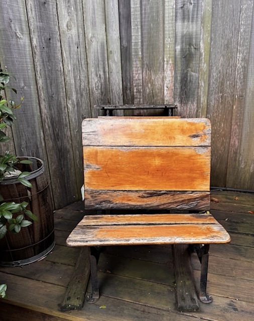
Excellent choice for going to black and white. It makes for a much more arresting photo. Interesting, too, that the speckles either disappeared or melded into the lines once you made the transition.
You didn't say whether the photo was cropped at any point or if that's the composition you got right out of the phone camera, but I think it's super effective.
Good luck in your print competition. |
Jun 5th |
| 2 |
Jun 23 |
Comment |
I really love how you slowed down the movement of the cars on the road. And until I read Jim's comment, I wasn't sure why I was having so much trouble reading the exit sign. It was a distraction because I couldn't read it, but I think if I could read it, it would add a nice touch.
I'd crop in a little bit more, too. I know there's not much room for cropping without losing the impact of the sculpture, but the photo is very wide and I feel like my focus is all over the place. |
Jun 5th |
| 2 |
Jun 23 |
Comment |
I think this is a wonderful image for a promotional piece. (My recollection of Sanibel is that there are shells all over the beach, just curious how there are none here. Is this a new post-storm reality?)
My favorite part of the photo are the splashes along their legs. But agree with Shirley that the water in the upper right being toned down would make the splashes pop even more! |
Jun 5th |
4 comments - 4 replies for Group 2
|
4 comments - 4 replies Total
|
