|
| Group |
Round |
C/R |
Comment |
Date |
Image |
| 17 |
Sep 19 |
Comment |
Seeing someone with a camera lying on the floor usually creates a curiosity jam - bystanders wondering what you are seeing. I do think this is very colorful and that flag is a central theme. However, I also thought it was a tad busy with so much going on in the frame. Not much you could have done to offset that. BUT, it all comes down to how well you liked it. If it does go into competition, I'd be very interested in hearing how it did. |
Sep 9th |
| 17 |
Sep 19 |
Comment |
On the campus of MIT in Massachusetts there are several buildings of modern architecture - Frank Gehry's work. I have spent several hours checking out the angles and the lighting, etc. This architectural masterpiece reminded me of them.
I think you made the right choice in that the work of art is on the outside - the building. Great handling of the sun's ray on such a shiny structure. Decision to go monochromatic was a very wise one.
I have spent considerable time enjoying the dips and angles. looks as if it could be used for a bicycle motor cross:) |
Sep 9th |
| 17 |
Sep 19 |
Comment |
It's the eyes for me as well - they are captivating! Such simple beauty needed to be captured and you did that well. Her skin is so smooth - possible facial model potential. I trust she liked what you did here. |
Sep 9th |
| 17 |
Sep 19 |
Comment |
Dick, I trust you have not been cursed by these Hawaiian characters. I think Peter's idea of the offering would offset the curse. Not too late to send a few dollars their way. The three "characters" are well composed and the detail appears to be sharp. There is a slight slope to the left. |
Sep 9th |
| 17 |
Sep 19 |
Comment |
They are irresistible, John. I don't think I have ever seen a bad pix of them! You managed to get some color separation between the meerkats and the dirt as they are almost camouflaged in this environment. I am with Peter on opening up the eyes - it would be an easy tweak. |
Sep 9th |
| 17 |
Sep 19 |
Reply |
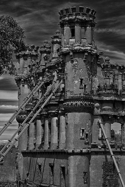
John, I almost always run my images through a B&W processing - for some reason these were not. I can see how those steel supports are greatly diminished and have become less of the story. Thanks. . . |
Sep 9th |
 |
5 comments - 1 reply for Group 17
|
| 80 |
Sep 19 |
Comment |
Bev, I think the muted tones surrounding your character allow him to be more prominent in the frame. His red hat, the plaid shirt and even the sneakers kept my focus on the man. I am not bothered by the fact that it is not a frontal view - this appeals more to me in that it does not look staged. Since a phone is not visible in the scene, I would rethink the title, "Siesta Time" or "Taking a Break"
Just my two cents. . . |
Sep 21st |
1 comment - 0 replies for Group 80
|
6 comments - 1 reply Total
|