|
| Group |
Round |
C/R |
Comment |
Date |
Image |
| 9 |
Jun 25 |
Reply |
Thank you for your kind words Linda. Movement of the Horizon seems to be the general consensus which is a valid point. All recommendations can work, deciding what works best is the challenge. Thanks again Linda. |
Jun 20th |
| 9 |
Jun 25 |
Reply |
Thanks Charles, I never really consciously consider horizon placement in post processing, I just do whatever looks good to me at that time. I'll be more aware from now on. Thanks again, your feedback is always appreciated. |
Jun 18th |
| 9 |
Jun 25 |
Reply |
Sabine, thank you very much for your feedback and kind words. Your astute in-depth evaluation of my work displays a perception that I am often to blind to see during a review of my own work. I'm not sure I'll ever achieve that ability that you so often display each month. But, at the same time, feedback from you and group members has improved my ability to perceive variables that make a good photographic image.
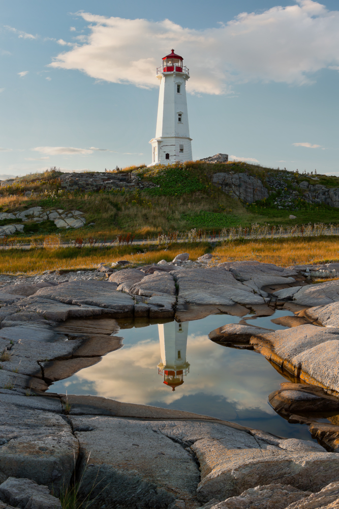
I downloaded my image you worked on and compared it to the image I submitted so that I could appreciate more the changes you recommended, which I understand and mostly agree with. Its a bit of a challenge for me to forego the foreground. BTW, the rock formation is another island inhabited by a small community. Thank you again for your time and effort, always much appreciated. |
Jun 17th |
| 9 |
Jun 25 |
Reply |
Thank you Yvonne, thank you for the tip on Ian Plant's webinar, much appreciated. The feedback from the group regarding crop size has been interestingly divided. |
Jun 17th |
| 9 |
Jun 25 |
Comment |
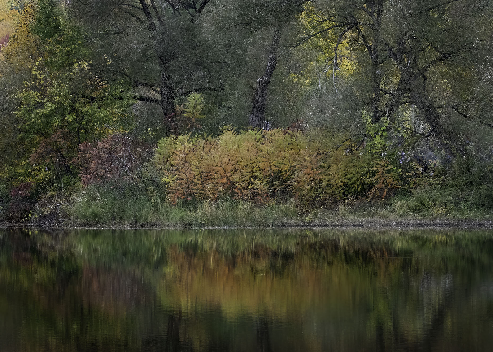
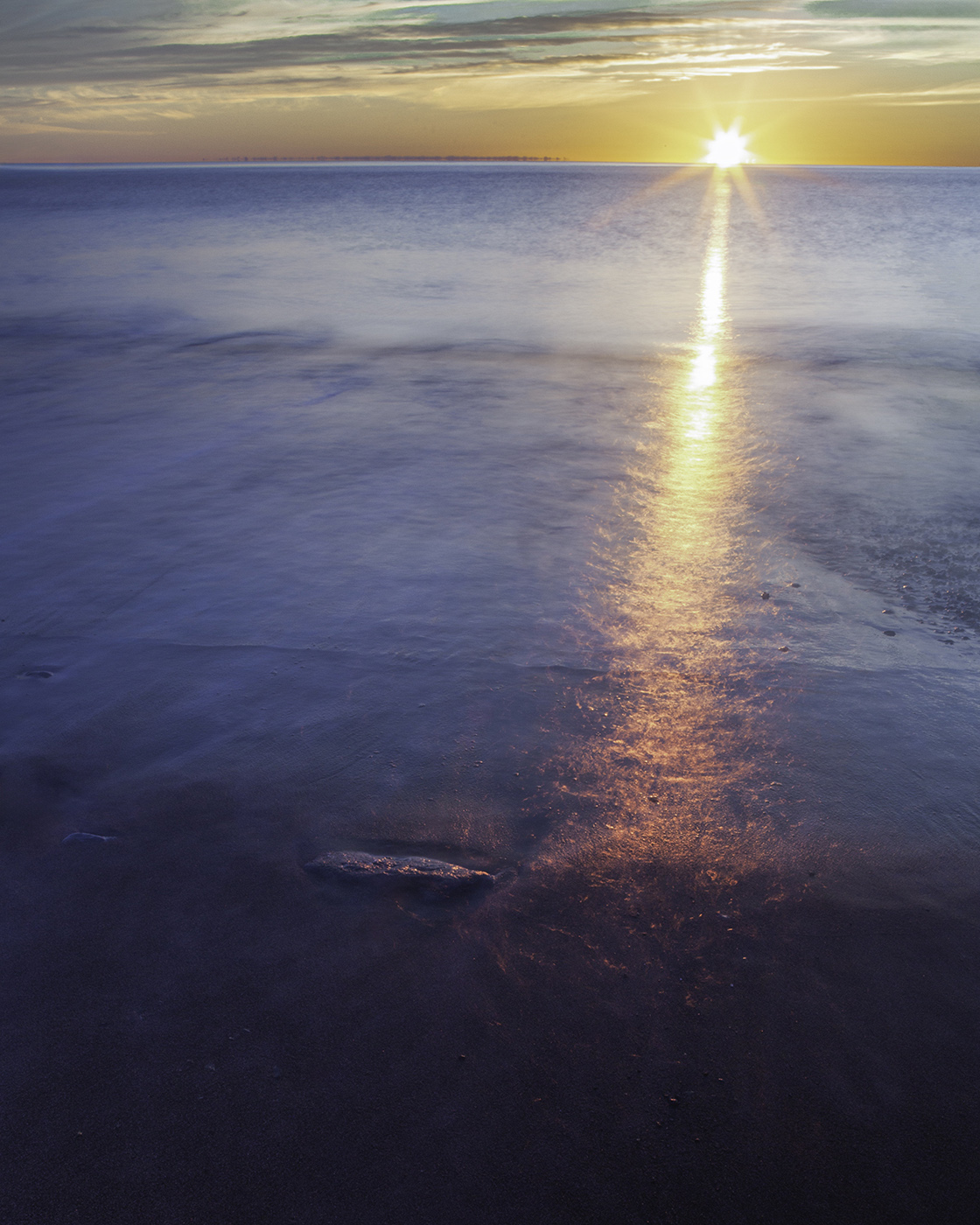
Sabine, I am mesmerized by this image. This is an image I enjoy each time I see it. I like how these colors are sharply and distinctly separated by a perfectly straight horizon line. The shifting color tones of the magnificent blues and oranges are striking and very intense, which is part of the allure to me. I find that the shifting color of the blues from dark to light along with its soft horizonal lines created by the waves leaves me with a nice calm feeling, whereas the intensity of the oranges leaves me feeling just the opposite, but in a good way that I can't yet describe. The dark horizontal line near the bottom of the image does draw my attention away from what I enjoy most about this image, which is the intensity of the contrasting colors. A very creative and challenging image. Great job! |
Jun 13th |
| 9 |
Jun 25 |
Comment |
Sylvia, I like the leading line of the stairs taking me up into a forest area with its soft inviting features. The trees look magnificent.
The bright highway is a little distracting to me, so I darkened it a little as well as making the staircase a little lighter, using Lightroom masks for both tasks. This frees me to navigate through the image a little more without being distracted. Of course, these are my preferences, what do you think?
|
Jun 11th |
 |
| 9 |
Jun 25 |
Comment |
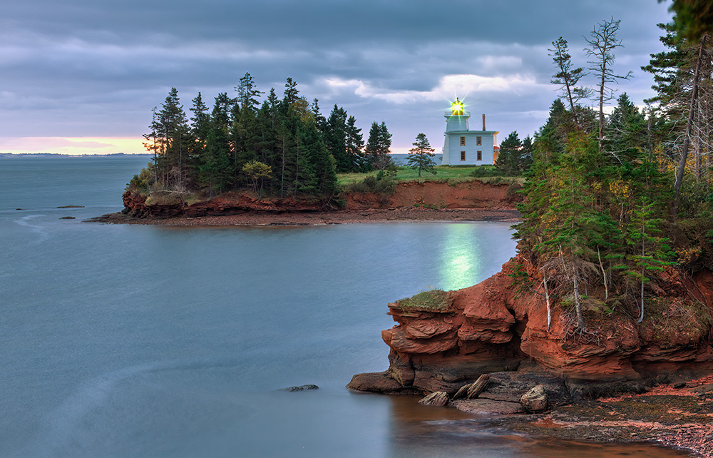
Amazing! I had to study this image to really understand what it was I was looking at. Great capture and post processing. I like this image mostly for the leading lines of the waters edge that takes me to a place beyond the tower and leaves me wondering what is there. Very creative capture and done well. |
Jun 11th |
| 9 |
Jun 25 |
Reply |
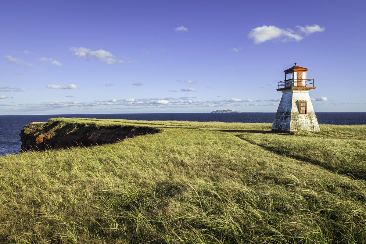
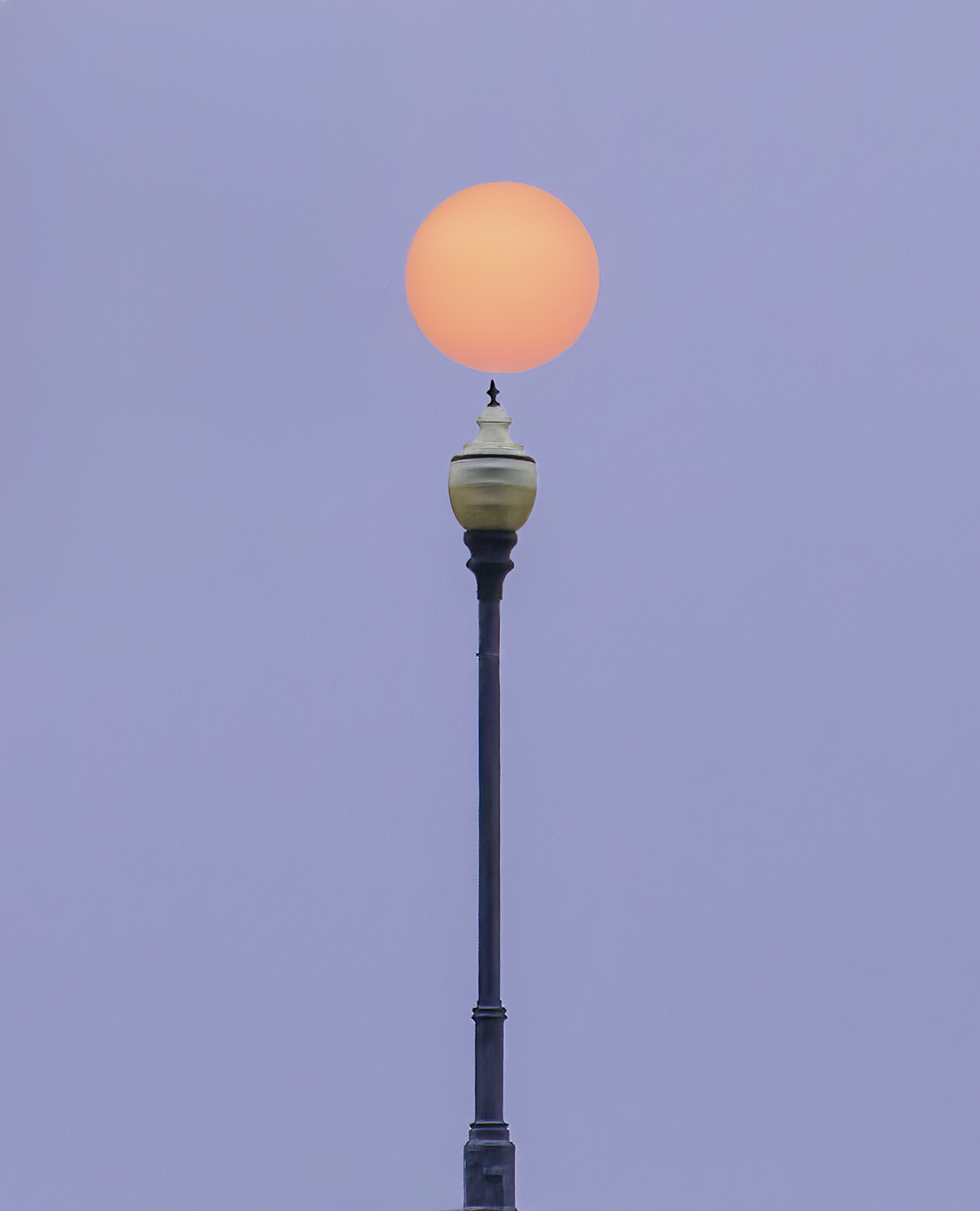
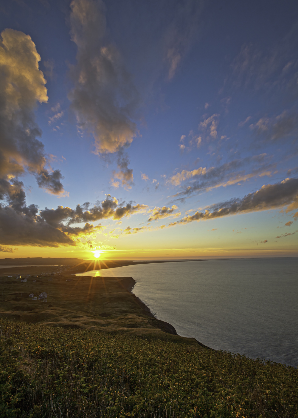
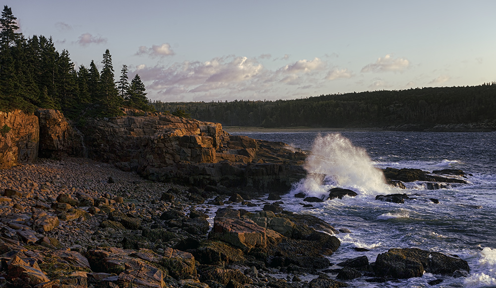
I mentioned it for the sake of full disclosure. Back in 2013, I tried to capture all the shadow details late in the day of the cliff on the left-hand side and for some reason, I never processed the three images for this shot. My camera at that time didn't have the dynamic range my gear now has. For this month's June submittal, I decided to submit this image after processing the three exposures in Photomatrix Pro simply for practice. But to your point, I could have simply processed in Lightroom one of the three images that was well exposed. In fact, I'll probably go back and do just that, after I straighten the horizon! |
Jun 11th |
| 9 |
Jun 25 |
Reply |
Hand held at that shutter speed and f stop. Nicely done. |
Jun 11th |
| 9 |
Jun 25 |
Reply |
Thanks Sylvia. It's funny, until your comment I never noticed the difference in elevation between the edge of the cliff and the land at the lighthouse. And I understand now how distracting that can be. As I write this, I remember how irregular the land elevation was across the whole Island and the rise and fall of the elevation is not unusual. Thanks again for your feedback Sylvia. |
Jun 11th |
| 9 |
Jun 25 |
Reply |
Yes, the island trip is one of my more memorable vacations. I'm still in shock that I didn't notice the horizon was off. Good catch. Your crop works for this image, but I'm not sure which I like better at this time. Thanks Douglass for your feedback, always appreciated. |
Jun 11th |
| 9 |
Jun 25 |
Comment |
Randy, I like this image. It is perfectly exposed. The lighting and colors of the floor, walls and ceiling along with their light reflections are warm and inviting. The many lines, shapes of arches, squares and are captivating. The color of the paintings complements the color of the overall scene nicely and becomes the focal point that draws me into the scene. I am curious about what your camera settings and lens used. Very well done! |
Jun 9th |
| 9 |
Jun 25 |
Comment |
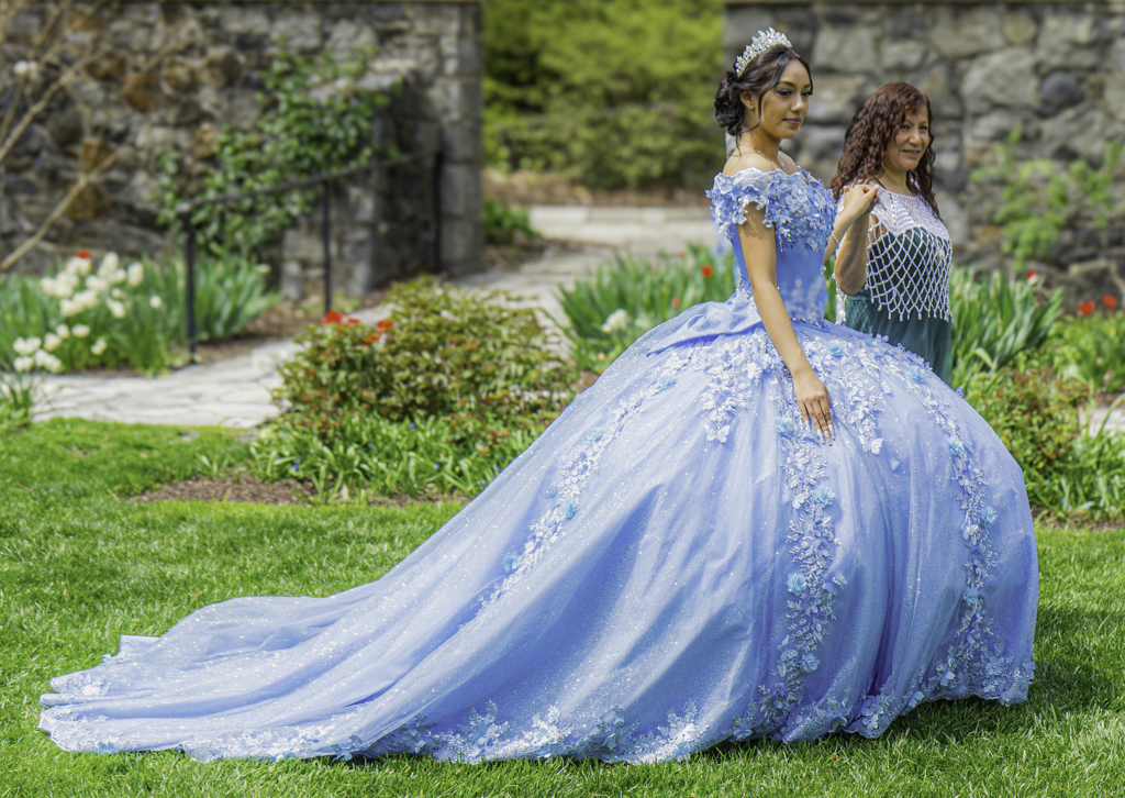
Douglas: This is a lovely scene. Perfect profile of the young girl in a stunning blue gown. The expression on the young girl's face is endearing. Both women and gown are in focus and sharp with good depth of field for the background. Your goal appears to focus solely on the beauty of the dress, which you certainly succeeded. However, my preference would be to compose the scene with more space between the couple and the right side edge of the frame, even if at the expense of part of the gown. The scene I thought was just a little over exposed and I created a mask for the gown to reduce the highlights and whites just a little, again a personal preference. |
Jun 9th |
 |
| 9 |
Jun 25 |
Comment |
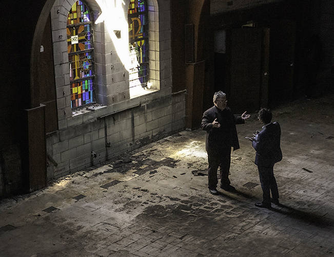
Yvonne, what a great opportunity to see, photograph and be a part of this great recent history. I am drawn immediately to the beautiful stained glass windows and then to the sad deteriorating interior which has a story of its own. I think the exposure is done well and I'm not as distracted by the bright light given the backstory you provided. The candid shot of the priest with the guest he is talking with really adds interest and context to this image. Using masks in Lightroom, I did lighten the two people in the image a little bit, which may, or may not be an improvement. Your original exposure may tell a better story. Great job! |
Jun 8th |
 |
6 comments - 8 replies for Group 9
|
| 21 |
Jun 25 |
Reply |
Thank you Marilyn. |
Jun 19th |
| 21 |
Jun 25 |
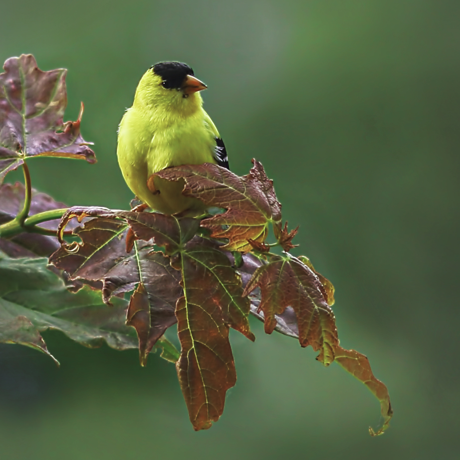
Comment |
Marilyn, this is a beautiful photo. The emerald eyes and yellow face are captivating. The pose of the birds body and wings are perfect especially while looking directly at you. The entire bird is in focus and sharp. The background has just the right amount of bokeh. Very well done. |
Jun 17th |
| 21 |
Jun 25 |
Comment |
Don, I like Tom's crop and the ducks reflections in the water. |
Jun 17th |
| 21 |
Jun 25 |
Reply |
Yes, a possibility I'm still considering. Thanks Don. |
Jun 17th |
| 21 |
Jun 25 |
Comment |
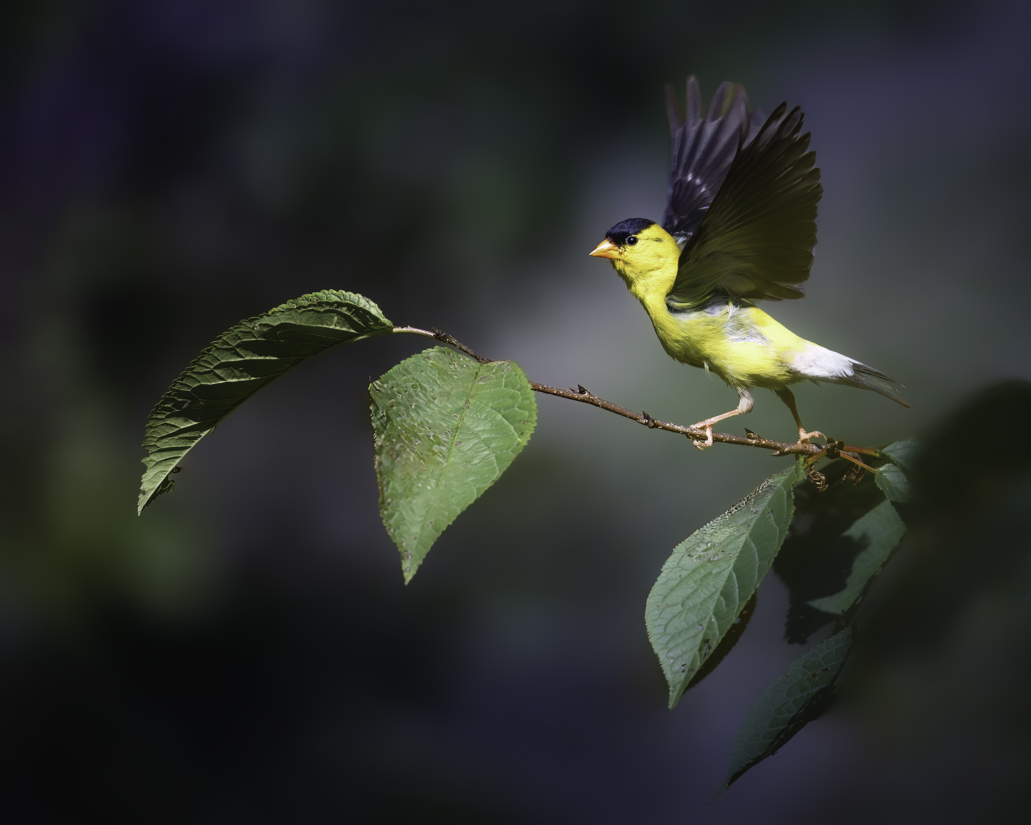
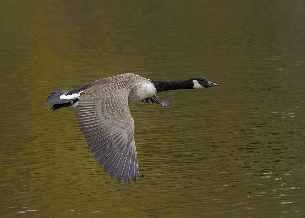
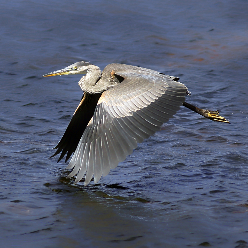
Mike, what an interesting bird which I have never seen before this image. I like the pose of the bird in flight and the soft brown color of the bird's body feathers. The colors and patterns in the face and neck are fascinating. I like the background colors, with a preference to soften the background a bit more.
|
Jun 16th |
| 21 |
Jun 25 |
Comment |
Tom, a very creative and interesting project. The form of this bird in flight is perfect and your post processing skills are impressive, especially when defining every detail. Nicely done. |
Jun 16th |
| 21 |
Jun 25 |
Comment |
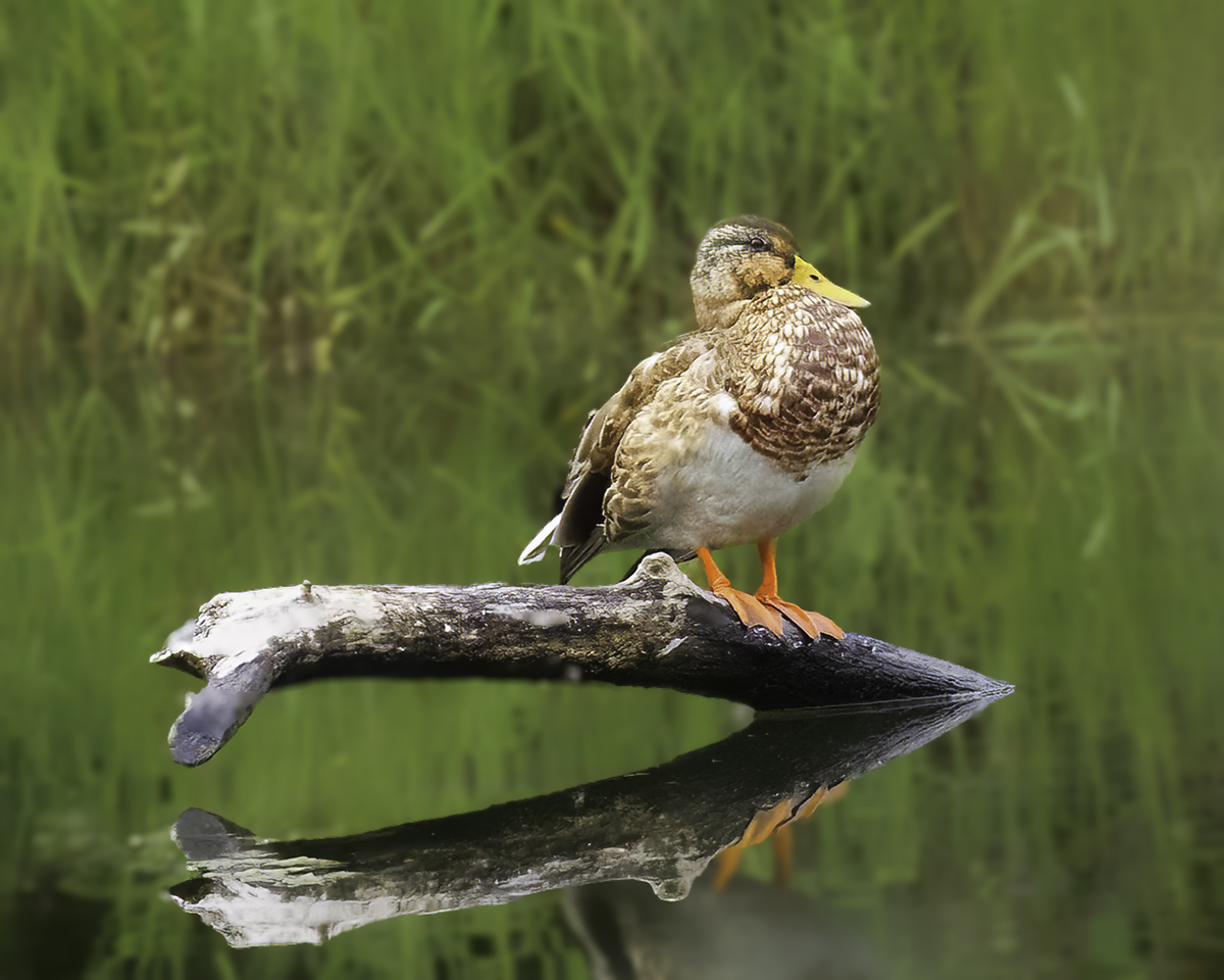
Very nice image. The detail and color are spot on and I think the poise of the bird on the reed makes this image. I like the surrounding reed background, maybe the sky could be a little lighter, brighter? My preference. Nice job. |
Jun 16th |
| 21 |
Jun 25 |
Reply |
Mike, thank you for your feedback. I will revisit my original and play with different cropping options. I know the branch can be distracting. |
Jun 16th |
| 21 |
Jun 25 |
Reply |
Thank you for your feedback Tom. The general consensus seems to be crop the image which makes most sense, but…it will take me a while to fully accept. Funny how we can be really partial to an image, regardless of the quality of the post processing. |
Jun 16th |
| 21 |
Jun 25 |
Comment |
Leslie, this is a very nice capture. I like the birds "attitude" poise and challenging look, while he looks right at you. Even the crossed reeds supports the appearance of "Don't tread on me". Everything is in focus and sharp with great detail, even in the blacks. Great image. |
Jun 11th |
| 21 |
Jun 25 |
Comment |
Thank you Ted. |
Jun 11th |
| 21 |
Jun 25 |
Reply |
Thank you Leslie. Since your response, I have been playing around with different crops, something I didn't do enough of before, but haven't settled on any particular one yet. |
Jun 11th |
7 comments - 5 replies for Group 21
|
| 42 |
Jun 25 |
Comment |
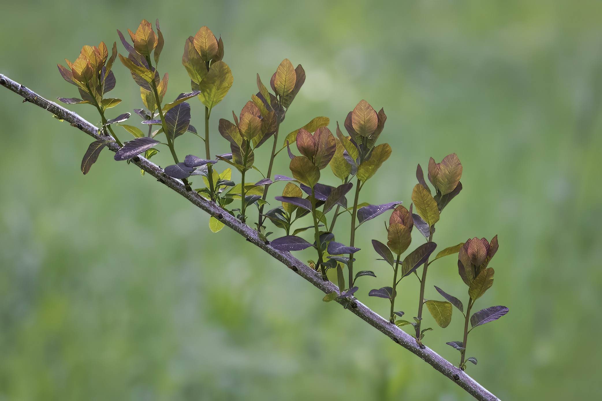
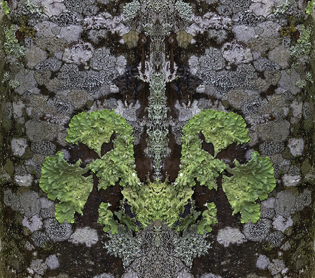
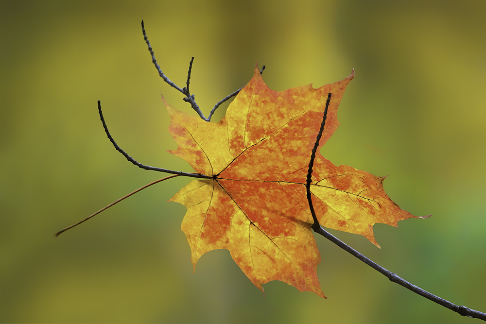
Charles, I like the image created by the symmetrical shapes of the leaves and their diagonal position within the frame. It reminds me of nature's ability to create beautiful images like this. You have inspired me to grab my macro lens and start shooting. |
Jun 18th |
1 comment - 0 replies for Group 42
|
14 comments - 13 replies Total
|