|
| Group |
Round |
C/R |
Comment |
Date |
Image |
| 9 |
Feb 24 |
Comment |
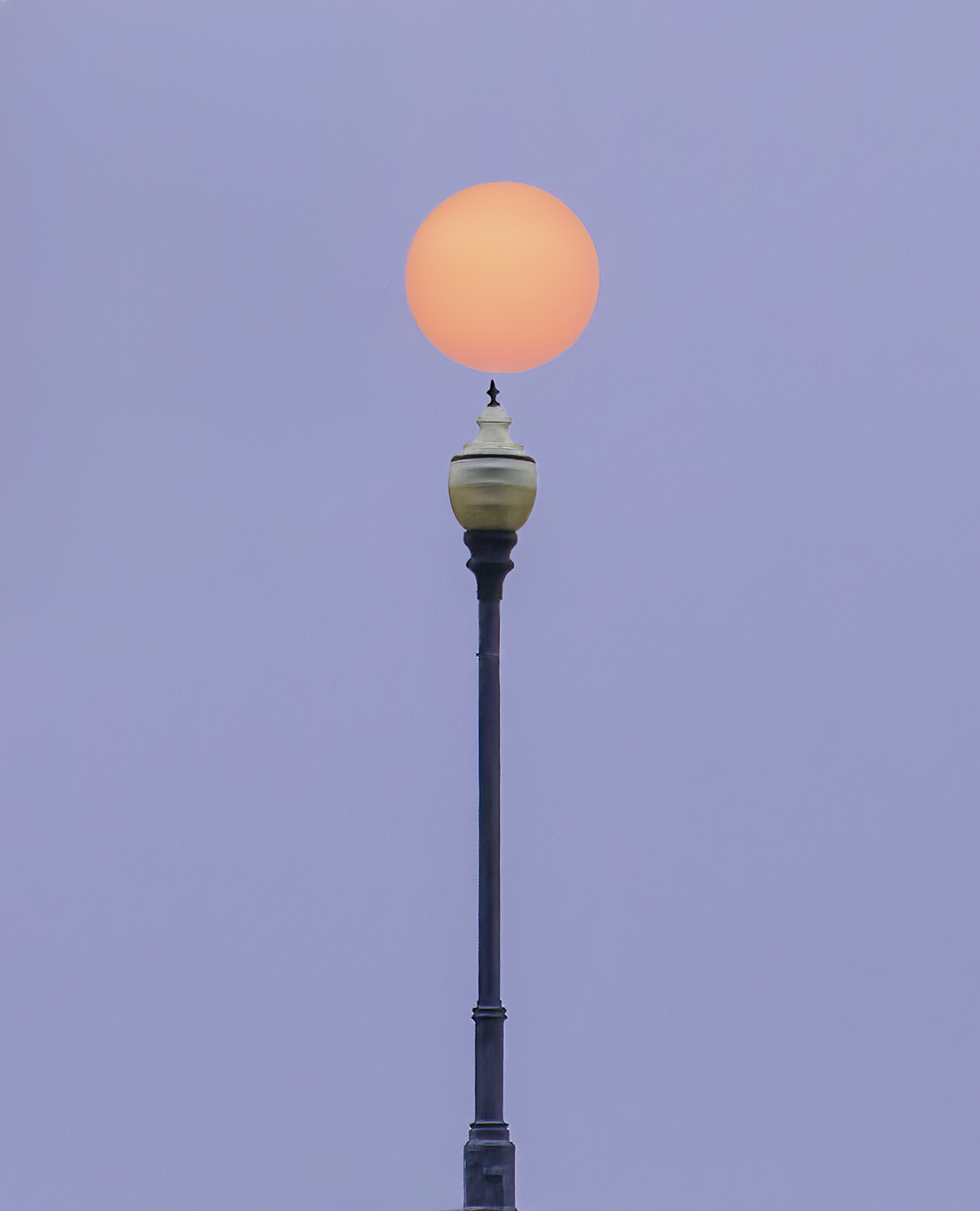
Thanks Chuck, the side view is certainly more pleasing to the eye. Thanks. |
Feb 24th |
| 9 |
Feb 24 |
Comment |
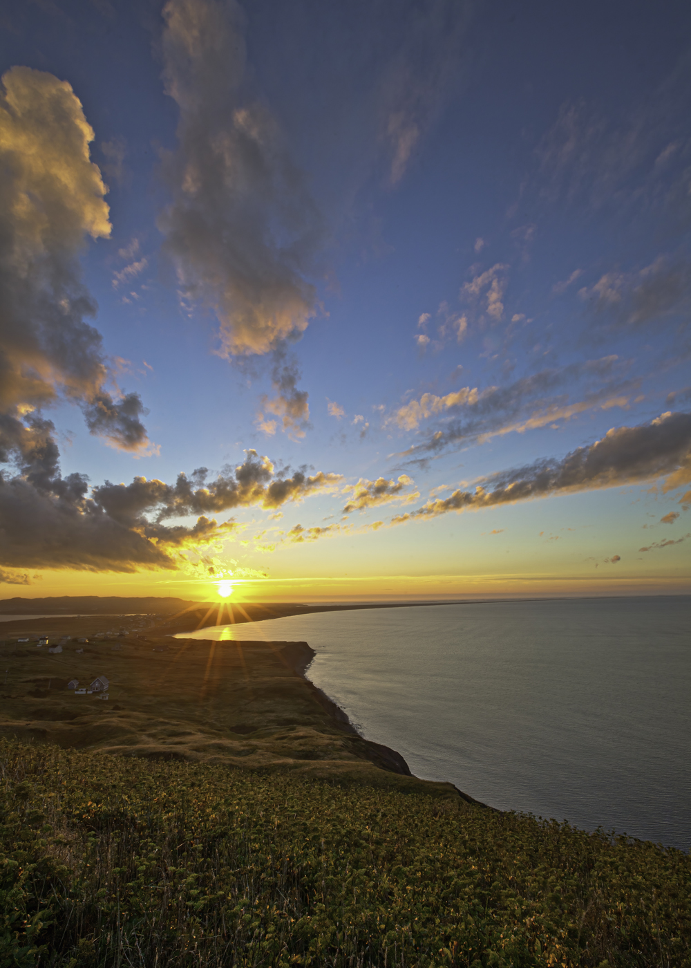
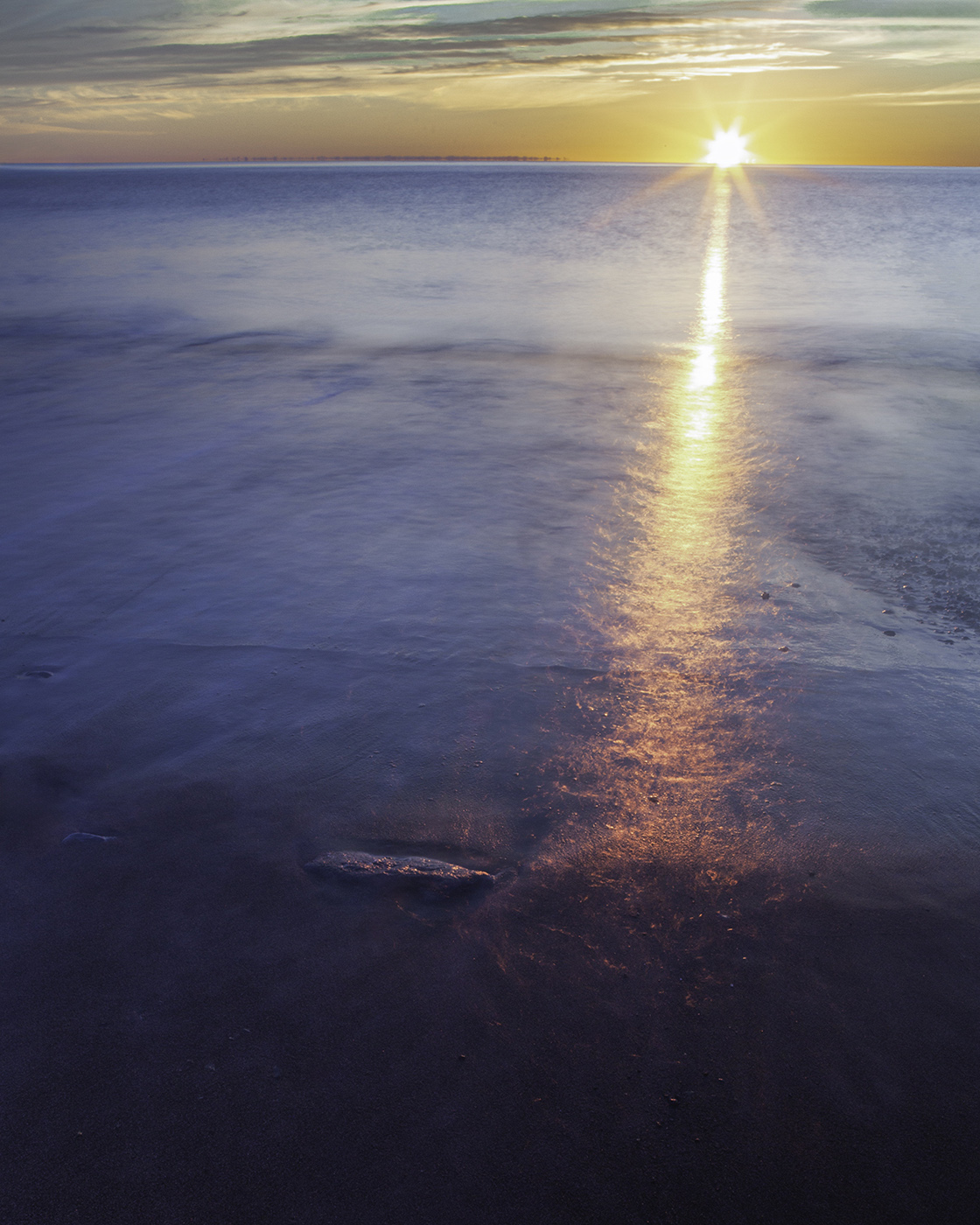
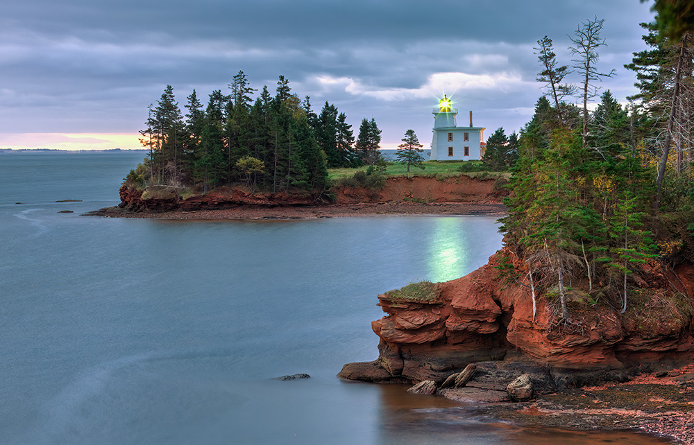
Sabine, very inviting image of a sea side "Blue Hour" photo. This color blue with multiple leading lines of the low pylons, the pier, pier railing ,lit lamp lights and the lamp light reflections in the water all ending at the hut really create a lovely image. Beautiful image. |
Feb 17th |
| 9 |
Feb 24 |
Comment |
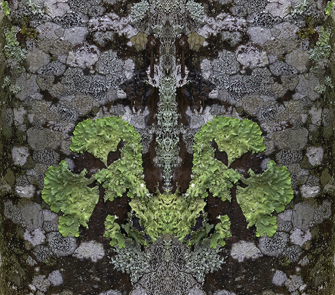
I really enjoy looking at this image. The symmetry of the lines and shapes along with the different shades of gray throughout the image, and the composition are fantastic. Really a great shot. My only comment would be that the windows are a bit bright and distracting to me. I hesitate to comment further, but in the case that you don't know, I offer the following. If you used a tripod, combining one shot at exposure, one minus and one plus, would provided an image where adjustments could be made to bring out more detail in each window. However, I suspect the shot was taken handheld, in which case, using a mask in any photo editing program on each of the windows would allow making some adjustments to bring out more detail. I've been traveling with no access to photoshop, so I'm unable to experiment with your photo, but when i return home, I'll give masking a try if you like. My comments certainly don't detract from every other fantastic aspect of the your photo. It is a joy to look at. |
Feb 17th |
| 9 |
Feb 24 |
Comment |
Sabine, very inviting image of a sea side "Blue Hour" photo. This color blue with multiple leading lines of the low pylons, the pier, pier railing ,lit lamp lights and the lamp light reflections in the water all ending at the hut really create a lovely image. Beautiful image. |
Feb 16th |
| 9 |
Feb 24 |
Comment |
Great job with post processing Linda. I agree with comments made by other group members. I enjoy the contrast between the red, white and blue colors, and in particular the enhanced red and blue. The large rectangular red shape as well as all the horizontal, vertical and angular lines in the stairs, brick and siding draw my attention to view a perspective that often escapes me when trying my hand at street photography. Your work often does that for me which I appreciate. When viewing an image like this, I often asses what I think are distractions to determine if they add anything to the image from my perspective. I think removing the number "2" from the door and entire cable, as Douglas suggested, along with removing the sticker in the doors window pane, would help me to stay focused on your composition. Very nice image. |
Feb 16th |
| 9 |
Feb 24 |
Comment |
I really enjoy looking at this image. The symmetry of the lines and shapes along with the different shades of gray throughout the image, and the composition are fantastic. Really a great shot. My only comment would be that the windows are a bit bright and distracting to me. I hesitate to comment further, but in the case that you don't know, I offer the following. If you used a tripod, combining one shot at exposure, one minus and one plus, would provided an image where adjustments could be made to bring out more detail in each window. However, I suspect the shot was taken handheld, in which case, using a mask in any photo editing program on each of the windows would allow making some adjustments to bring out more detail. I've been traveling with no access to photoshop, so I'm unable to experiment with your photo, but when i return home, I'll give masking a try if you like. My comments certainly don't detract from every other fantastic aspect of the your photo. It is a joy to look at. Another comment; I like both the B&W and color images equally. Both fantastic images to see. |
Feb 16th |
| 9 |
Feb 24 |
Reply |
I had to laugh at your comment Yvonne. No worries, my wife wont look at it either. |
Feb 14th |
| 9 |
Feb 24 |
Comment |
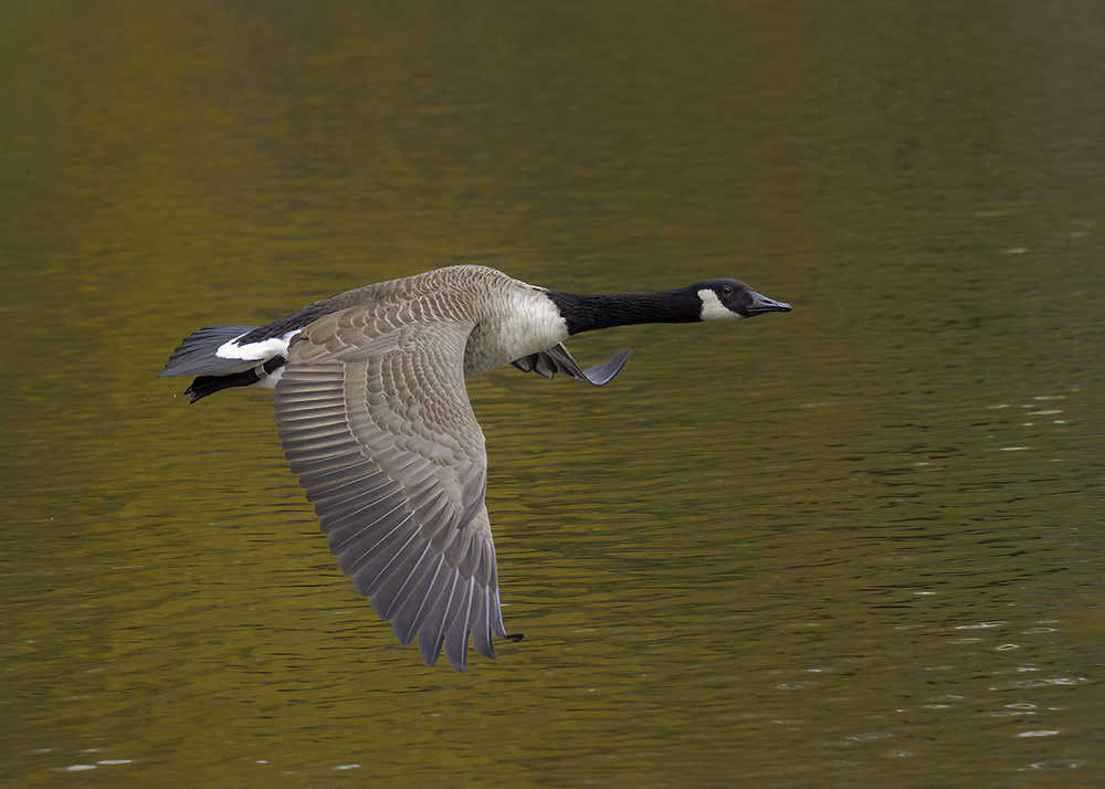
Midground and foreground and the geese are in focus and sharp. I Like the blurred background that creates good separation with the geese. Love the funny interpretations of the geese's action expressed by Sylvia & Douglas, which I tend to agree with. Nice action composition with good exposure. Very well done. |
Feb 14th |
| 9 |
Feb 24 |
Comment |
Good exposure that intensifies the color in the clothing and hat, as well as the subjects skin tones. Subject is in focus and sharp. Out of focus background creates nice separation with your subject to help accentuate mood in his facial expression. Your background composition is done well with no distractions. I am impressed with the quality of your PSA workshop photos Douglas. This particular image is done very well. |
Feb 14th |
| 9 |
Feb 24 |
Comment |
Thanks Douglas, I'm happy my contribution adds value to this process, just as feedback from group members here has helped me learn and see images from a different point of view. |
Feb 14th |
| 9 |
Feb 24 |
Comment |
Sylvia, you have a very creative style in your photography that is fun to see that doesn't disappoint this month. The patterns and colors are reminiscent of my tie-dyed clothing days of the 60's. Great job! |
Feb 13th |
| 9 |
Feb 24 |
Reply |
Thanks Sabine, I agree. Interesting how the subtle changes I made based on Silvia's feedback improved the image. |
Feb 13th |
| 9 |
Feb 24 |
Comment |
Thanks Sylvia. The background of the original consisted of green trees providing a great green background. The background of the frontal shot included trees, but more skylight, making it a bit more challenging for me to darken, as you suggested. But, I did revisit this image in Lightroom making minor mask adjustments to the background in the Tone sliders for highlights, shadows and blacks. I also created a subject mask and made similar adjustments for highlights, shadows and whites. Maybe these changes did improve the background a bit. What do you think? |
Feb 13th |
 |
| 9 |
Feb 24 |
Reply |
Thanks Sabine. |
Feb 13th |
| 9 |
Feb 24 |
Reply |
Thank you Linda |
Feb 13th |
| 9 |
Feb 24 |
Reply |
Thanks Cindy. |
Feb 13th |
11 comments - 5 replies for Group 9
|
| 97 |
Feb 24 |
Reply |
thank you Hans. |
Feb 17th |
| 97 |
Feb 24 |
Reply |
Thanks Kathleen. |
Feb 14th |
| 97 |
Feb 24 |
Comment |
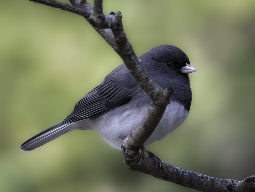
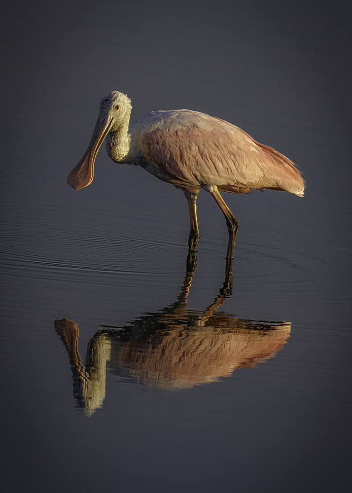
The pose of the bird and its water reflection is perfect. The subtle catchlight in its eye is great and the blending colors of its feathers and on its bill is fantastic. I've only seen photos of this animal but never with as much detail as seen in your photo, very interesting. Beautiful photo Julia. I agree with Roy and masked the subject in lightroom and made slight adjustments to the highlight, shadows and white sliders, leaving the background alone. I also cropped just a little. |
Feb 13th |
 |
| 97 |
Feb 24 |
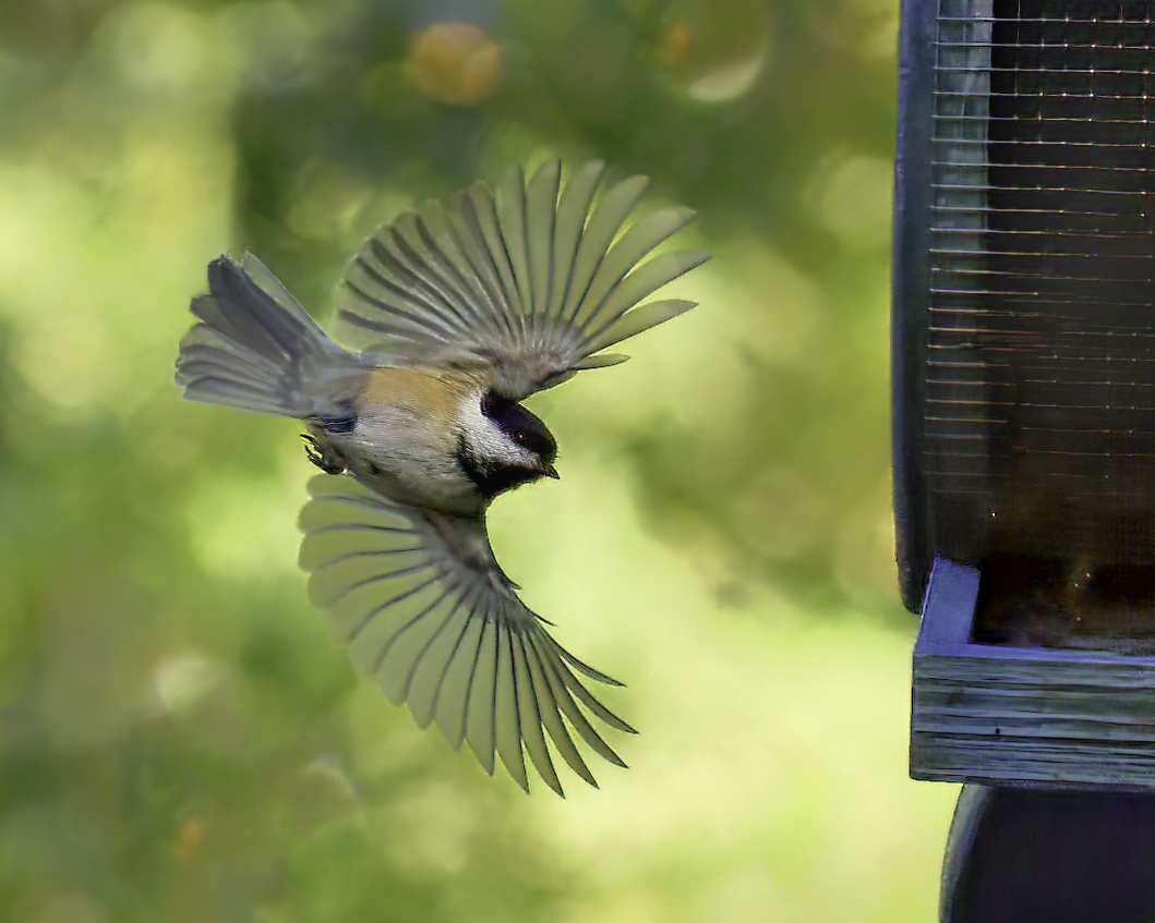
Comment |
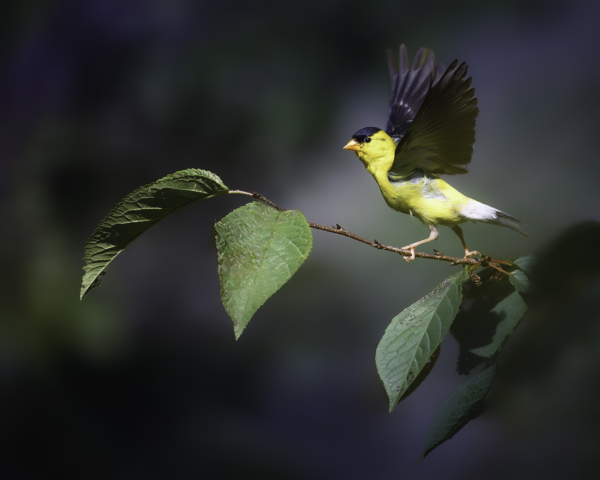
Hans, it looks like the bird stopped in mid flight just to pose for you. Really a great action photo with the wings and body position and looking straight at you while obviously expressing himself with its beak wide open. Nice exposure (post processing?) across the underside of its wings and head. Great color of its eyes and open mouth. Very nicely done. |
Feb 13th |
| 97 |
Feb 24 |
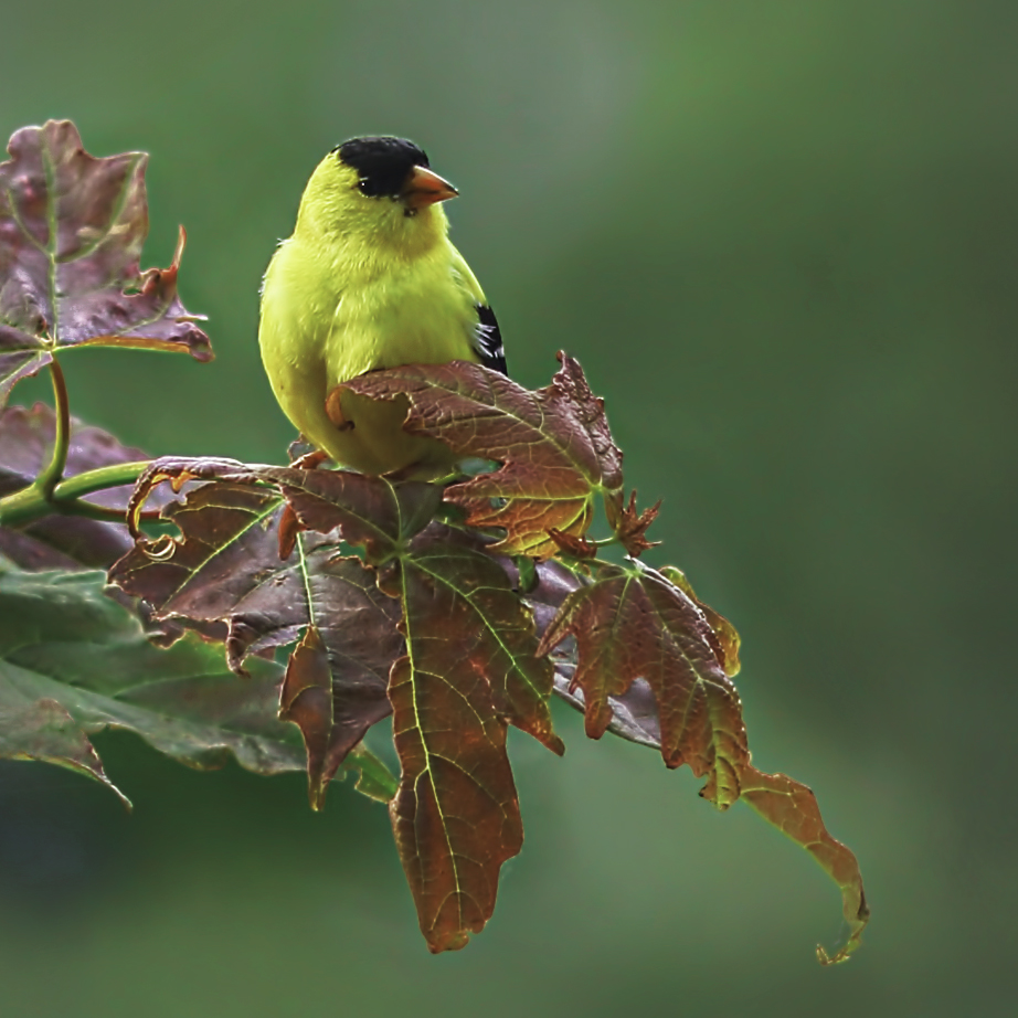
Comment |
Very sharp image of all parts of the bird. I like the pose of the pelican with the catch light in its eye. Beautiful color and texture of brown feathers on its head and bluish green tint around the eye immediately bring my attention to that area of the bird. You are so fortunate to have photo opportunities so close to home. Very nice image Sylvia. |
Feb 13th |
| 97 |
Feb 24 |
Comment |
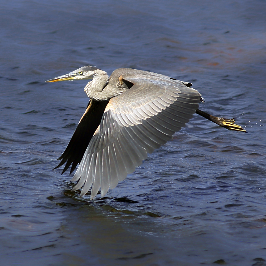
This is a great shot Roy. How lucky to capture this image while the crane is obviously trying its best to hide from you. The complementary colors of blue feathers and green reeds work really well together. The yellow part of the eye really draws my attention to the tack sharp eye framed between two reeds. Nice touch! I like the blurry foreground/background which I'm guessing is a function of the long lens and maybe the aperture size? Very nice image. |
Feb 13th |
| 97 |
Feb 24 |
Comment |
It never occurred to me during post processing to remove the bird feeder. But, I have to agree your crop recommendation is an improvement. I am still undecided how changes to the background exposure improves the image. Regardless, thank you for your feedback Roy, very much appreciated. |
Feb 13th |
| 97 |
Feb 24 |
Comment |
Thanks Sylvia. |
Feb 12th |
| 97 |
Feb 24 |
Comment |
I really enjoy this image, it looks so much like a painting. The overall softness of the colors, especially the background, are soothing and inviting to me. The morning mist with the sunbeam shining down through the mist onto the ducks wings and through the mist into the foreground are perfect. The overall composition works very well for me and the two logs add interest like you would expect to see in the wild. I really cant find any area that needs improvement. This is an exceptional photo. |
Feb 12th |
7 comments - 2 replies for Group 97
|
18 comments - 7 replies Total
|