|
| Group |
Round |
C/R |
Comment |
Date |
Image |
| 9 |
Oct 23 |
Reply |
Douglas, thank you for your comments. Please refer to my response to Yvonne's comments above for clarification regarding my use of photoshop. |
Oct 23rd |
| 9 |
Oct 23 |
Reply |
Yvonne, my apologies. I loosely and incorrectly use the term "Photoshop" when referring to using the post processing software. I purchased Adobe Photoshop CS5 several years ago but never learned its full capabilities (too complicated and time consuming for me) except for its very basic tools. This year I subscribed to Adobe Photoshop Lightroom Classic (LrC), which I find also very challenging for me to learn. While I am self taught with both software applications my experience using Photoshop has been useful towards learning LrC, and at this point in time, I'm comfortable using the sliders under the "Basics" and "Tone Curve" tabs in the "Develop" module. Still a long way to go. I refer to lots of YouTube training guides presented by anyone who is teaching some aspect of LrC, like Matt Kloskowski, Alister Benn, Anthony Morganti, and others. These YouTube sessions are very useful to me but as I said, its a steep learning curve. Thank you for your comments and support. Very much appreicated. |
Oct 23rd |
| 9 |
Oct 23 |
Comment |
Sylvia, love all the geometric shapes and arches. The frame within a frame within a frame, along with the different shades of color on each frame from dark to light, leads me through the image to the center. Removing the exit sign is a significant improvement. I think a mono-pod would be allowed, which would have permitted you to take two-three images at different exposures, and then combine the two images in post processing, or possibly done in camera, depending on model. In any case, very nicely done. |
Oct 19th |
| 9 |
Oct 23 |
Comment |
Douglas, for me the age and beauty of the window combined with more modern and beautiful sculpture is what makes this image. Cropping as you did makes me focus more on the story being told by the window and sculpture. Great subject matter. Nicely done. |
Oct 19th |
| 9 |
Oct 23 |
Comment |
Yvonne, what a great image! The diagonal shapes between the green and yellow really grabbed my attention and the combination of architecture and nature makes for a very interesting image. The fingers of the vine at each level, continue to slowly reach out for more of the structure. To me, it's a battle between nature and building, which one will win over time. I like your post processing for color, very bold and really makes this image pop. I do like the crop by Sabine, seems to create more balance to the image. Otherwise, I wouldn't change a thing, very nice image. |
Oct 19th |
| 9 |
Oct 23 |
Reply |
Thanks Cindy. |
Oct 19th |
| 9 |
Oct 23 |
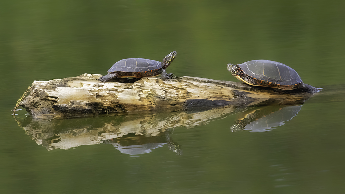
Comment |
Interesting capture of two fellas quite comfortable with their habit and if I had to guess, they seem like they would have been happy to pose for you with your camera as well. Nice job Linda. |
Oct 19th |
| 9 |
Oct 23 |
Reply |
Thanks Yvonne. New to learning photoshop this year, and its been a steep learning curve. Its a slow process. |
Oct 12th |
| 9 |
Oct 23 |
Reply |
Thank you Sabine |
Oct 12th |
| 9 |
Oct 23 |
Reply |
Thank you Sylvia |
Oct 12th |
| 9 |
Oct 23 |
Comment |
Cindy, I like everything about this image. The composition of the barn, the gravel road, green lawn and cornfield are simple elements that make this an interesting photo. Its surprising to me at how improved the image is just by Flipping the photo as you did. The sunset sky creates nice subtle color separation from the ground and the remaining sky, and the color and detail of the remaining sky really makes this image POP for me. I'm undecided if making the barn structure lighter (creating some separation) really improves the image, or takes away from the overall story. A very pleasing photo. |
Oct 8th |
| 9 |
Oct 23 |
Comment |
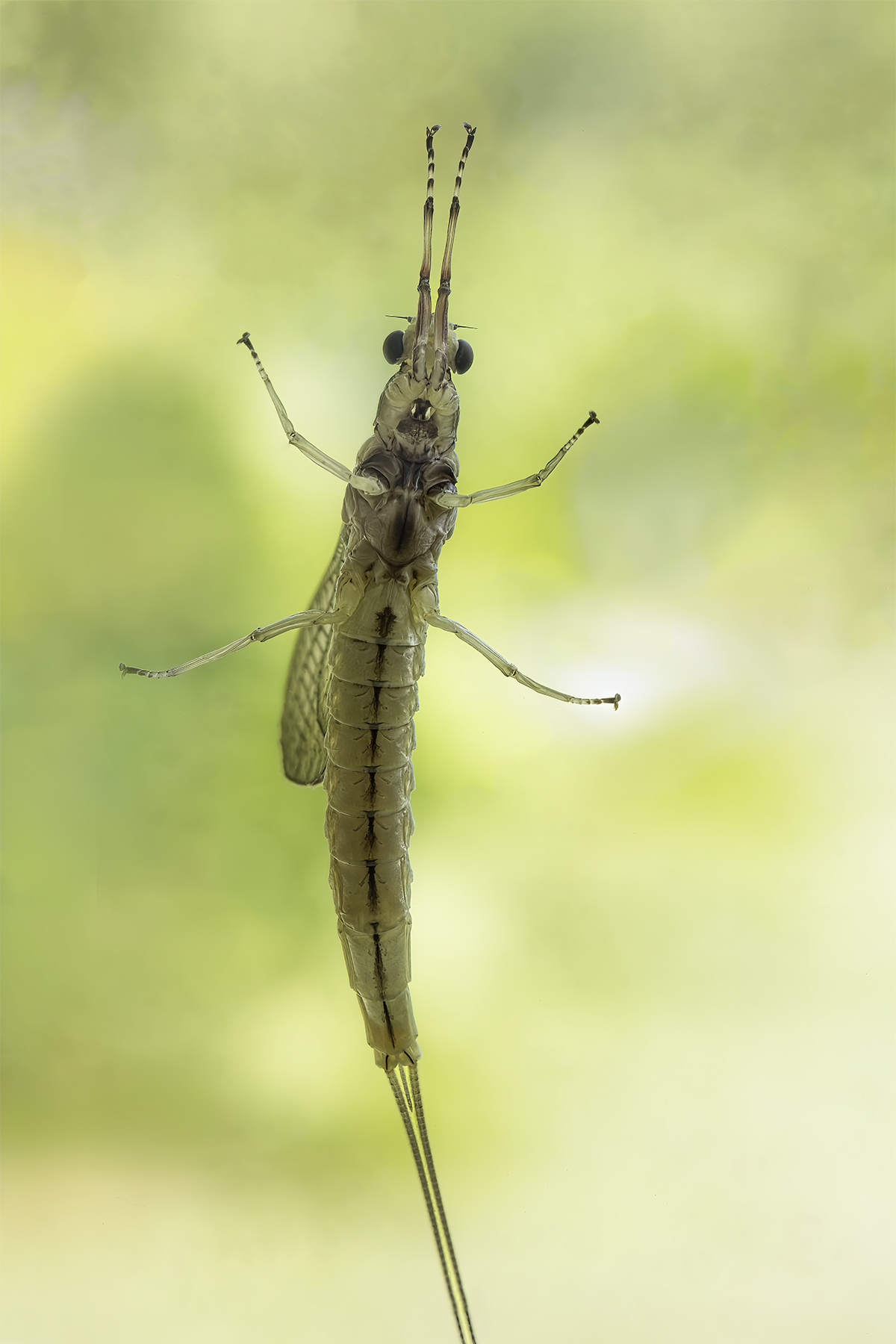
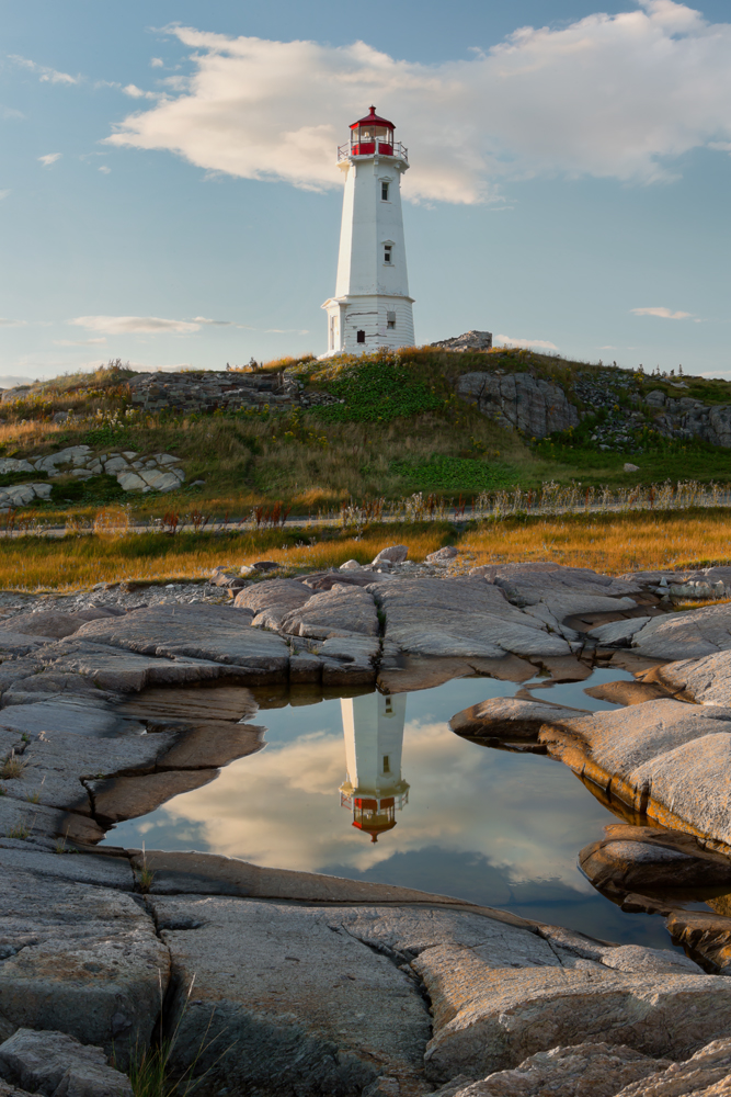
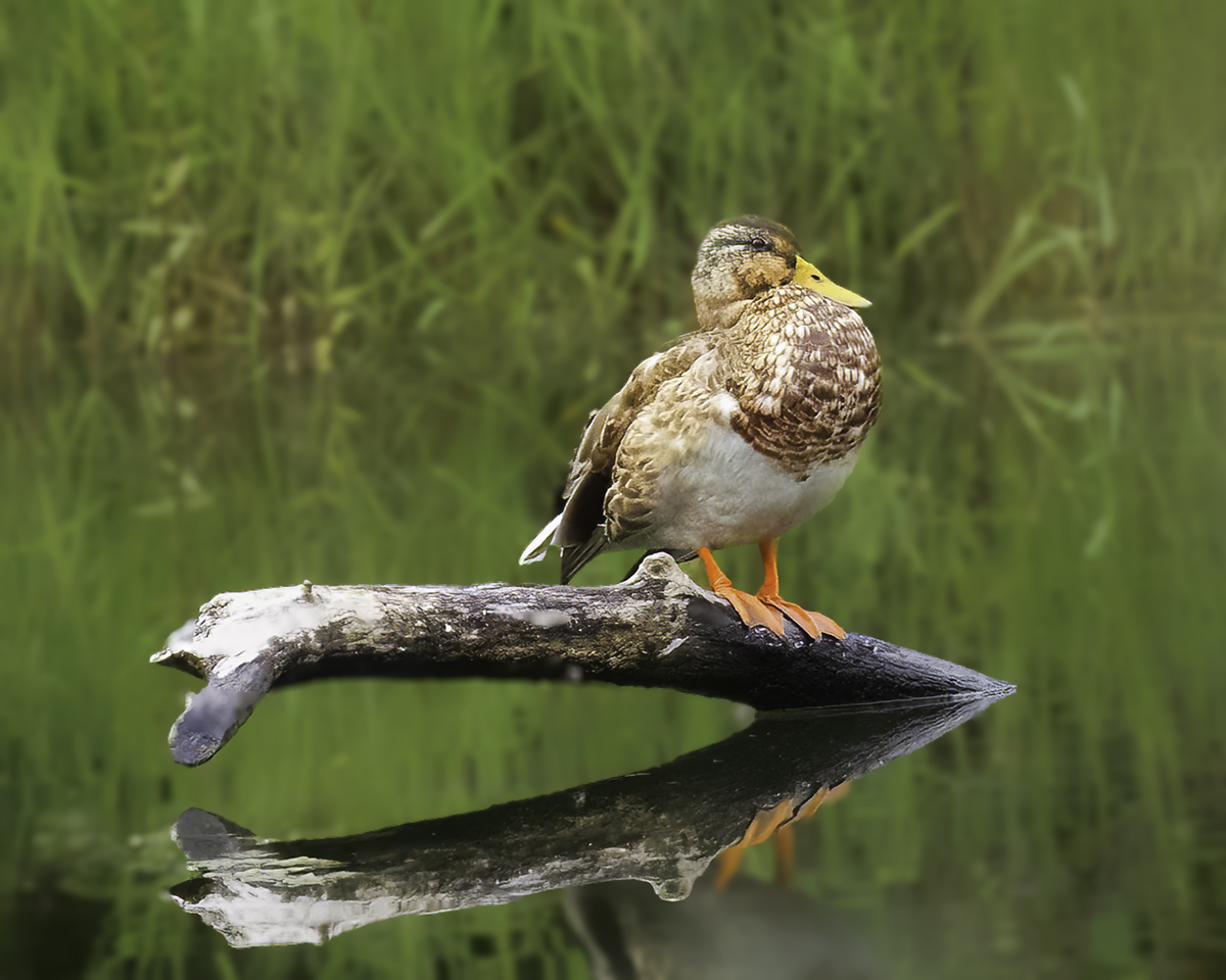
What a gorgeous image! Very interesting foreground setting with rocks, fencing and birds set in a warm morning glow with the mist/fog. Inviting and comforting. Which of the tint, saturation or luminance adjustments were made to reduce the radiation of the sun? Were they Global/Local adjustments? Personally, I would have removed some of streaks in the clouds and lowered the sky from the top, but that's just me. Curious about your thoughts; do you think removal of the streaks would impact photo integrity at all? Really enjoy seeing this image Sabine. |
Oct 8th |
6 comments - 6 replies for Group 9
|
| 97 |
Oct 23 |
Reply |
Thanks Kathleen |
Oct 12th |
| 97 |
Oct 23 |
Reply |
Thanks Hans. I like the warmer color as well, but I also like the improvement to the bird made by Roy's changes. |
Oct 12th |
| 97 |
Oct 23 |
Reply |
Thanks Kathie |
Oct 12th |
| 97 |
Oct 23 |
Comment |
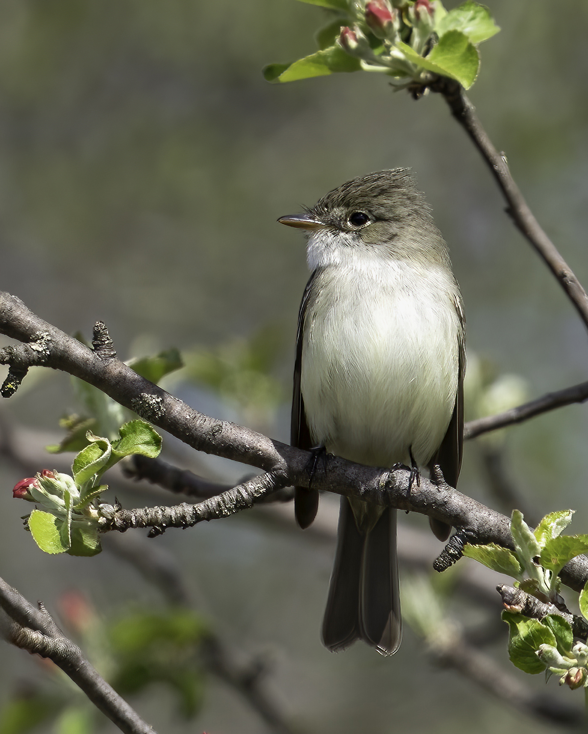
Thanks Kathie, and hand held I'm guessing. Nice and sharp for hand held, great detail for that distance. Very interesting bird, appreciate seeing it for the first time. |
Oct 3rd |
| 97 |
Oct 23 |
Reply |
Yes, I agree. Its funny; during my initial post processing, I did darken the background more but feared it might be a little to dark. But, I can see that your change does make a difference, does create more separation and improves the image. Thanks Roy. |
Oct 3rd |
| 97 |
Oct 23 |
Comment |
Love the feather colors and the soft bokeh works well as a background. Agree with the comments above but really nothing else to add. Nice job. I am curious about the focal length you used and how far you were from the bird. |
Oct 3rd |
| 97 |
Oct 23 |
Comment |
What a nice shot. The side profile is great, the different color contrast in the feathers along with the water droplets really make this image. Agree with the comments, and I would cautiously add that applying a background mask to reduce background texture to soften the background, and then darken just a little, might create more separation from the bird and its background. It's a subjective thing, but sometimes works for me. |
Oct 3rd |
| 97 |
Oct 23 |
Reply |
Thanks Roy, great image! |
Oct 3rd |
| 97 |
Oct 23 |
Reply |
Thanks for your comment Sylvia, which I agree with. Even though I did add a little more space when cropping, it just wasn't enough. It's not the first time members have commented with this same issue on previous images, so I have to work a little harder at this on future images. Thanks again. |
Oct 3rd |
| 97 |
Oct 23 |
Comment |
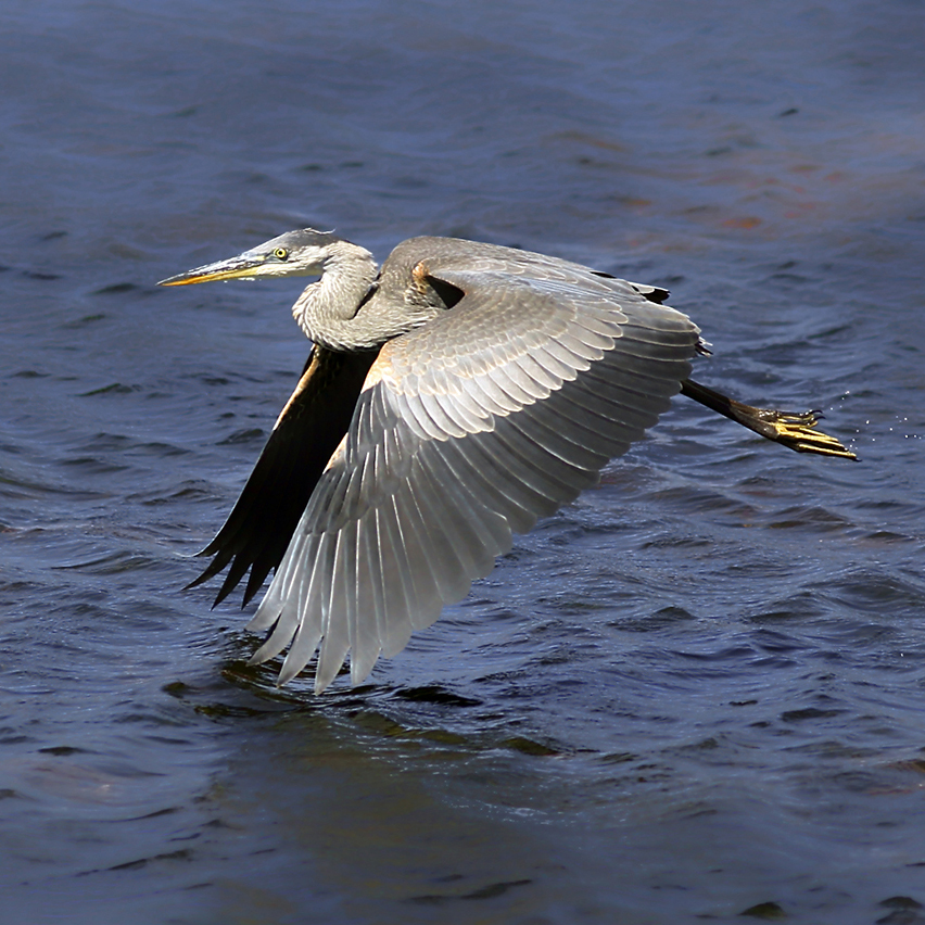
Beautiful shot Roy. I Like the side profile against the soft bokeh background, and the bird is sharp across the profile. All colors are fantastic and the reflection in the water is great. I would be interested to know if you were laying in the prone position near, or at water level, when taking this shot and what lens/focal length you used. I wouldn't change a thing, great image. |
Oct 3rd |
| 97 |
Oct 23 |
Comment |
Fantastic color, sharp foreground, nice background. Bird has sharp detail in the Feathers and the birds head facing more toward you helps make the composition work well. Beautiful image. |
Oct 3rd |
| 97 |
Oct 23 |
Comment |
The head is in focus, exposure is spot on and combining two images into one is nicely done. Beautiful image, great job. |
Oct 3rd |
| 97 |
Oct 23 |
Comment |
Sylvia, what a great opportunity to have an eagle perch in your own backyard. I agree with Hans suggestions, except I prefer your exposure for the eagle itself, which to me reveals more detail in the bird along with a great, in focus head shot. If you had additional time to prepare, I would try to reposition myself to reduce, or eliminate the sky background which might have helped with exposure, and maybe show more of the bird itself. Regardless, its a great shot given the few moments you had to prepare your equipment. |
Oct 3rd |
7 comments - 6 replies for Group 97
|
13 comments - 12 replies Total
|