|
| Group |
Round |
C/R |
Comment |
Date |
Image |
| 9 |
Apr 26 |
Comment |
Linda,
This is a beautiful photograph! I love tulips and the red surrounded by white really pops. Reminds me of the quote: In a world full of copies, be an original.
as for the original, I love the whole scene with the windmill in the background. It really hits home that the red tulip is doing its own thing, but just a gorgeous as her neighbors.
I will miss you in this group, especially your commentary - you have a great way with words. I will look for you on IG, so I hope that you post a lot! And please let us know what PID group you are moving too. Feel free to come back here and visit us!
|
Apr 12th |
| 9 |
Apr 26 |
Reply |
Thanks
|
Apr 12th |
| 9 |
Apr 26 |
Reply |
Thank you. I agree that the green stems should have been removed.
|
Apr 12th |
| 9 |
Apr 26 |
Reply |
I love your edits. I need to look up how to set a black point in the tonal correction. And I agree, removing the green was smart.
|
Apr 12th |
| 9 |
Apr 26 |
Comment |
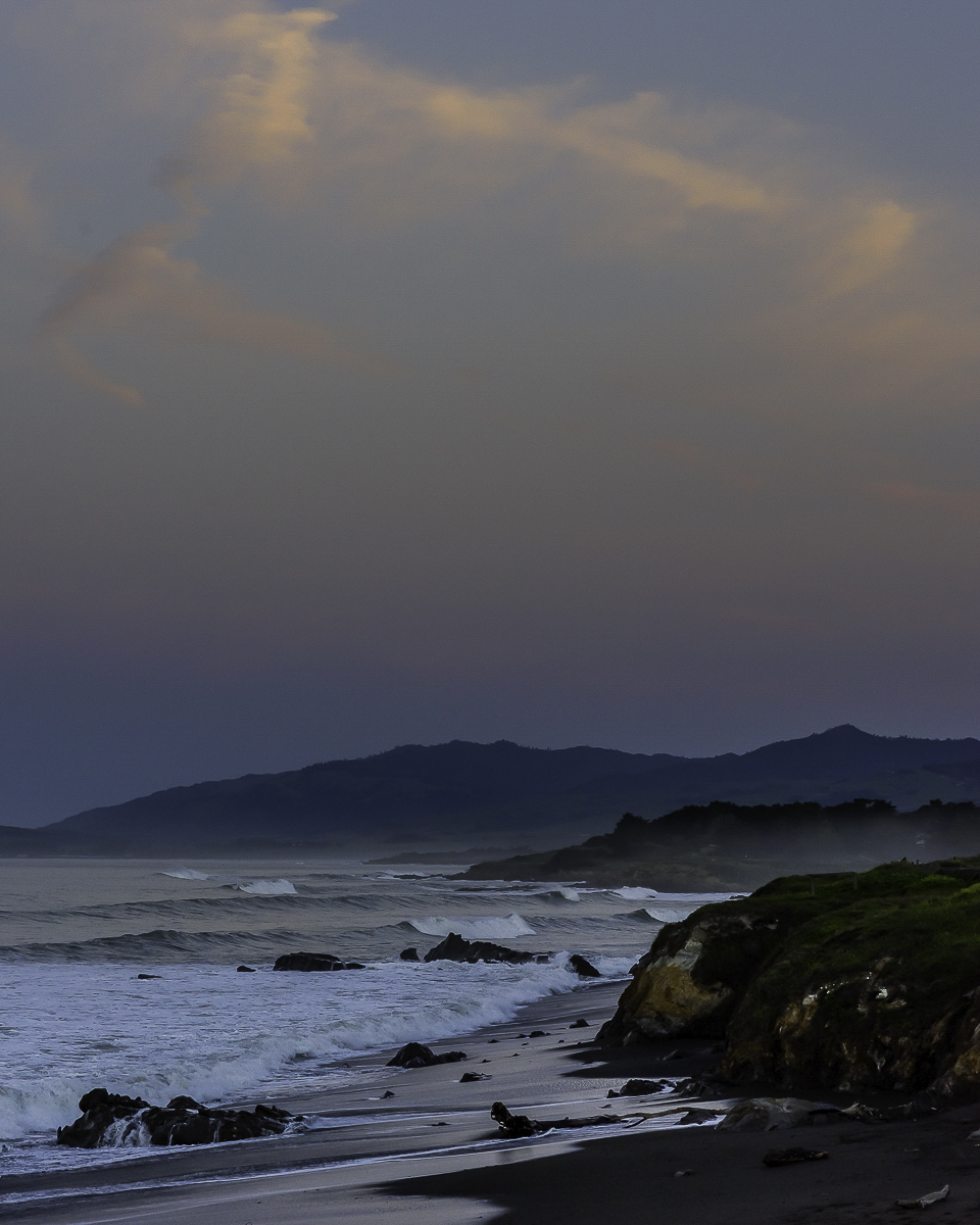
Hi Randy,
Peaceful morning sky! I would love to walk that coastline. I couldn't think of anything I'd do different, until I read Linda's comments. Then I thought I'd play. I added a linear gradient from the bottom and stopped just short of the clouds. I tried both lifting the midtones (I just learned how to do that so try it all the time) and pushing the exposure up a tad. I am not sure which I did in the end. Not a big difference, and not better, just different. I guess it all depends on what you saw that morning. |
Apr 1st |
 |
| 9 |
Apr 26 |
Comment |
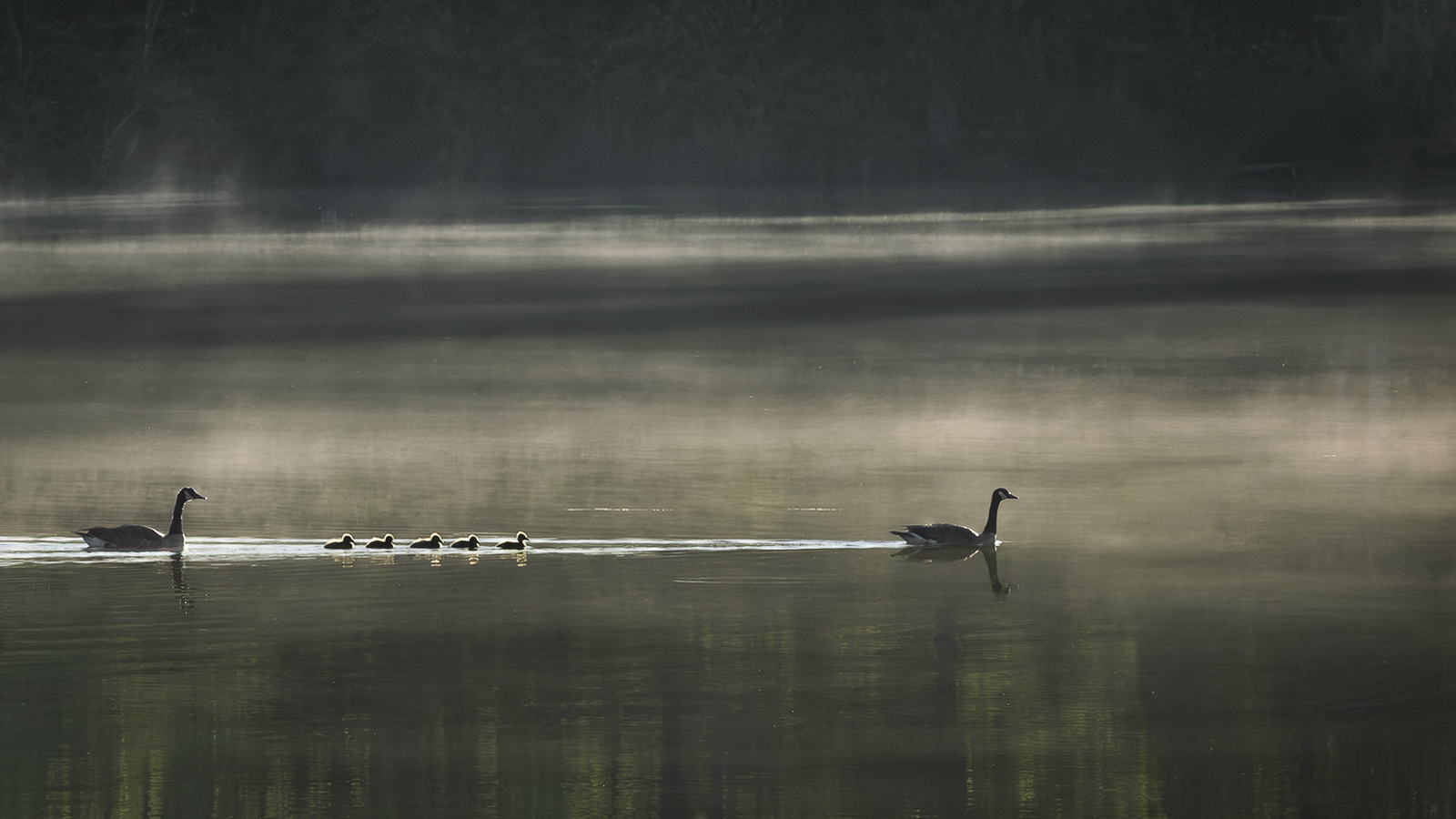
Jim,
This is beautiful as always! I love the fog in the background the and the plants in the foreground. I also like the reflections in the water. The only thing I make have done differently is to crop off some of the left so the geese have more room to swim. I tried that, and ended up doing a bit more. Not sure I like my crop better, but since I did it I'll share. |
Apr 1st |
 |
| 9 |
Apr 26 |
Comment |
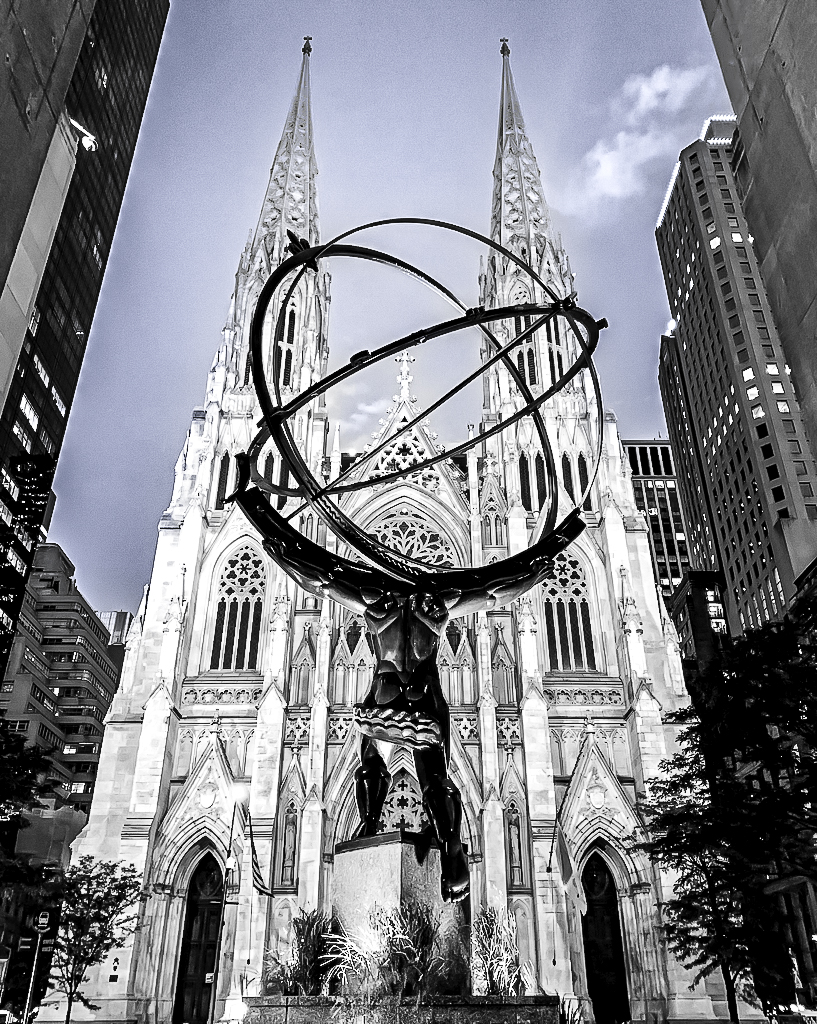
Douglas,
Great snap - I love that is shows a Greek god in front of gothic architecture with modern hi-rise buildings on either side.
I tried to separate Atlas in LR by pushing up the whites, lowering the blacks. I took a masking brush over Atlas and added more texture, clarity and dehaze. I modified the sky to give it more texture (and color) to give the cathedral more detail.
I also played with the sliders under manual noise reduction.
What do you think? |
Apr 1st |
 |
| 9 |
Apr 26 |
Comment |
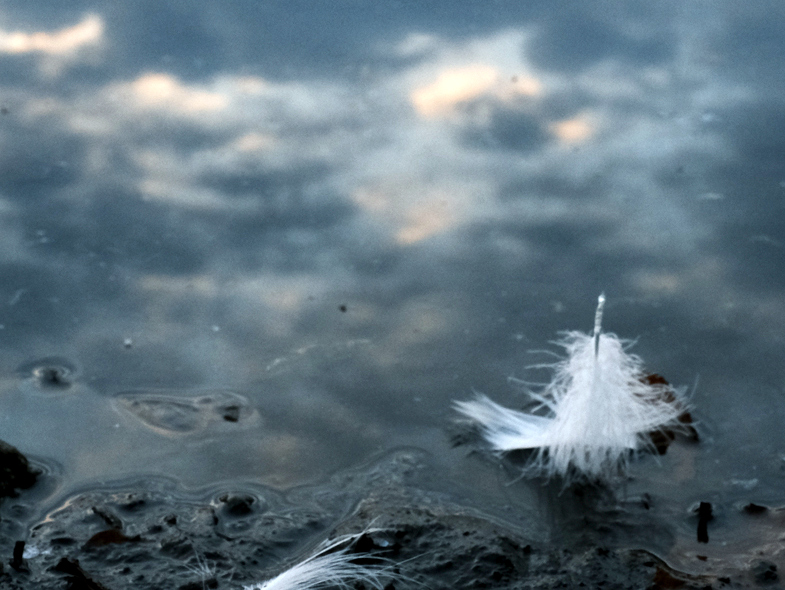
Yvonne,
I love the calmness of this image - very nice! I love that you can see clouds in the water - great reflection. I played with the crop to give more emphasis on the feather. Let me know what you think.
I agree that you choose the best color version. Interesting, I too tried getting advice from ai, this time Microsoft's co-pilot. I uploaded two different photos, turns out I uploaded the same one twice. AI told me why the second was better. Then I uploaded the actual different photo, it came in second between the two photos that were the same. |
Apr 1st |
 |
| 9 |
Apr 26 |
Comment |
Sabine,
This view is gorgeous, the tulips with the water and mountains in the background. Shooting low gave this photo a great perspective. I love that you brought out the sky and detail in the mountains. While I love that you brightened the flowers, for me, they may be a bit too bright as to almost look unreal against the background. But overall the image is beautiful! |
Apr 1st |
6 comments - 3 replies for Group 9
|
| 34 |
Apr 26 |
Reply |
Thanks Jan!
I am familiar with layer masks and did remove some of the texture from the bloom. I was worried it would look too washed out, but I like your version better.
I have not tried making the shadow but can see that it adds a lot to the image. |
Apr 4th |
| 34 |
Apr 26 |
Reply |
I see what you are saying. I am not sure I have the skills needed. |
Apr 2nd |
 |
| 34 |
Apr 26 |
Reply |
I think the face is good! And Dorinda looks fine to me :) Like she is real and the rest is magical |
Apr 2nd |
| 34 |
Apr 26 |
Comment |
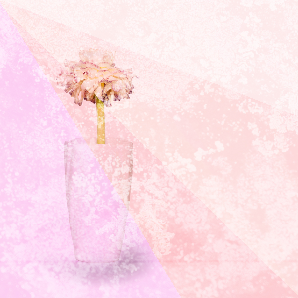
Angela,
This is so fun! I love it. The scene is genius. I am impressed that you added the faces in PS. I would have used a sharpie on the eggs :). |
Apr 1st |
| 34 |
Apr 26 |
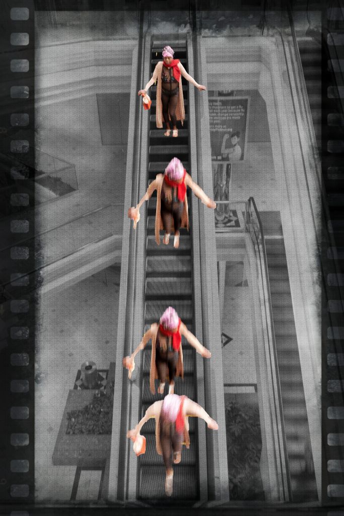
Comment |
Jan,
I LOVE what you did here! Very clever. Great composition. Very well done. I brought up your original to pick find the images in your composition - great use of shape and textures.
I greatly prefer the image you selected over the original 2. |
Apr 1st |
| 34 |
Apr 26 |
Comment |
Steve,
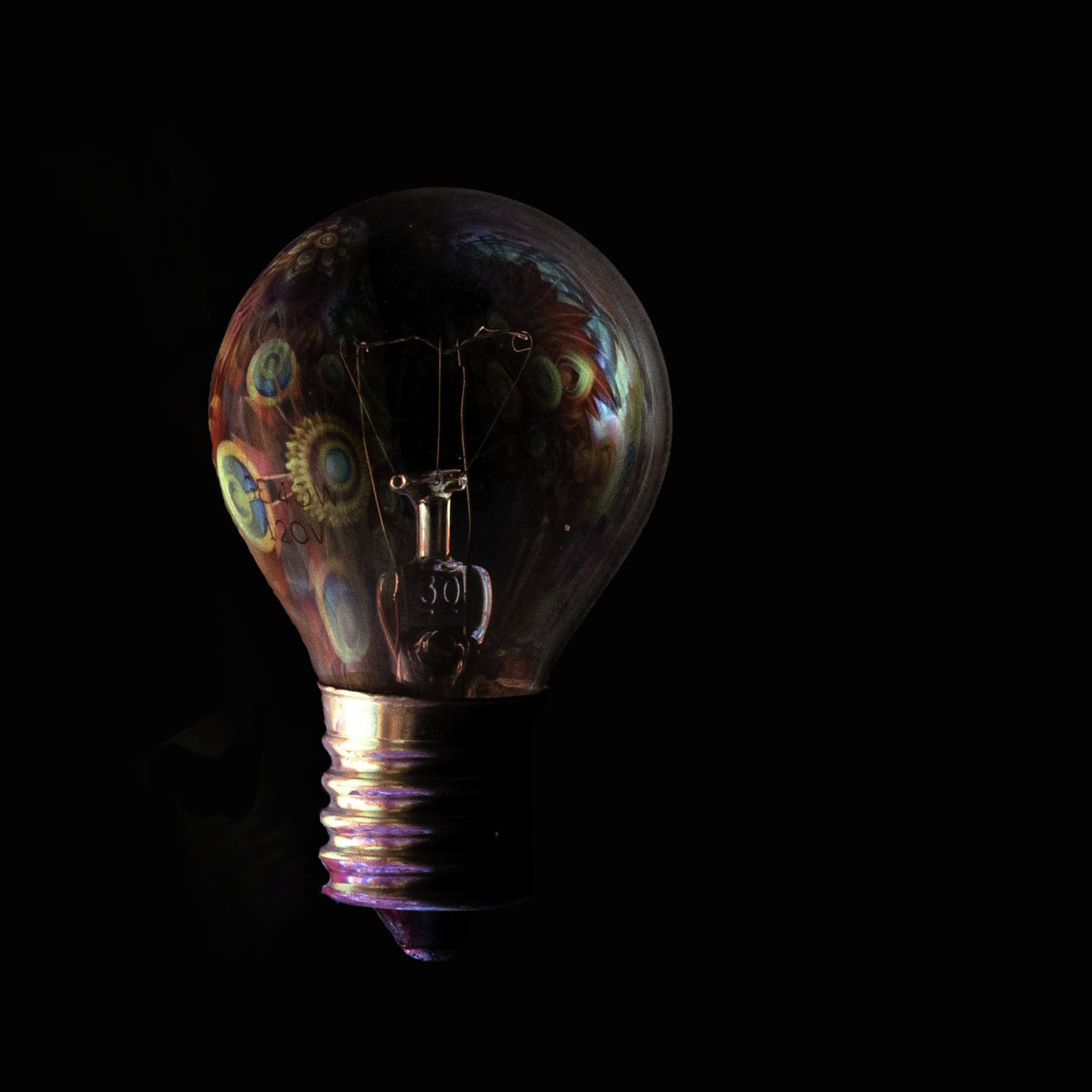
Very bold self portrait, I like it! I like that you kept your glasses as it helps to see the image as a portrait. I see it as almost psychedelic, with the color explosion erupting outward. I have to wonder if this your way of thinking, seeing the world? |
Apr 1st |
| 34 |
Apr 26 |
Comment |
Frans,
Your triptych is gorgeous! I see the energy, love the light trails and the motion/rhythm of the dancers.
My only concern is that without your explanation, I see a photo of a living room with beautiful art.
I like the order of you images in the triptych. For me, the only thing that might be improved is having their feet on the same plane. |
Apr 1st |
| 34 |
Apr 26 |
Comment |
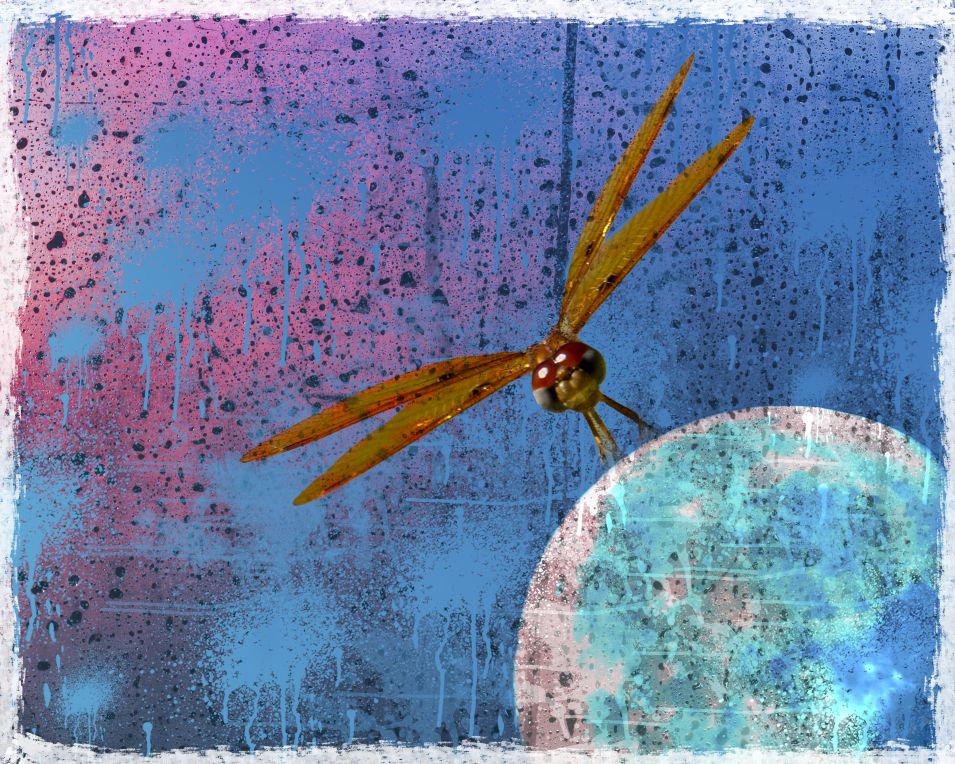
Bob,
This is lovely! It gives a mystical vibe which I find perfect for the subject. I love the added texture, the color sneaking through on the right and the face in the clouds.
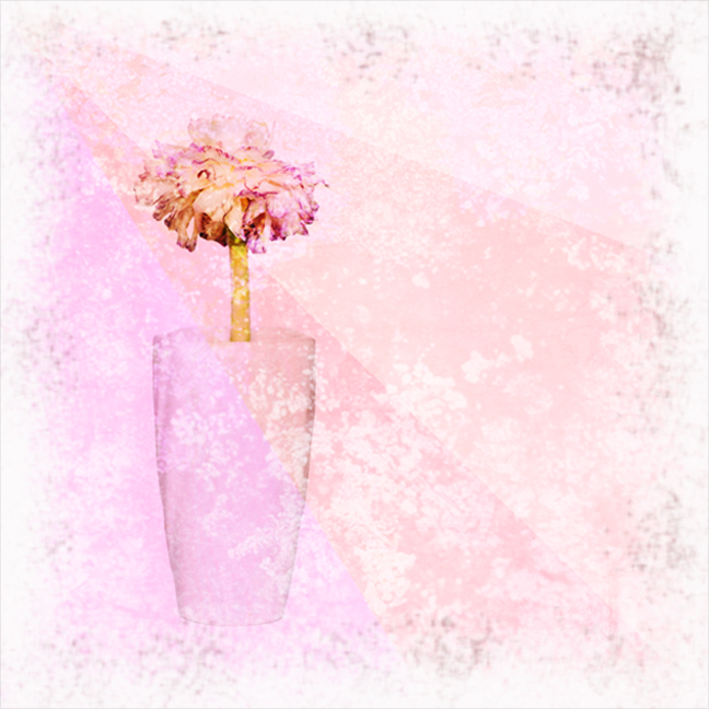
The only slight negative I find is that the added flowers on the left seem to bright for the rest of the image. For me, they don't blend quite as well as the other layers. |
Apr 1st |
5 comments - 3 replies for Group 34
|
11 comments - 6 replies Total
|