|
| Group |
Round |
C/R |
Comment |
Date |
Image |
| 9 |
Feb 26 |
Comment |
Thanks folks!
I have to admit that I just noticed the arc that Sabine corrected! Didn't realize it was off - don't know that I could have fixed it anyway. |
Feb 12th |
| 9 |
Feb 26 |
Comment |
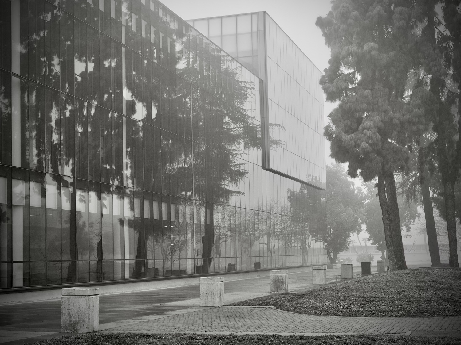
Hi Randy,
I played around somewhat and removed a few bare branches and shoots that distracted me, added a vignette, and tweaked some of the exposure and sharpness levels.
As a huge fan of fog - I really enjoyed your photo!
Doug |
Feb 9th |
 |
| 9 |
Feb 26 |
Comment |
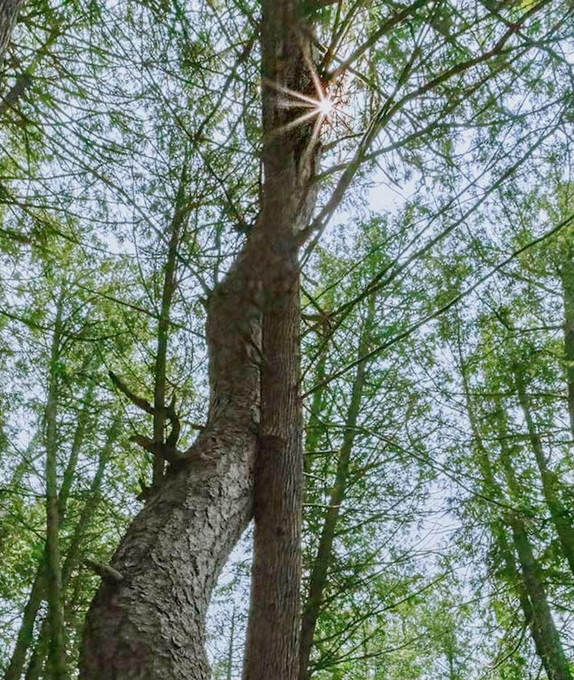
Hi Jim,
I took a different approach by cropping the photo and also straightening the main tree so that the curved one looks subordinate.
Not at all sure it's an improvement but it's a different approach! |
Feb 9th |
 |
| 9 |
Feb 26 |
Comment |
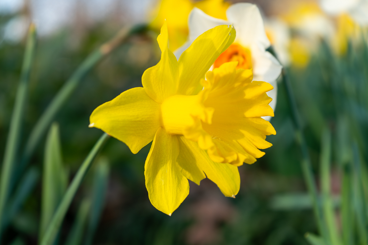
Flower photography, IMHO, is hard!
I like Sabine's enhancement of the colors. When I first looked at the original, I wanted more green in the stem. Felt washed out a bit.
Thank you! |
Feb 9th |
| 9 |
Feb 26 |
Comment |
I was in Cuba a few years ago and this reminds me of the homes I saw there. So interested in the textures you achieved. Well done! |
Feb 8th |
| 9 |
Feb 26 |
Comment |
I know we're supposed to give ideas for improvement and/or suggestions for edits - but I've got nothing! The detail and technique is outstanding and you've created genuine art! |
Feb 8th |
6 comments - 0 replies for Group 9
|
| 47 |
Feb 26 |
Reply |
I knelt down and aimed my camera at the base of the coffins and zoomed in tight.
I was intrigued by the way the two caskets framed another shape. |
Feb 13th |
| 47 |
Feb 26 |
Reply |
Here's basically the original - just opposite side. |
Feb 10th |
 |
| 47 |
Feb 26 |
Comment |
Sorry to misspell your name... Kirsti! |
Feb 8th |
| 47 |
Feb 26 |
Comment |
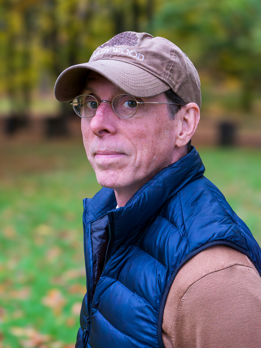
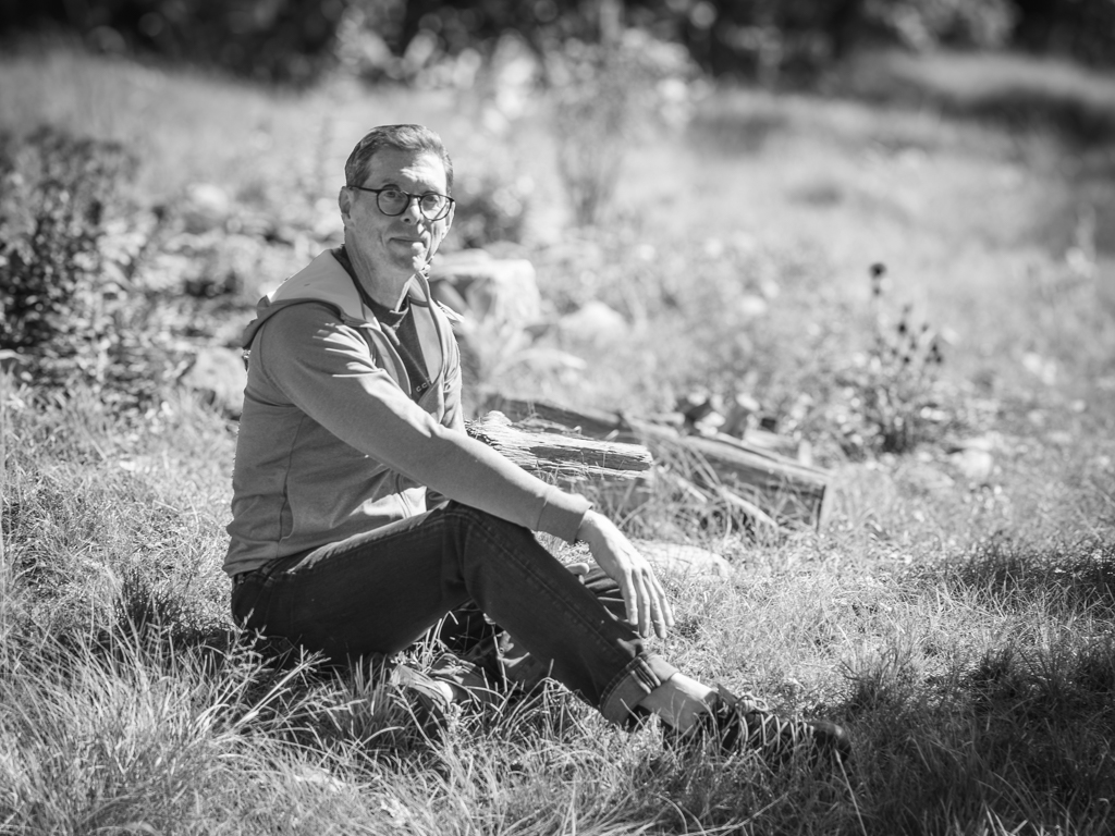
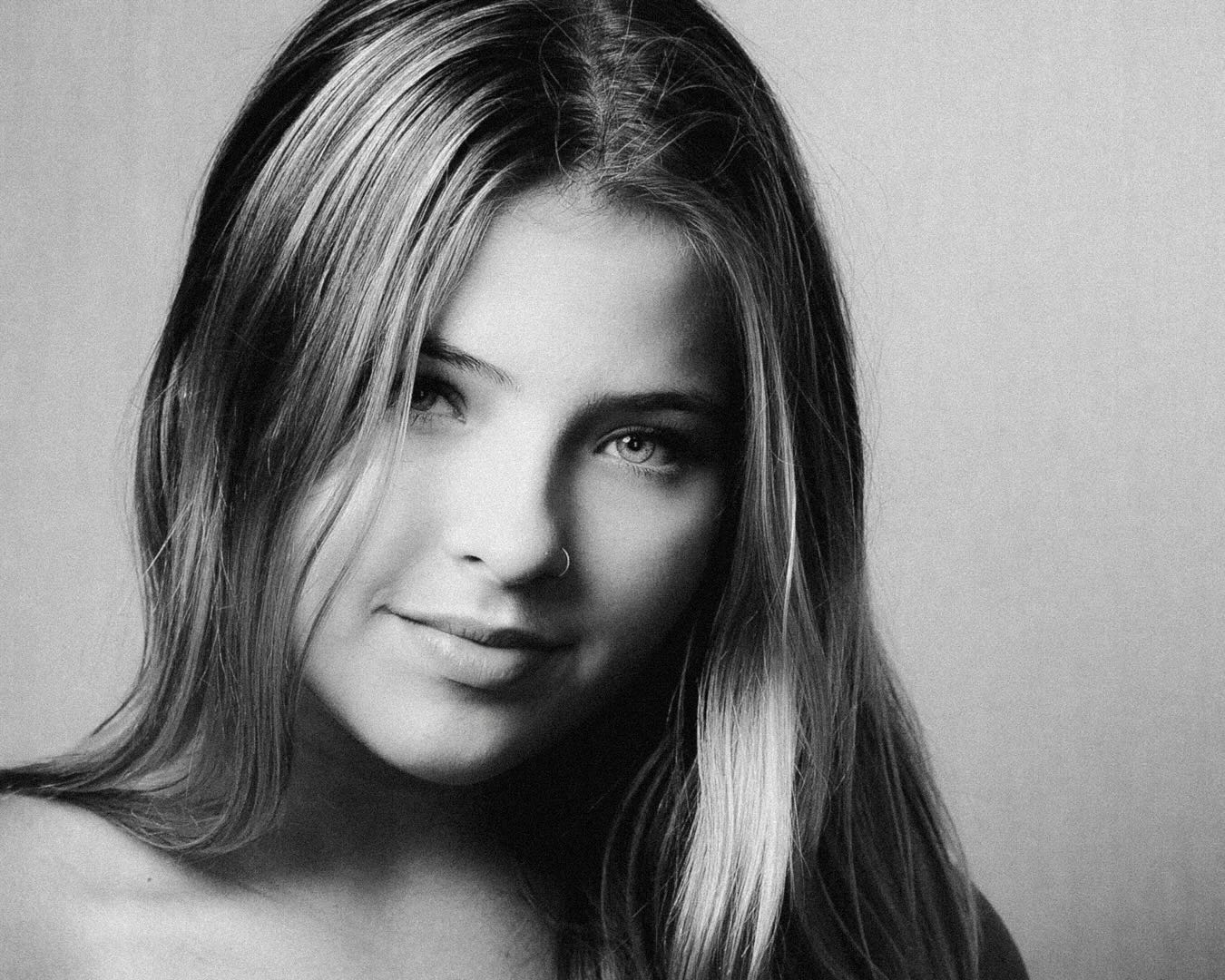
Stunning portrait.
I played with a little more clean-up and really like Kirsti's suggestion of a vignette -- it would really enhance the focus on the subject. |
Feb 8th |
 |
| 47 |
Feb 26 |
Comment |
I don't know how to do it well but I wanted the lizard to differentiate from the rocks a bit more. Not necessarily with texture but perhaps just exposure.
I was also reminded of the "Godzilla" posters from 1954. |
Feb 8th |
 |
| 47 |
Feb 26 |
Comment |
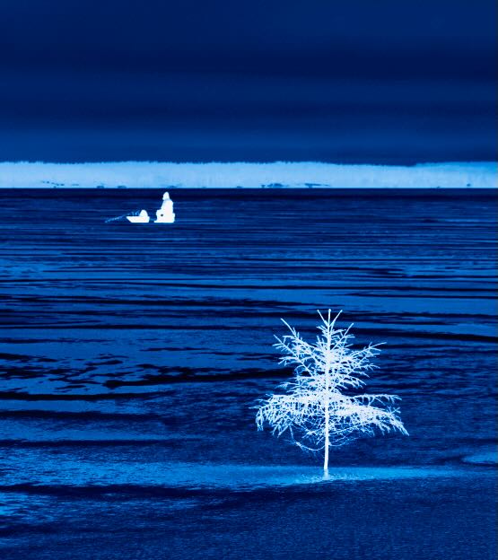
Hi Kristi --
I really like the changes you made in creating the blue-tone negative.
The changes I made were to add some vitality to the blue and also re-cropped to add more emphasis on the angler and deleted one of the trees. It's cropped to exact thirds. Just playing.
Thanks! |
Feb 8th |
 |
| 47 |
Feb 26 |
Comment |
Hi Ed,
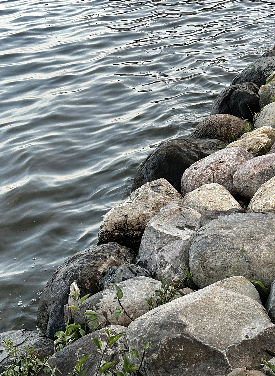
I tried a little different approach and cropped it tighter -- I found the shoreline to be a tad distracting -- and also the dark elements to the left of your subject. I also played with exposure and think you have it just right -- it washes out quickly. |
Feb 8th |
 |
| 47 |
Feb 26 |
Comment |
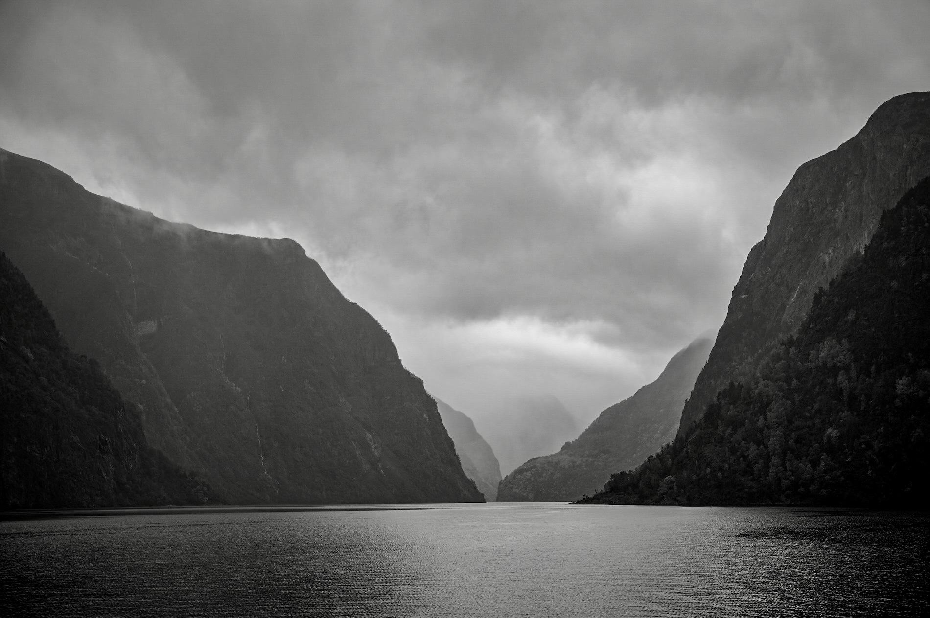
Hi Robert,
I really enjoy the majesty of your photo -- hard to imagine the grandeur of the scene.
My only attempt at editing was the increase the contrast in the layers -- keeping the forefront dark and boosting the white level more as they recede. |
Feb 8th |
 |
6 comments - 2 replies for Group 47
|
12 comments - 2 replies Total
|