|
| Group |
Round |
C/R |
Comment |
Date |
Image |
| 9 |
Jul 25 |
Reply |
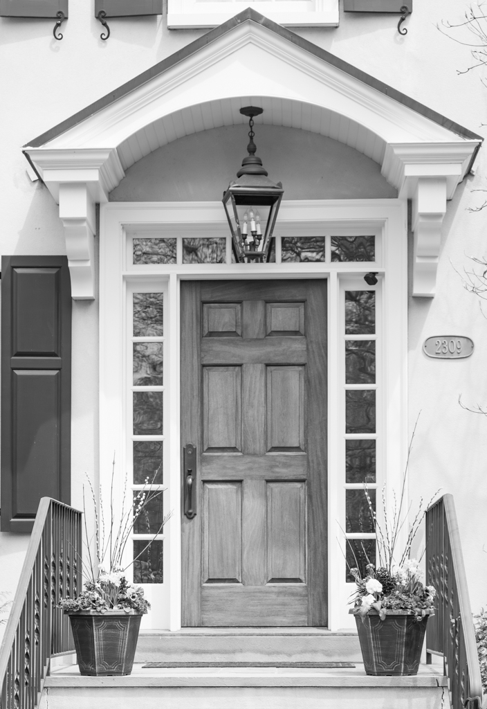
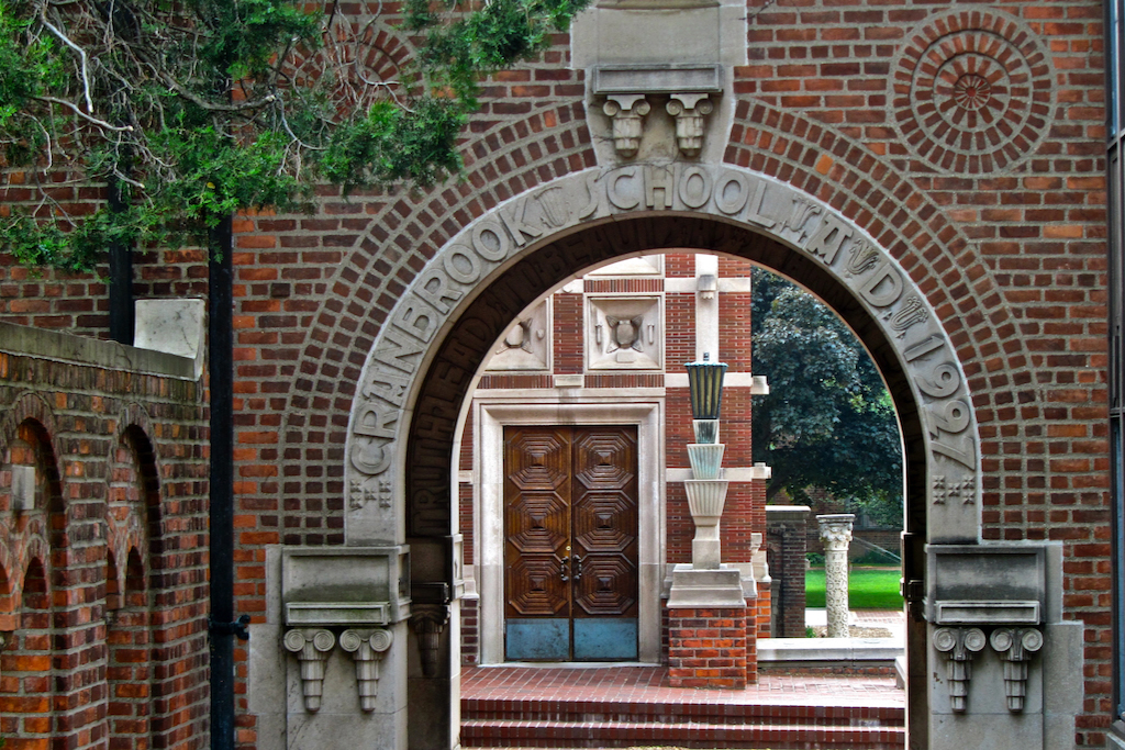
Thanks Linda -- I agree -- door is a bit washed out and could use more definition and character. |
Jul 19th |
| 9 |
Jul 25 |
Reply |
Thanks Randy! I really like your edits. I wish I would have included the entire 2nd floor of the house as the windows are quite nice as well. It's in my neighborhood so I might try it again! As for the bench and entry -- you're right -- it is inviting and also picks up the grid pattern of the walkway. |
Jul 16th |
| 9 |
Jul 25 |
Reply |
Wow! I really like that you were able to remove the upper windows! They annoyed me but my Photoshop skills aren't there yet. Also, finally ridding the branches really makes a difference. |
Jul 16th |
| 9 |
Jul 25 |
Reply |
Thank you! Your comment actually gives me the idea to mask the door and let it be the one color element in the photo. I've had a little success doing that with clothing on some portraits that I've done. Thanks for the idea! |
Jul 16th |
| 9 |
Jul 25 |
Reply |
Thanks Jim -- I also tried to get rid of the camera at the upper right of the entry but couldn't get the right mask so chose to leave it instead of a blurred mess! |
Jul 16th |
| 9 |
Jul 25 |
Reply |
You're 100% right about the branches -- I thought they added some interest -- but realize they are more of a distraction! |
Jul 16th |
| 9 |
Jul 25 |
Comment |
Hi Randy!
The color gradation is quite extraordinary. There appears to be a deep purple, perhaps puce, at the upper edge which fades and morphs to a taupe at the horizon. Then, abruptly, the photo shifts to grayscale with movement of the water. I also like that you avoided the possible temptation of centering the moon and reflection - it does angle in a bit - but doesn't feel forced! |
Jul 12th |
| 9 |
Jul 25 |
Comment |
Your sense of composition is excellent in this photo. You place the end of the leaf in an arrow at the upper right and let it gracefully fall down and to the left. It's very, very pleasing to the eye and completely draws me in and rewards my gaze with the dazzling dew drop at the end! |
Jul 12th |
| 9 |
Jul 25 |
Comment |
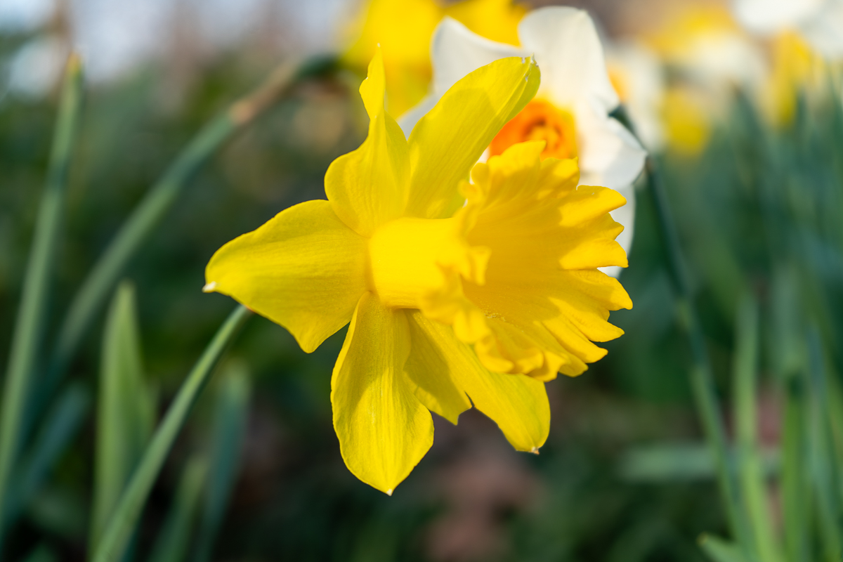
Photos with the middle distance in focus can be a challenge, at least to me, and this photo is a terrific example of why it's fun to do it! My only comment is that you give us a lot of area above the flower and perhaps a slightly tighter crop? |
Jul 12th |
| 9 |
Jul 25 |
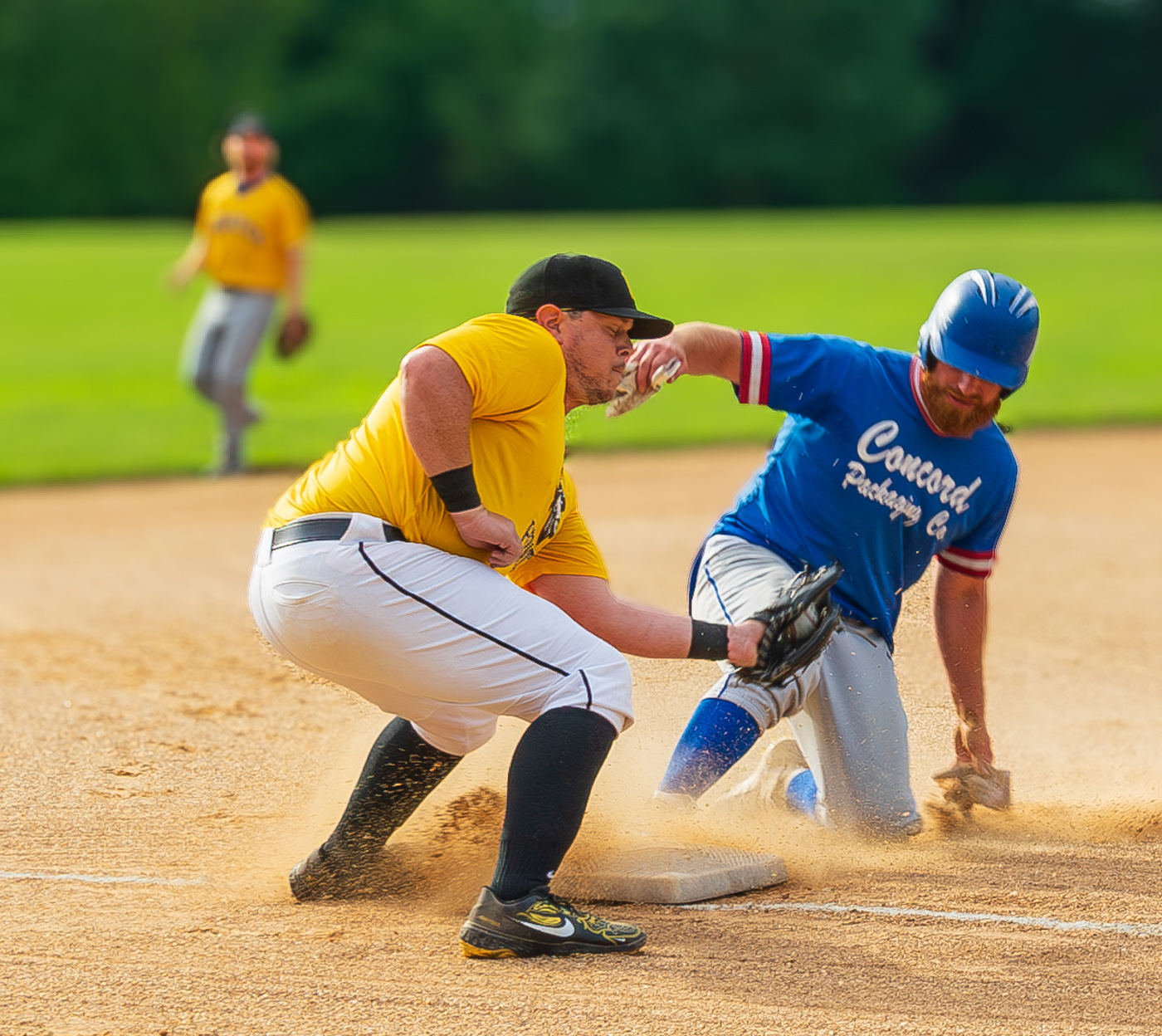
Comment |
I love Philly - and this photo is a great example of what makes it a great city - simple, honest patriotism and heart. You did a great job of capturing the moment and it was really nice of the dancers to line up symmetrically around Miss Philadelphia.
Great shot! |
Jul 12th |
| 9 |
Jul 25 |
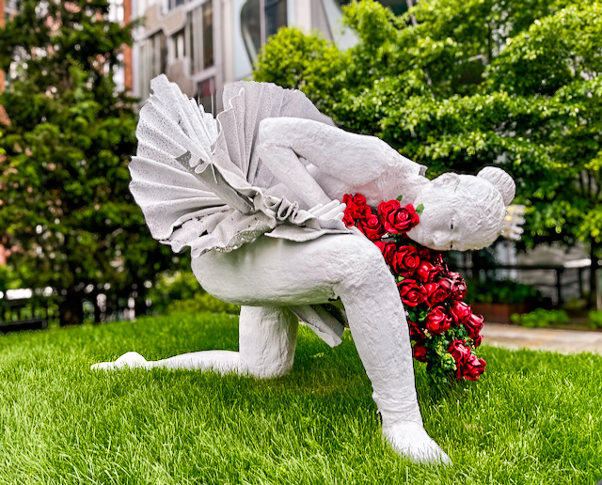
Comment |
I would have guessed that this was a watercolor painting! The plain, neutral background with the sole focus on the flower. The composition is truly inspired with the bud bowing to the full bloom!
Thank you! |
Jul 12th |
| 9 |
Jul 25 |
Comment |
I am amazed that this was frozen in ice! I thought it a collage of some sort, which I suppose it is, but not in ice!
The lower portion of the photo with the green leaves and stems is especially appealing. The central portion appears a bit muddled - could be the problem of not getting clear ice.
Super fun idea - and something I'll try on a slow day! |
Jul 12th |
6 comments - 6 replies for Group 9
|
6 comments - 6 replies Total
|