|
| Group |
Round |
C/R |
Comment |
Date |
Image |
| 9 |
Apr 26 |
Reply |
Glad you had fun! I always look forward to our groups' perspectives which opens you to different ways to see and process our art. Thanks for letting me know about Topaz. |
Apr 17th |
| 9 |
Apr 26 |
Comment |
Jim, I appreciate the clearness of your photo and the colors/textures you've bought out in the two rocks. I'm guessing Topaz cleaned up the image. Is Photoshop's denoising comparable to Topaz's? For me your version without the rocks feels like something is missing.
AI says I'm aiming for a Japanese minimalist aesthetic ...with some imperfections. I plan to rework the image with denoise. As always I appreciate your detailed editing suggestions. Thank you for taking the time to rework Fleeting Moment. |
Apr 17th |
| 9 |
Apr 26 |
Reply |
Sabine, Your image is giving off a sexy vibe. The deep blue is warm and velvety enhancing the silky texture of the feather. Your idea is quite interesting!
I like your analogy of the four elements of water, earth, air and fire. I'm going to tweak the image and title slightly with that in mind. I also prefer the color version but sent the B&W print to PSA's POQ for an evaluation. See my comments to Randy. Thank you for your inspiring comments and taking the time to share your idea.
|
Apr 17th |
| 9 |
Apr 26 |
Reply |
Randy, Thank you for your comments. I took your advice and lightened the feather in the monochrome version. Also for another critique, I sent the B&W to PSA pictorial print division's print of the quarter. It's not just a competition, they send you a written critique to improve your printing skills. I'm determined to start printing my digitals ...which costs a lot of ink and paper.
As far as Fuji's film simulation, I shot in Provia/Standard and changed to Acros in Fuji's X Raw Studio through my XPro3. I just discovered the profile tool in lightroom and photoshop. I appreciate your comments! |
Apr 17th |
| 9 |
Apr 26 |
Reply |
Douglas, I agree that in overdoing edits you may lose the soul of the image. Similar to the difference between listening to streaming music and vinyl. And there's something special about our old film images. The challenge is to edit an image with the story or sensation mind. Your comments are much appreciated. |
Apr 17th |
| 9 |
Apr 26 |
Reply |
Sylvia, LOL...AI critiquing the same photo differently proves we need to use our judgement. I do like the detail of your clouds. But the crop version looks like it needs something more. Thank you for taking the time to work on my image.
|
Apr 17th |
| 9 |
Apr 26 |
Reply |
Linda, Thank you for your thoughtful comments. I'll miss your poetic insights. See you in the general gallery. |
Apr 17th |
| 9 |
Apr 26 |
Comment |
Hi Randy, Love the many shades of blue and the sky's touch of pink. Serenity. Ocean Sunrise truly evokes emotion. I actually like the muted colors..if that's the correct term. It reminds me of morning's stillness.
I'd only add me to the scene :) You certainly captured the peacefulness. |
Apr 11th |
| 9 |
Apr 26 |
Comment |
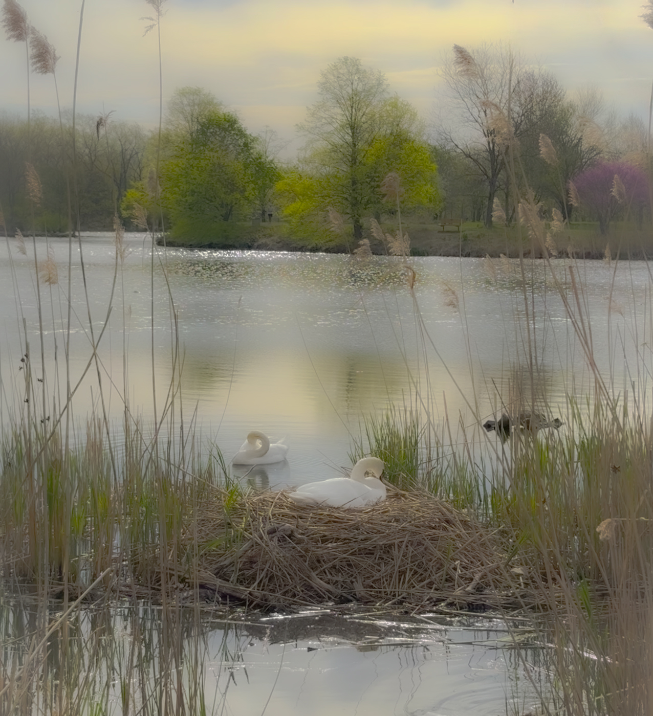
Jim, Love the Canadian Family with the kids falling in line. The fog and reflections give the image a calming effect and water lines add movement. The foreground weeds and background trees frame the family nicely. I was so drawn to the geese that I really didn't notice the tree in the upper left that you mention. Maybe you can darken it some.
Your editing choices add a warmness to the image.
|
Apr 11th |
| 9 |
Apr 26 |
Comment |
Hi Sylvia, My initial thought of Fallen Blooms was newness of life. Seeing the flowers against the dark water adds vibrancy and so much definition to the flowers. Then I did see the juxtaposition between the fresh and decaying blooms suggesting the cycle of life as Douglas mentioned. My only suggestion would be to remove the green stems on the right side. Very creative piece.
|
Apr 11th |
| 9 |
Apr 26 |
Comment |
Hi Linda, The second photo put a smile on my face. Individuality makes life interesting and the tulip asserting his bold presence is a good metaphor. Maverick is also stunning capturing the delicate petals with dew. Camera phones are amazing.
Sounds like you're a fan of Henri Cartier-Bresson's decisive moment . See you in the general galleries! Have fun! |
Apr 11th |
| 9 |
Apr 26 |
Comment |
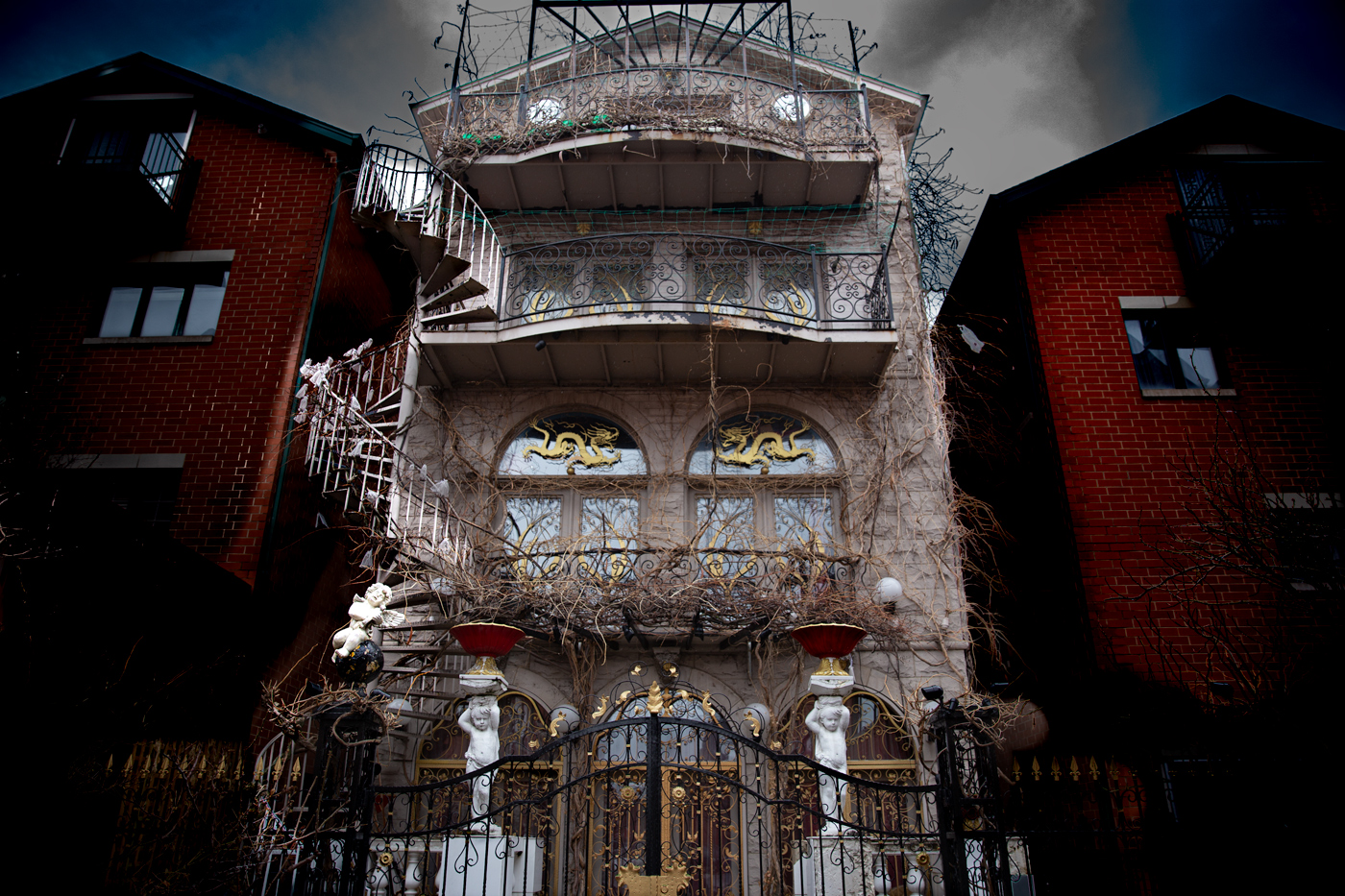
Hi Douglas, This is a striking photo showing the contrast between Atlas's strength and the grace and intricacy of St. Patrick's Cathedral. The leaning two side buildings forced my view to Atlas and St. Patrick's. Your description sounds like Atlas is the main subject, so I'd suggest lightening or experimenting with decreasing opaqueness of St. Patrick's to enhance the composition.
The photo also made me think about the symbolism of Atlas's brawn holding up the heavens in front of the cathedral. |
Apr 11th |
| 9 |
Apr 26 |
Comment |
|
Apr 11th |
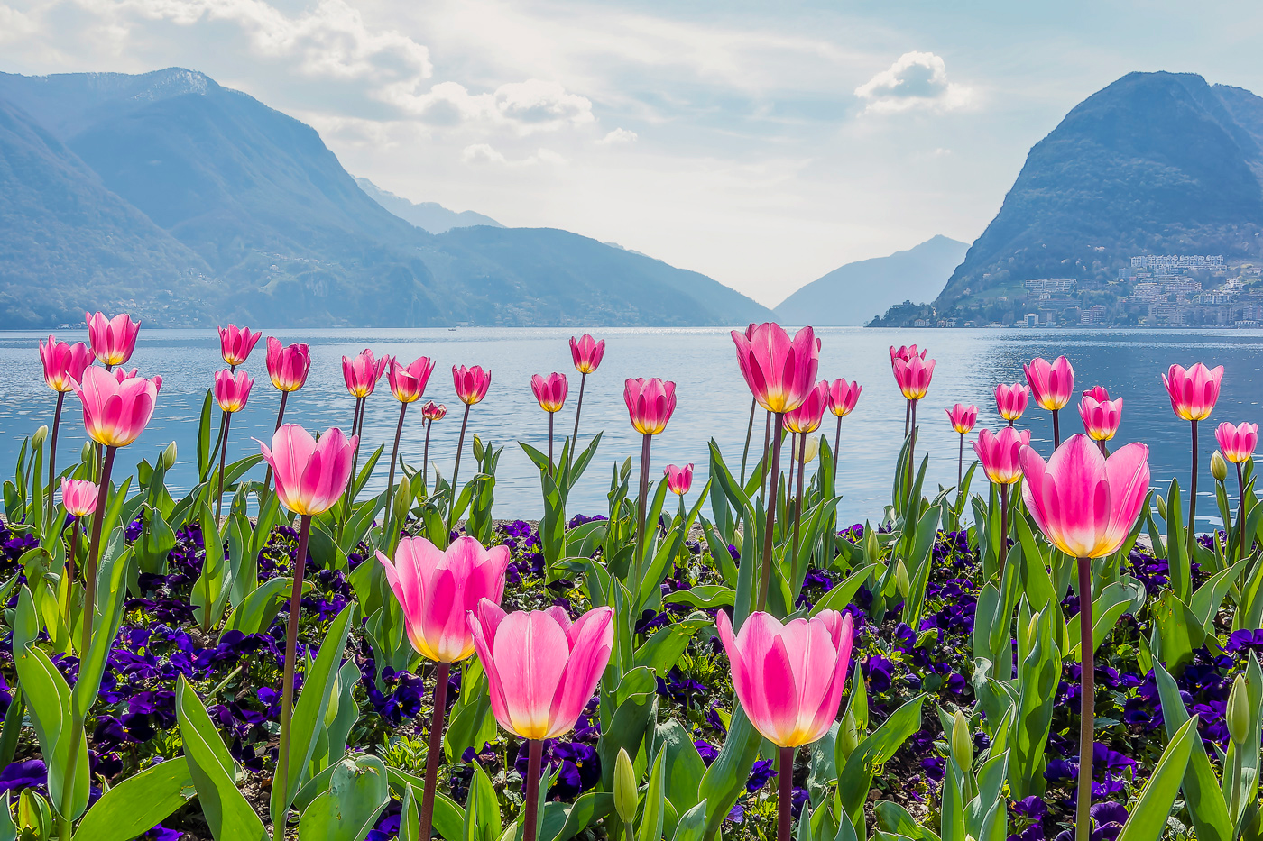 |
| 9 |
Apr 26 |
Comment |
Hi Sabine, Love the happy Spring feel of Spring on Lake Lugano. The pink and yellow tulips are so vibrant against the green leaves. The view showing the mountains and lake gives the viewer a sense of location. It also gives the photo a unique look which leans toward travel photography.
I agree with Sylvia and Douglas about post editing taking away from the beauty of the original tulips. I like the edited color but there seems to be a line around the edge of the tulips. I'm not computer savvy enough to suggest a correction. But I did try to offset the flowers with a little more detail in the sky. |
Apr 11th |
8 comments - 6 replies for Group 9
|
8 comments - 6 replies Total
|