|
| Group |
Round |
C/R |
Comment |
Date |
Image |
| 9 |
Feb 26 |
Reply |
Linda, Thanks for your comments. That's what being stuck at home will do :) |
Feb 24th |
| 9 |
Feb 26 |
Comment |
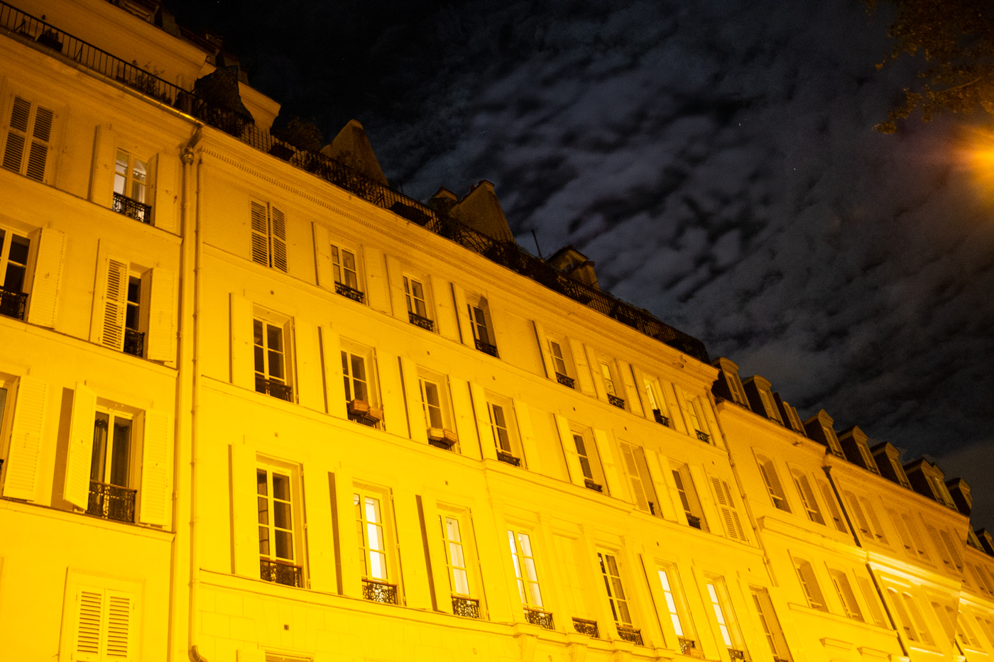
Hi Linda, The first thing I saw was the excitement on the kid's faces. Then I noticed the connection of feelings between the kids in both carts. The street brick pattern, red umbrella and address lettering add interest. The car wasn't that distracting for me. At first glance the car suggested that the bikers were in traffic then noticed it was parked. Good capture of family life in Amsterdam. |
Feb 24th |
| 9 |
Feb 26 |
Reply |
LOL...they don't know. What counts is how you feel about your art. |
Feb 18th |
| 9 |
Feb 26 |
Reply |
Jim, Wow. Glad I could help. Yes, editing expert :) |
Feb 14th |
| 9 |
Feb 26 |
Reply |
Jim, Thank you for your post processing praise. |
Feb 14th |
| 9 |
Feb 26 |
Reply |
Randy, I'll continue experimenting as long as the cold keeps me inside. Thank you for your comments. |
Feb 14th |
| 9 |
Feb 26 |
Reply |
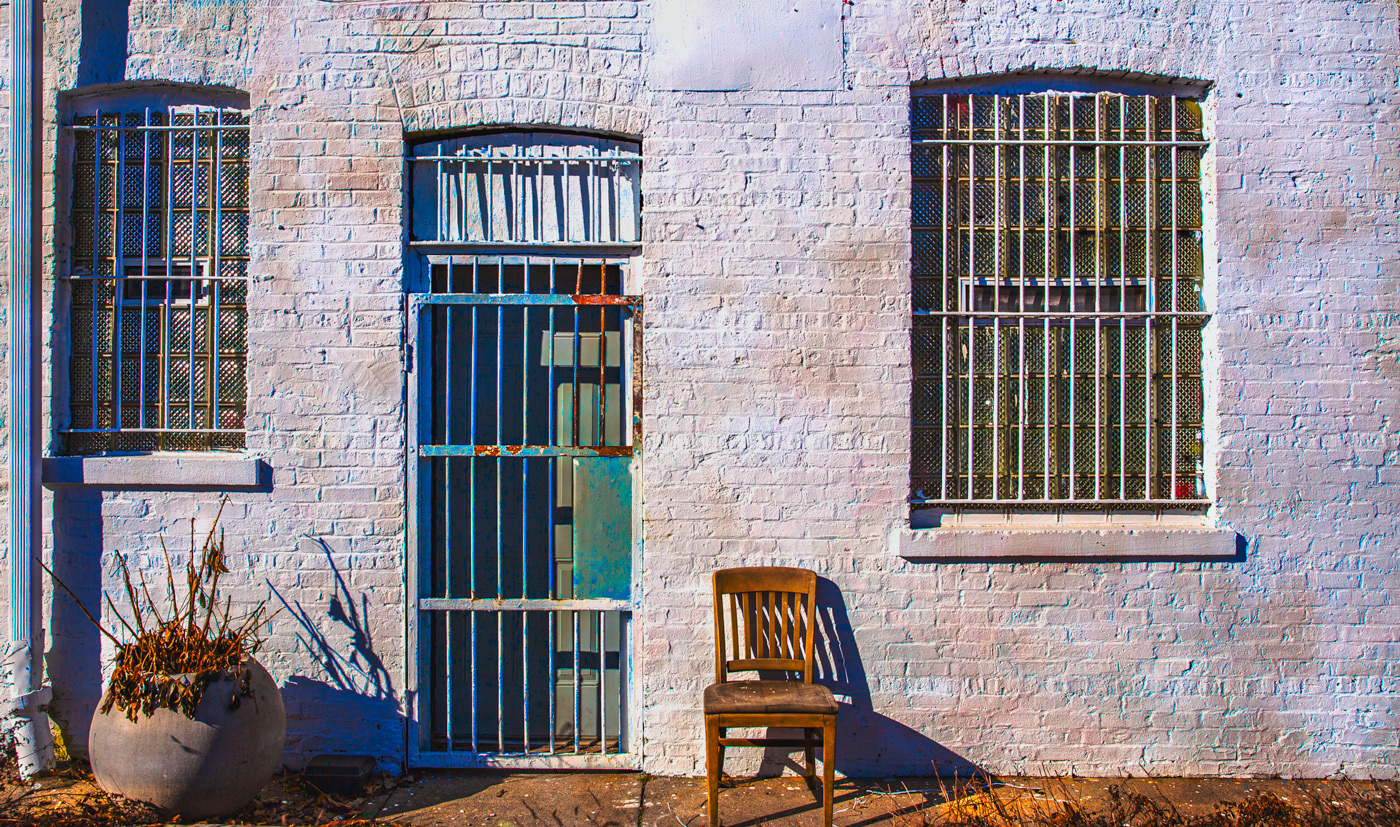
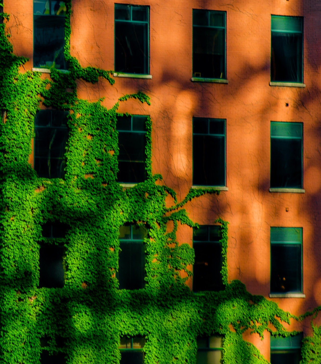
Douglas, So interesting that you thought of Cuba. Love the look and feel of Cuba! The building is the rear of a business. See photo in Sabine's comments. Thank you for your comments. |
Feb 14th |
| 9 |
Feb 26 |
Reply |
|
Feb 14th |
 |
| 9 |
Feb 26 |
Reply |
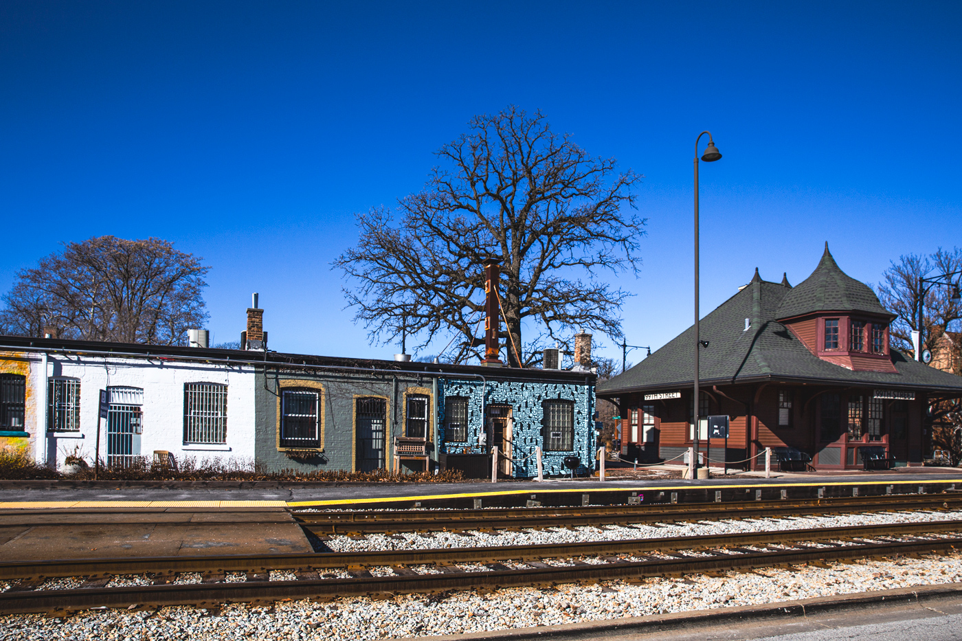
Sabine, The door color came from Photoshop's layer blending and saturation slides. If gutter means the ground , I agree it is stark . I removed the wires for a cleaner look and to make it look like a stand alone building.
This is the rear of a business adjacent to the Beverly Hills 99th Street Metra Train station in Chicago. The row of buildings change their design from time to time.
Your comments are much appreciated. I'll try out your suggestions.
|
Feb 14th |
| 9 |
Feb 26 |
Reply |
Sylvia, Photoshop's layer blending and saturation adjustments deepened the door color. Glad you liked it . |
Feb 14th |
| 9 |
Feb 26 |
Comment |
On second thought I do like how you used the foreground grass to frame your composition. |
Feb 11th |
| 9 |
Feb 26 |
Comment |
Rather than crop I tried to removed light in the left corner. But it seems distracting. It may be interesting to bring out the green on the trunks of the foreground trees. You're the editing expert. Hope you get an idea of what I tried :) |
Feb 11th |
| 9 |
Feb 26 |
Comment |
|
Feb 11th |
 |
| 9 |
Feb 26 |
Comment |
|
Feb 11th |
 |
| 9 |
Feb 26 |
Comment |
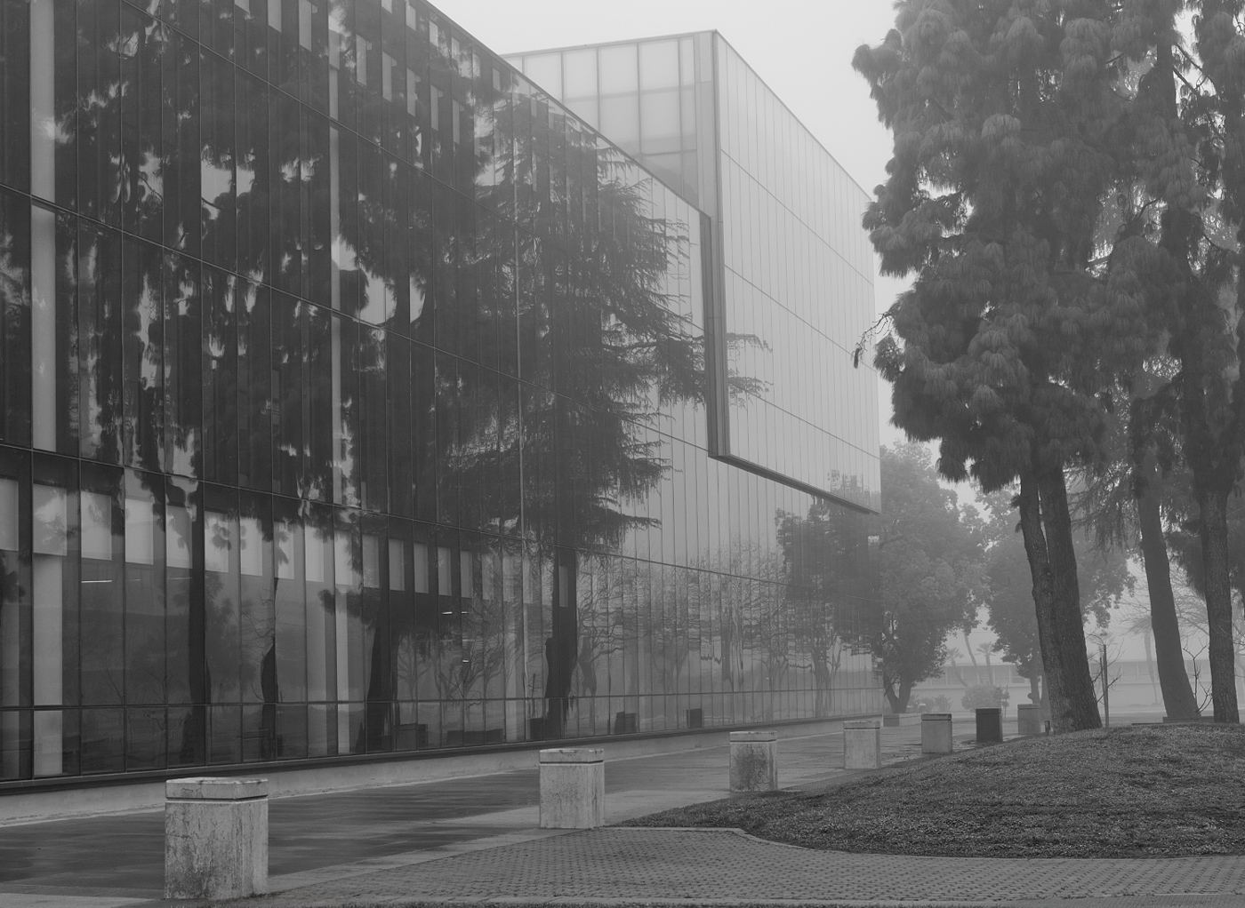
Randy, Foggy Morning is a walk of reflection in more ways than just the glass. I can feel myself walking in quiet reflection amidst the morning fog. The reflection of trees in the building add depth, the entry pathway and cement blocks lead you through the composition. The fog adds emotion. My only suggestion would be to crop the foreground grass. My eye stopped a bit at the grass before entering the image.
You captured a lot of emotion in Foggy Morning Walk. |
Feb 11th |
| 9 |
Feb 26 |
Comment |
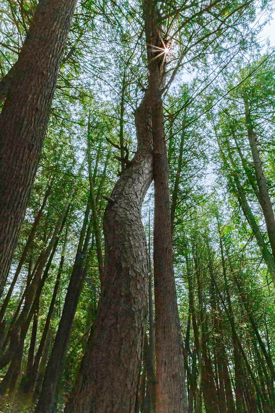
Jim, Great save. Sounds like your aim was to highlight the sun. The two twisted trees in the foreground do that with the surrounding background tress also pointing in the sun's direction. My suggestion would be to add more detail to the two twisted trees. Possibly crop out the lower left light to keep your eye flowing up.
Your are quite skilled in editing! |
Feb 11th |
| 9 |
Feb 26 |
Comment |
|
Feb 11th |
 |
| 9 |
Feb 26 |
Comment |
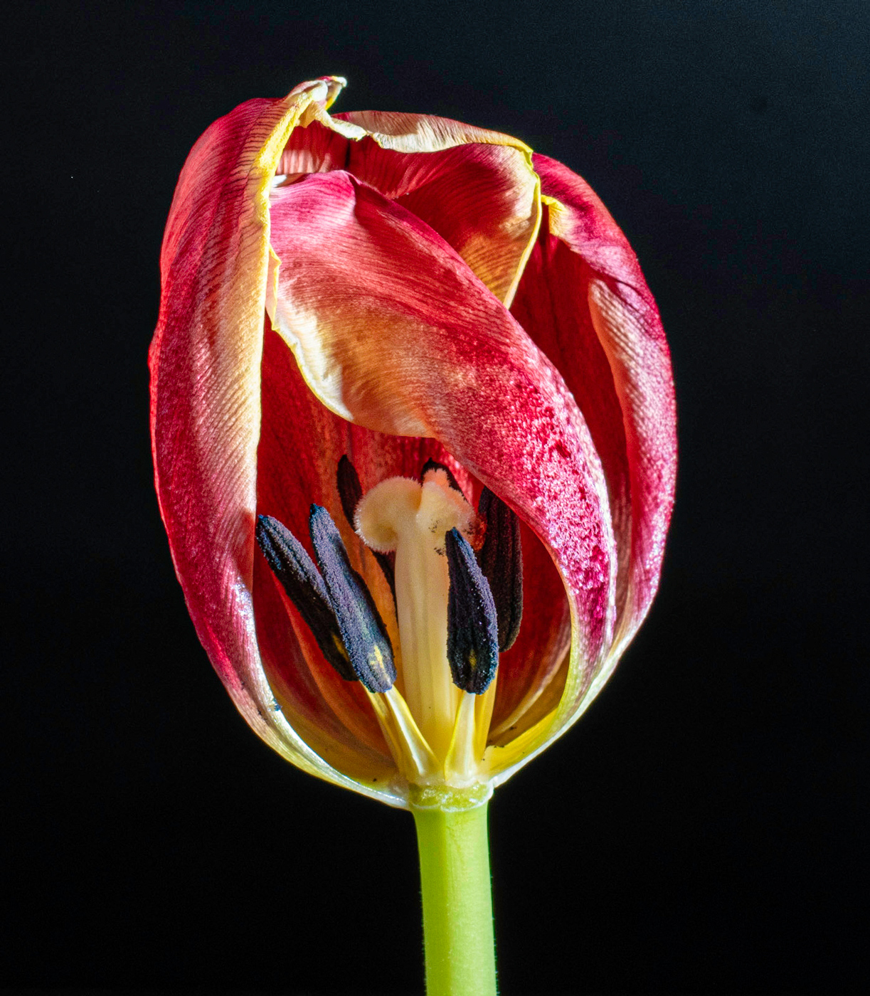
Sylvia, Beautiful. Love Faded Glory's pose. The petals seem to be protecting the exposed inside of the tulip . If you let your mind wonder this can be translated into human emotions. My only suggestion would be to add a little more definition to the petals and color. I tired by using Photoshop texture slides and a few color adjustments. |
Feb 11th |
| 9 |
Feb 26 |
Comment |
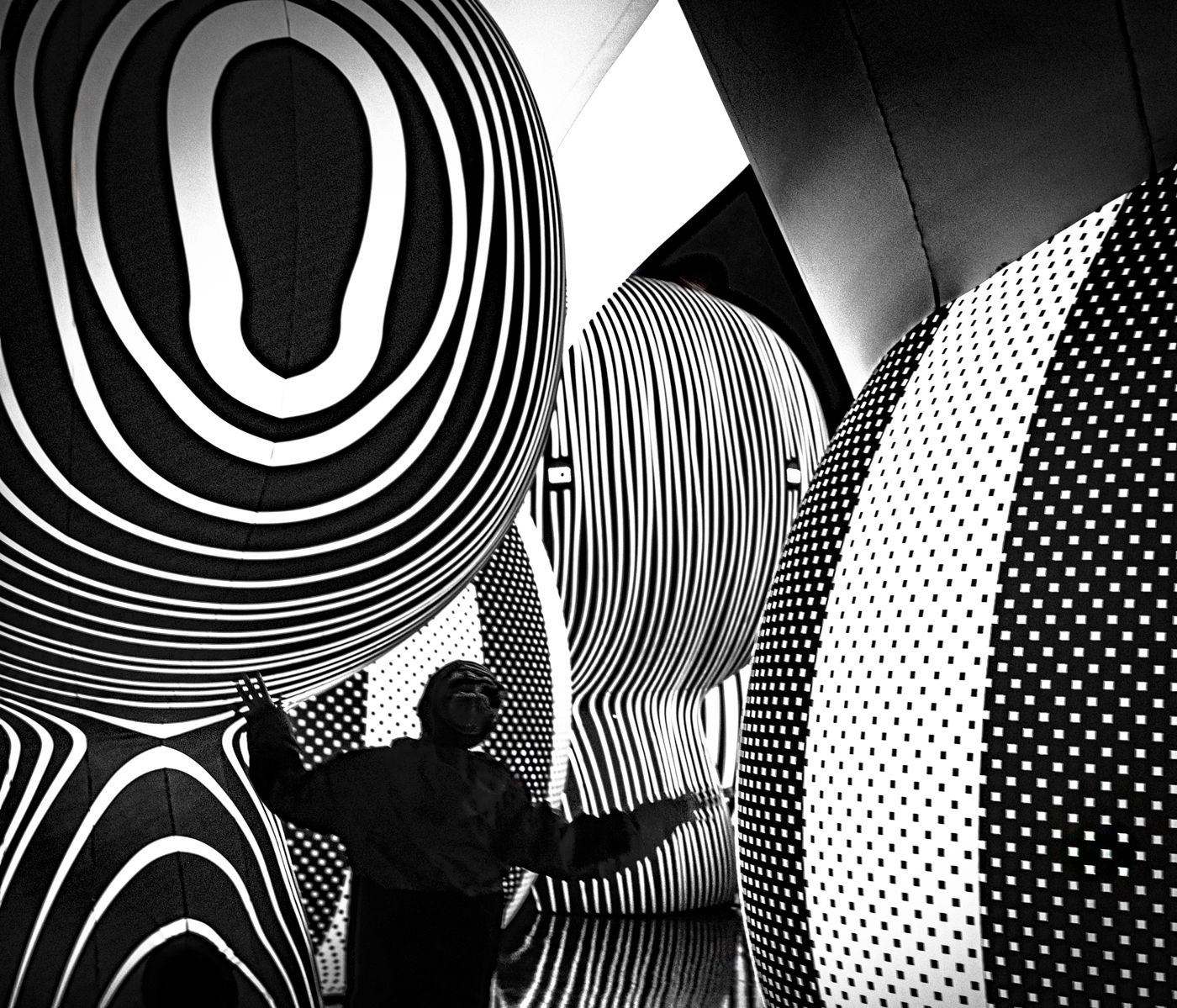
Douglas, As Sabine mentioned you see something and don't know what it is. Love how you turned Grants tomb into an abstract. The shapes and colors pull your eye through your composition admiring and wondering what it is. Very unique. |
Feb 11th |
| 9 |
Feb 26 |
Comment |
Sabine, So soft and velvety. I see so much detail in the petals and soft color. Gerber feels like it's 3D. Is it the blue light and crepe paper that adds depth? Your photoshop edits also enhance the colors.
I see you asked if we wanted to see the set-up...Yes! |
Feb 11th |
11 comments - 9 replies for Group 9
|
11 comments - 9 replies Total
|