|
| Group |
Round |
C/R |
Comment |
Date |
Image |
| 9 |
May 25 |
Comment |
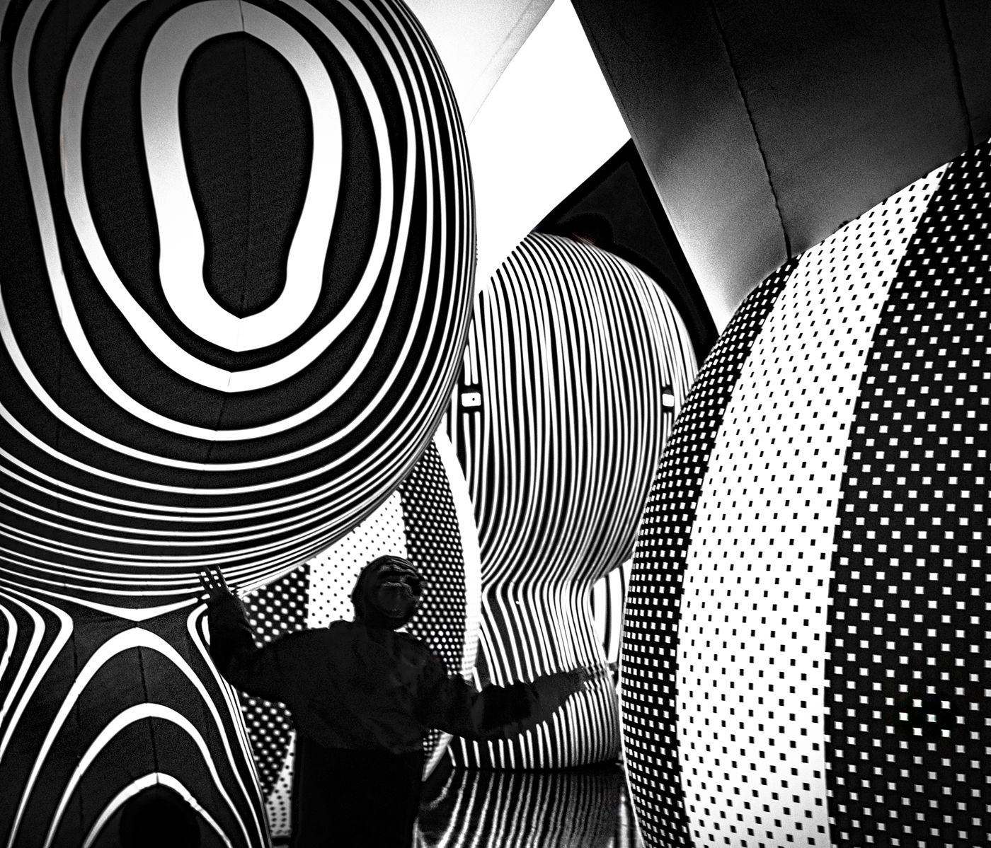
Jim, It's really interesting to see different perspectives on the same image. Your's even has a 3d effect. Thank you for your comments and sharing your version. |
May 19th |
| 9 |
May 25 |
Reply |
I'm going to experiment with your steps. Thank you. |
May 19th |
| 9 |
May 25 |
Reply |
Sabine, I was sooo impressed and inspired by Ian's webinar. Midnight is tough though! Do you think I can get similar results with a 10 - 16 lens on my cropped sensor Fujifilm camera? |
May 15th |
| 9 |
May 25 |
Comment |
Sylvia, Cherry blossom season in Japan season must have been beautiful! I love your edit for a soft realistic look. What did you do? Thank you for your comments. |
May 15th |
| 9 |
May 25 |
Reply |
Randy, I Googled plum trees and they do look similar. However, cherry blossoms have a distinctive notched leaf. I was going for a kind of surreal image. Thank you for your comments... and please thank your wife for sharing her views. |
May 15th |
| 9 |
May 25 |
Reply |
Doug, I don't know if I'd call post-processing a joy...as I now spend hours playing with my computer...LOL. But it does push you to create art. As I mentioned to Sabine, there is so much untouched beauty in nature. Thank you for your comments. |
May 15th |
| 9 |
May 25 |
Reply |
Linda, Thank you for your comments. I agree it does look like wallpaper. I tried a few lighter tones but I'll experiment more with pinks. |
May 15th |
| 9 |
May 25 |
Reply |
Sabine, Your revision with Color Projects adds a sense of movement. Mine reminds me of wallpaper or I was hoping to use it for note cards. It's fun experimenting with software for different looks and feelings. At the same time something is to be said for the untouched beauty of nature. Thank you for your comments. |
May 15th |
| 9 |
May 25 |
Comment |
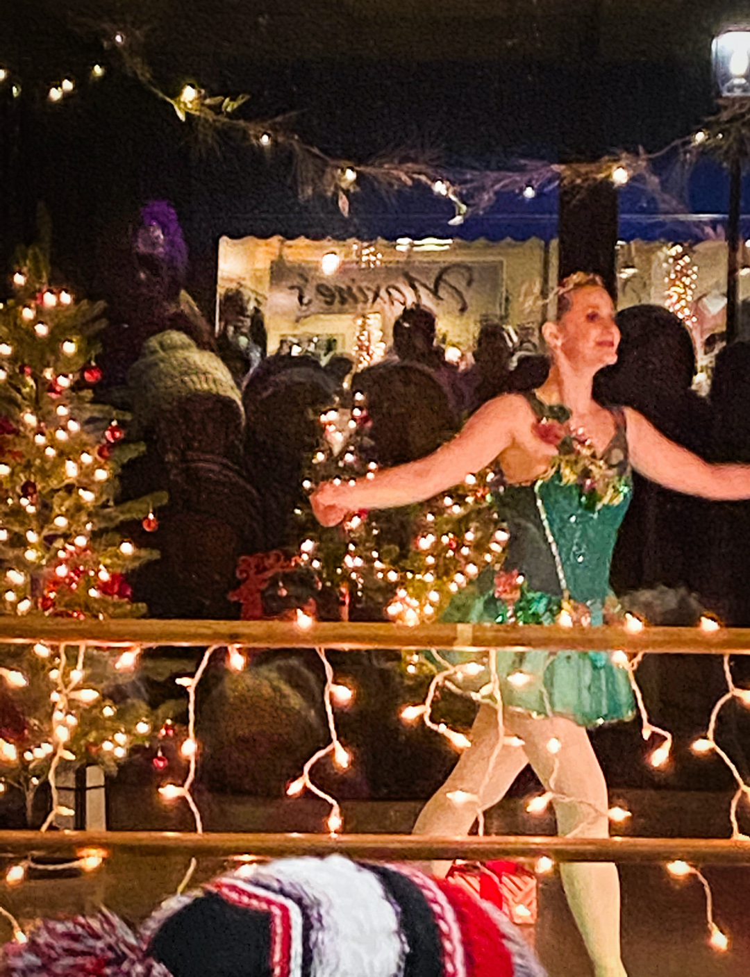
Jim, All your editing produced a beautiful image. The water reflections are clearer and overall colors are more vibrant. I do like the feel of the flipped image. Great image. |
May 14th |
| 9 |
May 25 |
Comment |
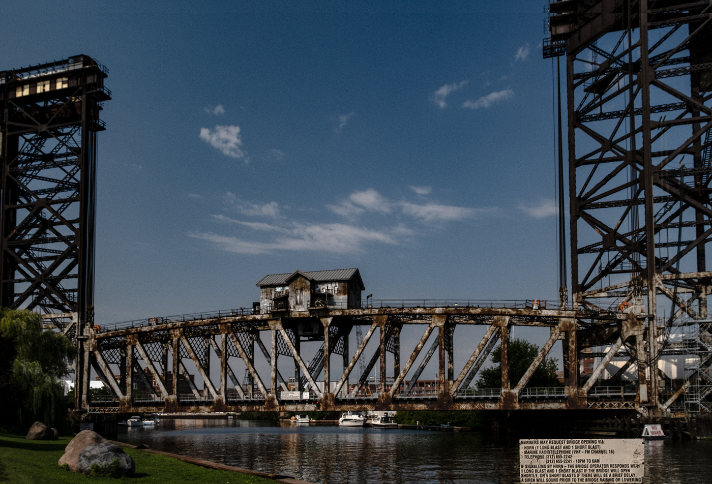
Randy, Love the lines and angles of the Yaquina Bay Bridge. You couldn't have picked a better day for the clouds. The monochrome highlights the two arches and cement foundations. The shrubbery adds a softness. I wouldn't change anything. |
May 14th |
| 9 |
May 25 |
Comment |
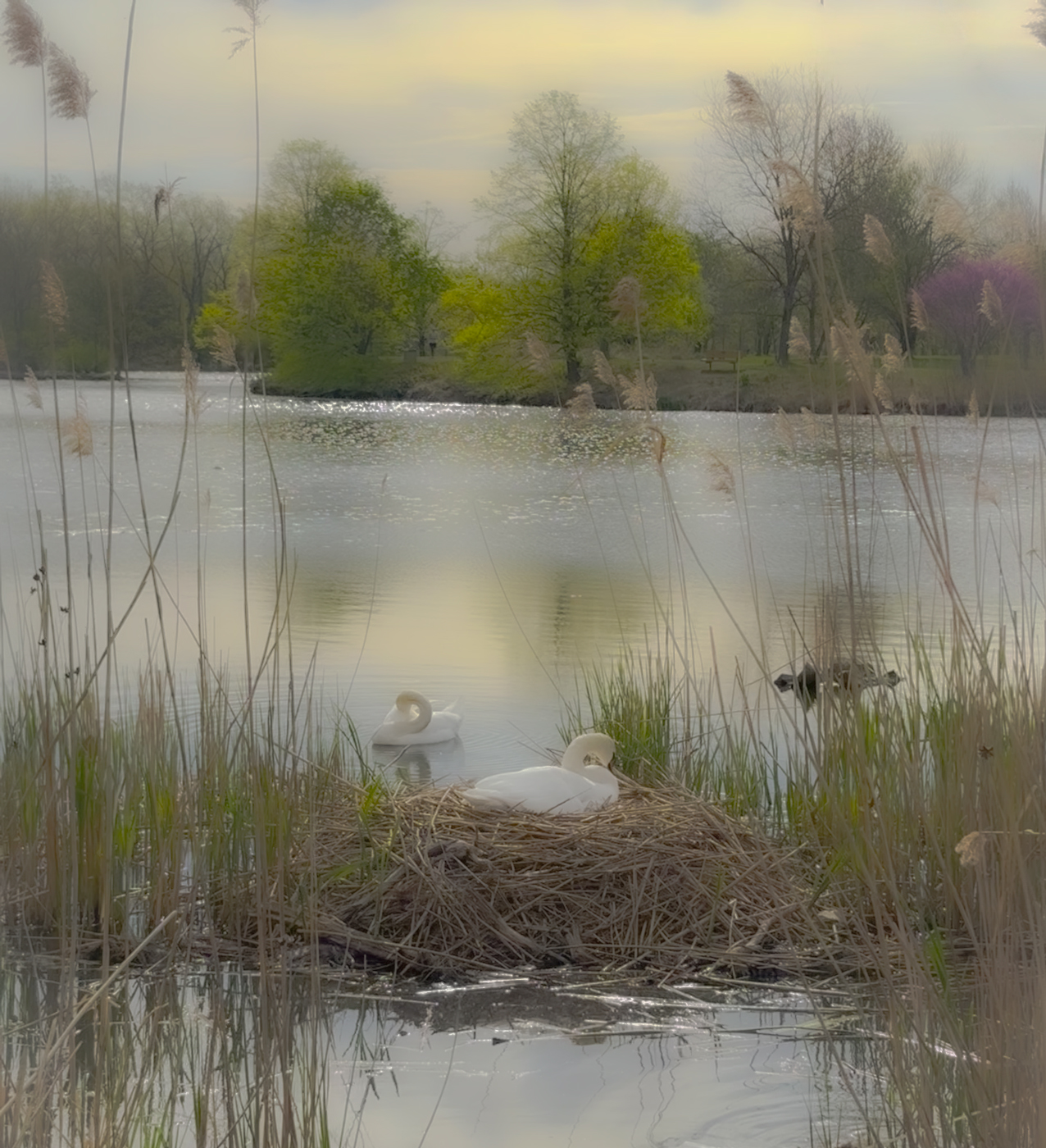
Sylvia, Thanks for sharing your Japan photos! I was also drawn to the foreground building. I would crop to the Torii gate and Benzaiten shrine to highlight Japanese culture . I also like the above edits to bring back your memory of the blue sky.
Great image! |
May 14th |
| 9 |
May 25 |
Comment |
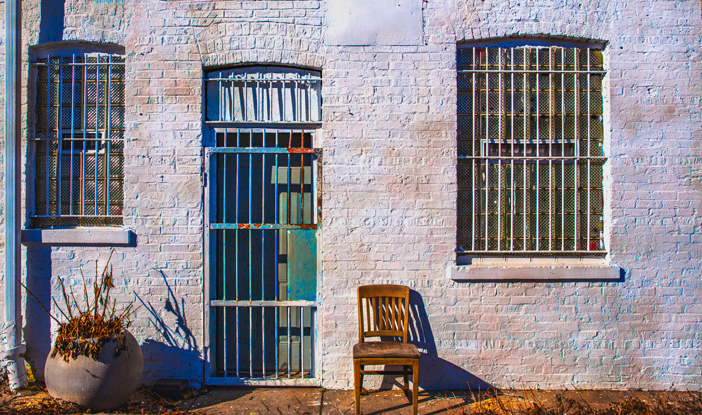
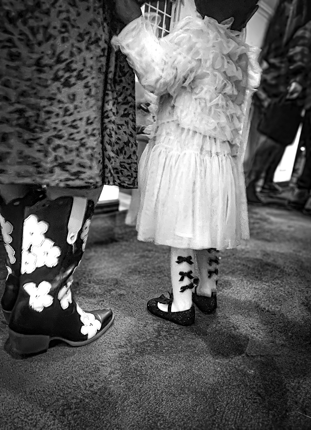
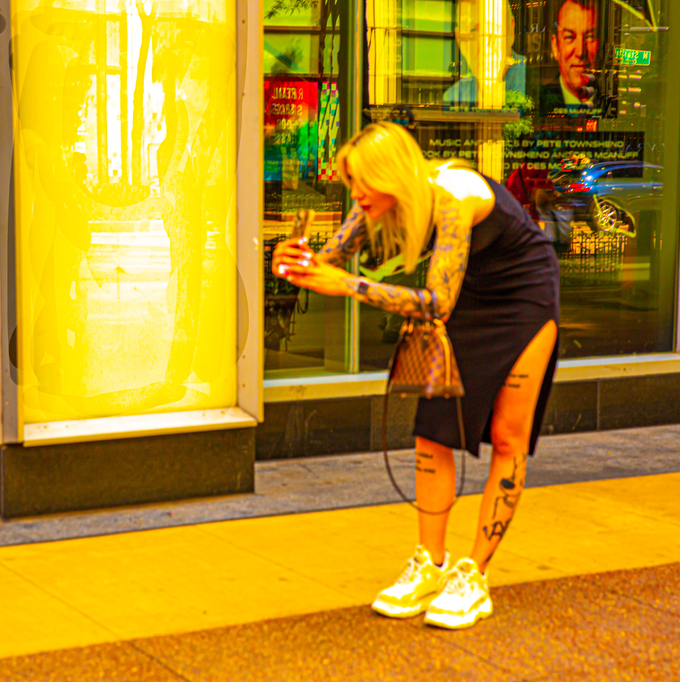
Linda, I agree that the shoe adds more to this story...and the spatters dripping between the head and shoe. Your editing enhances the small details that allow your mind to wonder. Great image! Reminds me of Bansky . |
May 14th |
| 9 |
May 25 |
Comment |
Doug, What a cheery photo! Love the way you caught the petals peeling back as if to say hello we're here! Depth of field highlighting the orange flower was a good choice. Have you tried AI expansion to complete the red flower on the right? |
May 14th |
| 9 |
May 25 |
Comment |
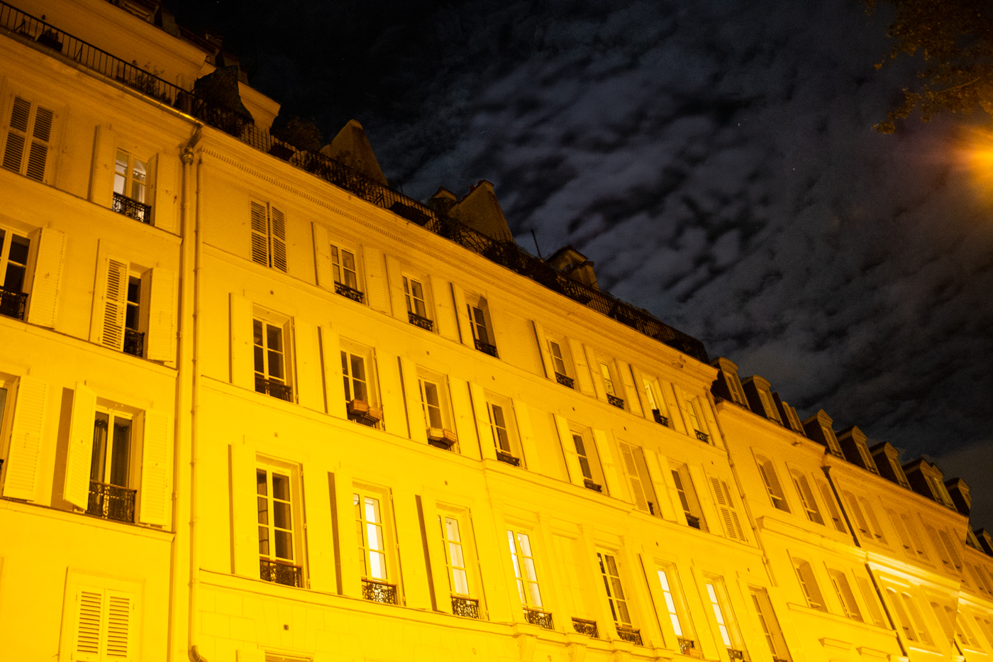
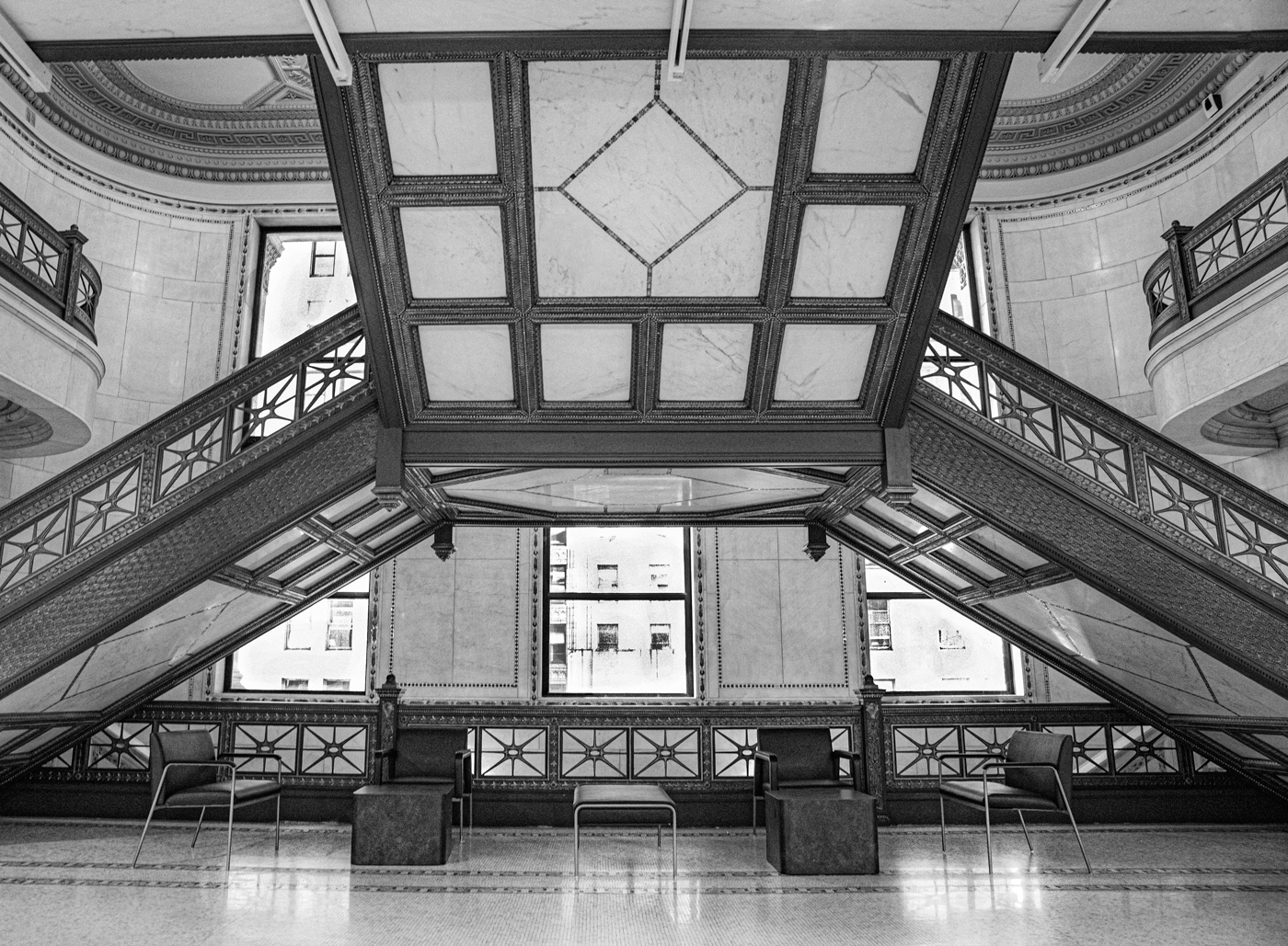
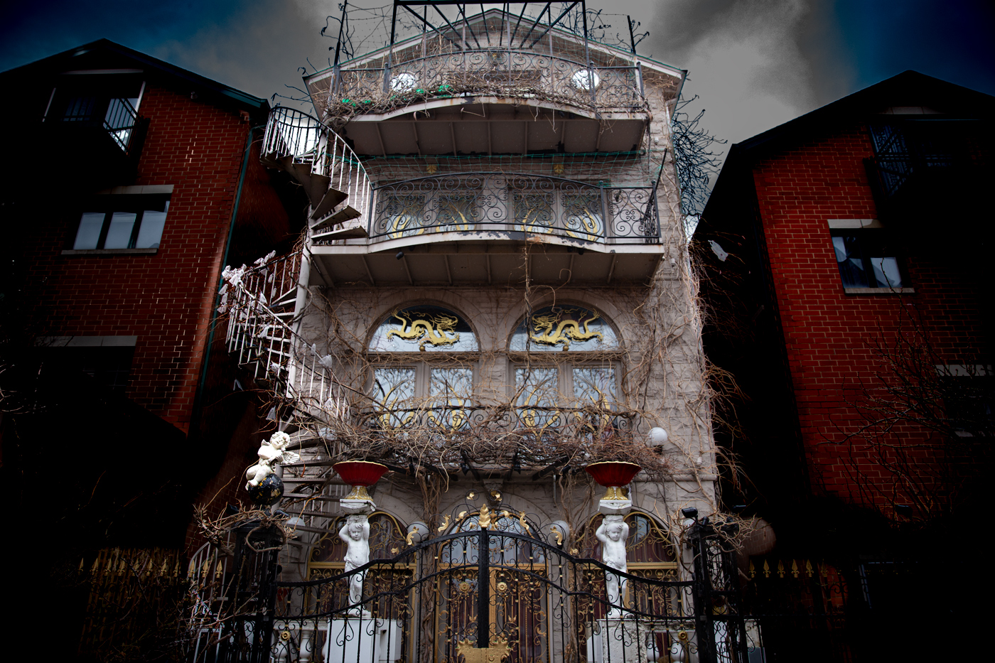
Sabine, Your photo certainly show's off the building's grandeur which inspired me to Google it. Interesting history. I like the framing you choose with the angle of the ceiling and parkay floor. Even though your post editing enhanced the colors, I kinda like the color of the original ceiling. Maybe somewhere between the original ceiling and the edited version. Your photo sparked my shopping curiosity.
Btw, I also attended Ian Plant's seminar. |
May 14th |
8 comments - 6 replies for Group 9
|
8 comments - 6 replies Total
|