|
| Group |
Round |
C/R |
Comment |
Date |
Image |
| 9 |
Apr 26 |
Comment |
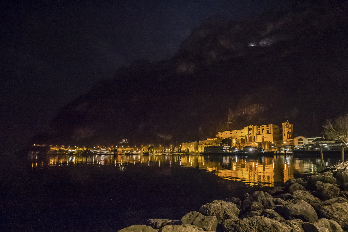
Very well observed and very well composed, Douglas.
Each of the two subjects is worthy of a photograph in its own right. Atlas carries the heavens on his shoulders, and one almost gets the impression that he's supporting the church as well. Together, they symbolize strength for me, and the low-angle perspective makes them even more imposing. The new skyscrapers on the left and right provide a striking contrast to the old ones, the historical ones.
Making Atlas stand out even more from the background isn't easy. I tried using the "Adjust Lighting" tool, reducing the overall brightness slightly and increasing the contrast a bit.
This makes the buildings on the left and right darker, framing the main subject.
Then, you can use the Dodge tool to brighten the church. (My result isn't presentable yet.)
Perhaps your iPhone also has the option to take an overexposed and an underexposed photo. These two photos would then need to be combined to create an optimized image. However, I'm not an iPhone expert. |
Apr 10th |
| 9 |
Apr 26 |
Reply |
Thanks, Stephen, for your comment. I like both photography and painting. I find it particularly challenging to transform a photograph into a painting. In my opinion, Sylvia succeeded with her April picture. |
Apr 10th |
| 9 |
Apr 26 |
Reply |
Douglas, thank you so much for your interesting post.
I'm not entirely sure what you mean.
"The photo doesn't feel like a photograph to me-more like a painting or watercolor. Perhaps the post-processing limited the depth and texture of the scene."
I think you see it like Sylvia does: the tulip blossoms no longer look realistic due to the post-processing, they draw too much attention and thus disrupt the overall impression/mood?
Let me know what I could change. I'm curious.
Of course, you're welcome to edit my photo too.
And, Italy is beautiful. Why not travel to Europe sometime? |
Apr 10th |
| 9 |
Apr 26 |
Reply |
Sylvia, thank you for your suggestion. I will take another look at the picture when I have more time, paying particular attention to the tulips. |
Apr 10th |
| 9 |
Apr 26 |
Reply |
Linda, I'm glad you like my picture. I was immediately captivated by the pink tulips too. |
Apr 10th |
| 9 |
Apr 26 |
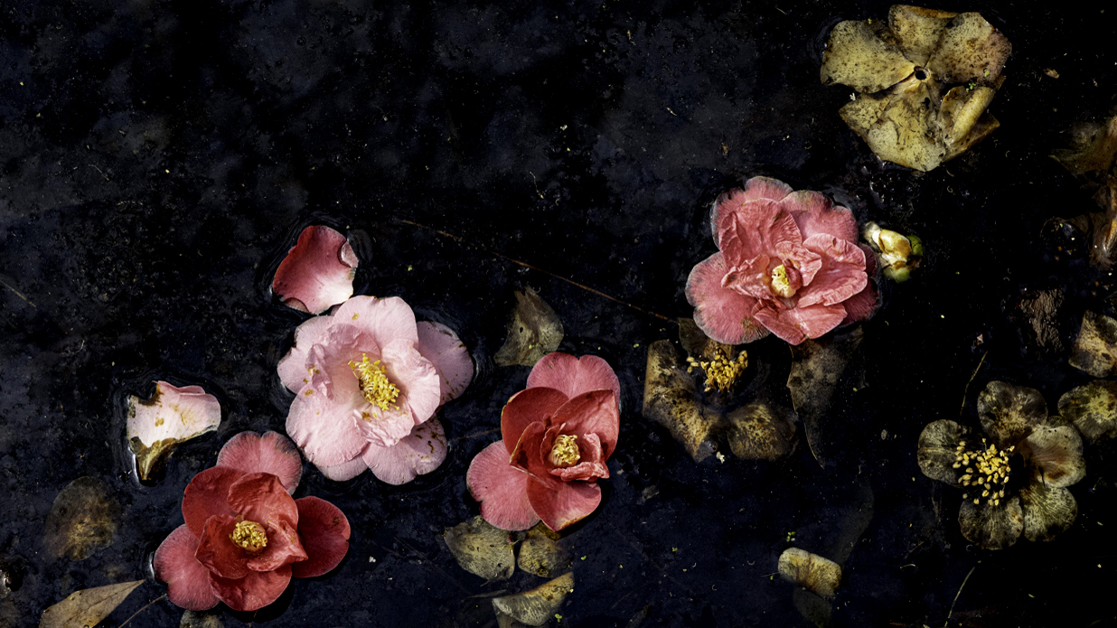
Comment |
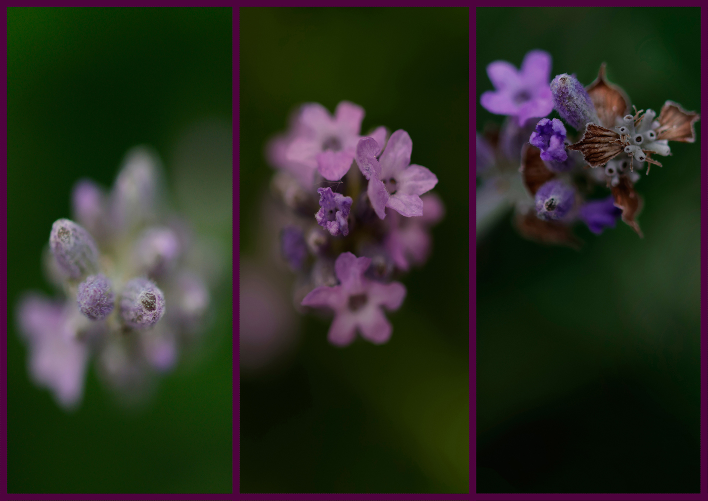
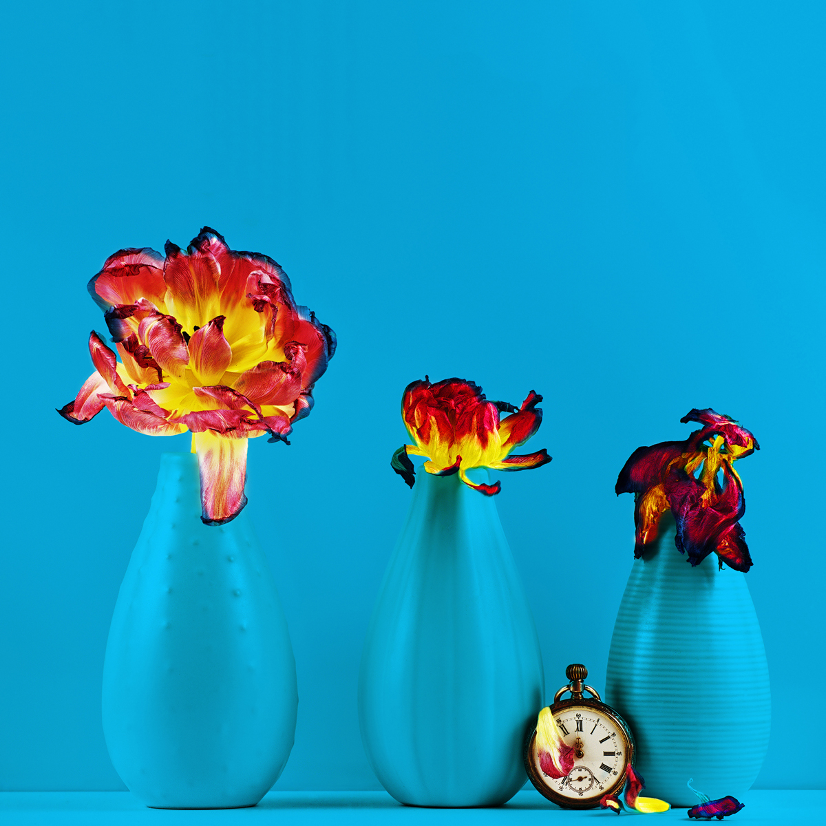
Sylvia, a wonderful picture, like something by the old masters.
I see the fresh camellia blossoms in two different shades. My gaze is immediately drawn to the lighter bloom, framed by two darker ones and two petals.
The lighter one is positioned at the focal point. Then my eye wanders to the right and finds another blossom. Now my gaze goes upwards and I notice the slightly darker blossom, beautifully placed. Finally, I look at the withered blossom in the upper right corner.
The individual withered blossoms blend into the composition, their monotonous brown supporting the brighter blossoms and making them shine even more.
The filled lower right section of the image finds its counterpart in the open upper left.
This prevents the image from feeling cluttered and instead draws the eye back to the flowers.
The composition is absolutely perfect.
Your message is clear, and I agree with Doug: there is a "circle of life" quality to the composition!
Perhaps you'll like my minimal changes. First, I set a black point in the tonal correction to make the background (water) a bit darker, cropped the image to a 16:9 aspect ratio, and removed the green on the right.
What a shame I didn't look at the ground in the camellia garden in Locarno. |
Apr 10th |
 |
| 9 |
Apr 26 |
Comment |
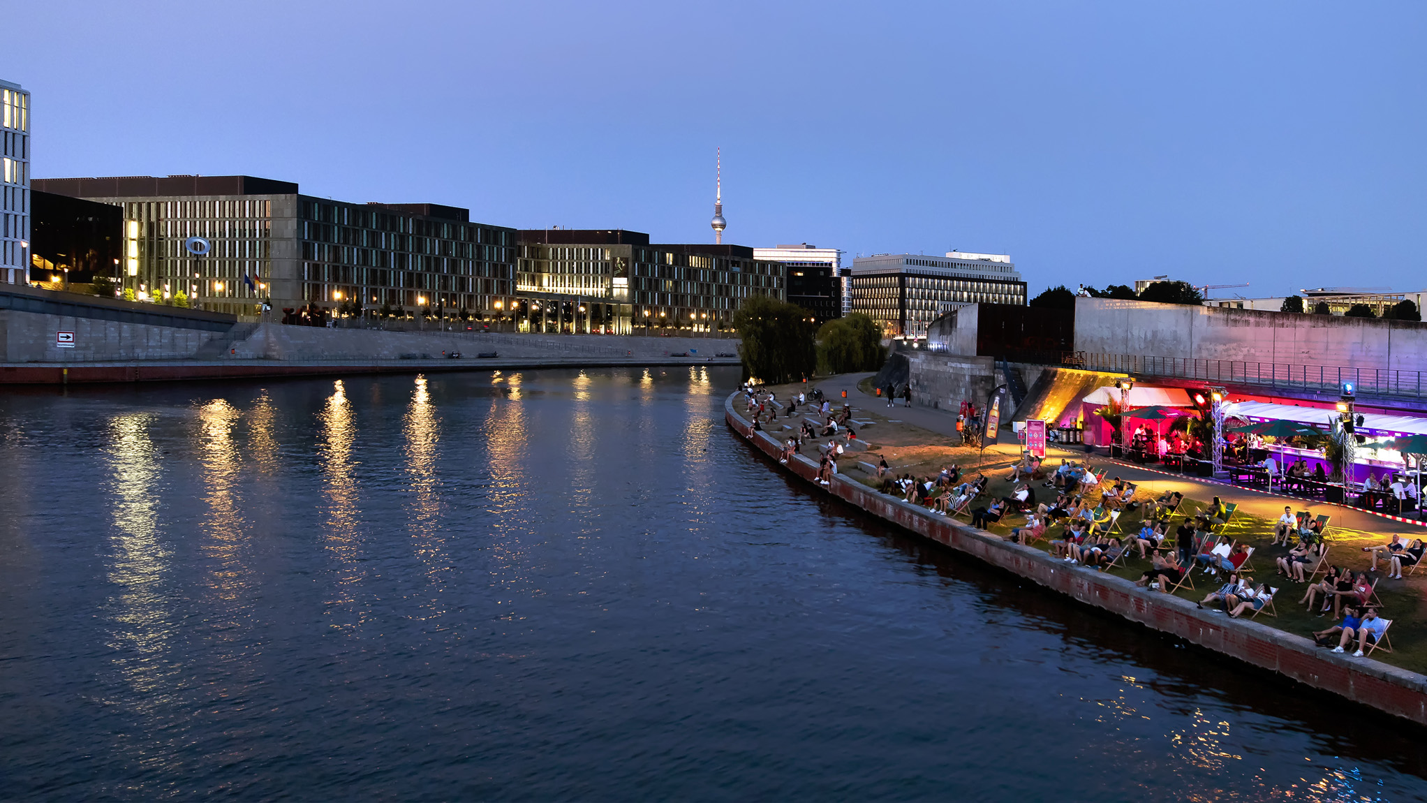
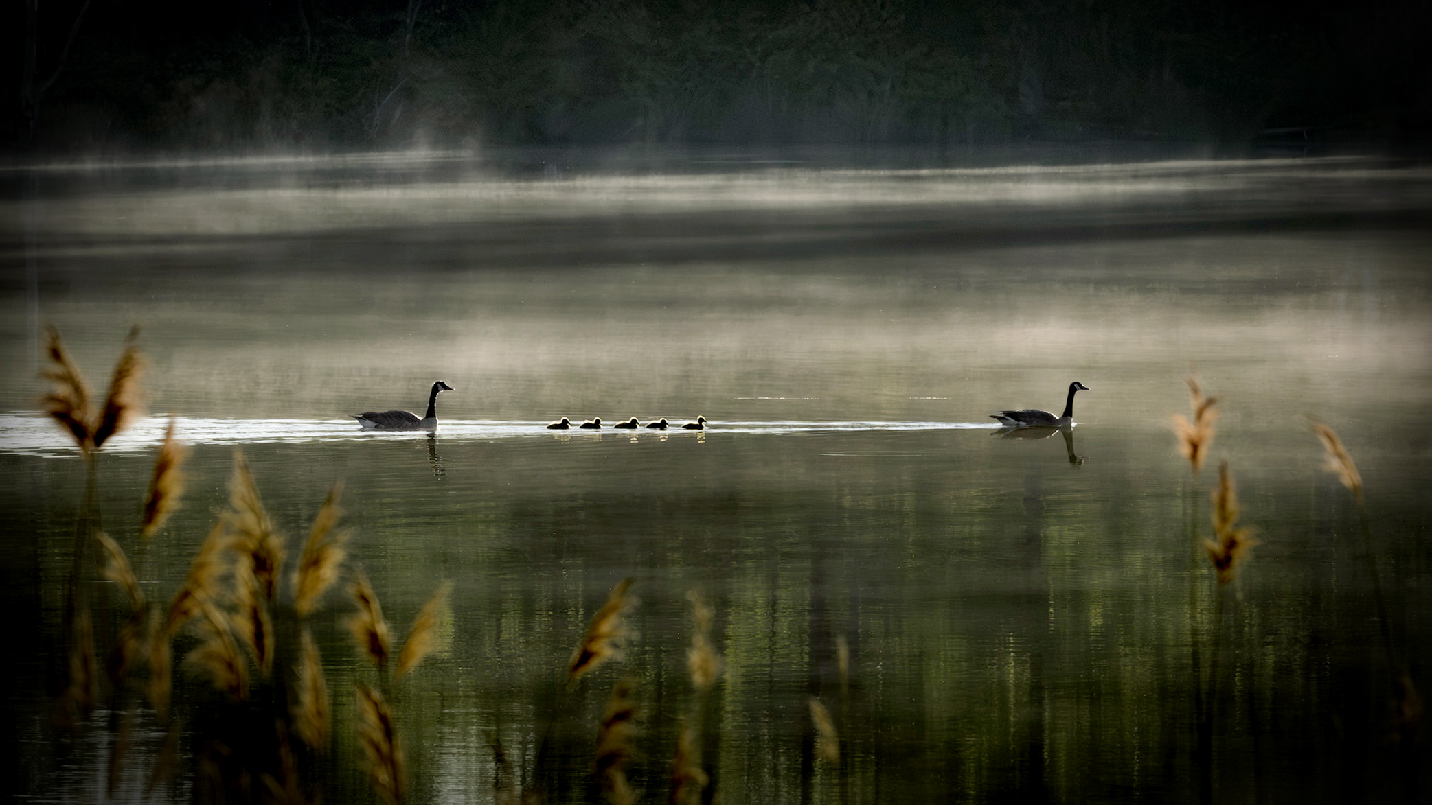
Jim, first of all, thank you so much for this atmospheric picture. I can almost see the parents paddling along with their goslings; it could almost be a Sunday morning outing. The little ones swim protected between their father and mother, wonderful light on their heads and reflections in the water.
I really like your composition; the foreground, middle ground, and background are all there and each fulfill a different purpose.
You did a great job with the lower frame of the goose family. The reeds don't bother me because of the blur. The distance of the geese to the edge of the frame is consistent, and I find harmony, peace, and balance here. The mist is visible, and I can guess what time of day it is.
I've been thinking about what I would change. As I said, it's just a suggestion and doesn't necessarily have to meet with your approval. That's okay.
I worked with your final image. First, I set a black point in the tonal correction and then slightly reduced the overall tonal values.
I adopted your idea of ??a vignette and intensified it. That also solves the problem with the tree trunk in the upper left.
Perhaps you'll like my edit. I'm curious. |
Apr 9th |
 |
| 9 |
Apr 26 |
Comment |
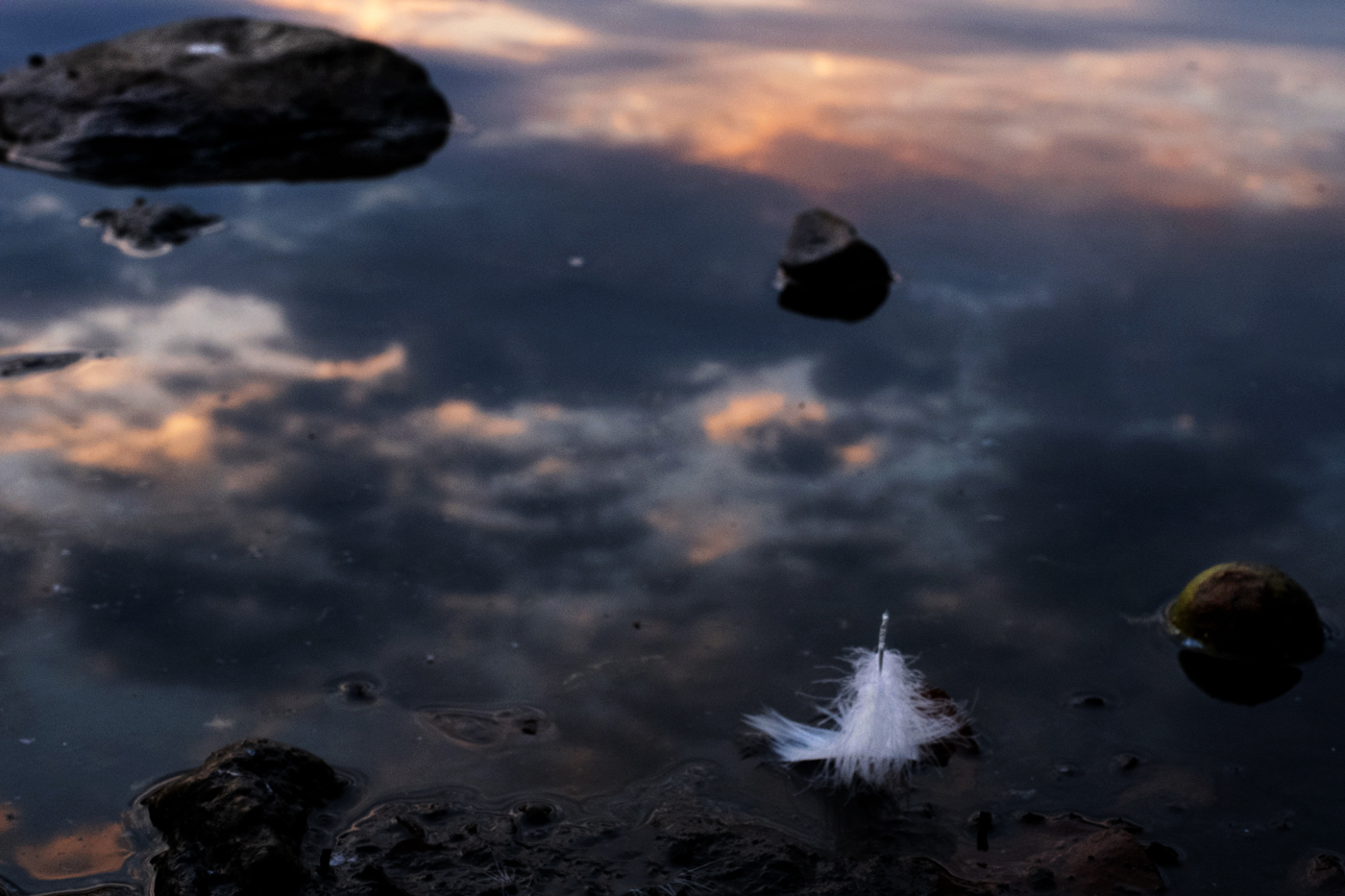
Yvonne, instead of looking up, I should also look down for once.
I almost feel as if the four elements are converging here:
water, earth in the form of stones, fire reflected in the clouds, and air through the feather.
So multifaceted, yet minimalist, full of contrasts and atmospheric at the same time! A wonderful image in which I constantly discover something new and can let my imagination run wild.
Regarding your pictures, I can say that I don't particularly like monochrome. It simply doesn't capture the mood.
I prefer your "Fleeting Moment."
Furthermore, I find the composition very fitting. As Randy wrote, the stones frame the feather. The gradient from dark to light also leads the viewer into the image and back again to the feather.
Thank you for this inspiring image, Yvonne.
Now, my suggestion isn't meant as an improvement, but rather as an idea.
I wondered what I would do with the image. After many attempts, I liked this one best. Overall, I've slightly reduced the tonal range, added a touch of yellow, and lightened the feather and the three stones using the Dodge tool.
I'm curious to hear your opinion. |
Apr 9th |
 |
| 9 |
Apr 26 |
Comment |
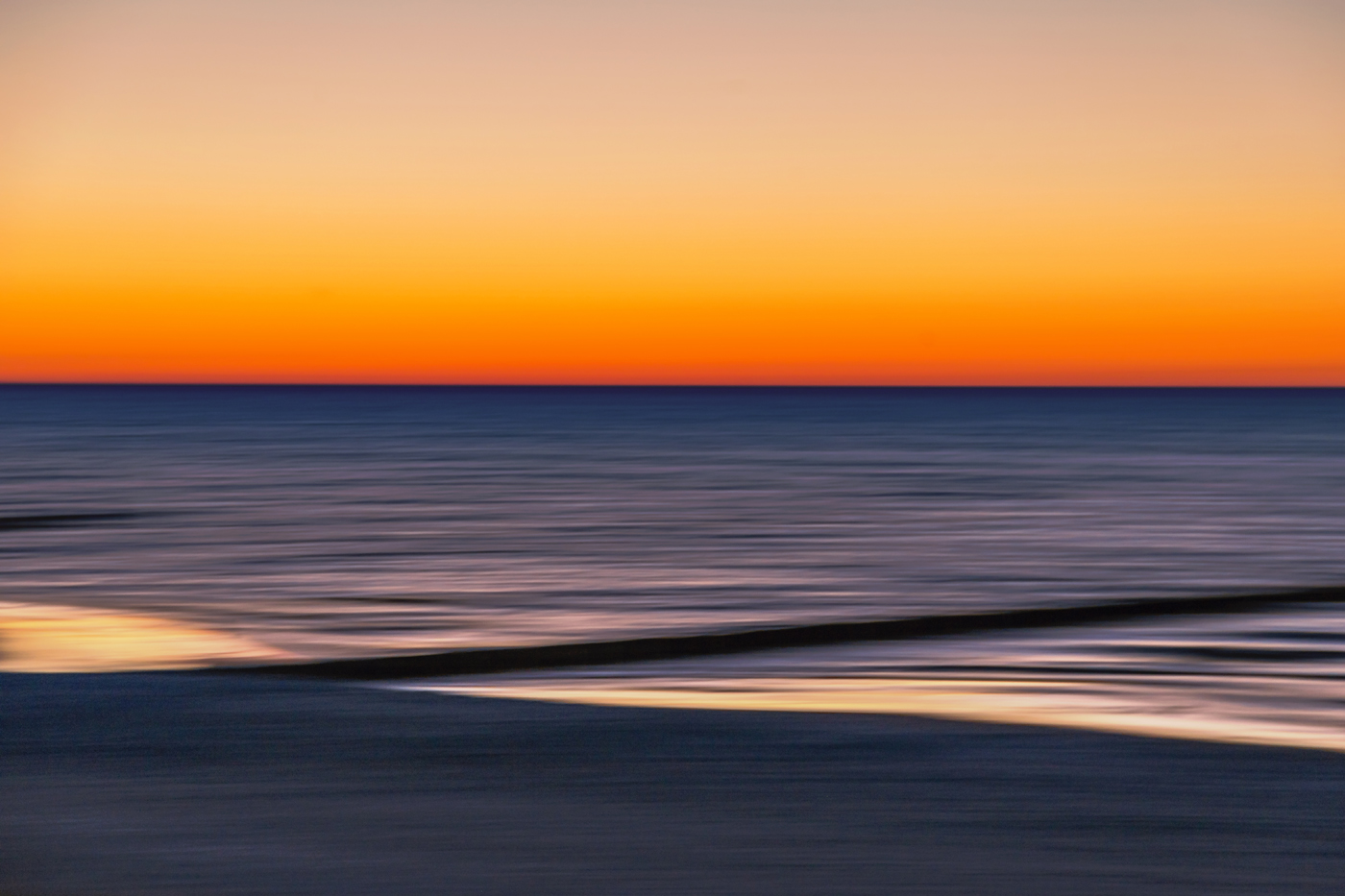
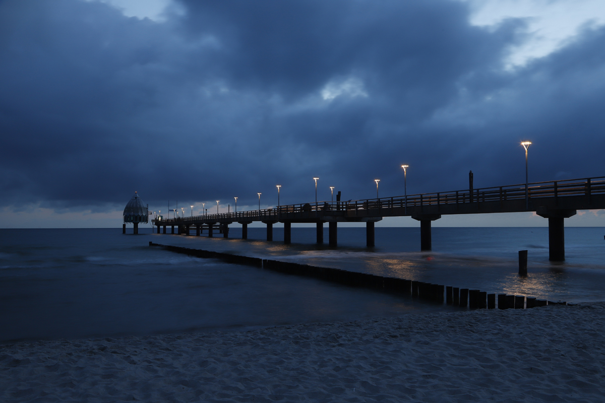
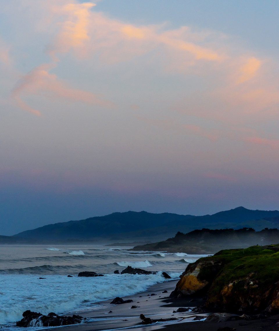
Randy, I was immediately transported to that scene.
Before sunrise on the beach, deserted, and the world is simply beautiful in that moment!
The reddish sky, the blue haze over the mountains, and the dark rocks in the foreground. The gradient from dark to light - very well observed and executed - perfectly complements your image. I can also hear the waves crashing on the beach.
If it were my photo, I would crop the bottom a bit; that would balance the composition (one-third landscape and two-thirds sky) and make the image more harmonious overall. I would also add a touch of red and yellow and increase the brightness slightly.
(In Photoshop, I always start with the exposure and then adjust the colors. Often, I like my image better that way.)
Perhaps you'll like it and it will give you some inspiration for further work with the image. |
Apr 8th |
 |
5 comments - 4 replies for Group 9
|
5 comments - 4 replies Total
|