|
| Group |
Round |
C/R |
Comment |
Date |
Image |
| 9 |
Oct 25 |
Comment |
These skyscrapers are impressive! Your chosen perspective further reinforces this impression. I find it hard to imagine, but the middle tower has 88 floors.
I also like the variation in the glass surfaces. That, too, makes the image interesting.
The white cube stands in contrast to the skyscrapers. I just read that it's the cultural center The Shed. The outer shell can also be enlarged. Very modern.
You captured the contrast between the cool architecture and nature well, Linda. |
Oct 16th |
| 9 |
Oct 25 |
Reply |
Thank you for writing such a detailed description of the photo, Randy.
I can only say the whole trip was wonderful. All the buildings, like the Leaning Tower of Pisa and the cathedrals, were simply impressive. |
Oct 16th |
| 9 |
Oct 25 |
Reply |
Yvonne,Thank you for your kind words, and I'm glad I was able to express the atmosphere, the wonderful details of this room, and my admiration. |
Oct 16th |
| 9 |
Oct 25 |
Reply |
A good idea to make the Three Graces a bit brighter so they stand out from the background. Thanks for the
suggestion,Douglas. |
Oct 16th |
| 9 |
Oct 25 |
Comment |
Yvonne, I love this picture and can't offer you a single suggestion for improvement.
I see wonderful green tones, very realistic. I see branches that lead me to the main subject, the bridge. The people on the bridge bring the landscape to life. The waterfall in the picture flows for me and isn't completely frozen like in other photos. The direction from left to right leads me out of the picture; the bright green to the right draws my gaze back up. Flipping the photo horizontally was a very good decision. |
Oct 12th |
| 9 |
Oct 25 |
Reply |
This picture has depth, the objects are placed very carefully. That's what I meant when I asked if you prefer the Gothic theme.
The lighting from the side fits the theme so wonderfully, emphasizing the mystique, as does the filter you used.
By the way, I didn't notice that the skull was made of plastic.
I'd also like to see your new picture. |
Oct 12th |
| 9 |
Oct 25 |
Reply |
I spent a long time thinking about which picture to show our group, Jim.
Of course, I also photographed the Leaning Tower of Pisa, but I was overwhelmed by these wonderful interiors, whether it was the Cathedral of Siena, the Pisa Cathedral, or this library. Simply fantastic. |
Oct 12th |
| 9 |
Oct 25 |
Reply |
Thank you for your comments, Sylvia. I, too, stood in the library filled with awe and admiration. My admiration goes out to the people who created this magnificent space. And they did so at a time when there was no artificial light. How could they, for example, paint the ceilings with only natural light? The artists have created something great. |
Oct 12th |
| 9 |
Oct 25 |
Comment |
Doug, When I first heard the name Winterthur, I thought of the Swiss town and was a bit confused.
Then I realized it's Winterthur, Delaware. There's interesting reading about the town.
And photographically, it's a place for wonderful landscape shots.
Your photo draws me right into the landscape.
I walk over the bridge in the lower left foreground down to the stream.
There I walk along the river to the small house and from there, I let my gaze sweep once more over the hilly landscape. I enjoy the sunshine. Wonderful!
An October stroll for the soul.
Perhaps you'd also like your picture in panorama format. |
Oct 8th |
 |
| 9 |
Oct 25 |
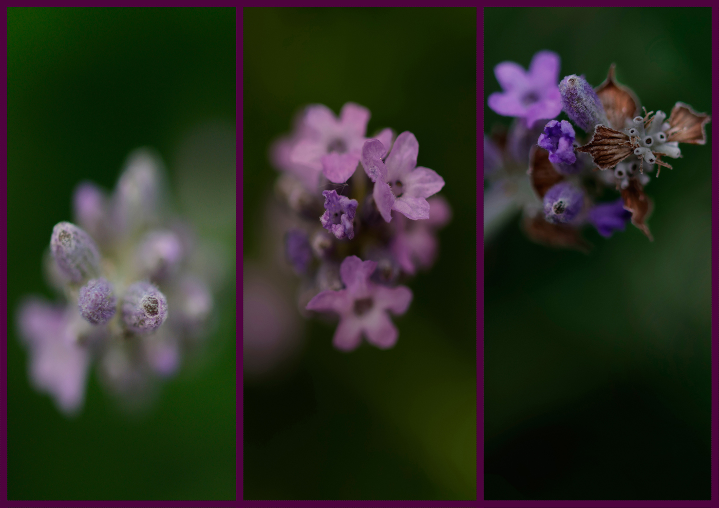
Comment |
Jim, It's autumn here, it's raining, and mostly windy. I look at your rose and think back to summer.
You've done a great job of cropping your subject, bringing it into focus across the frame.
The sharpness is just right, the textures are clearly visible, and the color reminds me of porcelain.
The light-dark gradient draws the eye to the center, and the blurred background
works wonderfully.
With the light, the rose tells me, "I'm a beauty, but I don't boast about it."
|
Oct 8th |
| 9 |
Oct 25 |
Comment |
Randy, It's great that you took your camera out again. It was worth it.
I like hibiscus, and you captured this flower so beautifully.
The eye is drawn from the bottom right and rests on the flower. Only then do you see leaves and other flowers, which lead into the depth.
The color of the flowers is exactly as I remember them from last summer.
I think the cropping is appropriate; it puts the flower in focus.
The edits bring out the colors.
I thought about how I could make the flower brighter,
so I added another vignette.
I hope that was okay and that you like it too. |
Oct 8th |
 |
| 9 |
Oct 25 |
Comment |
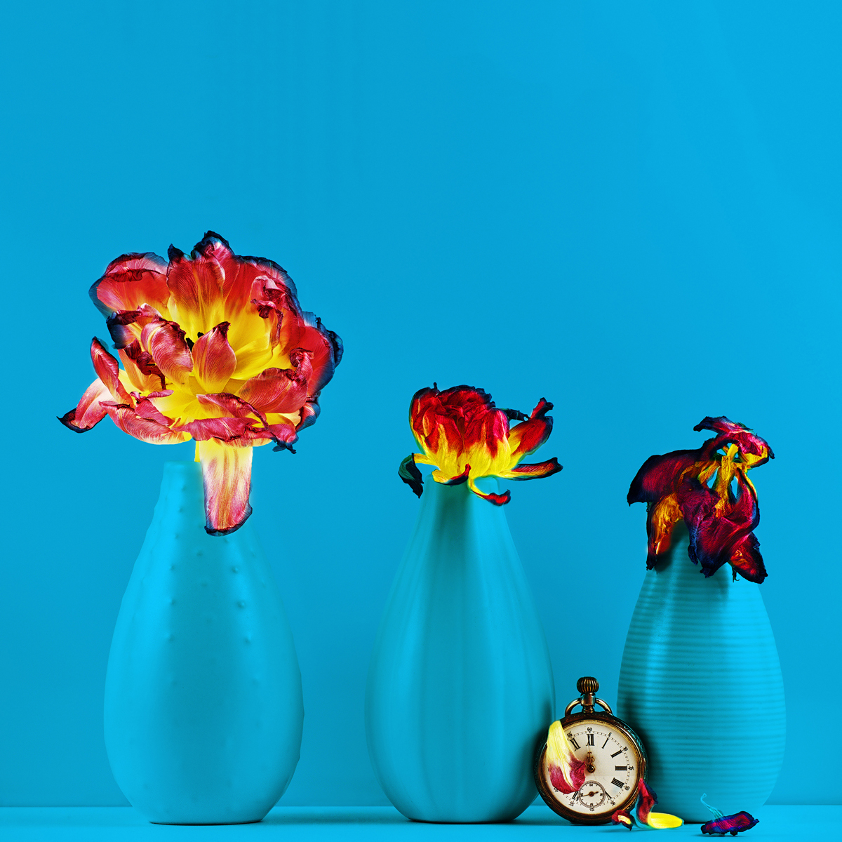
Sylvia, This photo is completely different from the September photo.
Are you more into the Gothic theme?
For me, it contains important symbols of a Baroque still life.
Dried flowers symbolize decay, an overturned bucket that stands for the end of life, the pearl necklace as a symbol of wealth, and finally, of course, the skull.
I'm curious where you got that.
Burnt-out candles in the candlesticks would have also fit the theme.
But that's just a suggestion.
I like the composition. The foreground and background add depth to the image.
The somber/darker tone emphasizes the overall effect of the image.
How much editing did your original image need? Did you use a filter?
I'm looking at the color image right now. I really like both images. |
Oct 8th |
6 comments - 6 replies for Group 9
|
6 comments - 6 replies Total
|