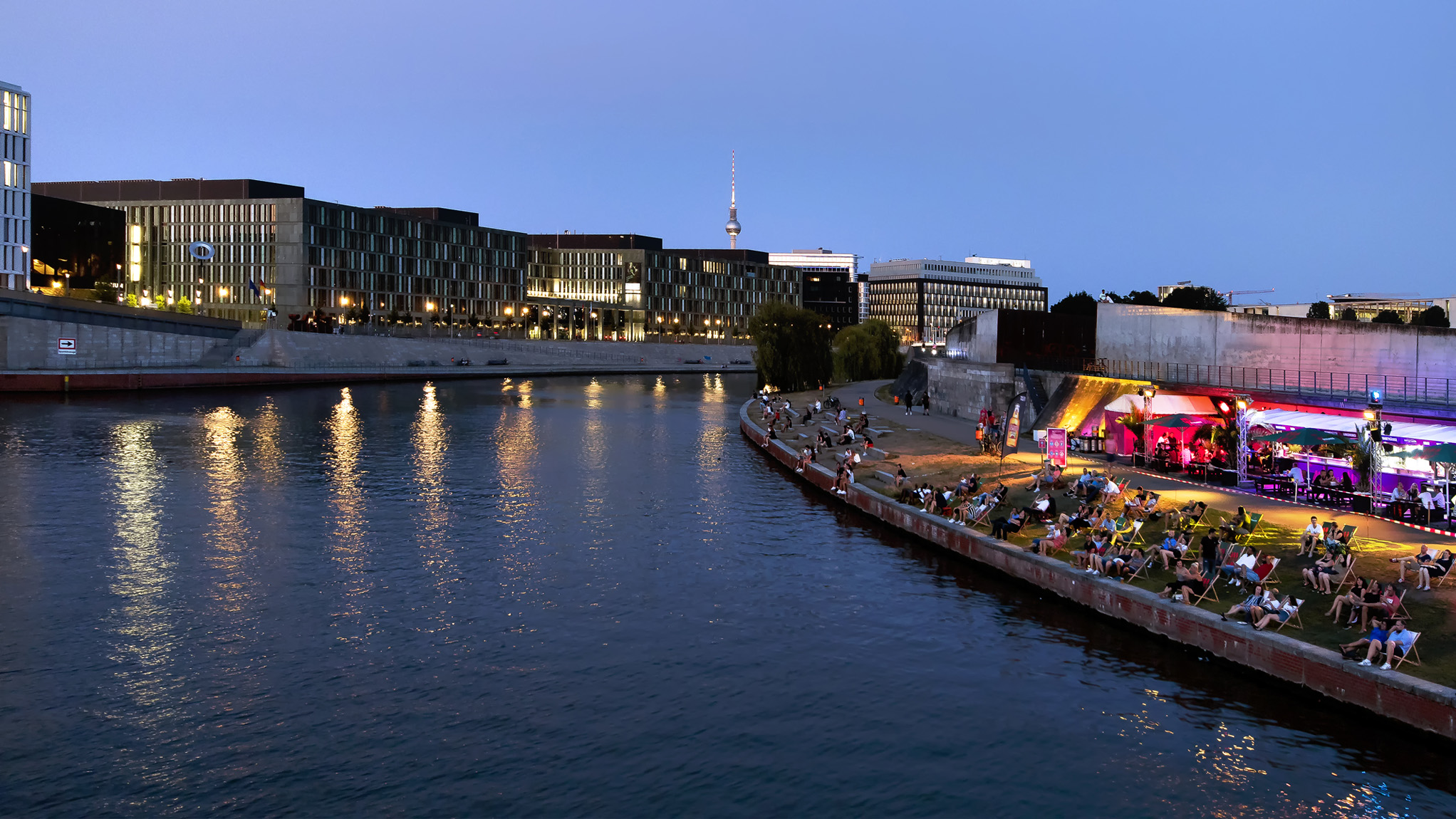
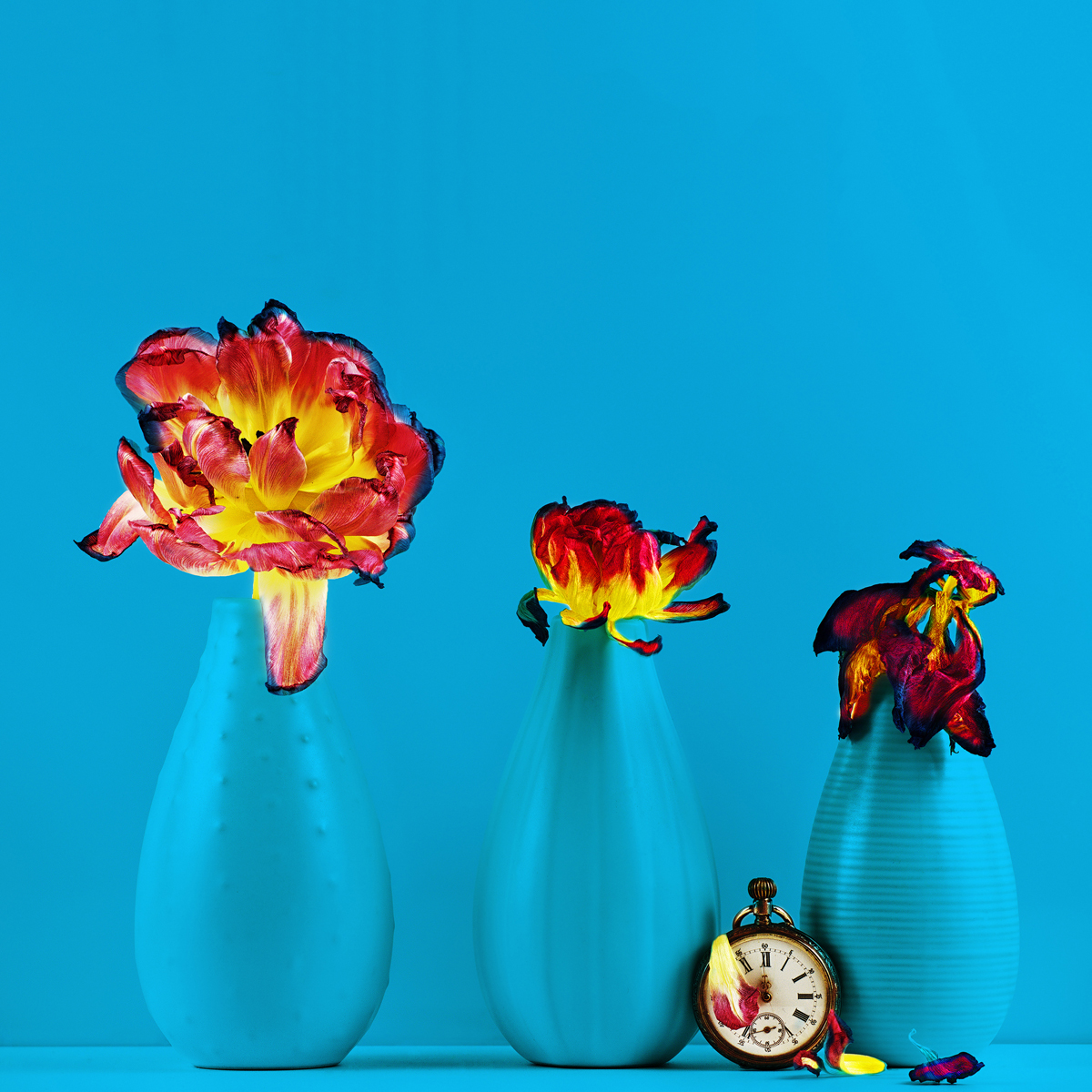
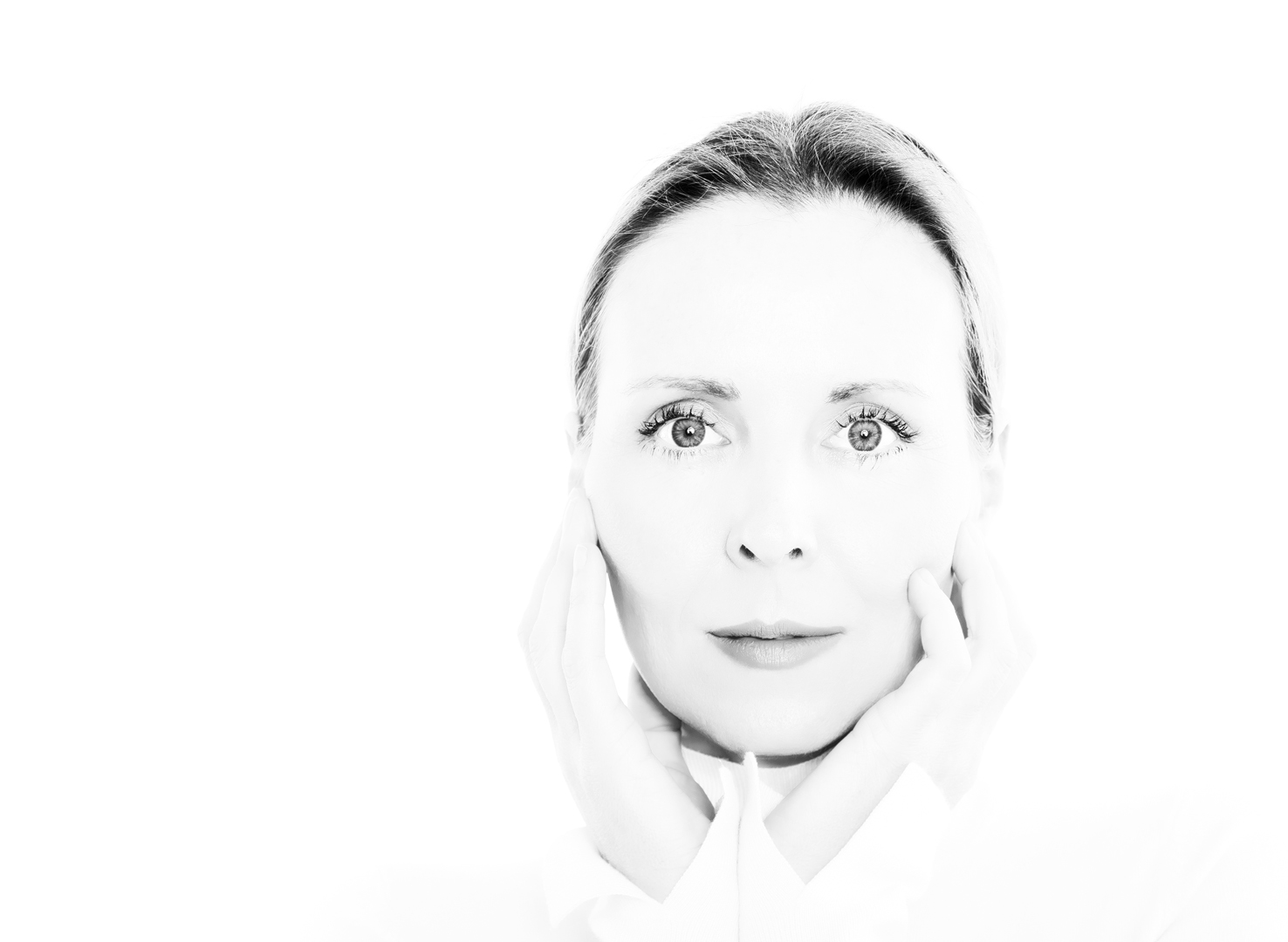
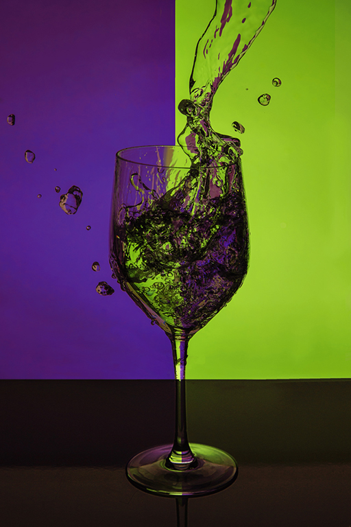
|
| Group |
Round |
C/R |
Comment |
Date |
Image |
| 9 |
Jun 25 |
Comment |
Randy, thank you very much for your comments. I like to do workshops and then try to put what I've learned into practice.
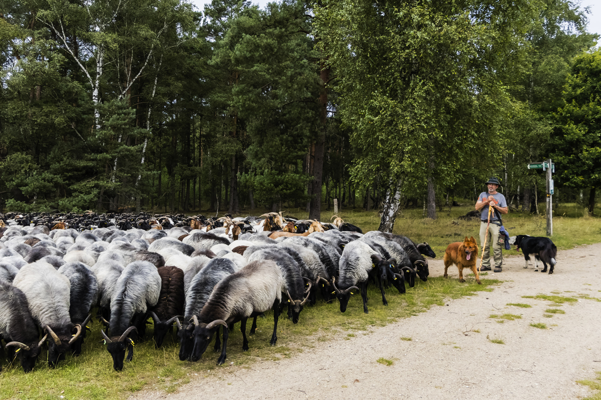
In all my photography activities, for example, I always try out panning with the camera.
A good photo sometimes has to do with luck. Just try out the technique.
|
Jun 18th |
| 9 |
Jun 25 |
Reply |
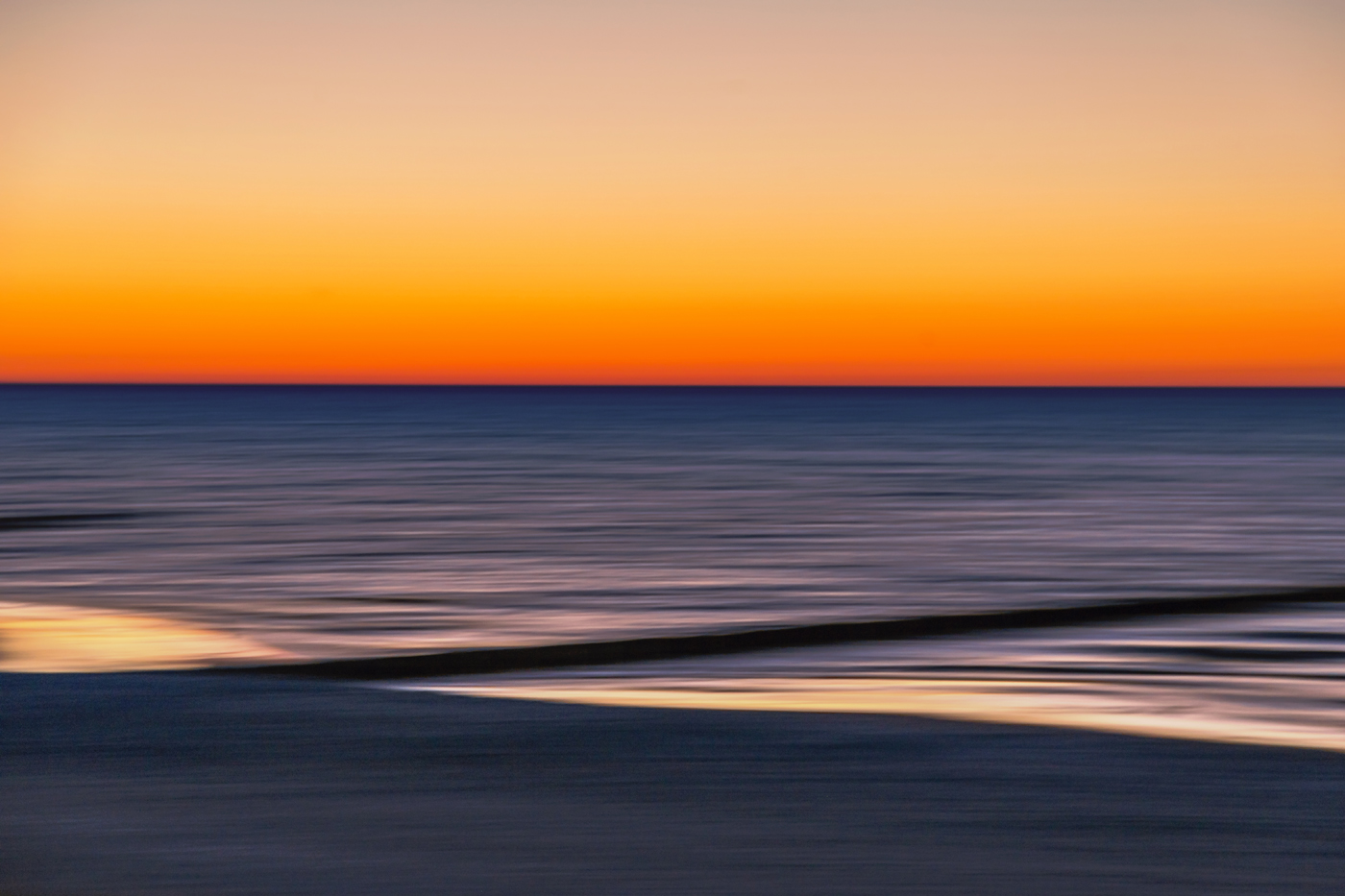
Yvonne, Now I understand what you and Jim mean by the black line. It's a groyne, wooden piles sticking out into the sea to break the force of the waves.
Thank you for your suggestion to lighten the line. I will give it a try.
In short, painterly photography to me means using my skills, abilities and equipment to paint images that trigger something in the viewer of the image.
|
Jun 15th |
| 9 |
Jun 25 |
Reply |
Jim, When images trigger emotions, touch the viewer and invite them to look at them for longer, then you can only be happy.
Thank you for writing in such detail about the image and your emotions.
|
Jun 15th |
| 9 |
Jun 25 |
Comment |
Randy, as Yvonne has already said, once a photographer always a photographer. For me, I look at a lot of things with a photographer's eye. Is a photo worth taking? How could I realize the situation?
You definitely had an eye for this elegant entrance area.
Old architecture combined with modern wall design, warm, inviting light. Lines that lead to the door, to brightness. Images on the wall that arouse curiosity. I like your image just the way it is. Well done.
I would remove just one small detail, the small ceiling lamp at the top right.
|
Jun 15th |
| 9 |
Jun 25 |
Comment |
|
Jun 15th |
 |
| 9 |
Jun 25 |
Comment |
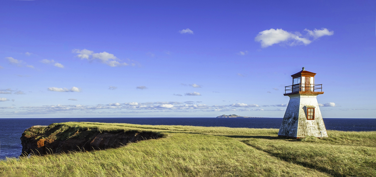
Jim, I immediately see the lonely lighthouse, the wide horizon and can immerse myself in the place. The lighthouse could certainly tell many exciting sea stories. My imagination is awakened.
The lines of the path from the bottom right and the lines of the path from the left lead me directly to the lighthouse. The lighthouse is well placed in the image and also helps my gaze to wander into the distance. On the other hand, it also divides the lines as it stands vertically and thus brings tension into the image.
Here too, less is more, the attention is on the lighthouse and the whole composition supports the strong focus on this part of the image. The light from the right also makes the lighthouse shine.
The colors of the foreground match well with the colors of the sky and the water, the whole image looks harmonious.
The chosen aperture is perfect, the sharpness reveals details.
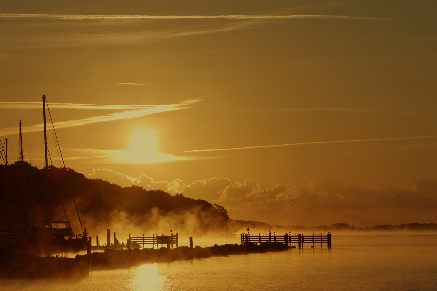
Jim, this is a wonderful image, I would only have a few improvements to make.
For me, the horizon is almost in the middle and therefore irritating.
That's why I cropped the image and straightened the horizon. Now the horizon is on the lower third line. I then increased the saturation for red slightly and reduced the brightness a little. So you can see the blood-red sandstones on the left, which are typical of these islands. I also increased the saturation in the blue channel to make your vignette look stronger. To create a little more distance between the horizon and the rock formation, I've removed some of the edge.
Maybe you like my suggestions.
|
Jun 15th |
| 9 |
Jun 25 |
Comment |
Sylvia, thank you for sharing your impressions of Japan with us. I haven't been to Japan yet, but I think this is a great travel picture. It shows the entrance to a shrine, the difficult ascent with many uneven stairs.
I like the surroundings, the many details to discover.
Unfortunately I can't speak Japanese, otherwise I would be able to read the signs.
Of course, I was tempted to straighten the archway and intensify the colors a bit, but no! For me, the image should be exactly as it is to preserve the atmosphere.
|
Jun 12th |
| 9 |
Jun 25 |
Comment |
Linda, I am irritated and amazed at the same time. Am I seeing the reflection or the original image?
In any case, you have succeeded in creating an image of the Eiffel Tower that makes you think. The fact that there is a river under the Eiffel Tower is enough to make anyone who has seen the Eiffel Tower wonder.
Thank you for the great idea .
|
Jun 12th |
| 9 |
Jun 25 |
Comment |
I would have grabbed the camera straight away with this motif, Douglas. The first thing I notice is the bright turquoise of the dress, then my gaze wanders up and I notice the proud posture of the young woman. As Quinceanera was a topic in my English lessons, I know what it means.
Her mother presents her majestically, in keeping with the occasion. The setting with roses and old walls fits perfectly.
You have captured the moment perfectly.
|
Jun 12th |
| 9 |
Jun 25 |
Comment |
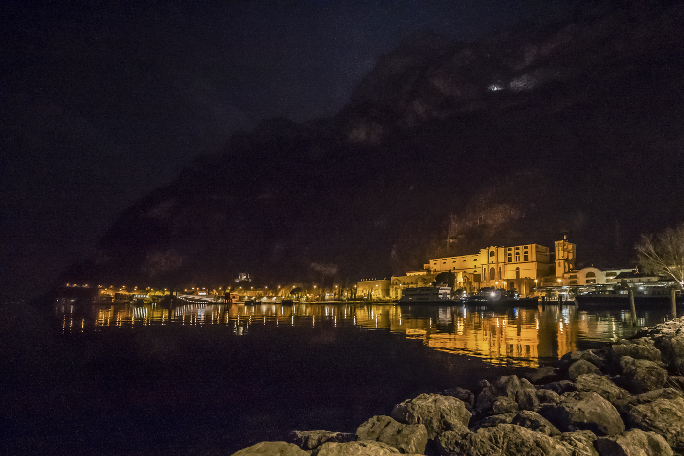
A special contemporary document and an honor for you to have been present at the brief opening of the church. Great!
I'm fascinated not only by the fact of which building it is, but also by the light coming through the windows. The bright light in particular leaves room for deeper interpretations.
The two men are in an exchange, they are facing each other and the priest's hands show a typical, inviting gesture. For me, a contrast between warmth and humanity and the coldness and desolation of the church.
I think you have mastered the difficult lighting situation very well.
You probably only had a brief moment to capture this scene.
I like your original composition a little better. As a viewer, you get an idea of the size of the church and its condition.
If you crop the photo on the left a little, the people in the middle will be the focus. But that's just a suggestion.
|
Jun 12th |
| 9 |
Jun 25 |
Reply |
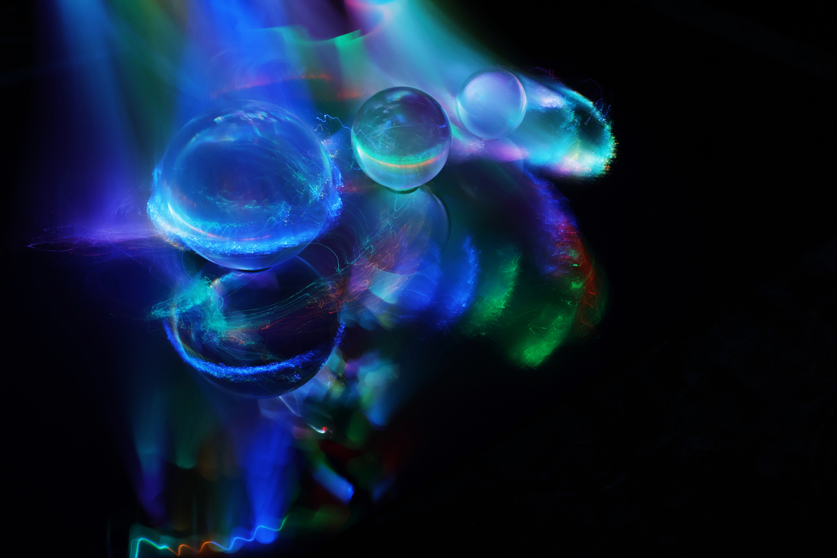
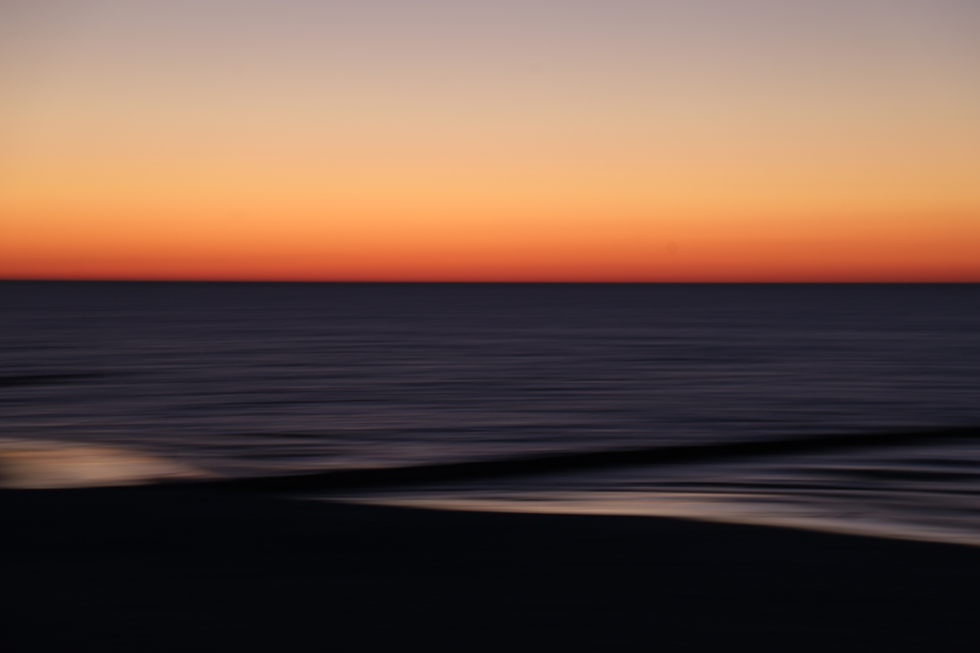
I'm glad you like my image, Sylvia, and don't give up! You can take wonderful, creative photos.
The difficult thing about ICM is that there are no universal settings for the camera.
It makes a difference whether I take photos with my full-frame camera or with my SLR camera. Each time I have to practise again until I'm happy with the result.
|
Jun 12th |
| 9 |
Jun 25 |
Reply |
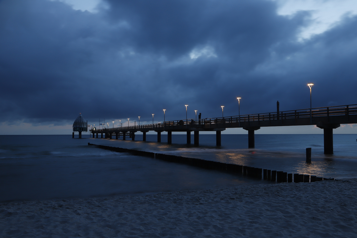
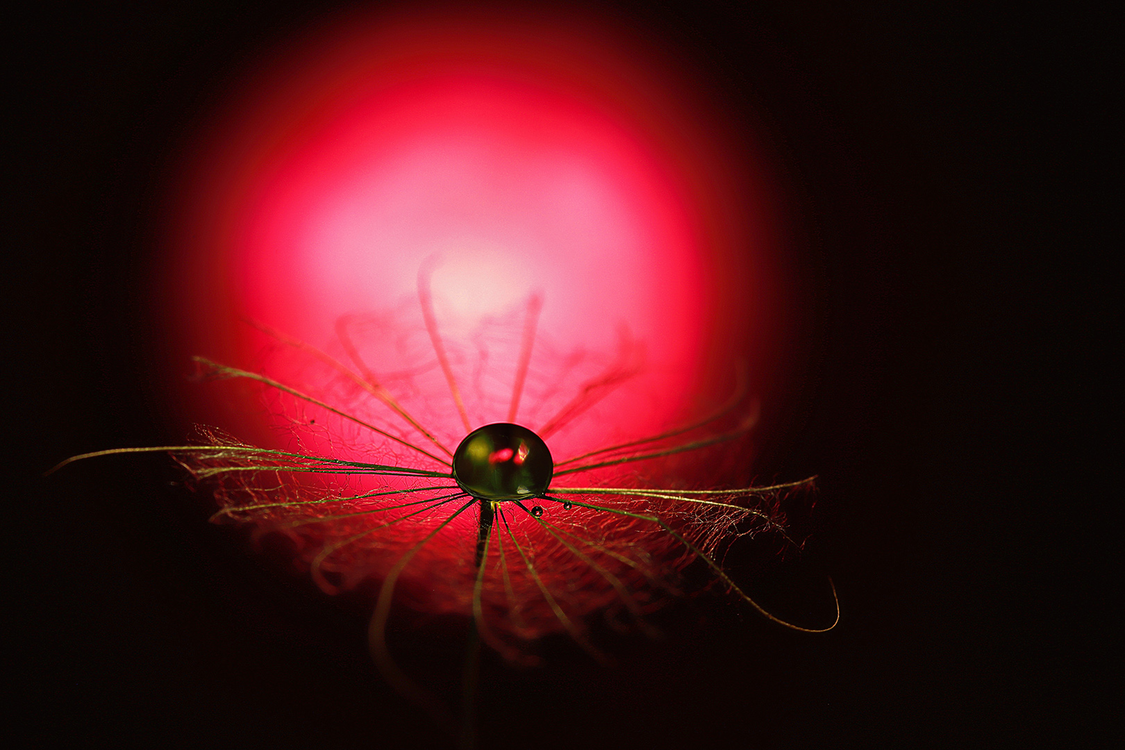
Thanks for your comments and your inquiry, Doug. As you can see, the image didn't need much post-processing. I lightened the image a bit overall to make the textures of the sand and water more apparent and intensified the red a bit.
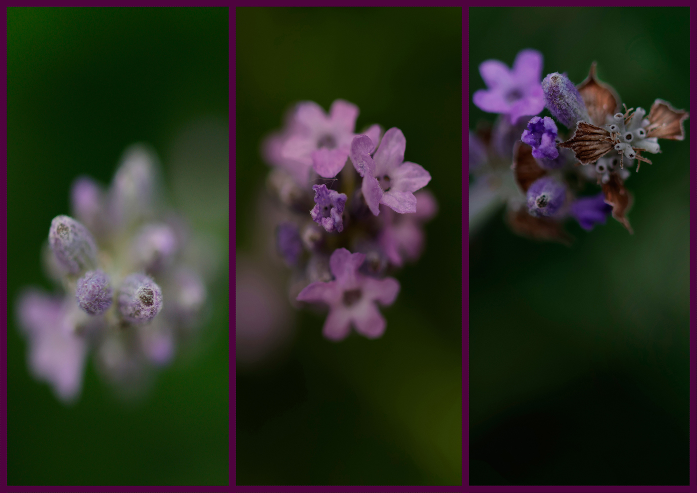
I didn't see Lavender in my image at all. But after you mentioned it, I took a closer look and indeed, the blue of the horizon turns into lavender. Thank you for noticing.
|
Jun 12th |
 |
8 comments - 4 replies for Group 9
|
| 11 |
Jun 25 |
Comment |
Hans-Peter, your staircase picture immediately caught my eye, I think because it's not a spiral staircase, which you see far too often.
The view of the stairs from top to bottom, the curved handrails in contrast to the straight steps, the symmetry, it all fits.
Well done! |
Jun 18th |
1 comment - 0 replies for Group 11
|
9 comments - 4 replies Total
|