|
| Group |
Round |
C/R |
Comment |
Date |
Image |
| 63 |
Apr 26 |
Reply |
Thanks for the comments. |
Apr 14th |
| 63 |
Apr 26 |
Reply |
Thanks you for the comments, I do like the grater gaps darkened. It was a fun experiment. I will be taking more photos of mundane stuff around the house. |
Apr 14th |
| 63 |
Apr 26 |
Reply |
Thanks I will look at cropping it a little. I actually changed it to B&W and didn't see any difference so changed it back. Thanks for the comments. |
Apr 14th |
| 63 |
Apr 26 |
Comment |
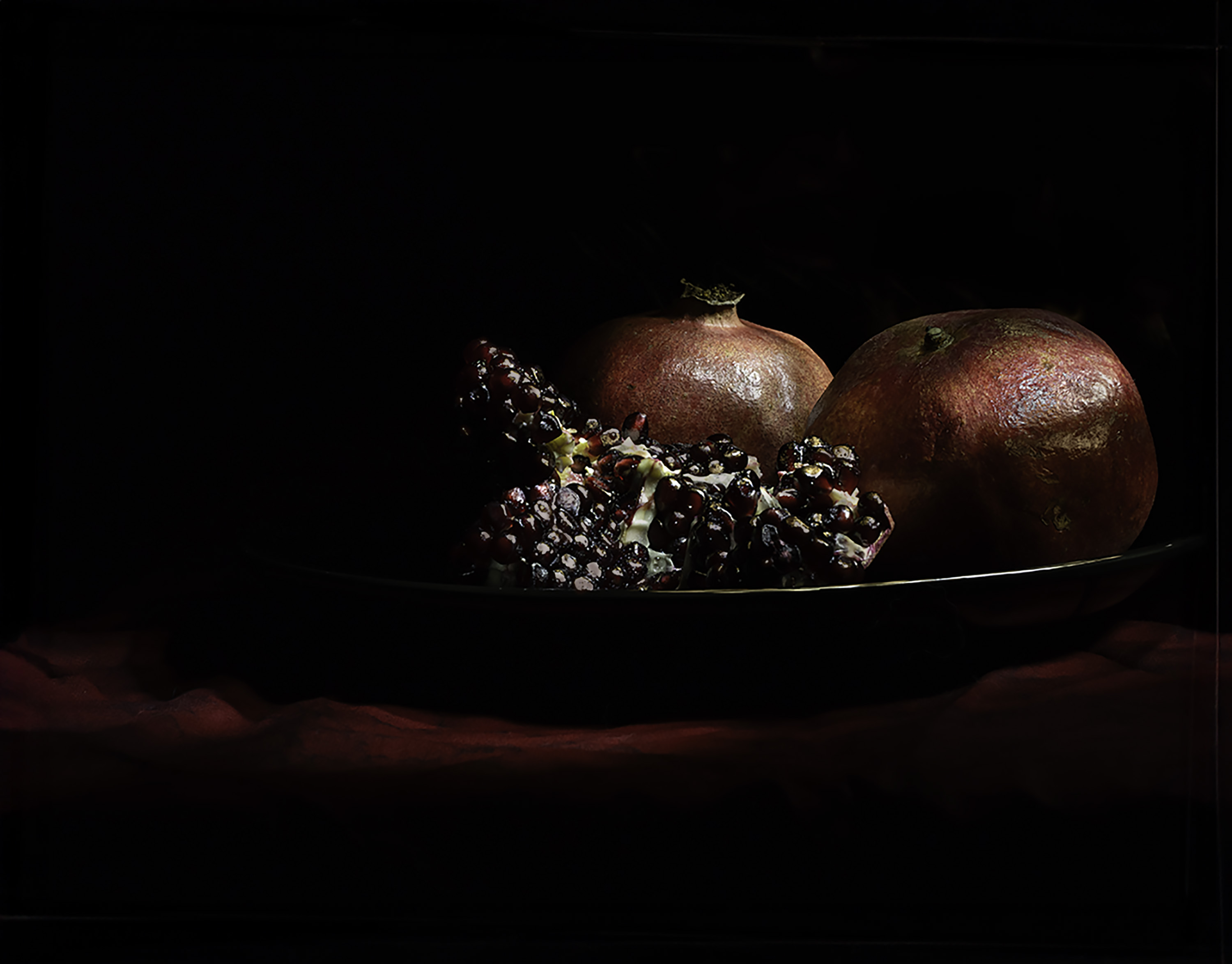
An interesting piece of pottery. I also would up the contrast a little to bring out the orange color.
Thanks for sharing. |
Apr 14th |
| 63 |
Apr 26 |
Comment |
It's a lovely image. The contrast of the grey spokes and the red leaves is great. The slightly of angle makes for great leading lines. Thanks for sharing. |
Apr 14th |
| 63 |
Apr 26 |
Comment |
Interesting item to photo. I would never have thought of using rubber bands. I like the curves and the reflection. Checking your original, I was surprised at how bright it was. It was good to tone it down. Nice job. |
Apr 14th |
| 63 |
Apr 26 |
Comment |
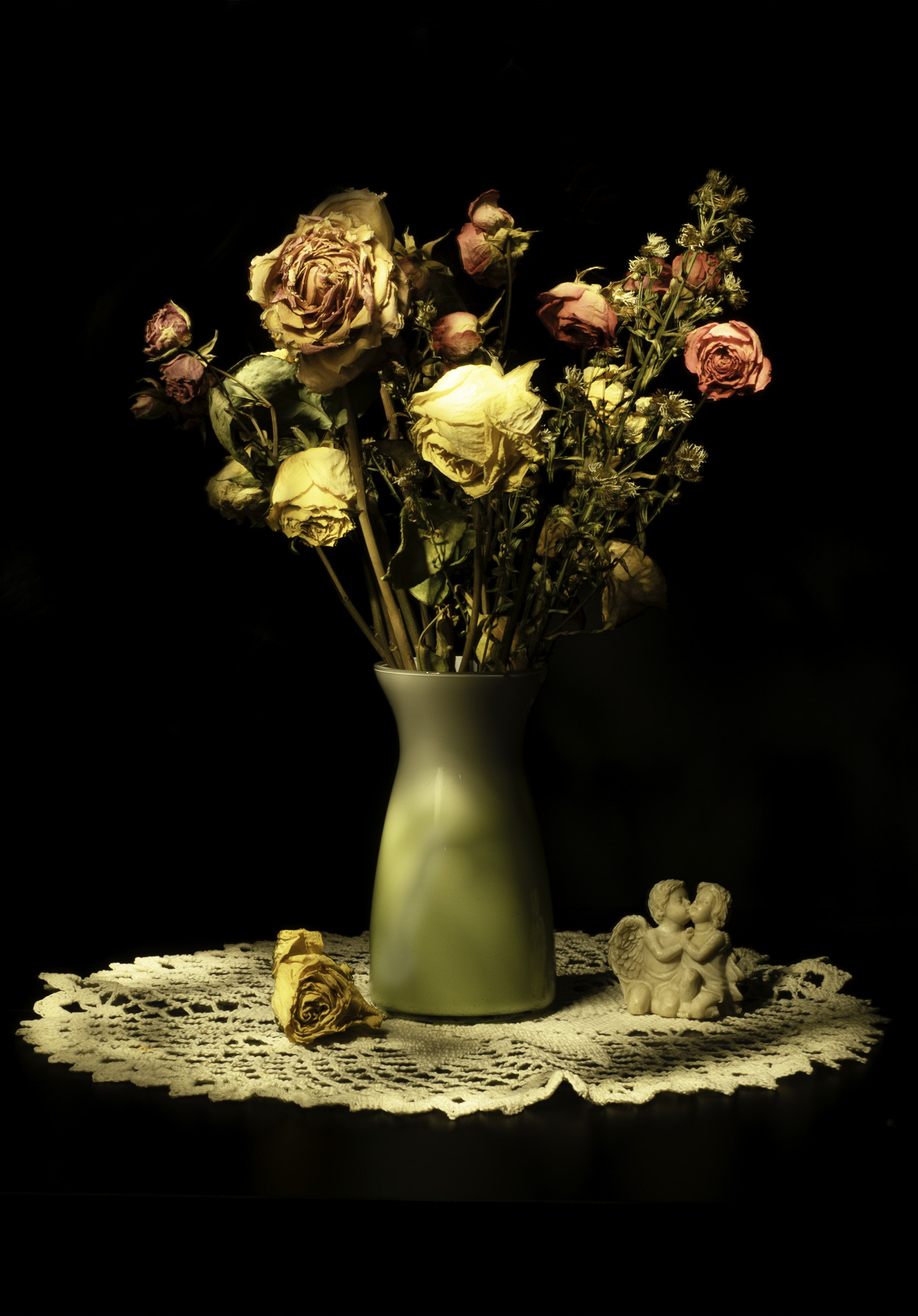
Very nice. Lovely perfume bottle. I'm not sure about the black background. I might up the saturation, and/or contrast to see if it brings out the gems a little more.
thanks for sharing |
Apr 14th |
| 63 |
Apr 26 |
Comment |
This is great, Very creative. We did this at a camera club meeting. It was fun. Were the forks plastic? That's what we used. I find it fascinating that the color pattern on the forks are very close to matching.
Very nice. |
Apr 14th |
5 comments - 3 replies for Group 63
|
5 comments - 3 replies Total
|