|
| Group |
Round |
C/R |
Comment |
Date |
Image |
| 6 |
May 25 |
Comment |
Hi Ruth - sorry this is so late. This is a good shot. THe background blurred is what it needed. How about replacing the apple with a real one? That would be really interesting.
-Melissa |
May 26th |
1 comment - 0 replies for Group 6
|
| 41 |
May 25 |
Reply |
Tom - I am gonna try this with my hubby's pix tomorrow. This looks like so much fun!! -Melis |
May 27th |
| 41 |
May 25 |
Reply |
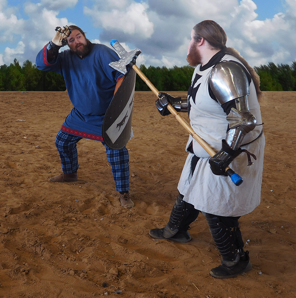
Hi Tom - thank you for the comment. Actually, the dragon is my own shot, not a cartoon character, but a sculpture on the top of a building at the RenFest gate. The background behind him is all trees and leaves, and very distracting. It took me a long time to cut him out, and a whole day to figure out what to do with him! |
May 26th |
| 41 |
May 25 |
Comment |
Oh my gosh Tom! This is WONDERFUL!!! Probably the best job of blending 2 totally different textures together I have seen in a long while. The really amazing thing is the colors you have attained in the skin tones - looks absolutely authentic. Also - the extra space you put betwen the nose and mouth further adds to the authenticity. If I had done this, it would be large and in a frame on my wall! Love it! |
May 26th |
| 41 |
May 25 |
Comment |
Hi Brad - Actually, I like your version better. The addition of extra rocks makes it look like the frame was taken away, and the image is sitting behind the rocks. I like just the water spilling over, because that would be an amazing feat, and this is meant, I think, to look like something special has happened. I sure do love your exposure and texture on everything!! -Melissa |
May 26th |
2 comments - 2 replies for Group 41
|
| 54 |
May 25 |
Comment |
Alan - This is REALLY great! What amazing texture. I just had to comment. -Melissa Sonnen |
May 3rd |
| 54 |
May 25 |
Comment |
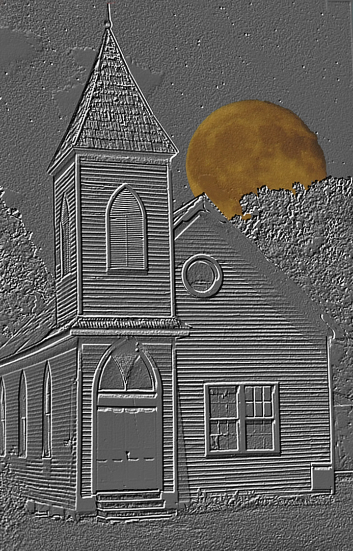
Dear Matt - I am not a Group member, but your image really resonated with me. I think this is the way colors should be worked, and I am trying to emulate your image. I would love to see the "outbuilding" to the right of the wonderful house cloned out to allow the landsape to continue back there.
I wish I had taken this one ! Thank You-
Melissa Sonnen, DDG Group 41 |
May 3rd |
2 comments - 0 replies for Group 54
|
| 74 |
May 25 |
Comment |
Ed - I agree on lightening the hull. But I think the image is simply perfect. And I mean "simply" because even though there are a lot of objects in here, it still maintains the simple feeling and "peace" of a foggy, still day because of the wonderful grey tone you have chosen. Nice job! -Melissa |
May 26th |
| 74 |
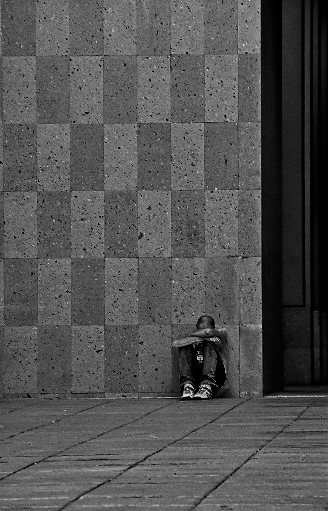
May 25 |
Comment |
Ed - for me this is just plain spooky. The man looks otherworldly or ghostly. And the transparent look within his shadow makes it even more ghostly. I really like this idea, and yes, the mono is way more effective than the color.
-Melissa |
May 26th |
| 74 |
May 25 |
Reply |
In answer to WHY? That is what I thought when I heard about it. But this building is in a BIOG tourist area in Branson, MO, right across the street from a huge pirate ship with girls (real) hanging off it. This whole part of town is truly crazy. So this upside-down building fits right in. This image is VERY popular in far eastern competition!?!?! |
May 26th |
2 comments - 1 reply for Group 74
|
7 comments - 3 replies Total
|