|
| Group |
Round |
C/R |
Comment |
Date |
Image |
| 6 |
Dec 24 |
Comment |
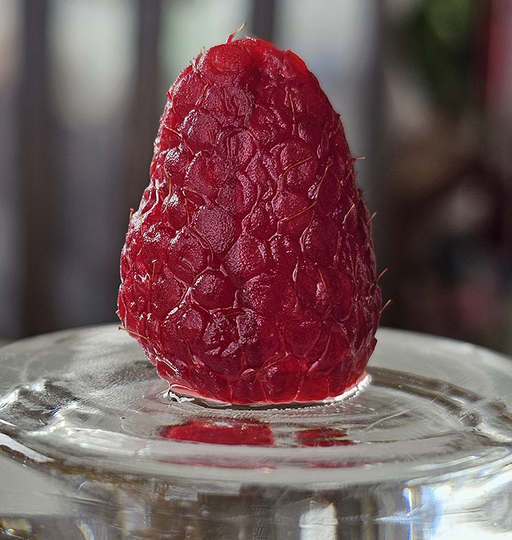
It surely is a tiny bud, with good color rendition, and the hand (nice manicure!) has a good set of flesh tones too. The subects are well brought out on the black bakground. I do think that the whole image needed a better focus. Seeing that you had a tripod set up, try a remote timer and multiple bursts per shot. You can then pick the best focus. |
Dec 11th |
| 6 |
Dec 24 |
Comment |
OH NO, JAMES! I am so very sorry. I mean REEALLY sorry. I share your pain of this loss. Here you have a wonderful memorial photo. Always remember...... |
Dec 11th |
| 6 |
Dec 24 |
Comment |
Oh, if only we could look so good on a bad hair day!! What a wonderful capture. For me, it is the light that is so appealing - not strong, not white, but just golden enough to show off the hair beautifully, and still make the stem show off its green color. When I look at this image, it feels like there is just a hint of shading behind the plant, but I don't think there is - it feels more like my eye creates that because of the great lighting on the weed. Kudos on the great focus too. Love this image. |
Dec 11th |
| 6 |
Dec 24 |
Comment |
Tom - All I can say is "Oh My!" To me - this is perfect. Thank you for giving your settings for me to try. Amazing shot. |
Dec 11th |
| 6 |
Dec 24 |
Comment |
Karen - Truly beautiful this month. Usually I find that bright green is too distracting for flowers. But not this time - the perfet focus makes the Hearts stand out, but it is the angle of the shot that makes this all work together. The horizontal spray forces my eye to view the flower first, but the green is necessaru to give the image a diagonal prespective too, which is further emphasized by the stamens on the left-most flower. For me, I would crop out just past that left-bottom round leaf. |
Dec 11th |
5 comments - 0 replies for Group 6
|
| 41 |
Dec 24 |
Comment |
Nadia - I don't know what to say. This is amazing. For ME, all the elements here work well together. The space from the tree over to the booth feels like an arrow pointing to the right. But yyhr tree does not feel too heavy because of the lightness of the gray. The amount of interest you have created does not stop with the person - it extends to the added flock in the sky, and of course, the bird in the tree. The sky has the perfect moody quality, but the background lighting on the grasses is also perfect. Your painting and blending of the grasses, turning and shading of the booth - all is just perfect. For me, the only thing that feels uncomfortable is the brightness of the girls hair on top. The red in the shirt is a balance to the booth, but the hair color draws the eye up there, which is a distraction. How long did this take you !!!! |
Dec 11th |
| 41 |
Dec 24 |
Comment |
|
Dec 11th |
| 41 |
Dec 24 |
Comment |
Oh - I really LIKE this. The handling of the sky is wonderful to show off the plane and parachutes. The reflection of the large chute on the buildings facades is great. Even the definition in the chute is good. I wish the underside of the plane were the smallest bit lighter. I believe this would not be effective at all if it were in color. Great job. |
Dec 11th |
| 41 |
Dec 24 |
Comment |
Brian - It looks like an infrared gone south. I am not sure of this image, because it is so unusual - kind of obscures the theme. I think it might be more efective if the area in front of the deck chairs were a regular green. The white shadows are appealing, but I feel the overall whitness is the distraction to the great appeal of the reverse shadows. This is a very good experiment, and I think it should be further investigated. |
Dec 11th |
| 41 |
Dec 24 |
Comment |
Hazel - I like this. It is not trying to be a "ghostly" photo, but more a record of traffic. Actually, I like the original also. and don't think it is too busy. The only uncomfortable thing is when the grass and pavers cut the people's legs in half. Perhaps some painting to soften that effect might help the discomfort. |
Dec 11th |
| 41 |
Dec 24 |
Comment |
Brad - this is a yummy shot - draws me right in there. I must say, cutting the Original 2 sky out looks like a time-consuming job to get it this clean. The sky is just perfect for the lighting below. Only one thing makes me wonder, the sun appears to be going down on the left, but the reflection in the water is dead-center. I doesn't look like there is enough in your sky image to rectify this. |
Dec 11th |
6 comments - 0 replies for Group 41
|
| 74 |
Dec 24 |
Comment |
Hi Ed - I don't see a difference from the original. But the mono is startlingly beautiful. |
Dec 11th |
| 74 |
Dec 24 |
Comment |
Hi Trevor. Great car shot. I like the crispness of the detail on the auto, and yes, it looks much more interesting as a mono. I don't think the contrasts, etc. should be changed, but I am uncomfortable by the starkness of the black sky - I just feel it is SO heavy that is pulls the eye up there a little. If a sky that dark is going to be used, there should still be some detail on the inside of the cab through that side window. |
Dec 11th |
| 74 |
Dec 24 |
Reply |
Yeah - I agree - the color was a dead shot. That is why I loke mono so much !!! |
Dec 11th |
2 comments - 1 reply for Group 74
|
13 comments - 1 reply Total
|