|
| Group |
Round |
C/R |
Comment |
Date |
Image |
| 6 |
Nov 24 |
Comment |
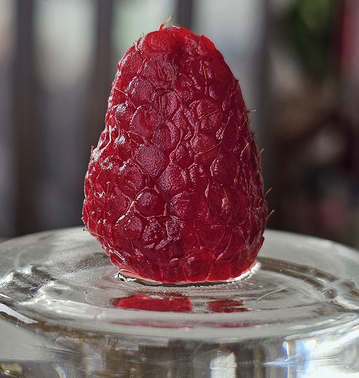
Karen - this is a beautiful capture. The flower is nice, but I think the pads around the flower are a strong part of the power of this images. They give the viewer's eye a rest. My eyes go back and forth between the lovely bloom and the wonderful shades of green. I was curious if you tried a tiny bit of the 'smart sharpen' filterin Photoshop - but only selectively on the flower. I tried that, and I think it heped on the bulb. |
Nov 3rd |
| 6 |
Nov 24 |
Comment |
James - I think this is great for a hand-held. Usually, I don't care for a light green background bcause it normally distracts, but here is feels like the exact oposite. The sameness of the green actually highlights the bug. Your texture on the wings is amazing, and it is always a plus to have the antennae so sharp. I am curious - what ISO was this taken at? |
Nov 2nd |
2 comments - 0 replies for Group 6
|
| 20 |
Nov 24 |
Comment |
Deborah - This is a sensational transformation. I am gonna try it just the way you stated. I think it almost looks "desparate" in a stow storm. Great idea.
-Melissa Sonnen, DDG-41 |
Nov 3rd |
1 comment - 0 replies for Group 20
|
| 31 |
Nov 24 |
Comment |
WOW - this is truly stellar. What good thinking - using the 3 different exposures. Amazing shot - perfect!
-Melissa Sonnen, DDG-74 |
Nov 2nd |
1 comment - 0 replies for Group 31
|
| 41 |
Nov 24 |
Comment |
Tom - Mission accomplished. This is truly other-worldly. What a great idea. THe crispness of the dock and ghosts against the blur of the wooks really works. I think the color choices further enhance the overall feeling. Wonderful - I wouldn't change a thing. |
Nov 2nd |
| 41 |
Nov 24 |
Comment |
Hi Brad. Pleasing image. I don't really notice the facial highlight here. But I did take the shot into PS, and was able to get a bit of texture on him and also the pyramid rock in the distance. I find the setting and exposure nice, the color on the surf very good, and focus is very good. For me, there is a lot of surf. I might like to see the scene cropped on the left to eliminate the first large cloud. The pix does not suffer from that, and I think the surfer stands out a bit more. |
Nov 2nd |
| 41 |
Nov 24 |
Comment |
Lisa - smart thinking. I always want to hear the juicy details of how these ghost shots are made. But yours came out of the box this way. I would say you did make lemonade. And I think it was really creative thinking. Actually, I feel the color is a little messy - too many different competing colors. But when you converted, it made the light at the trop of the stairs look "heavenly", like she really was entering from "above". Focus is perfect. And I like the framing of her by the pillar on the left and the railing. Tasty Lemonade !! |
Nov 2nd |
3 comments - 0 replies for Group 41
|
| 74 |
Nov 24 |
Comment |
For me, the color is really hard to distinguish what this is (at first gance). But there is no doubt with the mono. I agree that highlighting the eye, especially, made the head of this guy have more inmpact so it is not only about the ear. Nice crop job. |
Nov 6th |
| 74 |
Nov 24 |
Reply |
Ed - thank you for the idea. That is what I wanted it to look like. I do not use Lightroom, but am good at PS, which I will use. I think the darkness of the bushes really makes the cattle pop. Thanks a bunch! -MS |
Nov 3rd |
| 74 |
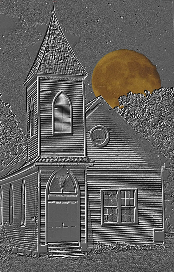
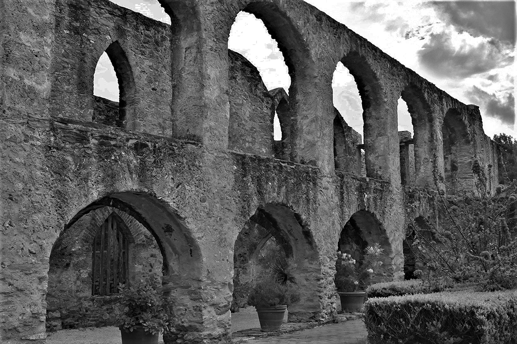
Nov 24 |
Comment |
Ed - It is a great story - you are fortunate to have this image. I think the softness of the color is quite nice, but ordinary. For me, the mono seems to fit the story much more - it has an "old" look. The overall softness of shading feels historical - like a historical print. Except that the white of the church face stands out quite well in contrast to the surroundings. I think it holds the viewer's interest. Very nice.
It is hard to imagine an ISO of 1. |
Nov 2nd |
2 comments - 1 reply for Group 74
|
9 comments - 1 reply Total
|