|
| Group |
Round |
C/R |
Comment |
Date |
Image |
| 6 |
Oct 24 |
Comment |
Charissa - this is just lovely. Your choice of the different flowers adds a lot of texture and varety to the image. And the nuances of color make the viewer want to look longer. I feel your choice of the pure white surface is perfect - no distraction! For me, the focus is a litle soft. |
Oct 15th |
| 6 |
Oct 24 |
Comment |
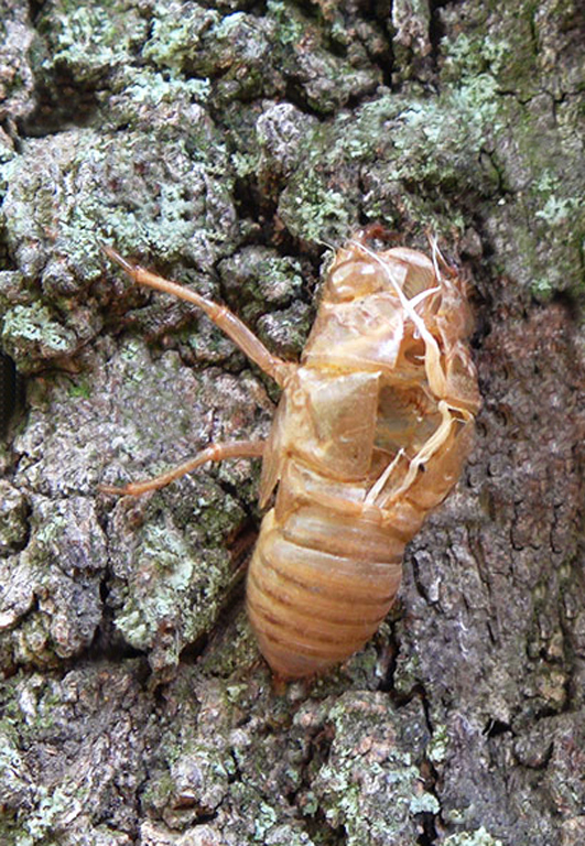
I find this guy wonderful. You got the important part spot-on - that beautiful back and antennae. His head is not bad, and one expects the legs to be fuzzy. For me, the background, although realistic, is really competing with the bug. It might be difficult to tone it down, though. |
Oct 15th |
| 6 |
Oct 24 |
Comment |
Oh, how moody! Of course your depth of color is very good. But what strikes me the most is the pose. Those dark leaves feel like a landing pad, and the flowers have blasted off. The sharpness contributes to making the viewer take a closer look at those pink beauties. And the length of the larger bud balances the green below. I might suggest cloning our that one horitonzal branch at the very bottom. |
Oct 15th |
| 6 |
Oct 24 |
Comment |
Hi Ruth. I just love onions - you can do so many things with them - including making excellent photos. I would not change a thing in this image. The pose with the onion heads leading up and then out of the frame is great. The color and lighting from the upper right is wonderful. And the focus and shadows you developed are just great. I wish Ihad taken this!! |
Oct 15th |
| 6 |
Oct 24 |
Comment |
Hi Karen - sorry this comment is so late. The image is beautifully handled in regards to lighting, especially with the highlight on the vase. The stem adds interest also. For me, I am a little uncomfortable with the shears. The scene is so serene but the cutter is like an unwelcome intrusion. I suggest a reshoot, with the shears gone, but the stem placed at the base of the vase at the same angle, but in front of it. Then a single petal just to the right of the vase. |
Oct 15th |
5 comments - 0 replies for Group 6
|
| 41 |
Oct 24 |
Comment |
List - WHAT an idea. I looked and looked until I realized that the 2 pieces are the same, just mirrored. This is particularly effective in monochrome. I won't begin to ask how you did this, but it looks like it took a lot of cutting!! |
Oct 15th |
| 41 |
Oct 24 |
Comment |
Hi Nadia, What a lovely image. Your darkening of the bower really sets the mood of this pix. She is nicely placed in the scene, and the door balances the whole thing. But it is the treatment of the door that is startling - color and texture are perfect, and I appreciate how you left only a part of the light in the window. Good added elements on the cave floor. Nice image. |
Oct 15th |
| 41 |
Oct 24 |
Comment |
Tom - I am wondering what created the monster's image. Is it pre-existing? I noticed that the man's hand seems to be reaching for a tool, but it does not appear to be ON the tool yet. Am I seeing that wrong? I like your use of the girders on both sides of the monster, and the coloration of this creature and all of the rest just work together. Nice. |
Oct 15th |
| 41 |
Oct 24 |
Comment |
Brian - this is an amazing idea. It is perfect, right down to the picture on the turned-back sheet. Of course, the technical elements are exactly right. I especially like the appearance of lighting by fluorescents from above. Very smart!
Does this "peeling back" work on faces? I'm in!!!! |
Oct 15th |
4 comments - 0 replies for Group 41
|
| 74 |
Oct 24 |
Comment |
Hi Ed, It is a nice capture of this beauty. I think it is surely nicer in Mono - the white blothches of light showed up on the color, but in mono, all his stripes seem to be phosphorescent and the whites pop off the page. Really nice conversion. |
Oct 15th |
| 74 |
Oct 24 |
Comment |
WOW! Ths original had a lot if impact with the primary colors. But the artist almost seemed like an intrusion into the color. I really like the mono better. He is now the star, and is totally highlighted by his whiteness among all the detail in the equipment. His pose, facial expression and, especially, the hand pose really shows he is "into" his music. And I like the totally different pacific expression on the fiddler. Needless to say the light and focus throughout is spot on. Although he is off-center, there is balance created between the fiddler and the profusion of equipment on the right. I might have tried to tone down the white writing on the wall to see what that does. It sticks out a little too much for my taste. |
Sep 30th |
2 comments - 0 replies for Group 74
|
11 comments - 0 replies Total
|