|
| Group |
Round |
C/R |
Comment |
Date |
Image |
| 6 |
Sep 24 |
Comment |
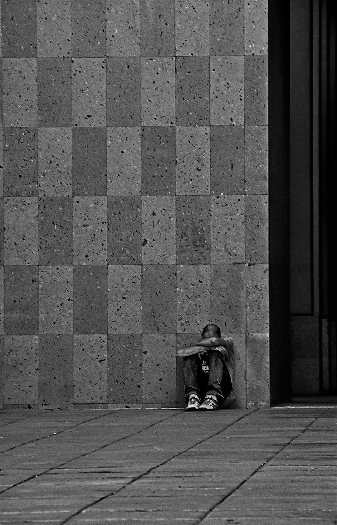
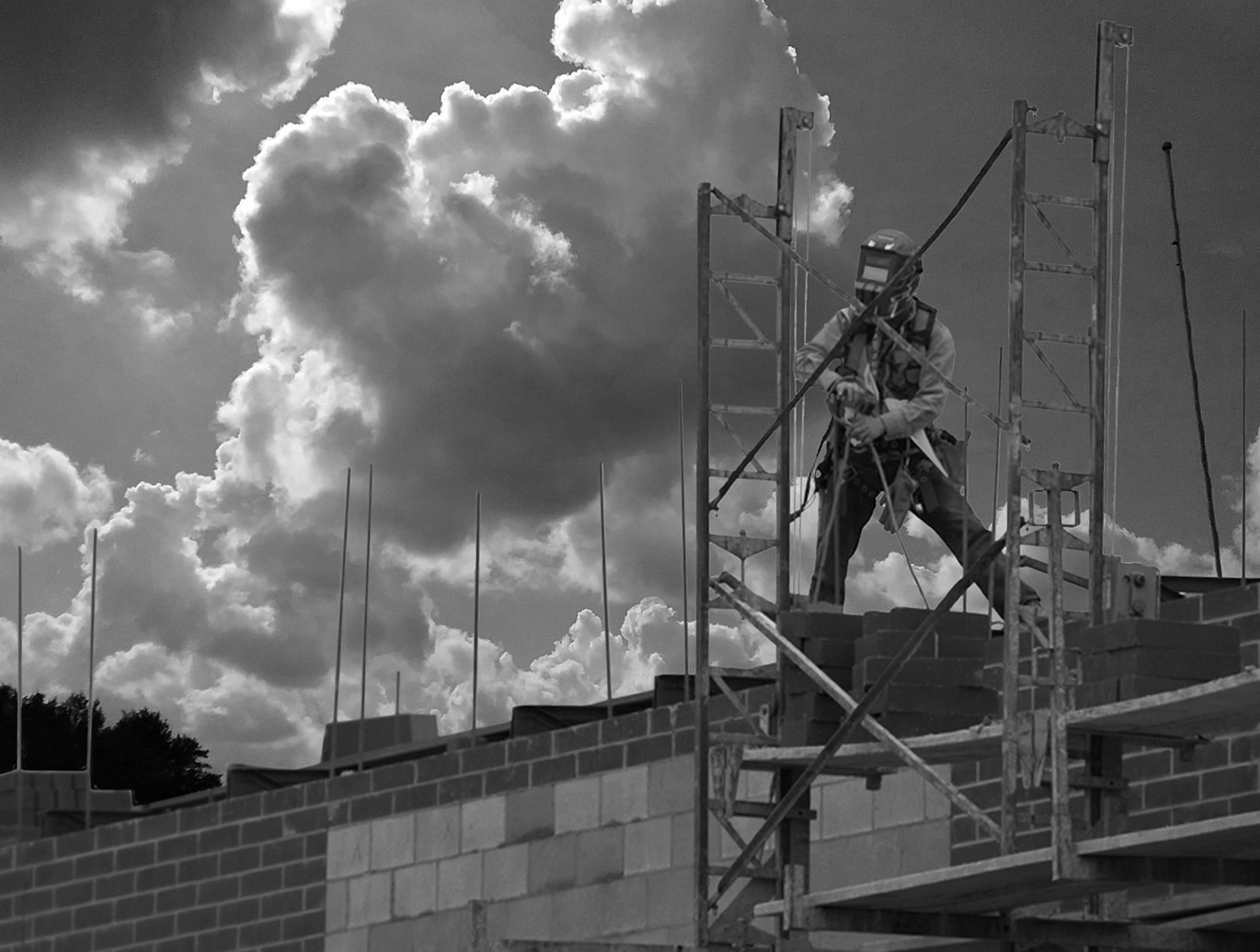
Really nice image. The diagonal feeling is comforting. Here I think the contrast of the pale reeds at below with the gold of his shirt above are very effective in separating the 2 areas of interest. The crop is perfect to highlight what is going on, and every tiny sliver of the reed shows up beautifully. I also like the fact that his pants are black, so there is no competition there for intrest. GREAT photo. |
Sep 11th |
| 6 |
Sep 24 |
Comment |
Oh my - what a great image. The color and light are the stars here. I like the 'downlight' on the center flower (it is a tiny bit too strong however) and that light highlights the front of the vase just enough to add interest there. The fallen bud is a good addition. For me, the addition of the cupids is not necessary to make this image, because the lace doily adds enough interest down there. Overall - a lovely job on this one. |
Sep 11th |
| 6 |
Sep 24 |
Reply |
Karen, Actually, I had to come up with a lot of fake food props, and real ones too for a workshop. I spent a fortune on cheese, and everyone enjoyed it afterwards. It was fun. But these rolls were in my drawer for years - I just never thought about shooting them. I have about 6 other types that I should shoot. Hmmmm- new project.... |
Sep 11th |
| 6 |
Sep 24 |
Comment |
Charissa - that is a difficult color to capture. You got that center pretty crisp. But the light seems just a tiny bit too bright and sort of washes out the petal detail. I would love to see all that leaf detail around the flower more. Did you try this one as a mono? It is spectacular with detail! |
Sep 8th |
 |
| 6 |
Sep 24 |
Comment |
Tom - the combo of the lens and extension tube really was effective here. Tripod, of course? I am surprised you only needed 1/13th. What was your lighting situation. This turned out very well. Nice job, and reallys CLOSE!
How do you like that Lumix?? |
Sep 8th |
| 6 |
Sep 24 |
Comment |
Whew - this is a tough one. The original image is very pretty, and you have 2 excellent comments on the treatment of the flowers. I think the choice must be made for soft effects (as in Karen's suggestion) and Drama (in Lance's treatment.) Each version of the image has merit, and I think the viewer must choose according to their preferences. For me, the foliage in the origial is noteworthy, and I think the little dark bud on the left should not be overlooked. Yes, the flowers did need some lightening, but to make the forward flower really show its texture (as in Lance's image) is a game changer. |
Sep 8th |
| 6 |
Sep 24 |
Comment |
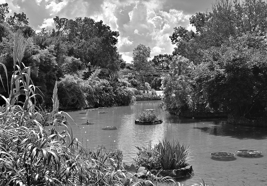
Karen - this was a lot of work with as eyedropper, but it sure paid off. The ripples are great. But also the light on the greens is spectacular. That brightens up the centerline, which would have been very boring otherwise. Of course, your lighting on the flower is wonderful. How did you apply the texture on the paper? |
Sep 2nd |
6 comments - 1 reply for Group 6
|
| 12 |
Sep 24 |
Reply |
Wow Lisa - yes, that is a VERY different look. I think if everyone played with image, it might eventually look good enough that I could put it to sleep!! Your adjustment is really good. I will try that too. Thanks. -M |
Sep 11th |
| 12 |
Sep 24 |
Comment |
This is a scary image for me. I once worked for an architect that specialized in jails. Among others, I got to see the big jail in Marion Ohio, which was built around the same itme as this. Except your mental picture with the noose still hanging is really creepy. I LOVED your image, because it reminds me of other things, but also because it is so colorful and full of LIFE. It really is a beautiful building and your photo shows all the details - your capture of the light and texture of the stone walls is really good. I could not resist making this an OLD photo so I renmoved the wires and played with it a little. Sorry! |
Sep 8th |
 |
| 12 |
Sep 24 |
Reply |
Srijan - I had not thought of deleting those right hand buildings - great idea. There is a mono version of this image and it does well in competition. But I can't seem to get the color right. I will now try to dampen the brighness. Yes, this might be a little soft - it was from a VERY old slide. But it is my "Project" - to make something out of nothing! Some things just won't let us go... |
Sep 8th |
| 12 |
Sep 24 |
Comment |
Hi Lisa, The colors are beautiful and you have a nice sharp architectural rendering. For me, this subject would be a perfect candidate for making it a centerpiece in a larger canvas, like a mandala, with the center wheel cut out, and placed on a muted-color canvas. That would be a show-stopper.
It does lose something when a round object is in a square frame. |
Sep 3rd |
| 12 |
Sep 24 |
Comment |
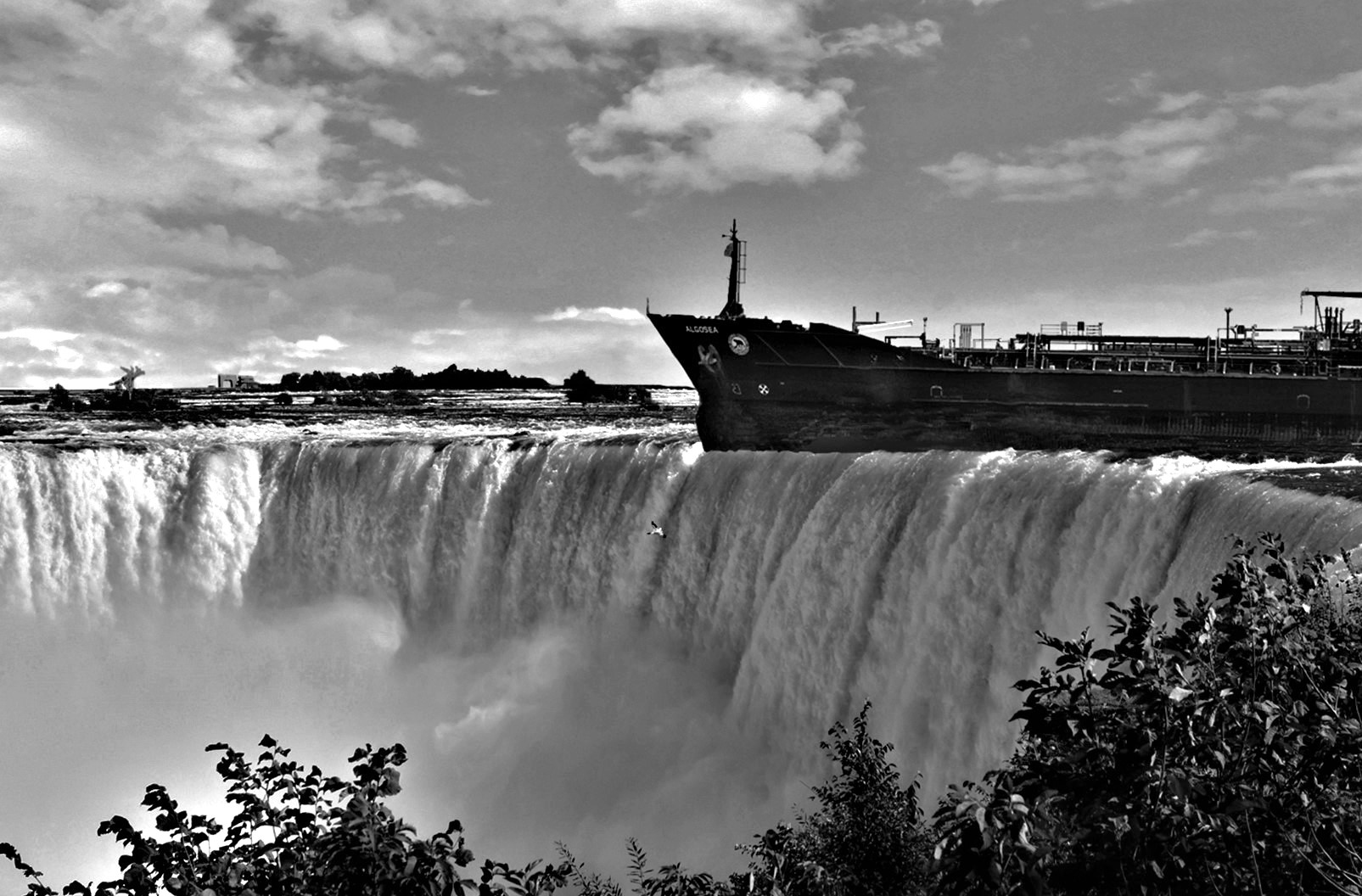
Oh - this is lovely. The colors make this a winning image. F/8 was perfect to get this detail, but the 1/10 speed really let the movement of the traffic show up. I think the vibrance change was the right thing to do with the intense lighting of the Gate. And the perfectly black background brings all the colors out even more. Wonderful. |
Sep 3rd |
| 12 |
Sep 24 |
Comment |
Carole - this makes me sad. Just the thought...
Nice capture of the guards and adding blue to the sky was a nice touch.I selectively brightened the blackest sided of the girder top piece (by a factor of 48) and it just made that part a little more interesting. |
Sep 2nd |
| 12 |
Sep 24 |
Comment |
Nancy - I find this to be a pleasing record shot and a piece of history. The only thing I would have done is change the cyan in the clouds to a true blue. I wish there were some people walking by. |
Sep 2nd |
| 12 |
Sep 24 |
Comment |
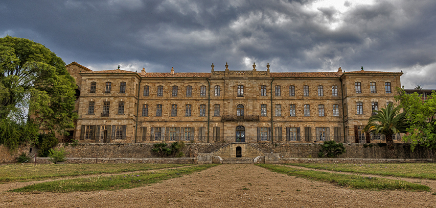
Abby, I think the front curbing should be removed. It kind of defines the image, and I find that without it, the building stands out more. I played with this one, and only using the shadow/highlight tool in PS, I think the building looks brighter and the clouds moodier. It truly is a beautiful old buildlng. |
Sep 2nd |
 |
6 comments - 2 replies for Group 12
|
| 24 |
Sep 24 |
Comment |
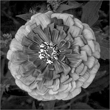
Charissa - THIS ONE IS AMAZING. Your background color is superb. But the best part is the shadows in the petals and the color on those petals that are created by the angle of the light. The delicate darkness in the center takes ones attention immediately. But you even captured the dark pink "stripes" on the lowest petals. And the angle that the flower presents is most interesting. Wonderful image!!!
Melissa Sonnen DDG-74,6,41 |
Sep 8th |
1 comment - 0 replies for Group 24
|
| 41 |
Sep 24 |
Reply |
Brian - another reply - My bio just changed drastically - all that stuff listed is now "past". I have to back out of all the "jobs" I was doing so I can concentrate on my "new" job - Publications VP. I am 15 days into that, and the workload far surpasses all the other stuff I was doing. Unfortunately, it is a mandate that when you have a Board position, you have to quit managing anything else.
BUT - I do not have to quit the things I participate in - like this DDG and my other ones.) I would hate to quit this group! -MS |
Sep 9th |
| 41 |
Sep 24 |
Comment |
Brian - I never thought of that left-to-right aspect, but you are 1oo% correct - it really does look more natural. Also, your edits, especially on the grass, make the picture feel more intimate to me.
And THIS is why we join DDGs - we really learn a lot and get wonderful advice and inspiration. Thanks, Brian |
Sep 9th |
| 41 |
Sep 24 |
Comment |
Brad - That is a great placement of the owl, especially with him looking over his shoulder at the viewer. The volume of light in the sky is perfect. For me, I might have lightened the dark greens of the scene and selectively lightened the rock under the owl, just to add a little detail to his environment. |
Sep 3rd |
| 41 |
Sep 24 |
Comment |
Brian - this sounds a lot easier than it looks. As I was studying it, I thought of a way I can use that technique. I just love the DDGs, because they always give us a new idea every month. Thanks for this one. |
Sep 3rd |
| 41 |
Sep 24 |
Comment |
Tom - This is truly lovely. We have many geese where I live, and I think I will try this. I especially appreciate your creation of the reflection. I have never used a horizontal sky flip. Than you for the idea. Your colors are very nice, and the soft texture created with the pan really make this a misty-looking morning. Very beautiful. |
Sep 3rd |
4 comments - 1 reply for Group 41
|
| 54 |
Sep 24 |
Comment |
This is amazing. Ths girl's pose was perfect for the idea. The "Prince Magnet" is the best add-on. I think the light and colors were beautifully done, and the choice of keeping the frog tiny further adds to the story. Your work to get that background just right to complement her colors was extremely well done. Wish this one were mine! |
Sep 8th |
| 54 |
Sep 24 |
Comment |
Maria - First, the treatment of the original sunset is very beautiful, and also very even, which is not always easy. Your collection of add-ins is nice, although I feel sorry for the turtle. The children are very good, and their poses are beievable. I was wondering if the nets were added in (I think so, because the hands do not seem to be cosed around them.)
I would like to see the boy on the right "warped" just a little to the right to make his proportions more realistic. |
Sep 8th |
 |
| 54 |
Sep 24 |
Comment |
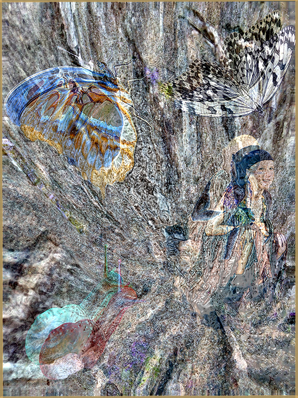
WOW - Peggy, this is a masterpiece. I wondered if you had the fnal product in mind when you started, or just started with an idea of a figure. You used a long process to get here, and it was all worth it. As a VIEWER, this image makes me study every little detail and ponder how it came to be. I never would have thought of a hollyhock as a garment, but it is perfect! The hair treatment is great, and just enough of the stairs is left to take the eye into the vortex. But the angle of the girl in the settinbg also takes the eye right up into the vortex. The strengthening of the colors in the whirl intensifies the drama too. Terrific job !! |
Sep 8th |
| 54 |
Sep 24 |
Comment |
What a wonderful idea. The flower is the perfect shape. I find the waterfall treatment very nice, and shadings of the flower are great. For me, there was great interest at the bottom of the flower with the rush of water coming out - it was not expected.
I might like to see the background a tiny bit rocky-looking instead of a straight blur. |
Sep 2nd |
| 54 |
Sep 24 |
Comment |
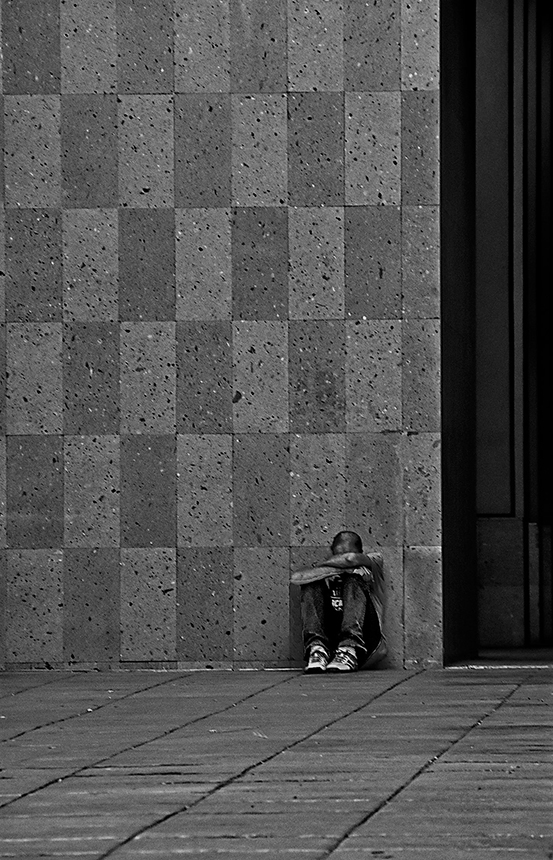
This one made me giggle. I know what you are talking about in the NYC doors. But this rendition appears more like confusion. I think it is the marked difference in the doors. Also, the "models" are looking in different directions, which helps the confusion. And your graduation from grey foreground to black background really isolates the figures. I cannot decide which is more prominant - the humans or the doors. |
Sep 2nd |
| 54 |
Sep 24 |
Comment |
When I see this I am reminded how creative humans really are. Who would have thought of the interior of a metal rail to give all this texture and content. The spectre with the phone is perfect. But the texturing and ghostly highlights really work on the biker and his rig. And even his shadow tends to make the image sparkle. Wonderful!! |
Sep 2nd |
6 comments - 0 replies for Group 54
|
| 63 |
Sep 24 |
Comment |
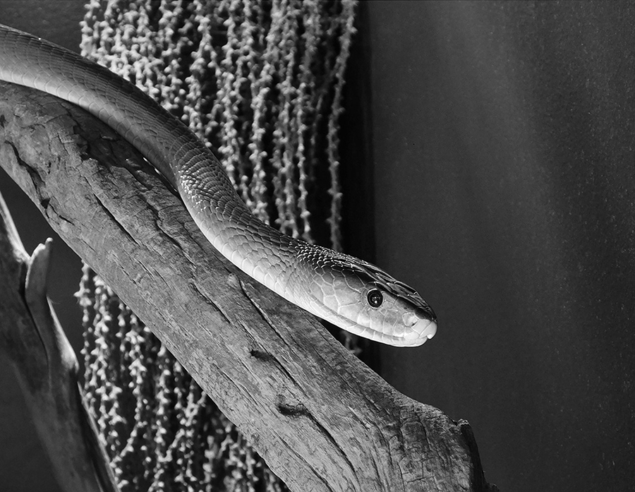
This is so good that it is almost 3D. Great with the black background. Wow!
-Melissa Sonnen, DDG-6,41,72 |
Sep 8th |
1 comment - 0 replies for Group 63
|
| 74 |
Sep 24 |
Comment |
Stacey - I always have believed that tto be the best way to learn - take a Master's image and try to duplicate it. Works for me (althought I never approach the beauty of the Master,) but I do learn a lot. -MS |
Sep 11th |
| 74 |
Sep 24 |
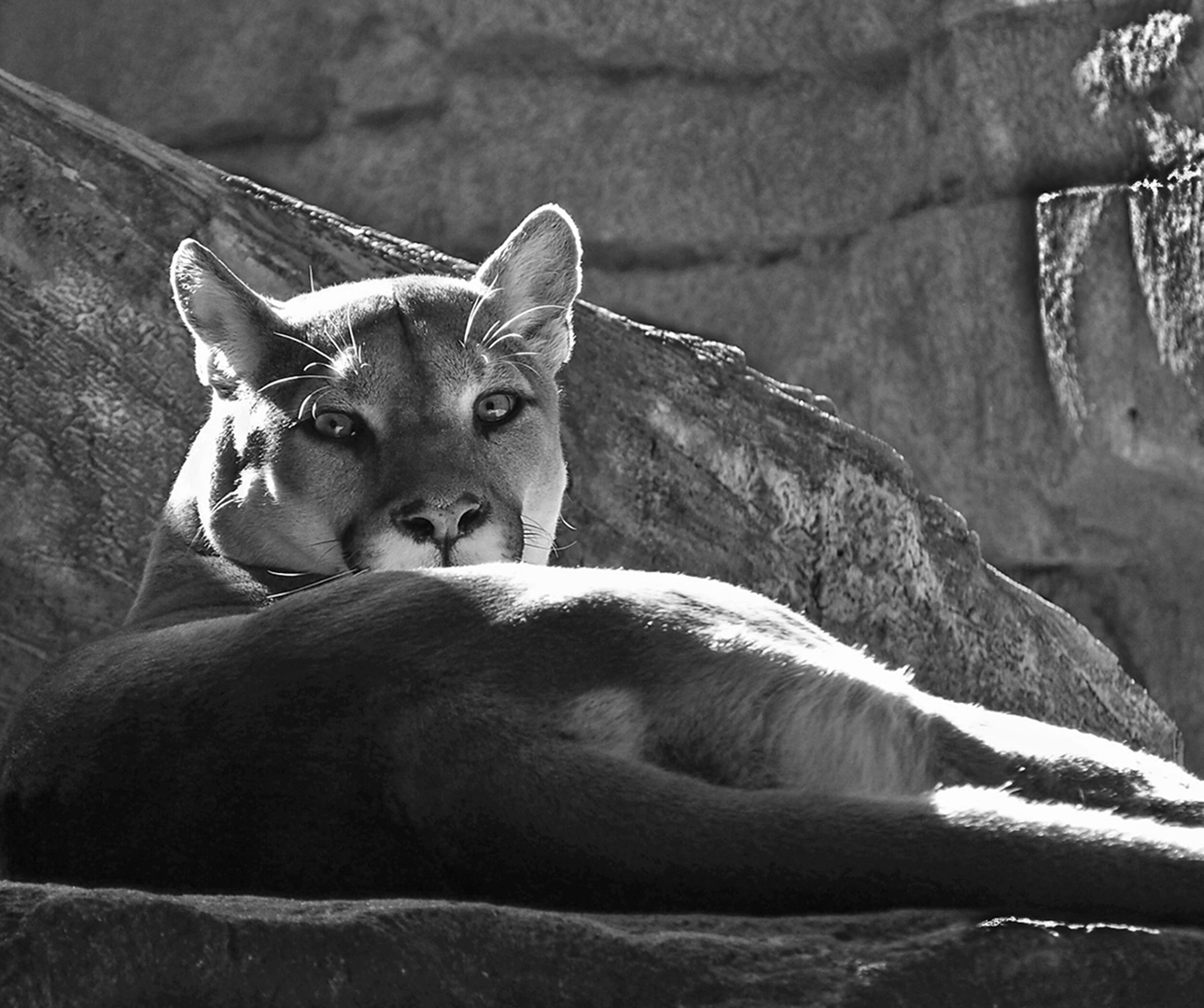
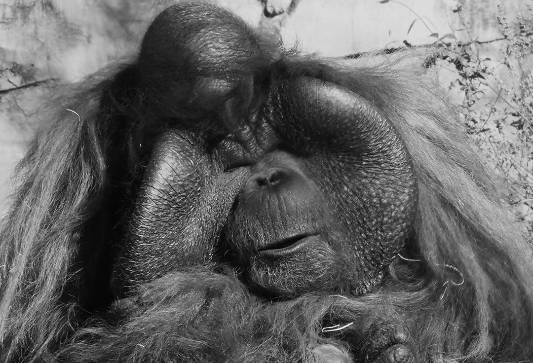
Comment |
Ah ha! He is snubbing us! I do not know which image I like btter. His coloration is beautiful, especially sitting on the green grass. And his texture really pops in the mono. But the pose is what gets me - he is so symmetrical and his hair really stands out. But shape of the adorable butt! Perfect. Thanks. - M |
Sep 11th |
| 74 |
Sep 24 |
Comment |
Ed - this is remarkable. Except for the long grass, this could have been placed there yesterday. And it looks like it was from early in the 20th century. The framing of your shot is wonderful. You could have taken it from anywhere, but this aspect shows the lean-to, that looks like it was hand hewn and is ready to fall, and the sturdy aspects of the piano. Your focus throughout is very crisp. I love the play of shadows under the canopy with the contrast of the light in the trees. I can't believe that the bench was still there. I did notice the number '5818' so I assume this was near a homestead. Very lucky find, and very good image. |
Sep 8th |
| 74 |
Sep 24 |
Reply |
Thanks Stacey. I am gonna try those settings. |
Sep 3rd |
| 74 |
Sep 24 |
Reply |
Thanks Stacey. I am gonna try those settings. |
Sep 3rd |
| 74 |
Sep 24 |
Comment |
WOW - I wish I could get this kind of depth with an original mono. Your layers of fern are very 3-dimensional. And the lighting is superb with the key light on the main leaf. The placement of that leaf in the ertical position is very appealing. I am curious about what your aperture was on this shot. |
Sep 3rd |
| 74 |
Sep 24 |
Comment |
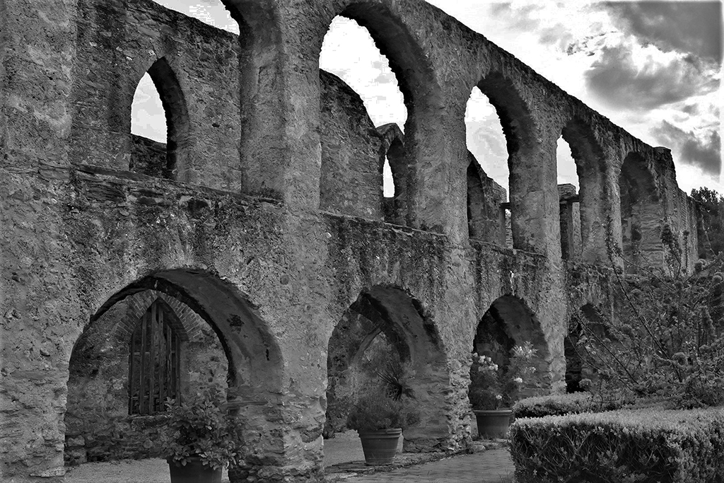
Here, I feel that the elements in the color point to the ruin, and the colors are all moderate and pleasant. It is a nice image.
Then, in the mono, it feels like the sky has exploded from the ruin, and the grasses are going along for the ride. I think the mono is much more dramatic and highlight the buildng just a little bit more. The only thing that is uncomfortable for me is that the black sky is very intense and comes on very suddenly. |
Sep 2nd |
| 74 |
Sep 24 |
Comment |
Haru - this may be my favorite image of all the ones you have entered. It is so surreal and emotional. The 2 trees do NOT compete with each other, but for me, this is a dialogue between the trees. The feeling it give me is almost heavenly, with the reflection having the effect of clouds, not trees. Normally I do not care for horizons in the center, but here, I feel it actually works well to promote an equality between top and bottom, while both halves are still diffeernt enough to work together. I also feel that the ratio in the depth of dark to light is superb. Wonderful image. The color pales in comparison to this unique monochrome image. |
Sep 2nd |
6 comments - 2 replies for Group 74
|
30 comments - 6 replies Total
|