|
| Group |
Round |
C/R |
Comment |
Date |
Image |
| 6 |
Aug 24 |
Comment |
Charissa - You sure got the colors right. Nice capture. When I plan to shoot a bunch of flowers, I always take an adjustable pocket flashlight along. In a garden it is hard to change the lighting without having someone hold a shade for you. Here, I might have shone the flashligh on just your subject flower. Then in post, perhaps take the entire image down in brightness and let the subject shine out. I am glad you use a tripod, 'cuz this shot would be hard to get without it. I would like to know if you did any post-processing. |
Aug 13th |
| 6 |
Aug 24 |
Comment |
Lori - I love sunflower and daisy photos because of the complex texture they both have. I find the angle of capture and position of the flower in the frame to be quite nice. I am a little distracted by the blur of the other flowers in the bakground. With flowers, especially when not captured head-on, I prefer to see all of the subject in sharp focus, and there is some foreground blur here. Unfortunately, wind movement sometimes alters our plans. |
Aug 13th |
| 6 |
Aug 24 |
Comment |
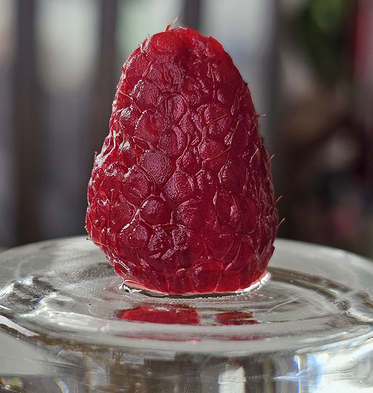
Ruth - this one made me inhale quickly. The first impression is IMPACT. This is beautiful. The perfection of focus on the fruits is amazing, and the texture holds the viewer's interest. Your colors are just wonderful. The balance is achieved by adding the light on the rim of the plate, and on the surface under the plate to draw the eye to the left. A truly great still life. |
Aug 13th |
| 6 |
Aug 24 |
Comment |
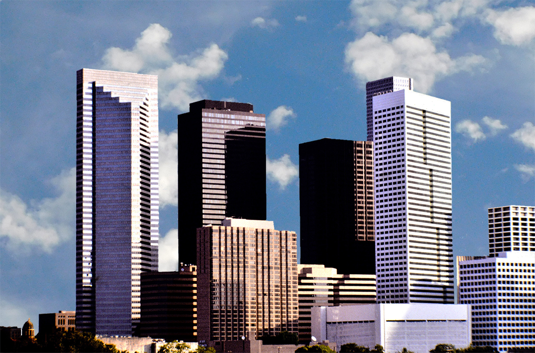
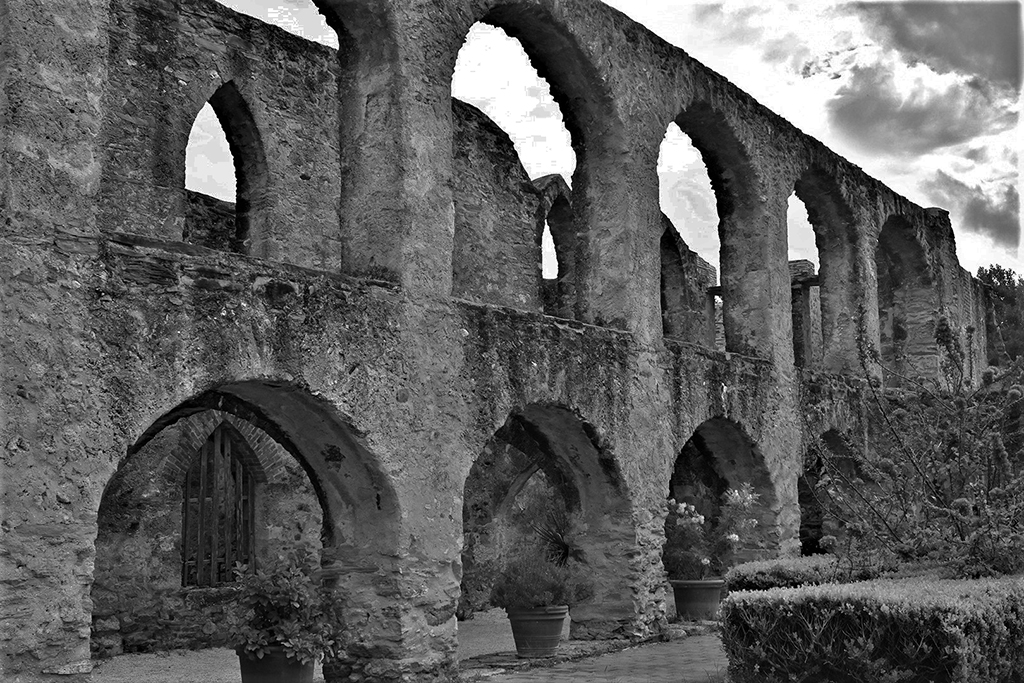
Tom - I really like the shooting position you took. Everything except the roots has become unimportant and it all is a great canvas to make the roots stand out. I wish there was a bit more lightening of the actual tree branch in the upper-right corner. For me this has a lot of interest not only because of the flow of the roots (in great focus) but also the puzzle of what the stack of squares in the background could be. I know it is a bulding, but the scene makes it mysterious. I also like the right amount of blue and cloud as a background. I wish I had taken this one. Great inventive shot! |
Aug 13th |
| 6 |
Aug 24 |
Comment |
Karen - I love the background treatment and the vibrance of the colors against it. Would it be possible to bring out more of the texture in the rose petals themselves? And perhaps sharpen the edges a bit? I feel that isolating the flower without all the confusion in the original was a great move. |
Aug 13th |
5 comments - 0 replies for Group 6
|
| 12 |
Aug 24 |
Reply |
Lisa - I had never done camera motion until our June assignment and I really liked it. Seems like old dogs like me CAN learn new tricks thanks to these great Groups. -MS |
Aug 13th |
| 12 |
Aug 24 |
Reply |
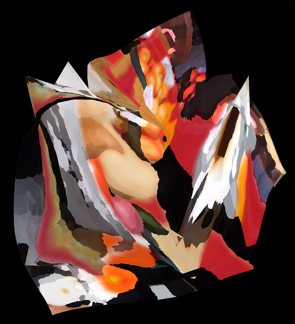
Connie - WOW - two of our group saw all kinds of stuff here. This is wonderful encouragement to experiment with this more often. I sent this one to a friend who does all kinds of abstracts and she was amazed I had this kind of stuff in me. I guess I have found a new "play" technique. It is very good therapy... -MS |
Aug 13th |
| 12 |
Aug 24 |
Reply |
Carole - You have a vivid imagination. I am glad you like the variety here. This was a most fun exercise, and I have tried it twice more since this challenge. I am loving the technique. Thank you for your comment and suggestion about an office environment. -MS |
Aug 13th |
| 12 |
Aug 24 |
Reply |
Nancy - you are right. I am trying to fnd a color I like for the background, but nothing seems to work for me. I am still working on it! Thanks for seeing that problem. -MS |
Aug 13th |
| 12 |
Aug 24 |
Comment |
Ally - you have made reality into a dreamy world of gentle color. The lovely image makes the flowers look almost like straw flowers. For me, it retains a little too much reality for the topic, but it would not take too much to tweak it into abstraction. |
Aug 2nd |
| 12 |
Aug 24 |
Comment |
Nancy - I never would have guessed what the base photo was. And I never would have guesed that the original could have become this beautiful image. I would love this hung in my home. Your color blends are beautiful, and the feathering of the colors is done without creating any blur. That is hard to do. I love the contrast of the white on the left with the greens on the right, and the inclusion of the dark background leaves a stopping place for your eye after all the contrasts and curves in the body of the pix. I love this! |
Aug 2nd |
| 12 |
Aug 24 |
Comment |
Lisa - For me this is a great portrayal of the merry-go-round ride. The portrayal of the forward and up-down action is right there. Your colors are beautifully saturated, and nothing sticks out too much. This happy image does confirm its title very well. |
Aug 2nd |
| 12 |
Aug 24 |
Comment |
Connie - Wonderful! The image seems to portray a romance. I would never have guessed that you started with ladders! This was a wonderful idea. I believe the 'posture' of each ladder really brings life to the poses. Perhaps these guys really are the theater ghosts and no one has been able to capture them until now! Until you did! |
Aug 2nd |
| 12 |
Aug 24 |
Comment |
Carole - for me, the blacks in the image define the action - with the colors on the lower half zooming in from the left, and the wash of pink flashing up on the left from the center. This certainly shows color blending, yet not quite blending - they don't lose their own personalities.
I would like to see some of the pup included in the image in some way. Perhaps those eyes and that lovely tongue! |
Aug 2nd |
5 comments - 4 replies for Group 12
|
| 41 |
Aug 24 |
Comment |
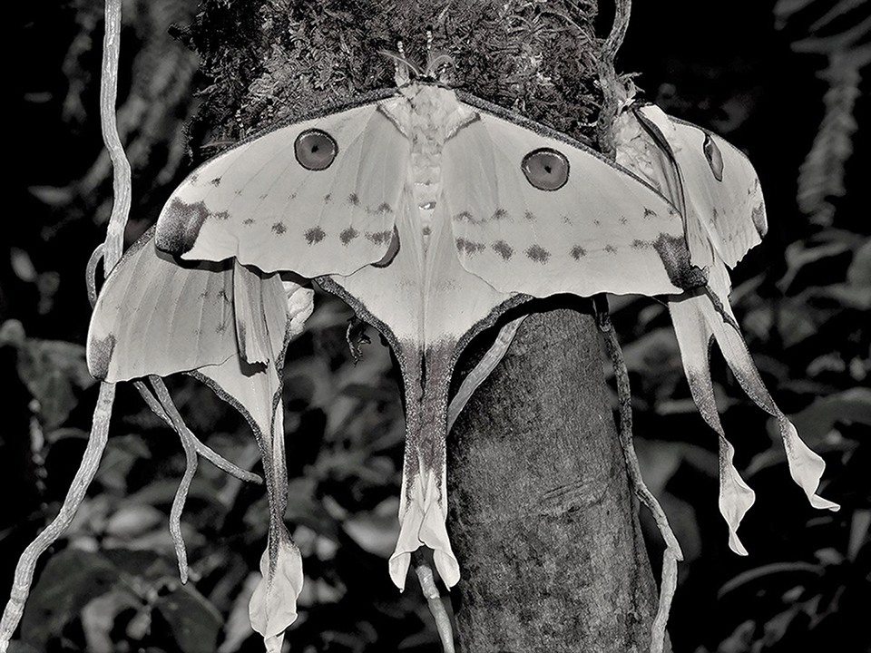
Hazel - Just WONDERFUL. I can appreciate models with a different agenda. But how in the world did you get all the perfection in focus on those cats? Those eyes are amazing and everything is fully in focus. The softness of the background and blending around the cats really is a contrast with the precision of the animals. The softness cerated is just right to tone down the stare and make this a beautiful portrait. -MS |
Aug 13th |
| 41 |
Aug 24 |
Reply |
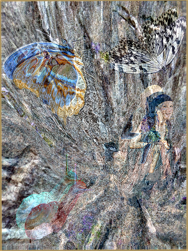
I agree. This is not what I would produce if I were using this elf for my own purposes. But the garden group went wild for the butterflies. For me, all the elements should be related. But I am very pleased with the texture this created. I think I took the manipulation a bit too far, and it obliterates the background. Something very different next month. |
Aug 4th |
| 41 |
Aug 24 |
Reply |
Brad - I agree with you. I have tried some of the comments myself, and sometimes it makes a big difference. I also like the fact that I have to do SOMETHING every monthy. I am now in 4 DDG groups for that reason. But I like the creative stuff best. |
Aug 4th |
| 41 |
Aug 24 |
Comment |
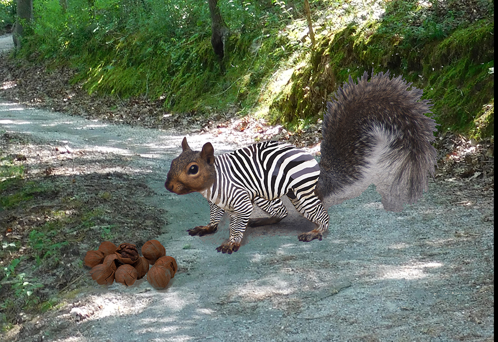
Brad - I like the muted colors in the image. There is just enough green to feel woodsy. And the squirrel looks great. I especially like the way the gentle curve in that section of woods leads you into the image. I think I might have put the squirrel a little further into the image. And because the forest is greyed-out, a bright red jacket might be more apparent on the hiker. |
Aug 2nd |
| 41 |
Aug 24 |
Comment |
Nadia - this is stunning. The colors are so moody and subtle. The eagle has just enough light on its head and back and talons.. I love the sky treatment (where did that come from?) The birds across the moon add the needed touch of mystery. The one thing I noticed is what looks like a metal 'can' under log below the bird's right talon. Is that part of the log, or something else? It caught my eye, and I kept going back to it. But this image is wonderful. |
Aug 2nd |
| 41 |
Aug 24 |
Comment |
Tom - your image looks like it is centuries old. And the features of your granddaughter are perfect for that classical look. I especially like the way the edges and lighting on the statue turned out - just enough shine to look like authentic marble. I appreciate the placement of the statue outside of the edifice, so the buldling is not competing with the subject, but rather adds context. Nice work. |
Aug 2nd |
4 comments - 2 replies for Group 41
|
| 74 |
Aug 24 |
Comment |
I REALLY thank you all for your comments. Now I have some additional direction to work with. I will let you know how this one does in competition in the future. -Melissa |
Aug 13th |
| 74 |
Aug 24 |
Reply |
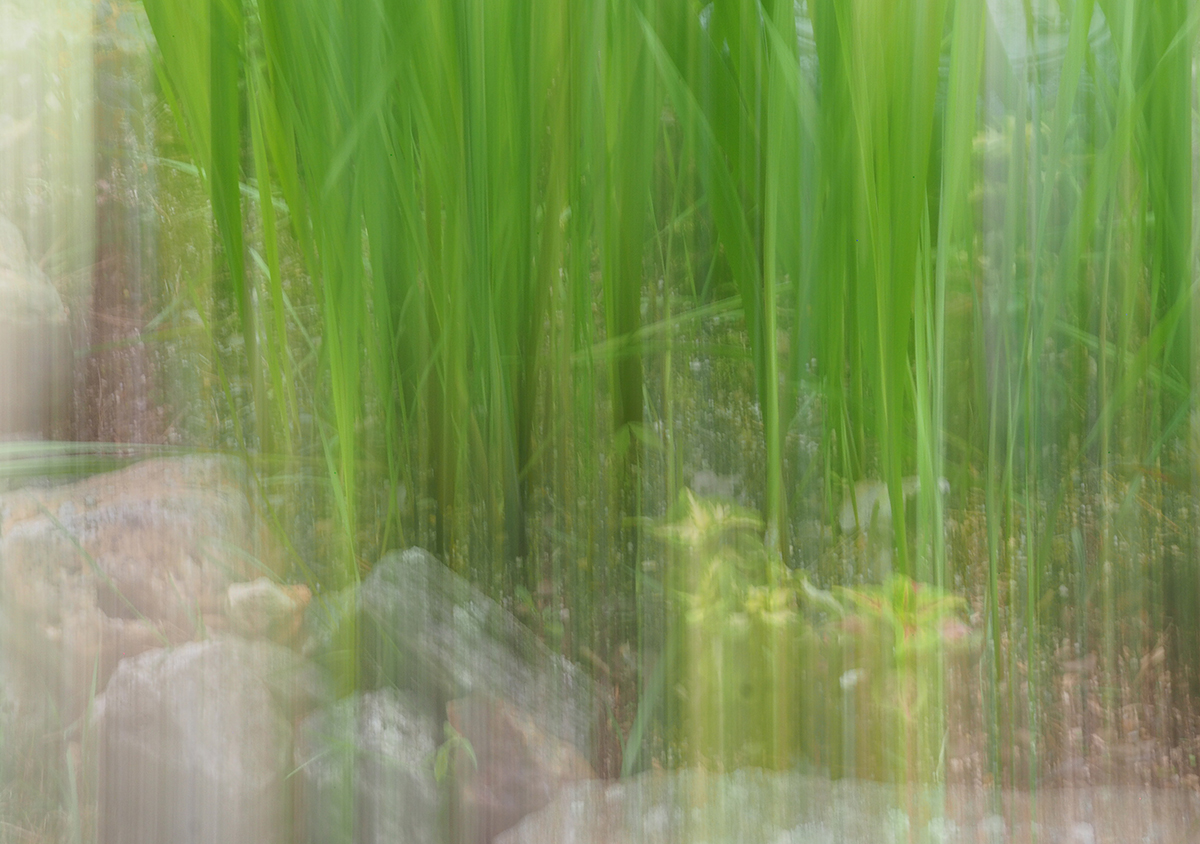
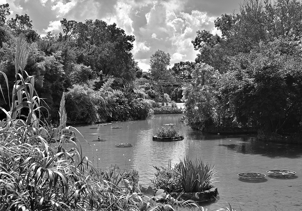
Haru - this morning I had a second thought. Take a look at the article in the August PSA Journal by Charles Gattis on SEEING. He had a photo with similar elements and showed the progression from original to final image, which was an ethereal rendering of just a reed in a pond. It will show you how strong your image could be. |
Aug 8th |
| 74 |
Aug 24 |
Comment |
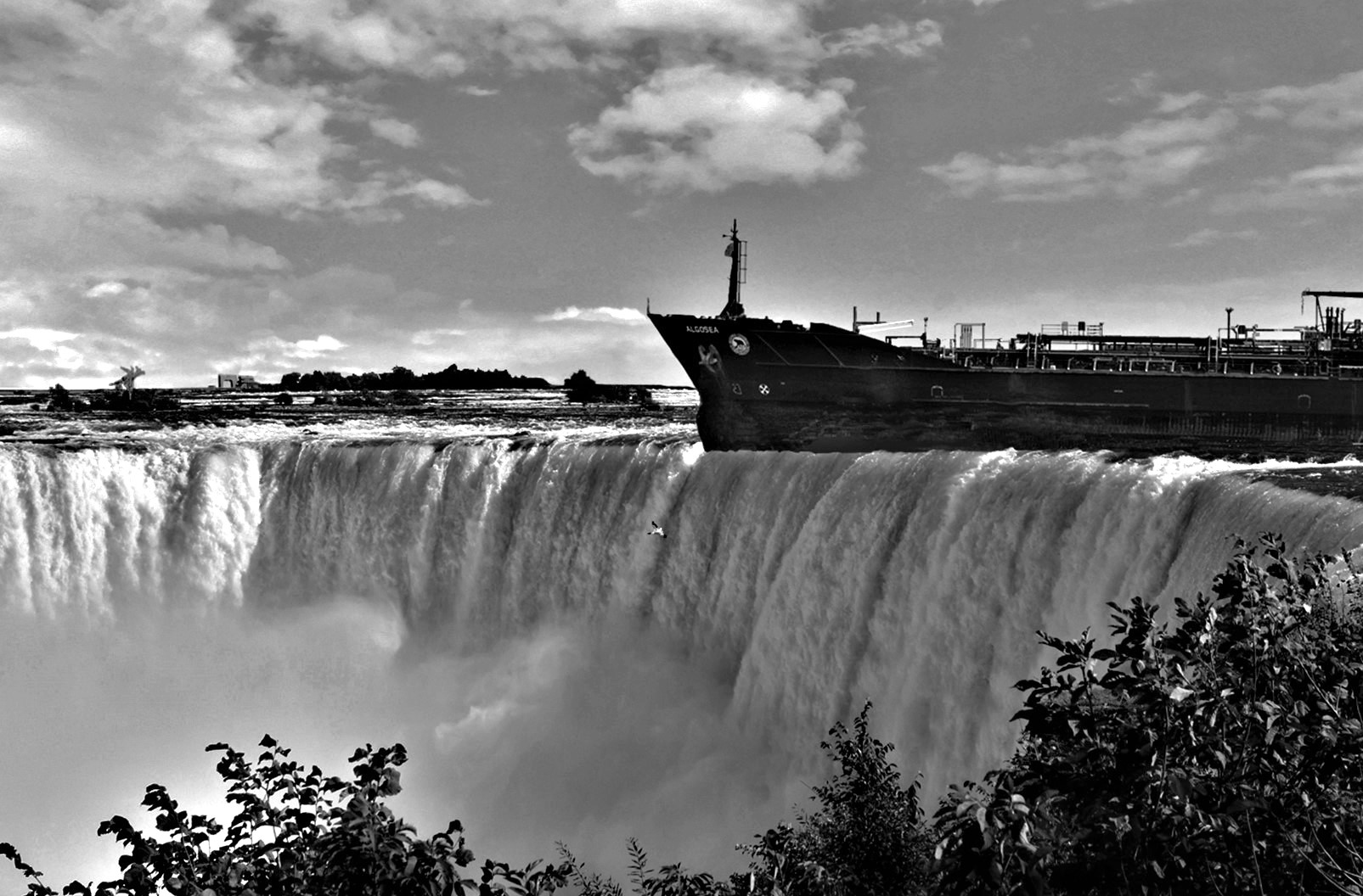
Ed - the difference between the 2 images is amazing, and I feel the mono is the best. In the original color, the darkness of the settng and background really do let the boats stand out, but there is nothing in the background that pulls in the eyes. The MONO - oh my. The water just sparkles with texture, the sky is thrilling, especially where the clouds come down on the mountain, and the lightness of boats is a counterpoint that to the dark sky. My eye is now forced to go back and forth through the entire scene. I think this is a perfect example of how monochrome can have more impact and strength than color. Very nice! |
Aug 5th |
| 74 |
Aug 24 |
Comment |
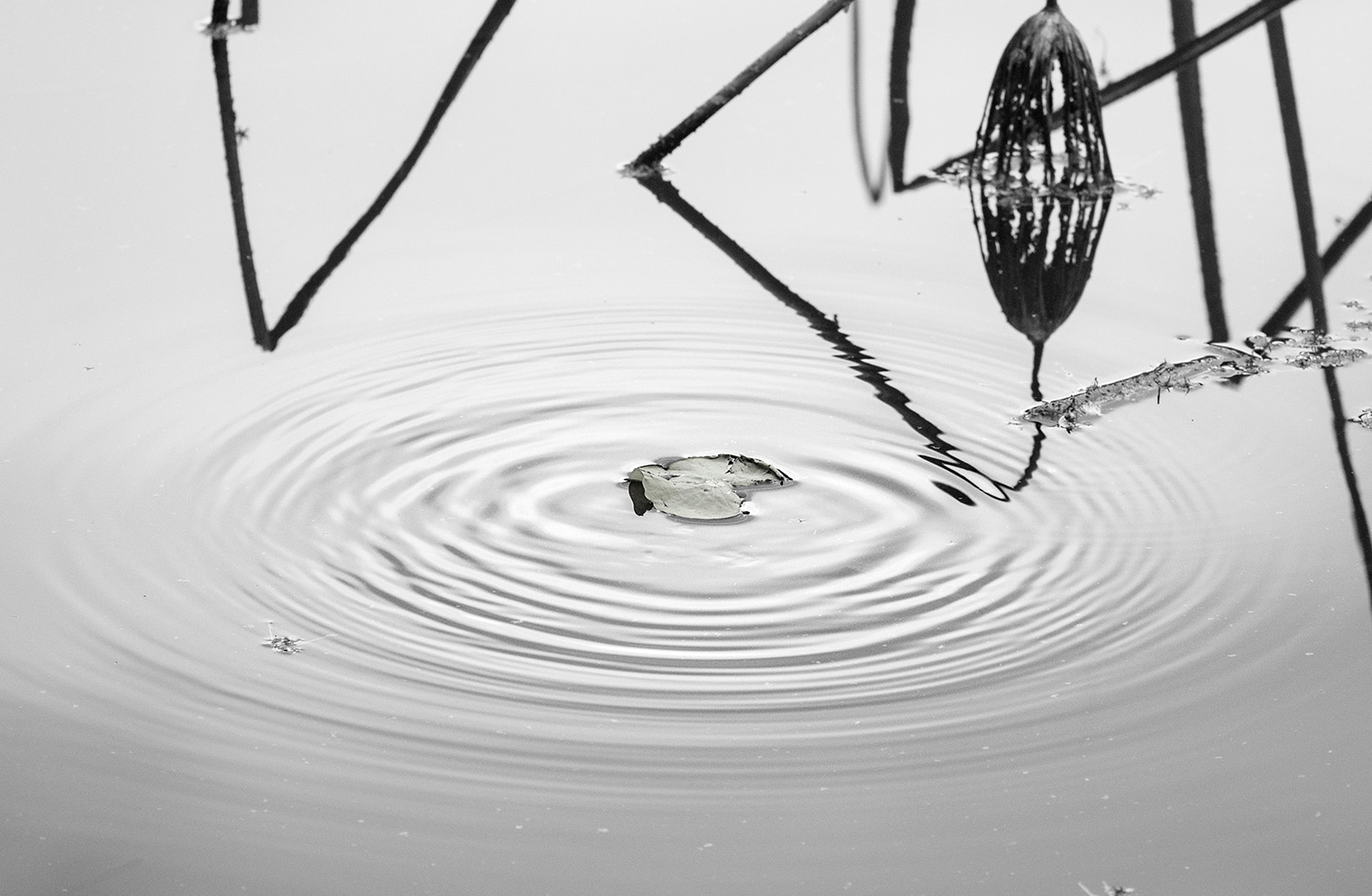
Haru - I studied this for a long time. My attention always goes to the big dark flower on the right then to the diamond-shaped figure on the left. I went back and forth and hardly noticed the leaf, even though the title is "A Ripple". In this case, I think the color image is the winner. The reason is that the 'subject' - the leaf- stands out because of the green. Also the browns are softer and easier on the eyes. For me, the mono is just a study in complication. I believe it might be more interersting if it were severly cropped. I think the lighting and shadins if good.
|
Aug 5th |
 |
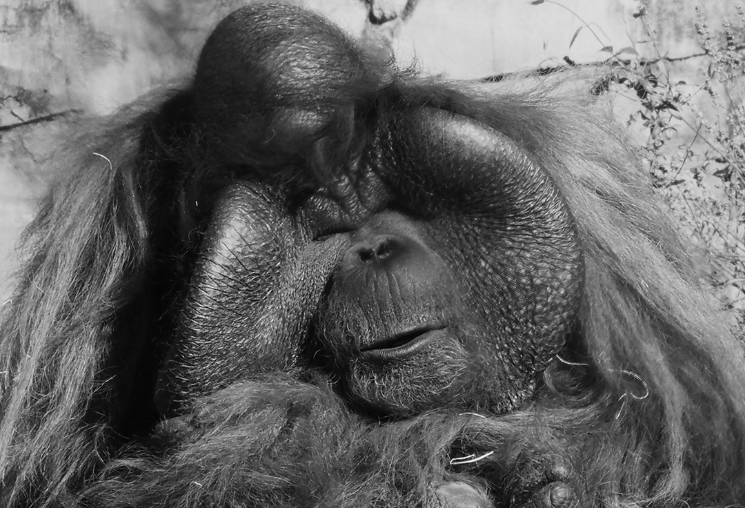
| 74 |
Aug 24 |
Comment |
Ed - you already know I love Apes. This one is lovely. Textures on Michael are quite nice. For me, all the other texture, mostly background, distracts. If Michael had turned his head a tiny bit toward you so we could view both eyes, it would have really made this photo. Can't wait to see the whole series. |
Aug 4th |
| 74 |
Aug 24 |
Comment |
Stacey - this is a hard one to analyze. Both images are great. The color is a dreamland of green with light streaming through the foliage. It is a paradise. And then the mono turns on, and the scene becomes full of mystery. In the color, the grasses in the cneter hold the interest. But the mono brings out the mosses, the sky, the ivy on the trees, and even the lichen on the trunks. It makes me want to walk in there and investigate further. I think the mono is very powerful. Love it. |
Aug 2nd |
| 74 |
Aug 24 |
Comment |
Oh my goodness - what a difference monochrome makes. The background rocks lit up! The clouds came out to play, and I hardly noticed the people in the color version. This is much better in mono. It makes me want to study the picture. Nice job. |
Aug 2nd |
6 comments - 1 reply for Group 74
|
20 comments - 7 replies Total
|