|
| Group |
Round |
C/R |
Comment |
Date |
Image |
| 6 |
Jul 24 |
Comment |
Actually Ruth, I would crop the top flower because it shows the nature of the vine the flower lives on, and the size of the bloom relative to the blur of the vine. It could also be a horizontal, which might be more comfortable.
For a wall hanging - i really like the long thin set of flowers. |
Jul 20th |
| 6 |
Jul 24 |
Comment |
Charissa - I liked last month's image - quite similar. BUT this mono is really THE BEST. The lack of color lets my mind process the textures much easier. The contrasts are wonderful. Also, I appreciate the perfect focus on all parts of the flower, and also in the glass. That's not an easy task. The reflections on the fluted bowl lead the eye back into the subject flower. And even the background texture is just enough. Great image. |
Jul 8th |
| 6 |
Jul 24 |
Reply |
Thanks. I really LOVE being in a butterfly house, even with the humidity. You can't find these little guys in your garden very often ! |
Jul 8th |
| 6 |
Jul 24 |
Comment |
James - I don't think this shot says that you have a lot to learn about focus stacking - I think you have nailed it already. Your colors are spectacular. But the amazing detail on all edges is the best. That tiny piece of stem on the bottom right shows the perfect focus details on those tiny hairs. And I like the intrusion of the green - it cools the heat of the fuchsia color just enough. |
Jul 8th |
| 6 |
Jul 24 |
Comment |
Welcome Lori. Nice shot of these elusive creatures. They are one of my favorite things to shoot also. I think your color quality is my favorite thing about this one - the light on the wings makes the colors pop and the markings stand out. I appreciate the sharp focus on the mid-section and especially the eye and antennae. But the hardest part of doing butterflies is getting all of the guys in perfect focus, and I feel there is a bit of drop off on the bottom and top of the insect. |
Jul 8th |
| 6 |
Jul 24 |
Comment |
Wow. First, the diagonal placemenet is a winner, espeially with the detail becoming greater as the orchids trail down. Next, the lighting on the flowers themselves is what most of us try to achieve. Light on the flower faces is enough and there are shadows to provide detail. The touch of blue fading gently away from center adds interest, but does not distract at all. I think I will try to emulate this one. |
Jul 8th |
5 comments - 1 reply for Group 6
|
| 12 |
Jul 24 |
Comment |
Connie - I really love this image. It strikes a chord with me. Would you mind if I printed it to hang on the wall in my work room? -Melissa |
Jul 27th |
| 12 |
Jul 24 |
Reply |
Lisa - I LIKE that treatment. Thank you. I will do that. -MS |
Jul 8th |
| 12 |
Jul 24 |
Comment |
Wonderful image of agriculture. The rows lead into the background, and he clouds are dipping down to meet them. The colors, although definite, are quite soft. I appreciate the pop of color in the center of the image. I also like the horizon in the center of the shot so that the shot is not sky-starved. And the workers are even dressed the part. |
Jul 8th |
| 12 |
Jul 24 |
Comment |
Srijan - This is beautiful. The composition really strikes me. You see the foregound picker, but then your eye is led down the path to see the other workers, and then into the background. But the foreground image is so strong you go back to that. The image seems circular.
I studied the mountains for color and find it quite believable. I did question the brightness of the greens, but that must be what it really looks like. Nice image of agriculture. |
Jul 8th |
| 12 |
Jul 24 |
Comment |
Nancy - I love this one. This process has sure changed with the years. Gone is the irons stuck in the fire. And pneumatic vaccination machine? - wow. I do wish more of the calf was showing. But I love the people in the background - I only wish they wre watching the proceedings. I think mono is the only medium for this shot - color would be too distracting. |
Jul 8th |
| 12 |
Jul 24 |
Comment |
Lisa - for me, this is a winner. What I like most is the leading line of the path back to the other people and the farm buildings because it says 'this is a farm' not a park. Of course the colors are well-handled and the off-center path and silos add interest. I like the other folks in the background. For me, I am distracted by the sky. It is so VERY bright blue with contrasty clouds. I might suggest calming the blue down a bit. |
Jul 8th |
| 12 |
Jul 24 |
Comment |
Connie - I really LOVE this image. Something about those muted, yet bright colors (can that be a true thing?) There is an old-time feeling about the image. Your treeatment with the NIK filter seems to have brought out texture on the corn, but also the husk. This is the kind of image I like to frame and hang.
AND HOORAY for the local effort to stop Big Petro. Shows what a camera can help to do !! |
Jul 8th |
| 12 |
Jul 24 |
Reply |
You are right. The best camera is the one you have with you. This one goes everywhere with me - even into Walmart. The Nikons and Olympus stay at home unless I am going somewhere "to shoot". |
Jul 8th |
| 12 |
Jul 24 |
Comment |
This is surely not a snapshot, but a beautiful portrait. I love the slightly off-center presentation. And I appreciate that the entire area around the subject is in focus. For me, color rendition is important. Here the colors are true with no blow-out from being in the full sunlight. And I like the cloudless sky - no distractions. Very nice. |
Jul 8th |
7 comments - 2 replies for Group 12
|
| 20 |
Jul 24 |
Comment |
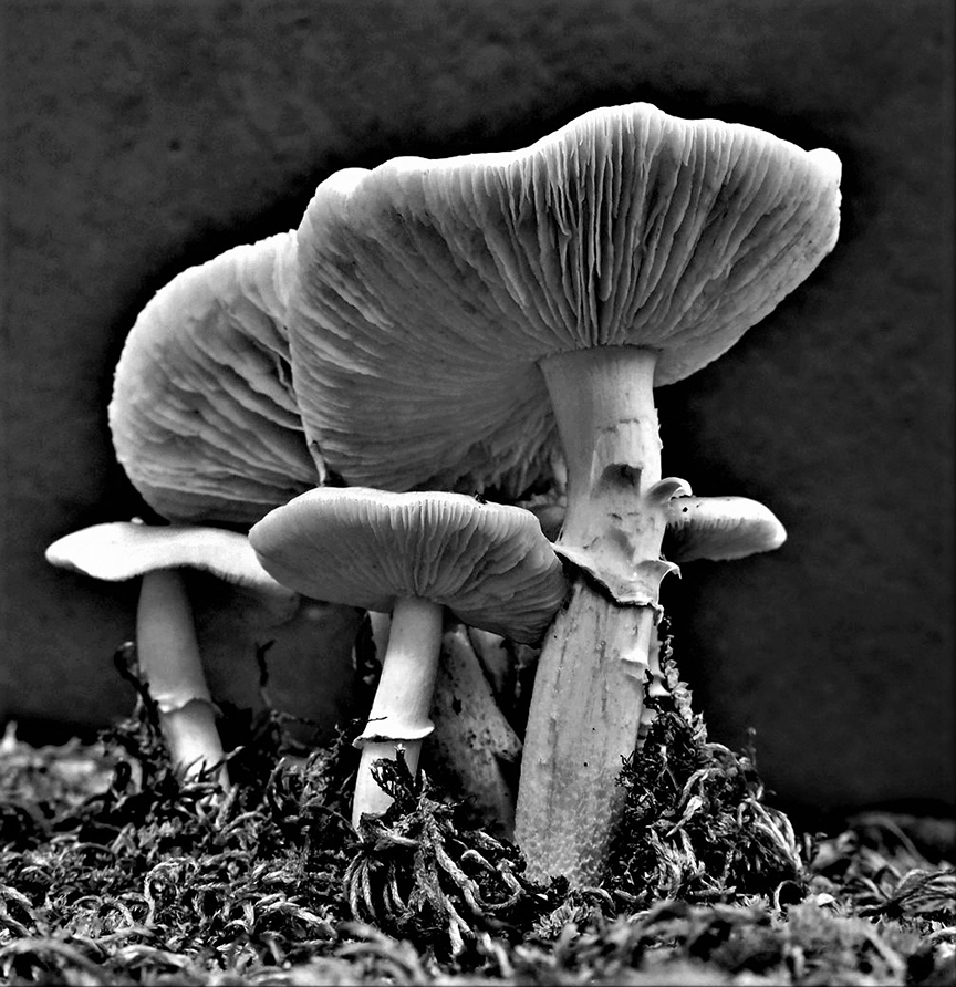
Angela - this is VERY creative - I like the idea of using something simple like moss. That is why I love mushrooms. But your combination of the lovely sunset scene with the 'trees' is genius! I wish I have thought of this. (I will probably imitate your idea - the high form of flattery!)
-Melissa Cramer Sonnen, DDG-74 |
Jul 29th |
1 comment - 0 replies for Group 20
|
| 34 |
Jul 24 |
Comment |
Dear Mike - I think this is wonderfully altered - and spectacluar. It has the right amound of interesting "things" fo keep the viewer looking for a long time. Excellent job preparing the ride. For me - the swans should be a bit smaller and perhaps, muted a little. I love the resuts!!
Melissa Cramer Sonnen, DDG-27 |
Jul 29th |
1 comment - 0 replies for Group 34
|
| 74 |
Jul 24 |
Comment |
Haru - I agree with Ed. I always try to look at the mono image before viewing the color to see how it strikes me. This mono was very difficult to understand for a long time until I realized the light blur was a fish. When I saw the blue in the original, I realized what the mono was portraying. |
Jul 20th |
| 74 |
Jul 24 |
Reply |
I think the color loses a lot when replaced with version 3. It seems to have just enough color to be distracting, where in the peach background it is just a compliment. And No. 3 is a mere shadow of the mono first version. |
Jul 20th |
| 74 |
Jul 24 |
Comment |
Giovanna,
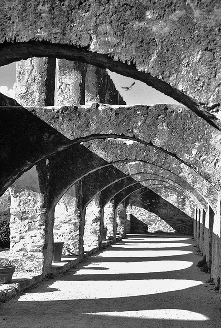
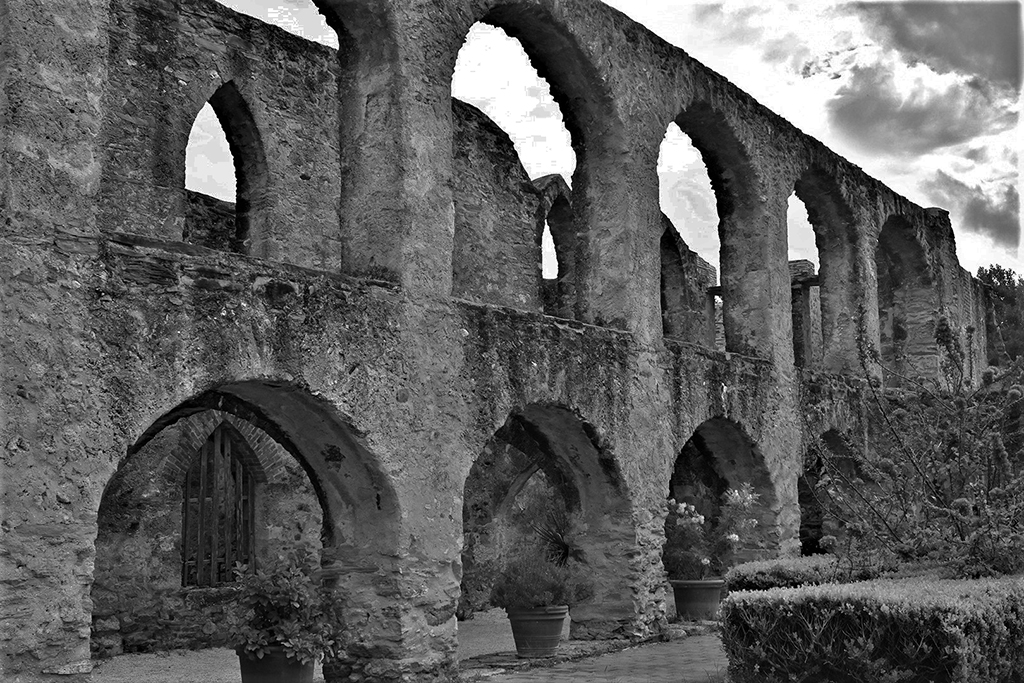
This image took my breath away. I am not sure if it is the slight fisheye, the bend in the columns, or the feeling of great space. But I think it may be the texture of the slate against the wood ceiling texture. For me this feeling is missing completely in the color. But the mono makes this an active image, where the eye goes from one feature to another. I love this one. |
Jul 20th |
| 74 |
Jul 24 |
Comment |
For me, the mono is very startling. That bird is almost scary - he appears to be walking on his wings because he is so close to the ground. The contrast in his feathers is really great. I might suggest trying a small crop of some of the grass - not too much -just to take a little of it away from the things the viewer has to look at. This is a great mono! |
Jul 8th |
| 74 |
Jul 24 |
Comment |
I agree with Trevor. Both are beautiful. For me though, there is something really special about the color - I think it is the gentleness of the peach background that makes the color on the bird's back so beautiful.
I think this one should be entered in mono AND color contests !! |
Jul 8th |
| 74 |
Jul 24 |
Reply |
Trevor - you may recommend me for judging if you wish. I do that for PSA Club Judging Service, but recently got some designations I had been working toward, so now I feel much more qualified to judge. |
Jul 8th |
| 74 |
Jul 24 |
Reply |
Trevor - I agree. I never noticed that because I was so concerned with the contrasts. Thanks. -MS |
Jul 8th |
| 74 |
Jul 24 |
Comment |
Trevor - This was a wonderful accident. For me, the color image is mostly about the pale green color and texture of the wood railings. In your conversion to mono, I believe you have revealed so much more - here the textures from front to back just pop out, and the image gave me a physical reaction of pulling me in. Those outstretched rails feel like arms reaching for me. It felt a bit intimidating at first. You have really achieved Dimension with this image. I suggest you print it and hang it! |
Jul 2nd |
5 comments - 3 replies for Group 74
|
19 comments - 6 replies Total
|