|
| Group |
Round |
C/R |
Comment |
Date |
Image |
| 6 |
Jun 24 |
Reply |
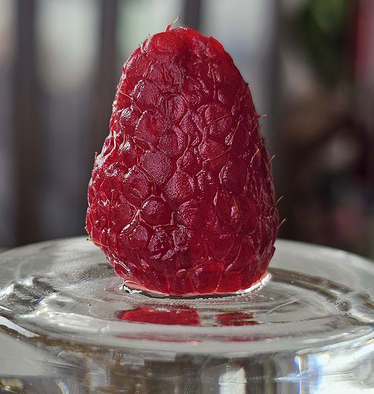
Karen - thanks for the reply. Yeah - the berry was wet from washing, and it was on the bottom of a wet glass. It was really a snapshot more than a photograpy - no posing or thought involved - because hubby was about to eat them and I thought they were beautiful. The berry was delicious.
I will be using camera only for this group. |
Jun 11th |
| 6 |
Jun 24 |
Comment |
Charissa,
I find this amazing image to be about texture and contrasts and it does that very well. Those flowers are an entity themselves, then you added the smoothness of the glass bowl. Wow - what a great contrast. Then there is the sparkle below and the shadow - all comlpletely different from the flowers. Even the texture in the table participates in the contrasts. However, the overall color is monochromatic. All of this keeps my eye attentive -looking back and forth between these layers.
I am amazed at this image - it held my attention for a long time. I even brought it to PS and did a Mono of it - It still works, but this color is so soft and beautiful. I wish I had taken this one. |
Jun 11th |
| 6 |
Jun 24 |
Comment |
Jim - I would say your experiment worked perfectly. There is quite a bit more texture in this edit. I agree about the lower bud. The beginning shot is great! |
Jun 11th |
| 6 |
Jun 24 |
Comment |
Ruth - Impeccable detail in that flower center, right up to the pollen (at 5x). The color values are very strong and true and the intrusion of the green buds is wonderful. I like how the focus trails off slightly to the left.
For me, I would like to see the background darkened a bit on the right, which might make the flower stand out a bit more. |
Jun 11th |
| 6 |
Jun 24 |
Comment |
I agree with Karen about the "white thing". Although this is not very 'close up' all the details are there - even the wear on the wall above the seat (at 5x). I feel that this could not be compressed of cropped, because the seat and appearance of the door is necessary to tell the story. Very nice. |
Jun 11th |
| 6 |
Jun 24 |
Comment |
Karen - This is stunning! I think just the right amount of softening was applied. And the handling of the whites is very good. I never thought of getting lost in the petals, but I find it to be true when you stare at the flower. -Just a lovely capture. |
Jun 11th |
5 comments - 1 reply for Group 6
|
| 12 |
Jun 24 |
Comment |
Nancy - For me the movement appears to be on the diagonal, which I really like because that is the direction the grasses are taking too. I think this is just enough blur - And the clouds turned out great too. |
Jun 15th |
| 12 |
Jun 24 |
Reply |
No, I don't think so - the way it is, there is a 'start' at the bottom, but not seeing the tops of the trees gives me a feeling of "it goes on forever". I like that effect. |
Jun 11th |
| 12 |
Jun 24 |
Comment |
Connie - I really like this image so much mnore than the original. This vignette really worked for me - it made the flags to be the centerpiece with no other frame of reference. The line on the table from the original is gone. For me this goes beyond a pcture of flags in a vase. The dreamy look and the green and blue you added takes a dreamy picture and gives it a reality - like this is about the whole scene of our earth. I think this is really nice. And also very meaningful to me. Thank you. |
Jun 11th |
| 12 |
Jun 24 |
Reply |
I know what you mean - even after cataract surgery - still blurry!! |
Jun 11th |
| 12 |
Jun 24 |
Reply |
I really agree with with Ally and the T-shirt idea - this is much prettier than tie-dyed |
Jun 5th |
| 12 |
Jun 24 |
Reply |
Thanks Ally - I wil be trying this again soon in a nearby woods. |
Jun 5th |
| 12 |
Jun 24 |
Comment |
WOW. I have GOT to try this on the new phone I got this morning. I can see the possibility for backgrounds with muted shades of autumn colors. I like the way the colors blend, but cannot see how the 'texture' on the left happened. We should try this assignment again soon. I actually like it. |
Jun 4th |
| 12 |
Jun 24 |
Comment |
Ally - I feel the starkness here. This image almost looks like there is a mist of snow in the air. I especially like the disappearing trunks at the bottom. I would like this on my wall!
-Melissa |
Jun 3rd |
4 comments - 4 replies for Group 12
|
| 41 |
Jun 24 |
Comment |
Brad - When I saw this, I giggled - very creative with the sweatshirt hood over the face. I thought about adding a person farther down the hill showing their obvious back side with the hood draped over toward the back and their head on backwards (looking forward). That would give something for the dog to look at too. Or maybe a big cat's back with the head facing forward?!?
-Melissa Sonnen, DDG 74 Mono |
Jun 3rd |
1 comment - 0 replies for Group 41
|
| 74 |
Jun 24 |
Reply |
Ed - I tried messing with that backgorund. It just does not work. But I think I have a new textured background I am going to try. This will be entered in a mono contest, so I CAN change the background. Thank you for that suggestion !! |
Jun 15th |
| 74 |
Jun 24 |
Comment |
Haru -
I see little difference between the 2 images. However, without the explanation, I have no frame of reference for the white specks. I believe the image would benefit with more on the right to give the view an idea of what the image is. I always thought that a good image should tell a story without the title, which is missing in this image.
I am further confused by the intrusion of the white in the upper right of the image. I'm not so sure that this one worked.
I like the amount of blur. |
Jun 11th |
| 74 |
Jun 24 |
Comment |
Stacey - very unusual. I think it is a little difficult to understand because the hair going up is so unnatural. Ed is right - it needs some cropping done. I would also like to see the hair going to the left, like a huge wind came up and she is struggling through it. |
Jun 5th |
| 74 |
Jun 24 |
Comment |
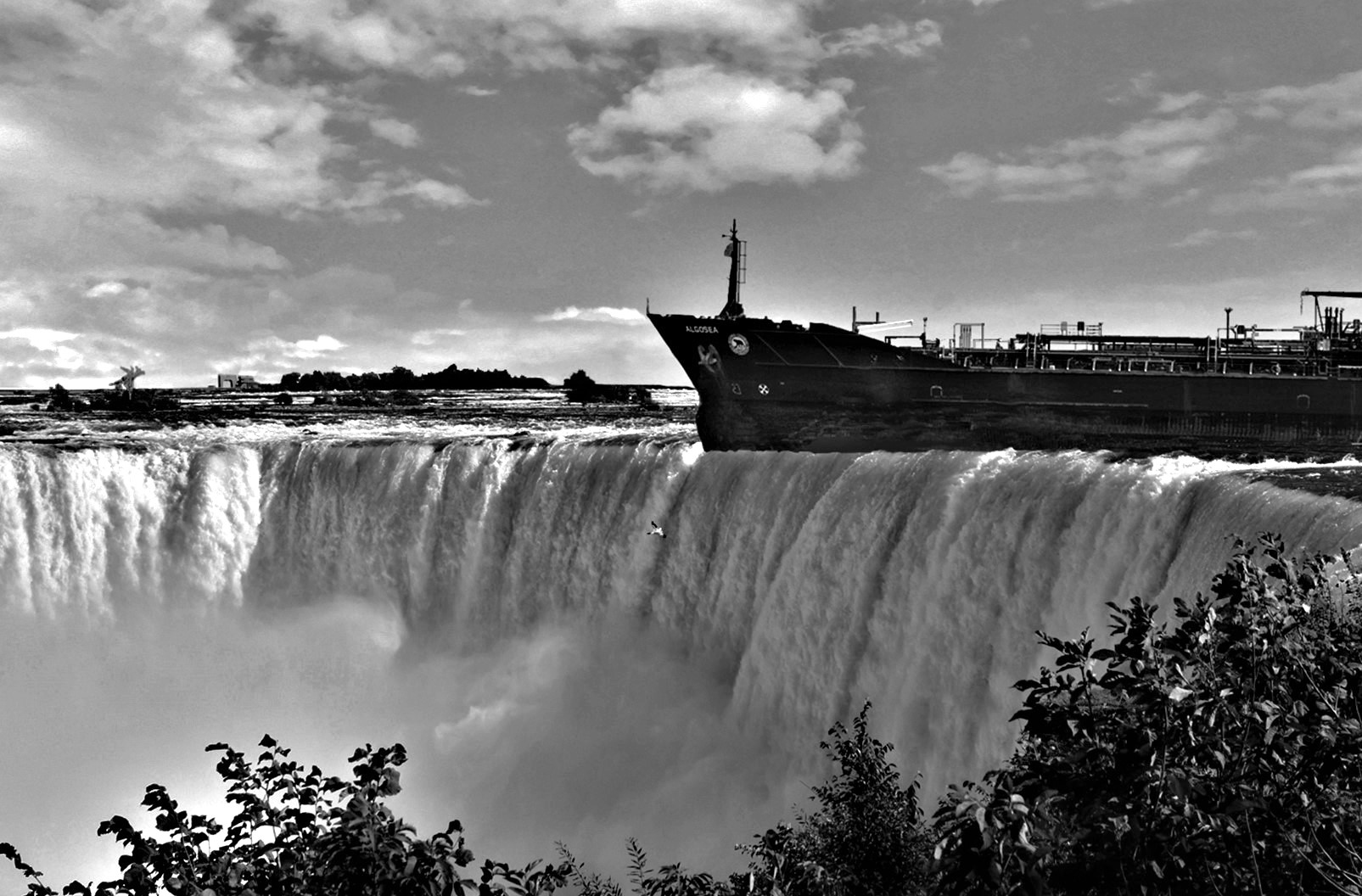
Ed - This is quite a stark difference between the color and mono. The ship really stands out. The solid black background is the right thing to help all the details pop forward. The details are amazing. I like the tight crop also, and the small water wake on both ends of the ferry really add a little movement. A really great image in mono. |
Jun 5th |
| 74 |
Jun 24 |
Reply |
Thanks for the suggestion. I tried darkening 80%. but then the texture stands out. Tonight I will have time to work on it and make the back a smooth darker color. I'll let you know how it comes out. |
Jun 5th |
| 74 |
Jun 24 |
Comment |
For me, this is a very unusual image because of the placement of the birds. The beginning directoion is in the diagonal, then the branch goes straight up. This creates a great feeling of tension. I think the small twigs on the bottom are in balance with the open space in the upper left. This sems to be a perfect example of the importance of 'placement' in making an image feel right. Nice job. |
Jun 4th |
| 74 |
Jun 24 |
Comment |
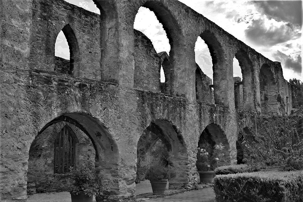
WOW - wht a difference the monochrome made. The work on the sky was just enough to bring out the nice clouds. The building was kind of nonde in the color - jut a lot of beige. But the mono makes all the corners and angles just POP. I find the shooting angle very good to give a feeling of grandeur. I might suggst doing a TINY selective lightening on the gargoyle that sticks out on the left so his eye and wing are highlighted just a little. Great shot. |
Jun 4th |
| 74 |
Jun 24 |
Comment |
Giovanna - This may be your best image yet! The color image is a really good shot with the beautiful horn and colorful background. But in the mono - the trees in the reflection come alive. I did not even notice that in the color because there is so much to look at. The background yellow and green do not distract from the horn. And the musician becomes incidental to the scene - it is ALL ABOUT THE HORN. This image proves that monochrome is not dead, and has a LOT to contribute to excellent photos. |
Jun 4th |
6 comments - 2 replies for Group 74
|
16 comments - 7 replies Total
|