|
| Group |
Round |
C/R |
Comment |
Date |
Image |
| 12 |
May 24 |
Reply |
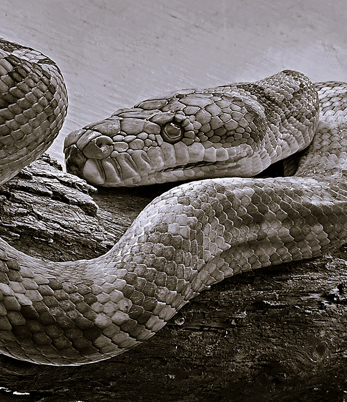
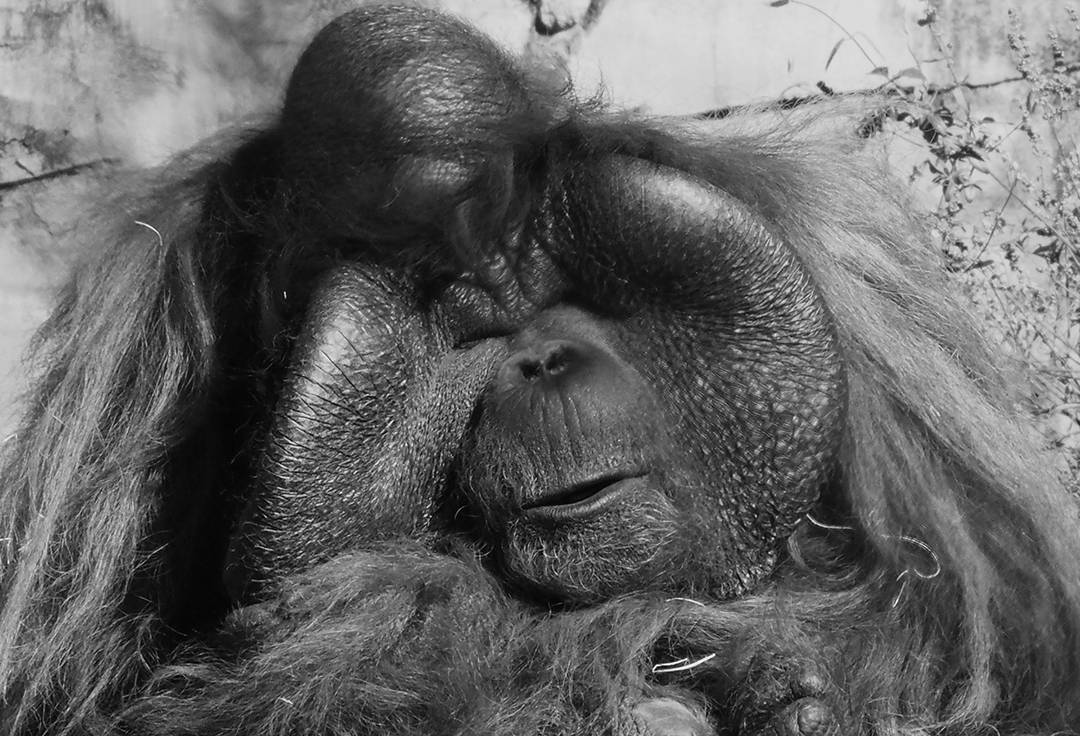
Thank you Connie. The focus is a little soft here. This image was huge to begin with, and most of it was cropped out. It was very early and most 'residents' here were asleep. I wanted a dreamy mood, and thought the focus helped with that. SO, you saw what I was trying to create. I usually like tack-sharp focus, but sometimes that just doesn't work. |
May 13th |
| 12 |
May 24 |
Reply |
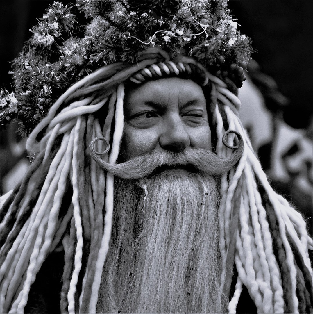
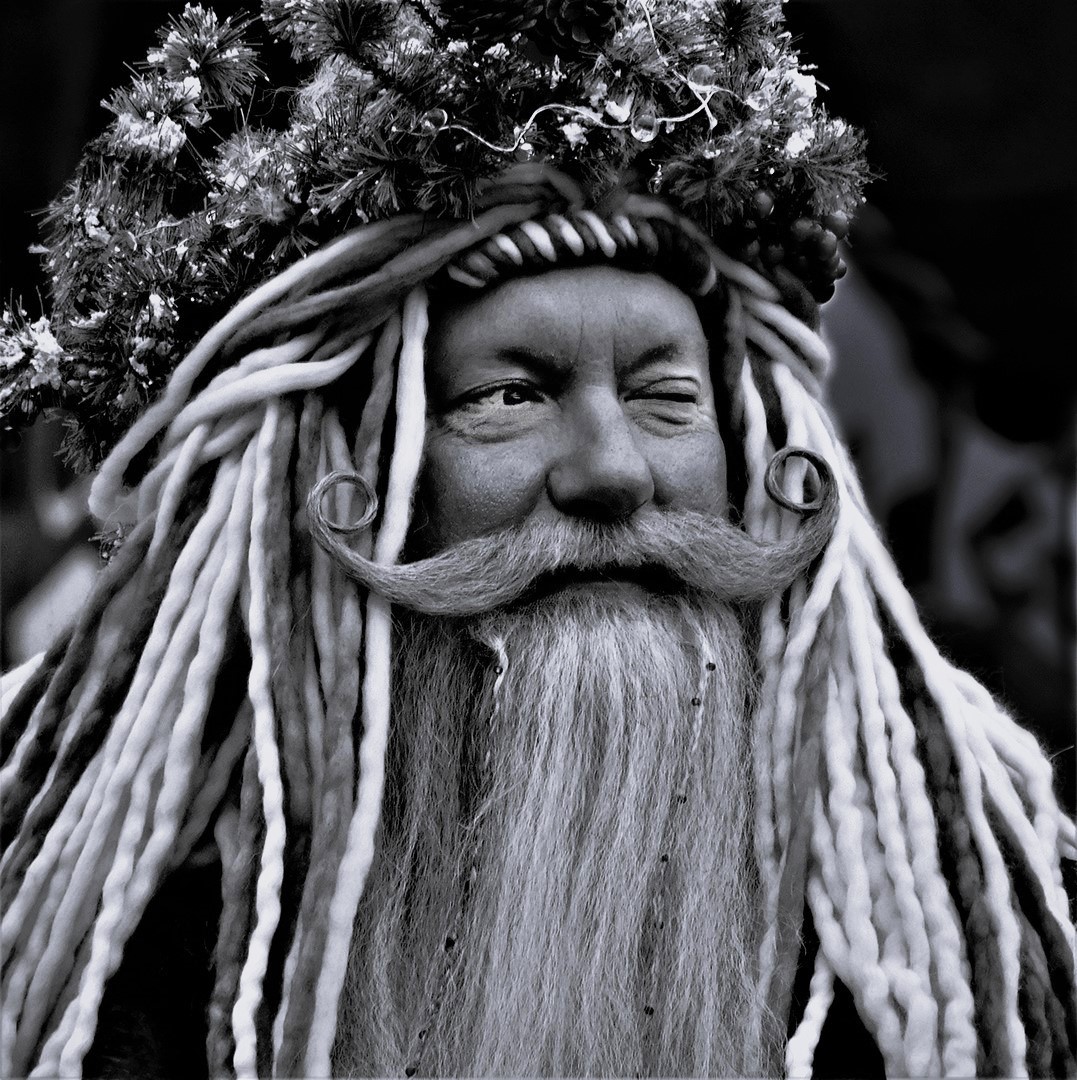
Thank you Carole - I appreciate your comment because that is exactly the feeling I got when I saw him - so the image works!! |
May 13th |
| 12 |
May 24 |
Comment |
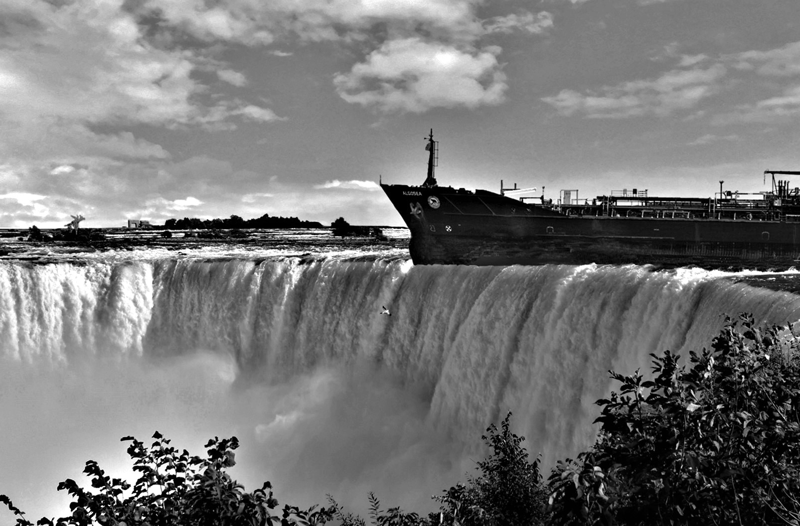
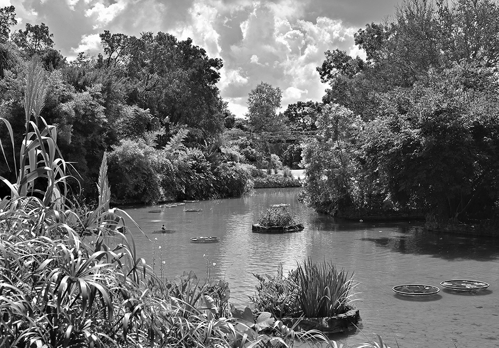
I believe there is a really good balance here, even with the negative sky. There is a lightness in the right side of the sky that balances the lightness of the background grass. When I put my hand over the sky, the background just screams "I'm here" and I miss the hay bale. But I think the sky stops that, and sends the bale forward. I also love the pole to break up the flat stretch of earth. |
May 11th |
| 12 |
May 24 |
Comment |
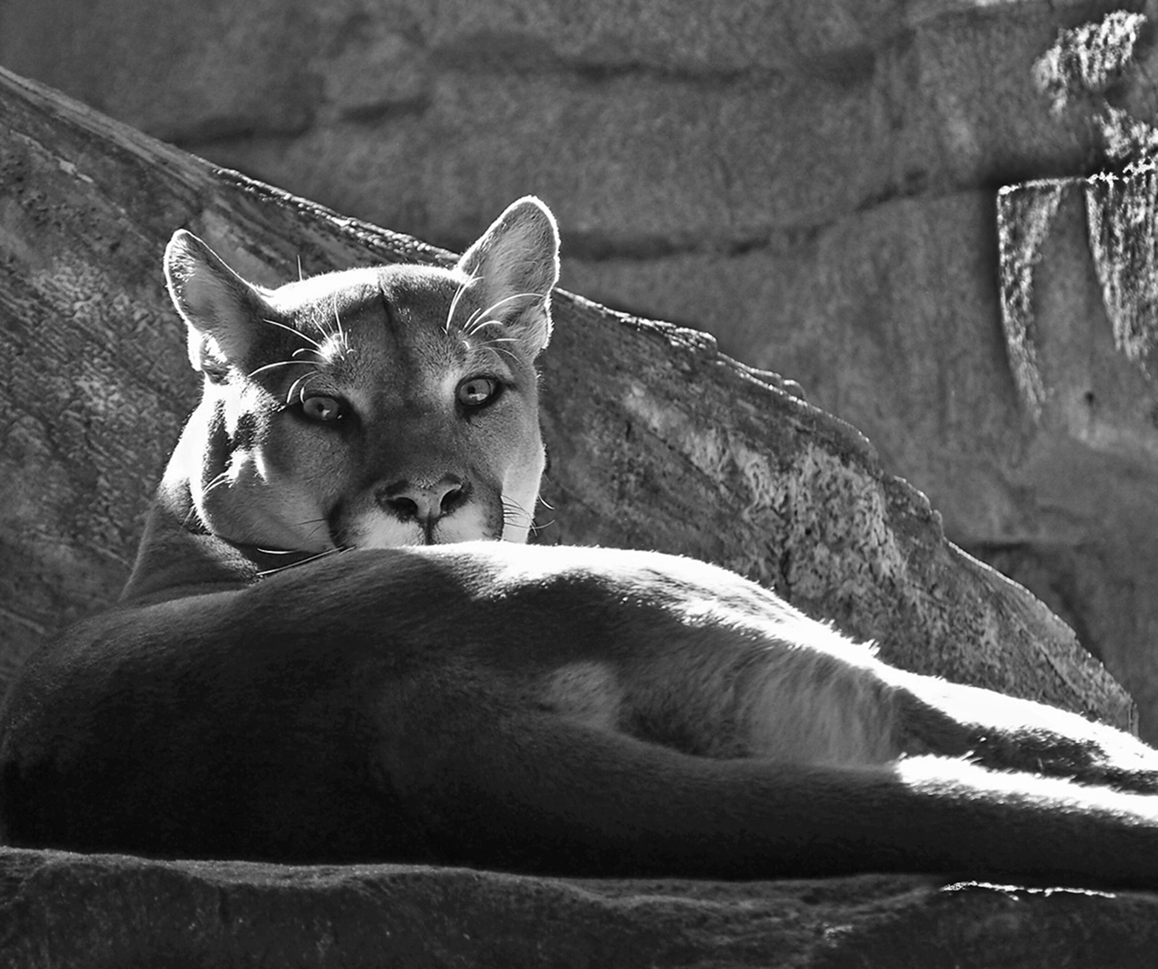
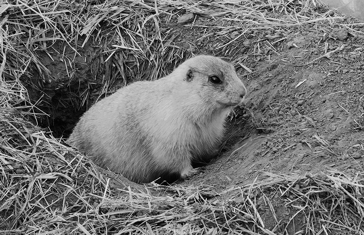
I find this image evokes the "awww" response - it is so unusual and cute. For me, the best part, besides the crisp detail, is the effect of the background manipulation - it brought out all that wonderful texture. The colorful flower is a perfect balancing influence. I also liked all the activity being in a corner, which further adds to the negative space feeling with 2 nearly blank sides. |
May 11th |
| 12 |
May 24 |
Comment |
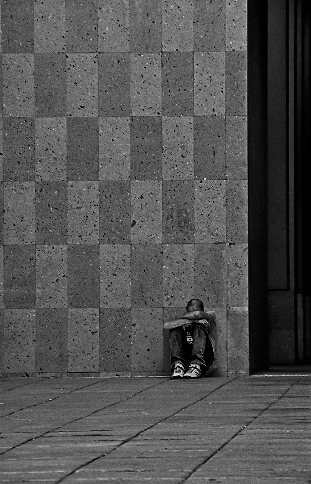
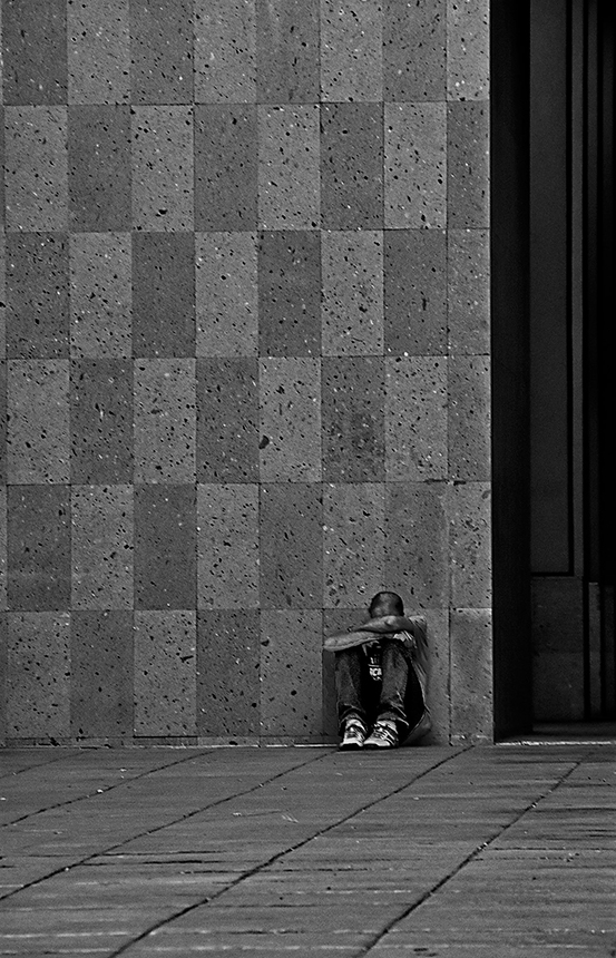
I think the color version was just a photo. The mono version makes this come alive, and the addition of the person was absolutely necessary. I love the contrast between the black glass walls and light tile floor. Of course, the man is the subject. But his indifferent demeanor makes me feel like he is unaware of the "X" he could be crossing over. The photo makes me curious why there is an "X" here, and where does it lead. This one is a thought-provoking image. The focus is great, and the insertion of the man is perfectly done. |
May 11th |
| 12 |
May 24 |
Comment |
Connie - I really like this image. You me, it tells me a little different story that would not be possible without the negative space. All the headstones occupy the earth as "ex-alive" creatures in one place. But they are all dead. And yet, the negative space - the entire world for this tree, is occupied by a living, vibrant and beautiful being - the tree. The image is a reminder to us that although we relish our importance, we are swift to pass on, but the "unimportant" tree will go on for far longer than our few 80 years. What a lesson. And the tree is in the beauty of the blue sky, not the mould below. This is an emotional image.
This is also a beautiful done photo... |
May 11th |
4 comments - 2 replies for Group 12
|
| 74 |
May 24 |
Reply |
I( am so thankful for all your comments. I worked on this and thought you might like to see the difference it makes! |
May 13th |
 |
| 74 |
May 24 |
Comment |
THank you all - I am doing a lot of work on this one. Thank for your guidance. -Melissa |
May 11th |
| 74 |
May 24 |
Reply |
I agree with Don Hill (DDG-40) that the square format is best. |
May 11th |
| 74 |
May 24 |
Reply |
Stacey - I did not realize what was troubling about the image until Trevor mentioned the tattoo being lost. I thought it went unnoticed. (too bad - I like tattoos) I pulled your image into PS and did a selective capture with the lasso tool on some of the arm and some of his face and lightened the arm 18% and the face 8%. It gave me a clearer look at that beautiful tattoo. |
May 11th |
 |
| 74 |
May 24 |
Reply |
I agree with Haru - some lightening of the bulding makes a nice difference. I would not do the whole image though. I wish I had a big print of this one on my wall! It is stunning. |
May 11th |
| 74 |
May 24 |
Reply |
Awww Ed - that really does make this special - I mean the chair. When you view this image now, you can know that the chair was meant just for you. And she is looking right at you too! |
May 11th |
| 74 |
May 24 |
Reply |
Trevor - I agree with Haru - I would not change a thing! |
May 11th |
| 74 |
May 24 |
Comment |
Haru - For me, this is the best of your 'tree' images. The color is just a plain picture. But, the mono has become a work of art. The intricacies of the branches really are fully shown. The 3 whiter areas become just magical. Then - that trunk has taken on a dark matt look which is a wonderful contrast. In the mono, one can even notice the larger branches have an outlne caused my the ice coating. and the angle of the tree gives a feeling like the trunk has 'launched' the ice upward.
I wish I had taken this one !! |
May 3rd |
| 74 |
May 24 |
Comment |
Stacey - I agree that this is really more effective in mono. The musician is much better portrayed in the mono. Perhaps you could still selectively tone down the background. It might mean a lot of time cutting him out, but I think it would really be worth it because he is so sharp and effective. |
May 3rd |
| 74 |
May 24 |
Comment |
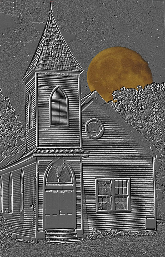
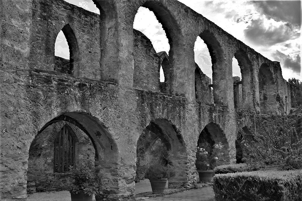
Ed - here is a picture that is best in mono. The color has a washed-out, watercolor feeling. But the mono just sings with contrasts, impact and balance. That building's highlights really stand out, and the cloud have become a major factor in the landscape - they were not so in the color. And this focus is so perfet throughout. There are many small thinkg to look at here - the single fence rail in the right-hand bushes, the gentle path going in from the left, the changing cloud formations. For me, this one is a very strong and interesting photo. |
May 3rd |
| 74 |
May 24 |
Comment |
Ed - the thought behind this picture is really good - it ties you to Ellis Island. More than that, the image has great balance of mom's white corner and the dark door frame to the right. I would have loved to see the bottom half of her, possibly translucent like a ghost. Again, the texture in that whole place is the headliner for me. It is a beautiful set of photos. |
May 3rd |
| 74 |
May 24 |
Comment |
Trevor - I must admit, the color image is a nice photo. BUT the mono really created an extremely thoughtful image. It works so much better than the color. What I find the best is the perfect balance in the picture, and the loss of crisp detail in the clouds add to the dream-like quality. If you were going for a 'mood' shot, this is 100% perfect.
|
May 3rd |
| 74 |
May 24 |
Comment |
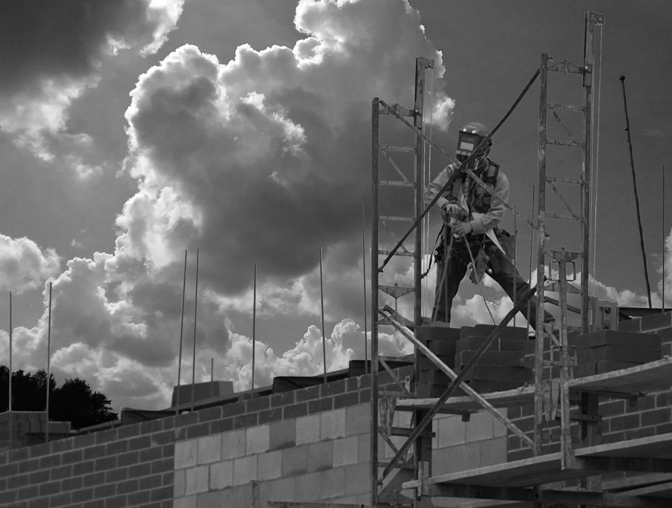
Giovanna - you are experiencing Perspective Distortion, which is fairly common with a 16mm lens. This problem is minimal when shooting straight on, but increases when shooting from above or below. Your elements in the center are correct, but the outside edge is where this can creep in. There is no fix for this that I know of in the optics. I always shot much more of the scene than I needed, so I could crop out the distorted edged. That being said, the human eye has kind of the same mechanism, so it probably would not even be noticed by many folks.
What is important here is the main subject and it is wonderful in this photo. For me, this is a great example of crisp, sharp and clear lines really making this image stand out. The contrast of the blacks and whites is magnificent. The grid at the top and all the spectators balance each other and remove the starkness of the center whiteness. I just love this one. And I think the mono is much more effective than the color image. Great job. |
May 3rd |
7 comments - 6 replies for Group 74
|
11 comments - 8 replies Total
|