|
| Group |
Round |
C/R |
Comment |
Date |
Image |
| 37 |
Jul 25 |
Reply |
Thanks Peter for your compliments on my July photo submission. I did tone down (darken) the background and now the colors of the flowers really pop. |
Jul 30th |
| 37 |
Jul 25 |
Reply |
Thanks Yamuni for all your compliments on my submitted photo. Your suggestion of reducing the saturation and luminance was spot on. After applying the adjustment I could not believe the difference. Again, Thank You for your suggestion. |
Jul 30th |
| 37 |
Jul 25 |
Reply |
Howard: Thanks. I did take the suggestion of toning down the leaves and the color balance of the photo looks 100% better. |
Jul 30th |
| 37 |
Jul 25 |
Reply |
Bob: Thank you for the suggestion of using a hue/saturation layer to tone down the background leaves. I did do that and the photo looks much more balanced with emphasis on the lilies. |
Jul 30th |
| 37 |
Jul 25 |
Comment |
Thanks Joseph for your positive comments. I will try your suggestion to slightly reduce the contrast for a more dreamy feel. |
Jul 19th |
| 37 |
Jul 25 |
Comment |
Joseph: This photo is a great example of perspective. Your eyes immediately follow the field of sunflowers until you get to the buildings and sky. I would crop the photo on both sides (as Bob suggested). The image also gives the illusion of two different photos. The sunflowers in the foreground with warm tones to the hills and sky with cool tones. Personally, I find this quite interesting. However, you might want to blend these areas a little bit to add to a better composition. |
Jul 17th |
| 37 |
Jul 25 |
Comment |
Kathy: Love the color composition of this photo. Since you were going for some focused and unfocused areas of the flower, I would go for more consistency. For example, all the petals to be unfocused and the stamens to be focused or the petals to be focused and the stamens to be unfocused. The consistency would lend more credence to the composition of the photo. |
Jul 17th |
| 37 |
Jul 25 |
Comment |
Howard: Love the breather and the fact that you caught him at precisely the right moment in time. The warm tones on the bricks and people brings the viewer into this photo that tells a story about people drawn to danger. Given the fact that it is night time and the only light in the photo is coming from the fire you still managed to capture a lot of detail with the breathers, the bricks, and the people in the stands. Very well done.
|
Jul 17th |
| 37 |
Jul 25 |
Reply |
Thank you for your comments Kathy. I agree that the green should be toned down. |
Jul 17th |
| 37 |
Jul 25 |
Comment |
Bob: This photo certainly does capture a person's attention. The yellow and red colors add to the drama of what is taking place in the photo. The softening of the foreground, not unlike a bokeh effect, allows the details in the smoke to take center stage and create an even move dramatic effect. Kudos to you! The photo seems to come alive due to your skills in the developing stage of creating the final outcome. I would however suggest that you eliminate the two white dots that are to the left of the person standing alone. And, just out of curiosity, is that a tripod in front of the man standing by himself? |
Jul 17th |
| 37 |
Jul 25 |
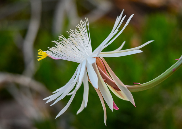
Comment |
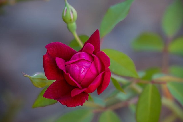
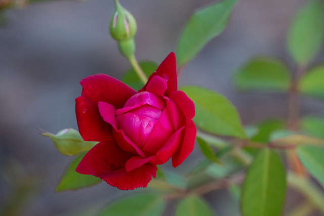
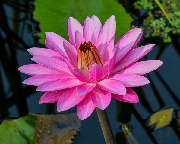
Yamuni: What an interesting take on a flower. I love the formation of the petals. For me, however, the contrast of the black at the bottom with the white at the top
interrupts the flow of the flowers natural beauty. Perhaps, the black and white is intentional and this is what you meant when you stated you used Luminar Neo to bring out the mood and depth of the composition. |
Jul 17th |
| 37 |
Jul 25 |
Comment |
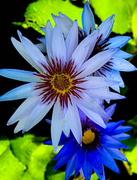
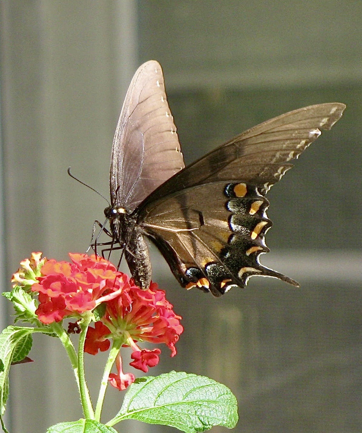
Peter: This is a lovely capture of tiger lilies. From a viewer's eye, the light appears to be coming in on the right side of the photo. The main petal (actually called a tepal) is a bit over exposed at the top because of the light. This is not difficult to correct. Also, I would minimize the white spots on the flower; which, again, is not difficult to correct (either through Lightroom or Photo Shop). On the main stem, I would have put more green where the color is a light grey. Your choice of a black background certainly shows off the beautiful complimentary colors of Mother Nature. Beautiful flower. |
Jul 17th |
7 comments - 5 replies for Group 37
|
7 comments - 5 replies Total
|