|
| Group |
Round |
C/R |
Comment |
Date |
Image |
| 37 |
Jun 23 |
Reply |
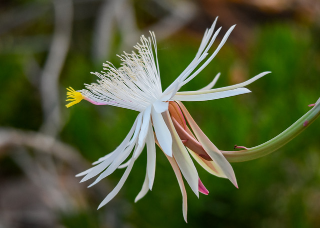
Sharon: Thank you so much for taking the time to comment on my June entry for Group 37. Your suggestions are not taken lightly by any means. Since the "Queen" only blooms once a year, I will apply your suggestions to future flower images that I take. For example, I did not realize by keeping the lens all the way out the image gets compressed to give a nice bokeh. I will definitely try this approach. Also, I was using spot metering along with "finding" the correct exposure so I would not blow out the highlights, especially since the flower is white. Your image "I See You", is outstanding. I love that you show the original image. Another aspect that interest me is your detailed description of your inner thoughts to acquire a better photo along with the final settings you used for the image described. Everything is so helpful. Thank you. |
Jun 18th |
| 37 |
Jun 23 |
Reply |
Hi Helen: Thank you so much for your suggestions with regard to my June entry. I am just getting familiar with LR, and as far as PS goes...I have no clue. However, I am looking at YouTubes and exploring both avenues. Your positive comments are very appreciated, and I thank you for them. |
Jun 18th |
| 37 |
Jun 23 |
Reply |
Peter: Thank you for your suggestions with regards to flipping the photo and doing a tighter crop. I agree. By applying both of these tactics, my photo would be more pleasing to the eye. Thanks for taking the time to preview and comment on my image. |
Jun 18th |
| 37 |
Jun 23 |
Reply |
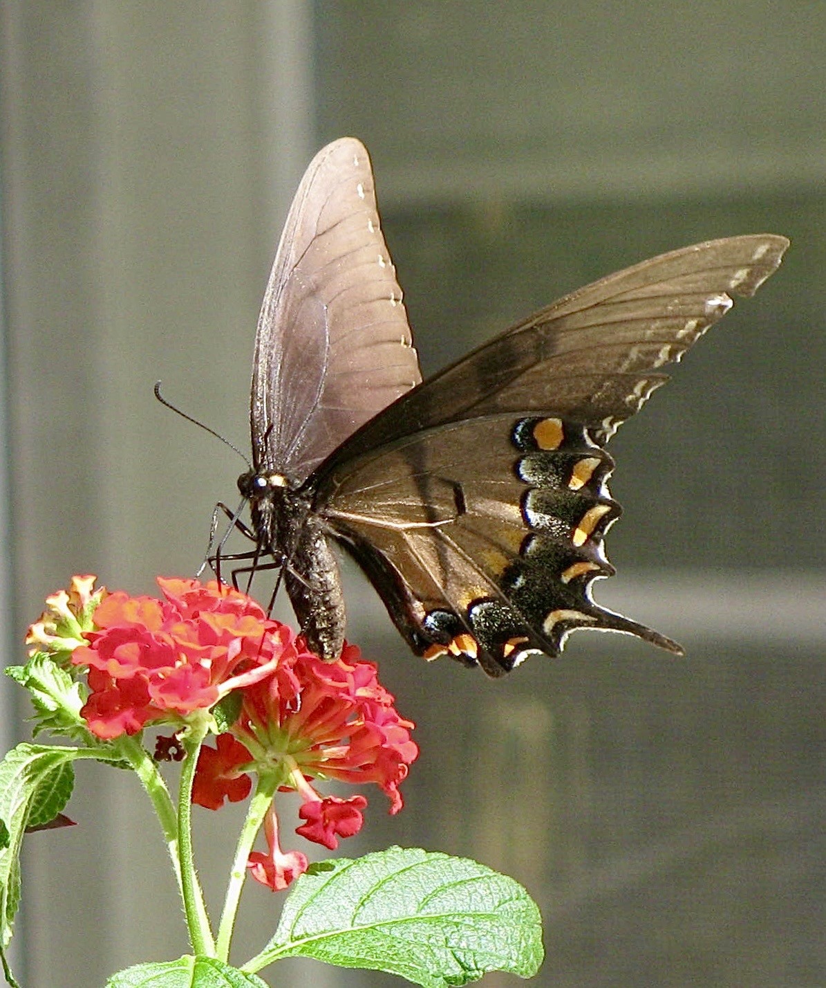
Gary: Your photo titled "Butterfly" is gorgeous! The colors are so magnificent and clearly defined in both the butterfly and flower. Another point to envy is the tack-sharp focus. Thank you for telling me the "higher power" (yes, I did appreciate that comment) is to learn to see the distraction. What great advice. And, something I will have to train my brain to remember when I click the shutter on my camera. As you requested, Sharon Prislipsky (Hmmm, wonder who she is?) did take the time to view my photo and also gave me some great suggestions and advice. Thanks! |
Jun 18th |
| 37 |
Jun 23 |
Comment |
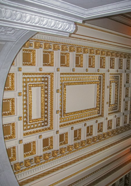
Helen: What a great capture. And, on an iPhone! I am impressed with the details of this photo from top to bottom. It certainly conjures up many thoughts as to what "happenings" occurred to bring this room to this point. Love the cropping along with all of your other efforts in post processing that led to the end result of this wonderful photo. |
Jun 18th |
| 37 |
Jun 23 |
Comment |
Howard : The beauty of this bird cannot be denied. Love the way you captured the details of all the aspects of this beauty. The black background definitely makes this bird pop. I feel like I can reach out and touch him, he looks so life-like. What an amazing photo! |
Jun 18th |
| 37 |
Jun 23 |
Comment |
Bob: This photo is definitely all about the horse. Your ability to catch and enhance the reality of this moment is definitely above par. I do agree with Helen in that a little more catch light in the horse's eye would be better. The expression of the horse is definitely the apex of the photo. Your post processing definitely brings out the best this photo has to offer! Kudos to you on this one! |
Jun 18th |
| 37 |
Jun 23 |
Comment |
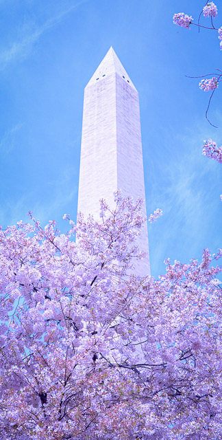
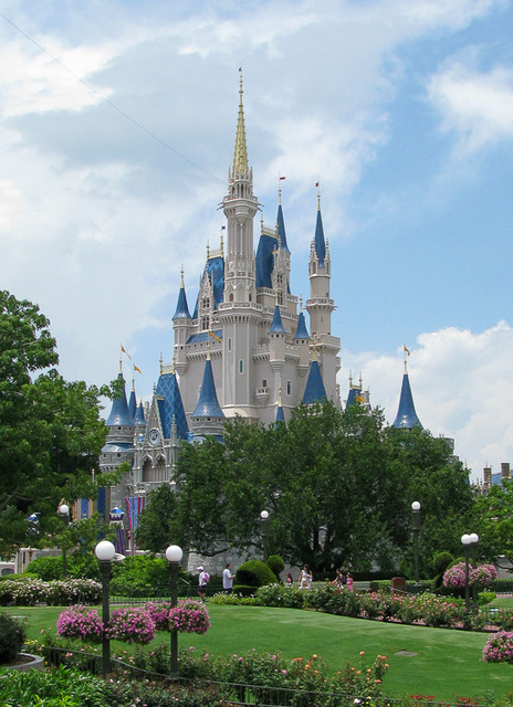
Peter, This photo is exquisite in reflecting the historical beauty that is part of the Longwood Gardens grounds. Love the clarity of details you captured of the tower. Also, the angle you chose enhances the magnificence of the tower. The softness of the color chosen, I believe also adds to the defined beauty of the tower. Great photo in all aspects of photography! |
Jun 18th |
| 37 |
Jun 23 |
Comment |
Peter, love this image. It does give the feeling of a Japanese Ink painting. Perhaps the contrast could have been a little more prominent to see where the bird(s) been and end. It's too bad the feet on the right red-crowned crane are not as defined as the left bird. However, viewing your original leads me to believe this was not possible. I believe showing their red crowns (and, yes they are small), would be the absolute touch to put this photo in a league of its own. Great photo and well done. |
Jun 18th |
| 37 |
Jun 23 |
Comment |
Sorry folks, but I find this photo personally disturbing. I do realize art is in the eyes of the beholder. And, I also realize we are to critique a photo on composition, technique, camera settings, etc. The sharpness and clarity of the outhouse is definitely a plus. In cropping (perhaps this is not possible), I would crop some of the photo off on the right side and extend the dimensions on the left side of the outhouse rather to include the unseen corner of the outhouse. To me, the dead vines going up the side of the outhouse is in tandem with the neutral sky of being neither sunny or foreboding. I would, therefore, not do anything with the sky. |
Jun 18th |
| 37 |
Jun 23 |
Reply |
Gary, You are so kind in your assessment of my photo. I especially appreciate your critique in reminding me that the eye moves from left to right. You are so observant in your suggestion that I should consider flipping the photo. Genius. Thank you. Totally agree with reference to "get all green...". This did not go unnoticed on my part. However, I am still getting acquainted with Lightroom and its fantastic capabilities to eliminate the distraction of the white lines. How I do appreciate your encouragement in my photo abilities. |
Jun 5th |
6 comments - 5 replies for Group 37
|
6 comments - 5 replies Total
|