|
| Group |
Round |
C/R |
Comment |
Date |
Image |
| 24 |
Apr 24 |
Reply |
Bev, that sound easy enough. I use Elements 2023, but I suspect there is a similar functionality. Thank you!! |
Apr 21st |
| 24 |
Apr 24 |
Comment |
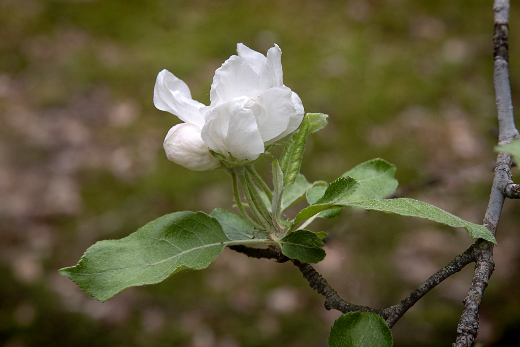
Charissa, the sky is a nice background to the blossoms. Yor iPhone did a nice job with the scene. I'm glad you got the capture before the blossoms went by. |
Apr 21st |
| 24 |
Apr 24 |
Reply |
Charissa, I frequently miss important details and that corner of the frame was one of them! Yjank you! |
Apr 21st |
| 24 |
Apr 24 |
Reply |
Fred, yes it is so! |
Apr 21st |
| 24 |
Apr 24 |
Reply |
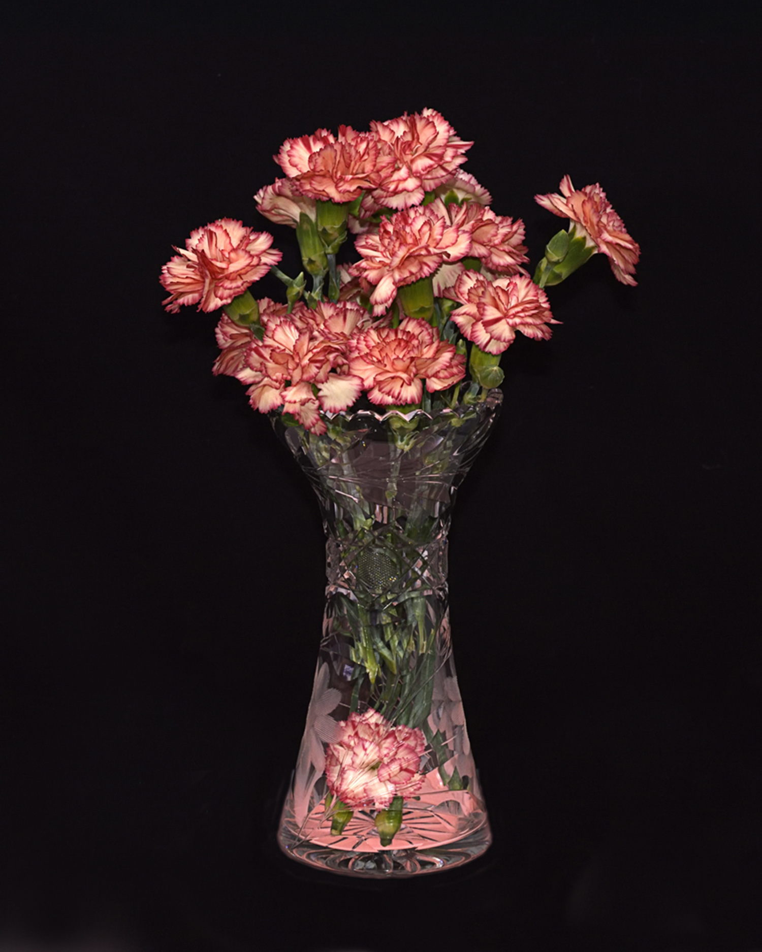
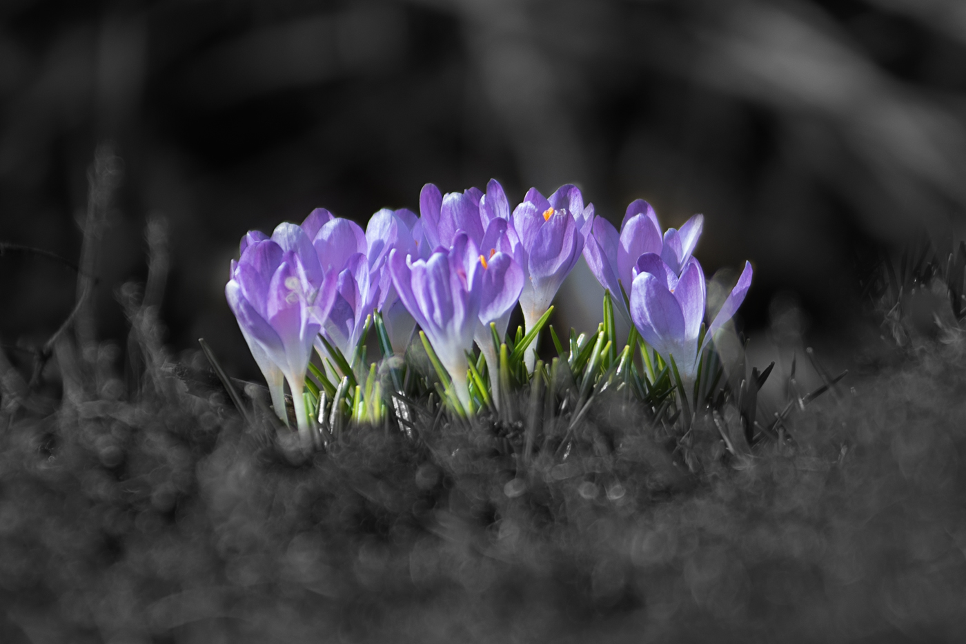
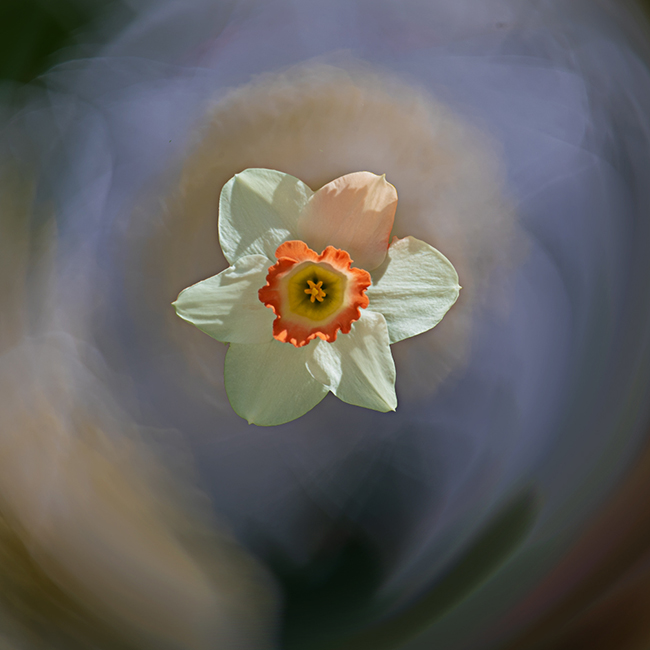
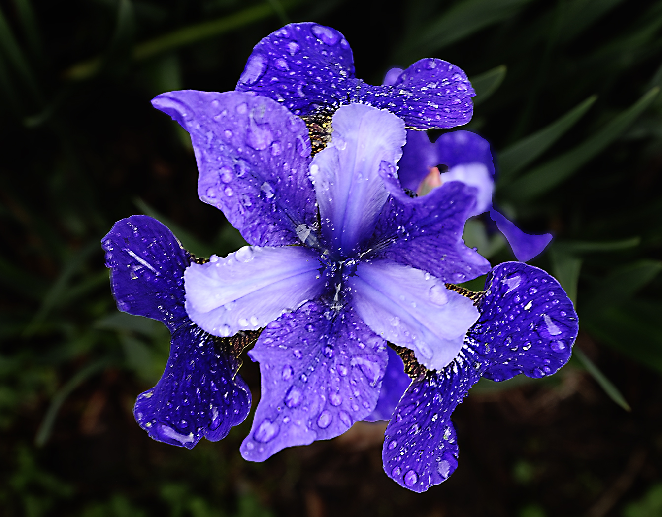
Pinaki, you are right! I needed to crop up and in more to eliminate that gap exposing a background blossom. Thank you!! |
Apr 21st |
| 24 |
Apr 24 |
Reply |
Yvonne, thank you very much! |
Apr 21st |
| 24 |
Apr 24 |
Reply |
Frank, thank you! I appreciate that! |
Apr 21st |
| 24 |
Apr 24 |
Comment |
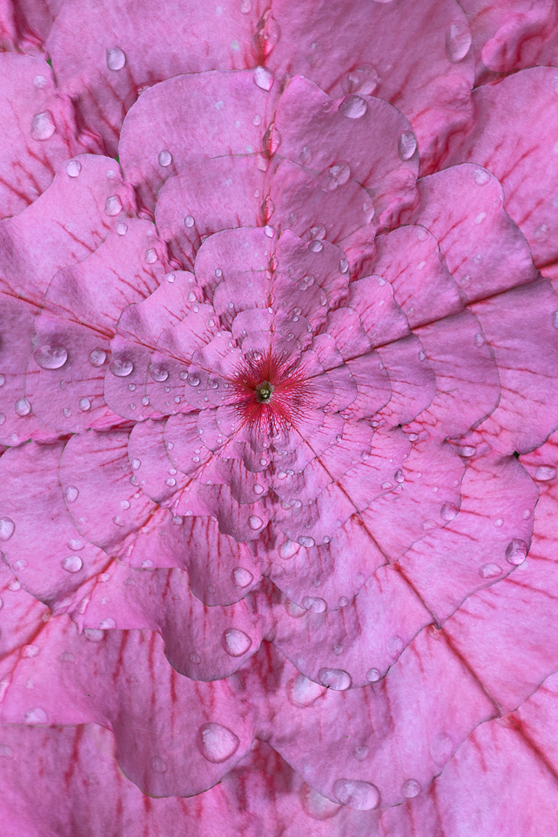
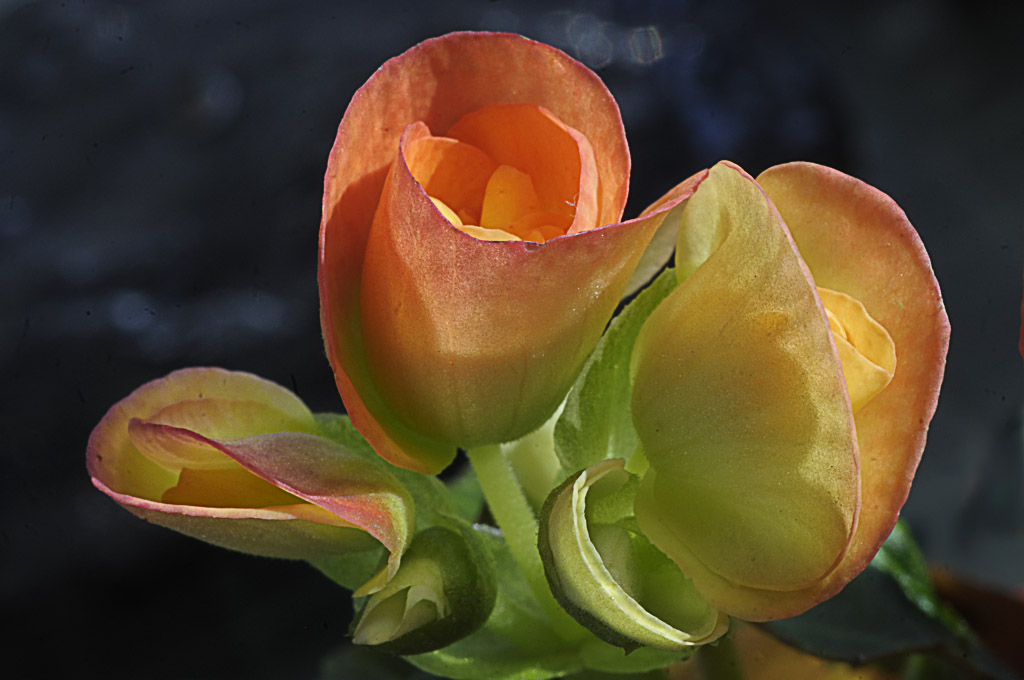
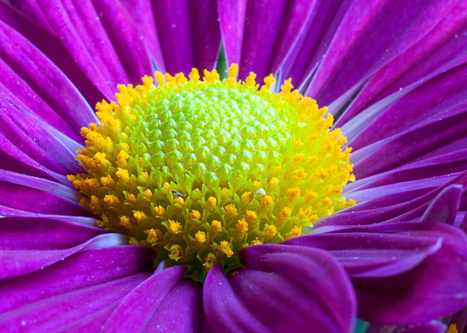
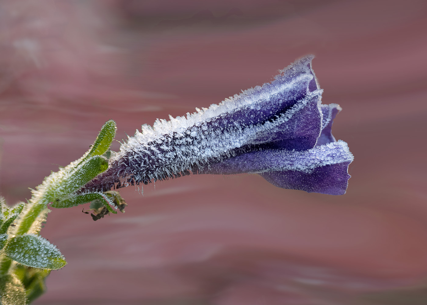
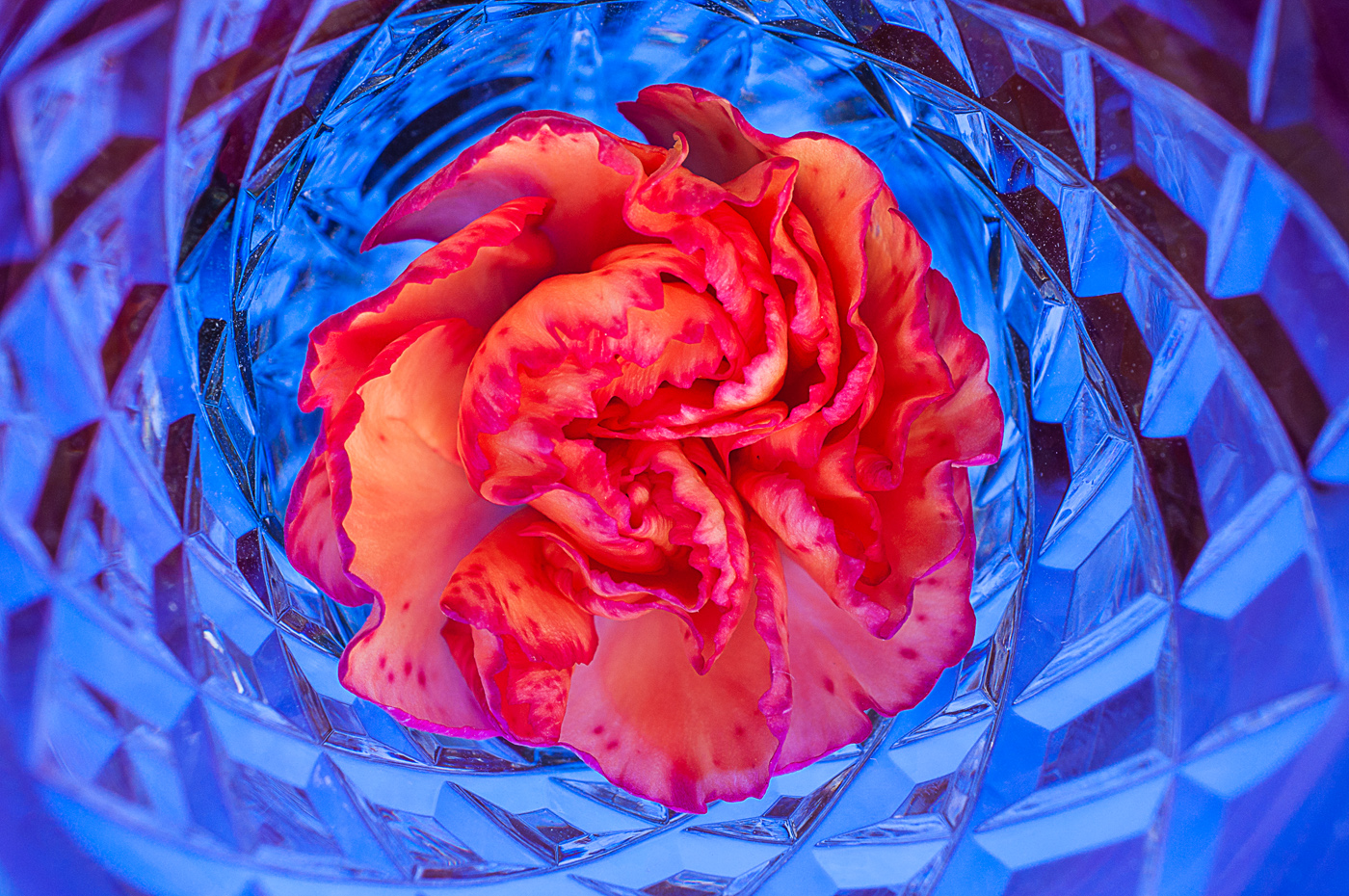
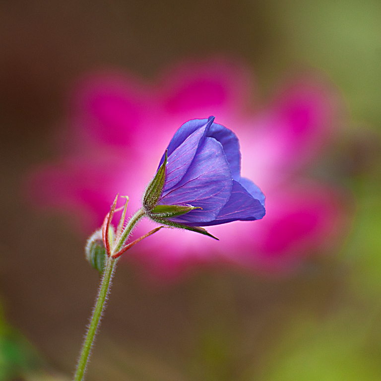
Pinaki, boy what a nice shot. There is a strong abstract quality to this shot. I did reduce the saturation a little and increase the contrast. I thought that may bring out a little more detail in the flower. You've got a good eye. Very pleasing image! |
Apr 5th |
 |
| 24 |
Apr 24 |
Comment |
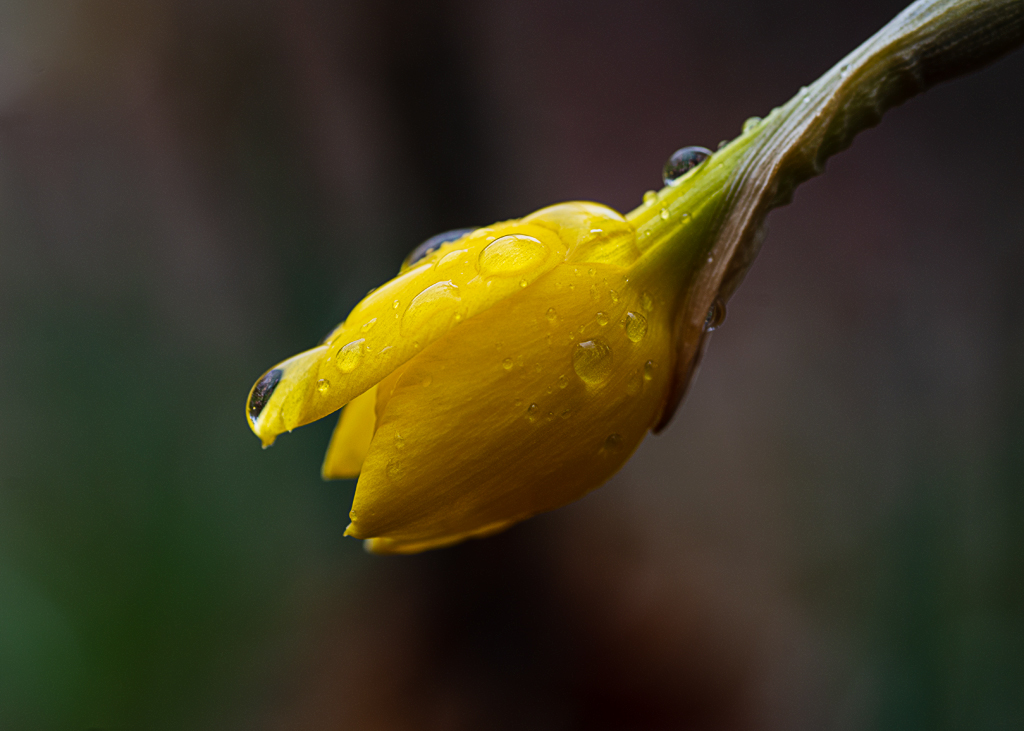
Yvonne, I like the subject very much. I like what Bev did to your image. The background in the original image was quite distracting. The subject is sharp! Very good! |
Apr 5th |
| 24 |
Apr 24 |
Comment |
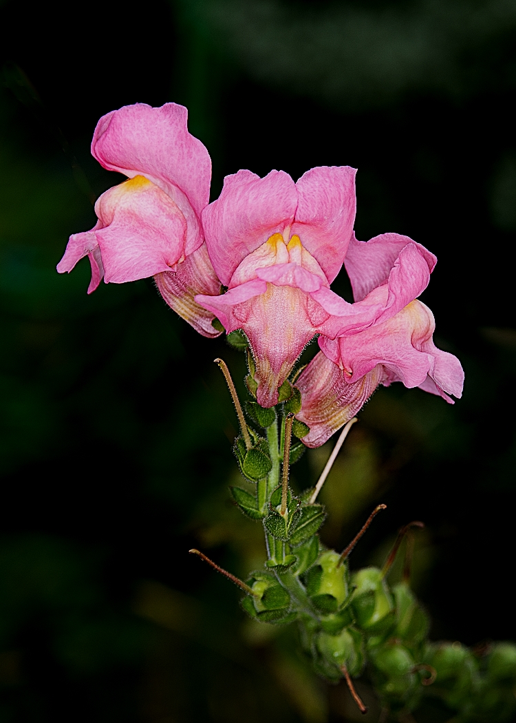
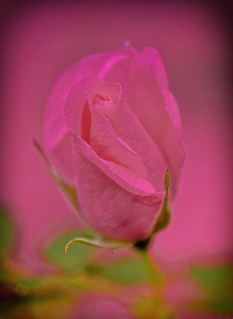
Frank, both images have appeal to me. The subtle color in the color version makes the flower look more delicate then the high key version. The high key version seems to emphasize the margins of the petals more and emphasize the outlines of the petals. Generally speaking, I like the color version. It does look like the center of the image is a little soft. Very nice work! |
Apr 5th |
| 24 |
Apr 24 |
Comment |
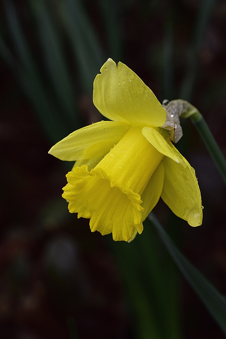
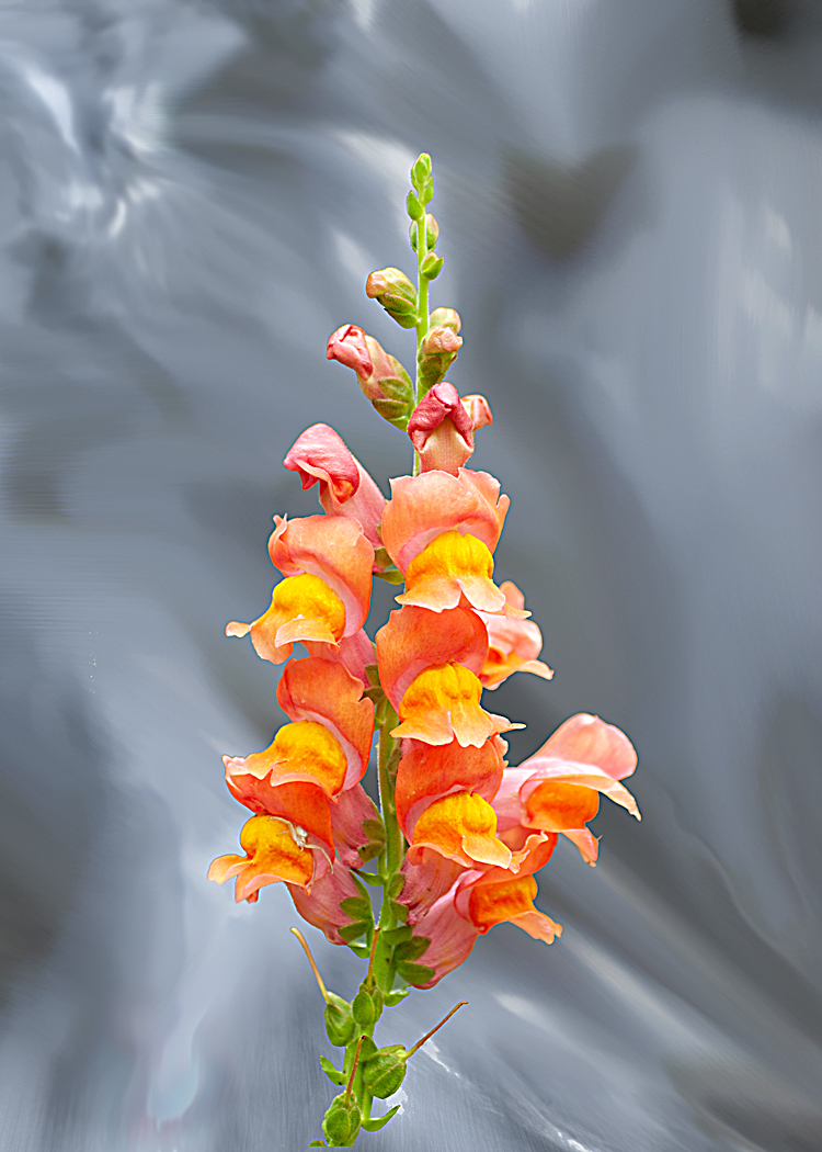
Fred, very elegant subject. I see your intention by showing so much of the flower. It could be a temptation to darken the background behind the petals more to add even more pop. This is a very nice image of a pleasing subject. |
Apr 5th |
| 24 |
Apr 24 |
Comment |
Bev, this is a bit of an "eye popper" when the image is opened. I'm not especially familiar with the procedure you used (invert) to process the image, but the result has a lot of impact. |
Apr 5th |
6 comments - 6 replies for Group 24
|
| 48 |
Apr 24 |
Comment |
Lloyd, I really like this shot. The metallic quality the conversion made to appearance of the leaf. The texture of the leaf surface is appealing. You have very good detail in this capture. Very good!!!
|
Apr 22nd |
| 48 |
Apr 24 |
Reply |
I'm hopeful I can get a panning shot of one of our dogs. I'm grateful not to be using film for this effort...... |
Apr 22nd |
| 48 |
Apr 24 |
Comment |
Tom, thank you so much for the kind comment!!! |
Apr 22nd |
| 48 |
Apr 24 |
Comment |
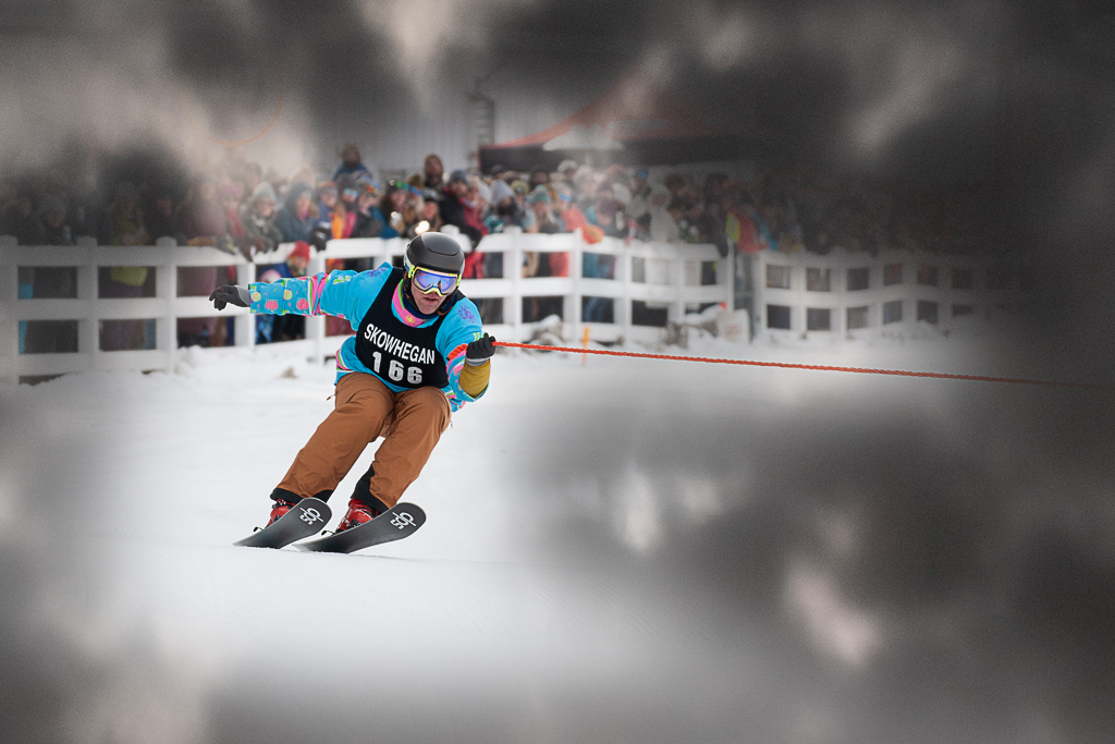
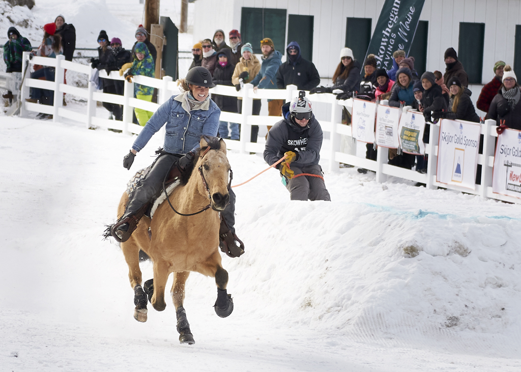
Tom, wow! What a shot! I really like the rider looking at you. You did an excellent job panning the subject. The background is great. Very nice work! |
Apr 5th |
| 48 |
Apr 24 |
Comment |
Jamie, spring indeed! Nice composition. The colors are very pleasing to the eye and nicely sharp. Excellent work with the post processing AND the original capture! |
Apr 5th |
| 48 |
Apr 24 |
Comment |
Paul, Excellent background on the prairie. Thank you for that detail. I appreciate the detail about the lighting on the scene. The composition is very good. Now, I'd like to get there some day myself for a "live eye" view. Thank you for sharing. |
Apr 5th |
| 48 |
Apr 24 |
Comment |
Bev, I also like the title. I think it's a great shot showing the deer browsing undisturbed. I think Tom's exposure adjustment worked very well. This is a really nice image and I'm glad you shared it! |
Apr 5th |
6 comments - 1 reply for Group 48
|
12 comments - 7 replies Total
|