|
| Group |
Round |
C/R |
Comment |
Date |
Image |
| 75 |
Oct 24 |
Comment |
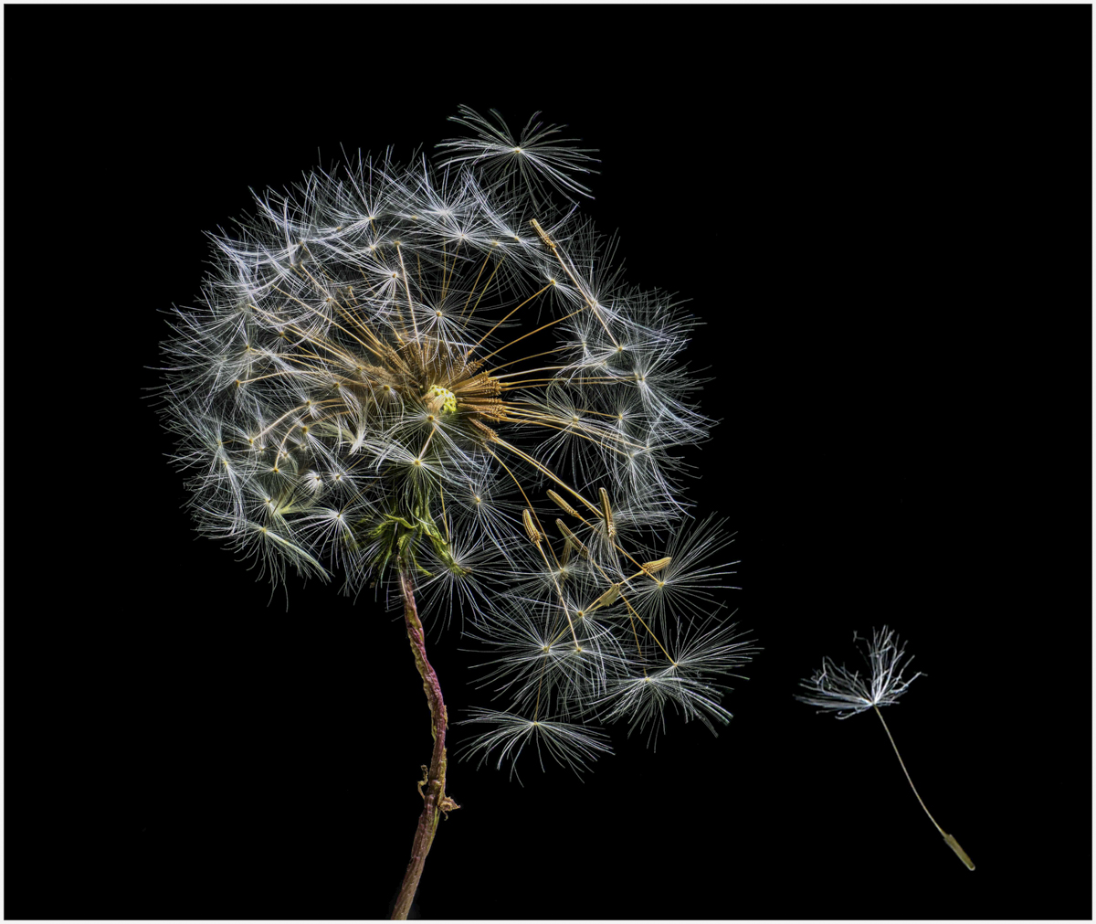
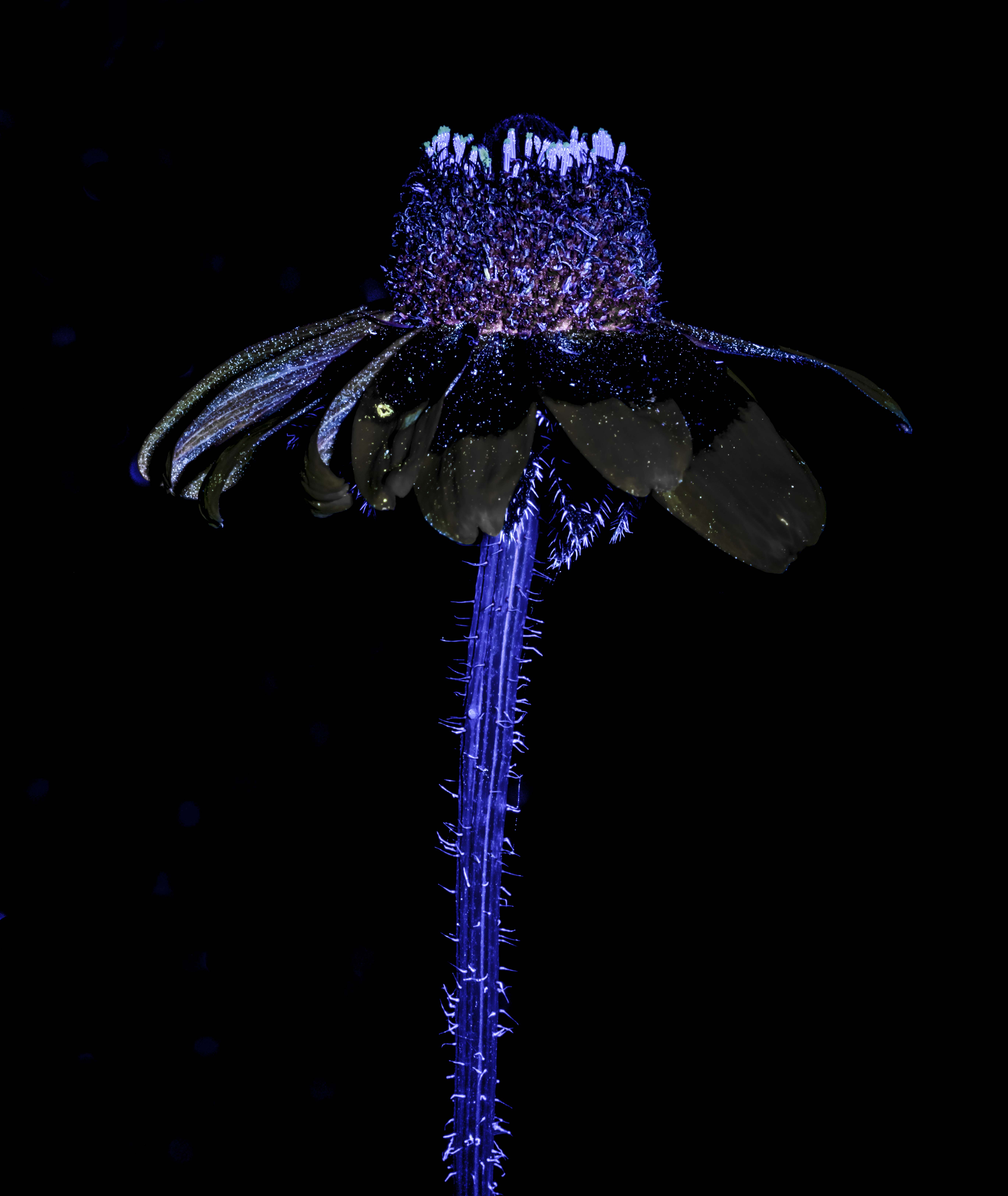
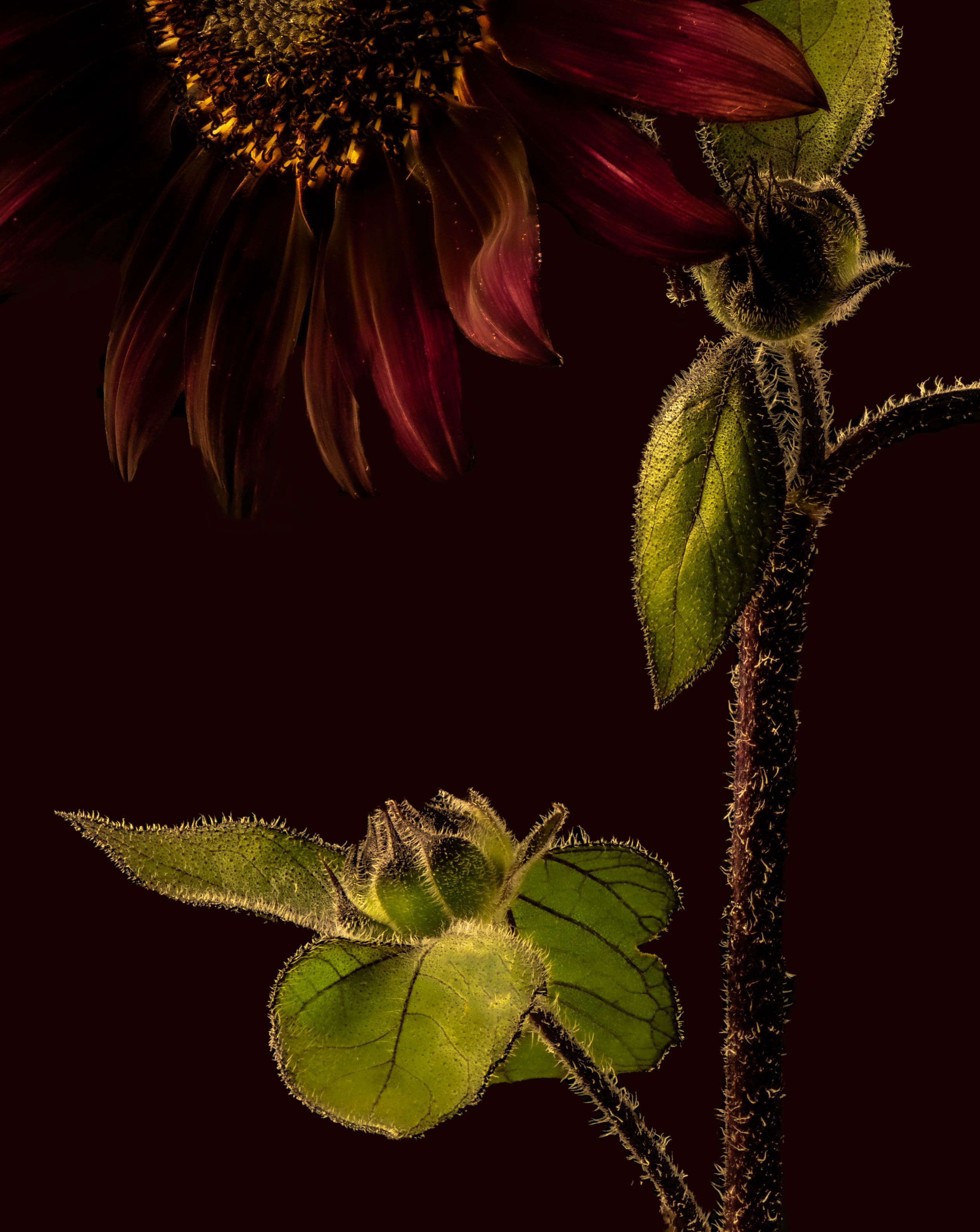
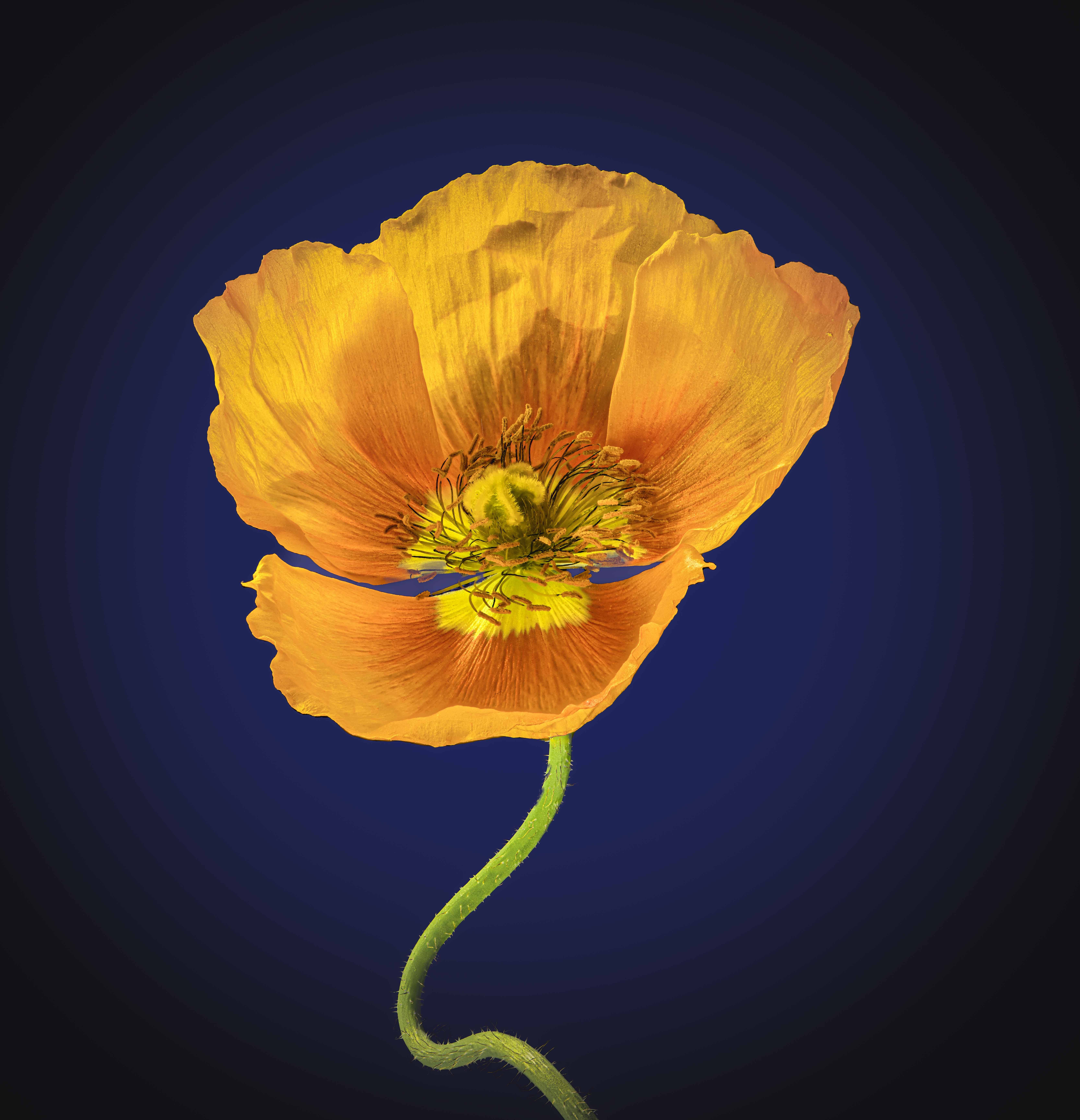
Mo, I always look forward to seeing what you have to offer. Before reading yuo description, I had decided it was a water shot of a rose in B&W with a purple dye of some added to the top of the water. I think the texture of the rose seems off but not sure why, and as you say, the image is over vignetted (if one can say that). I tried to work out whether more purple strands or fewer ones or ones spread out more or clumped on both the right and left but not the middle might work better in terms of a composition but failed to get any resolution other than to try and see. Thanks for sharing. Ray |
Oct 9th |
| 75 |
Oct 24 |
Comment |
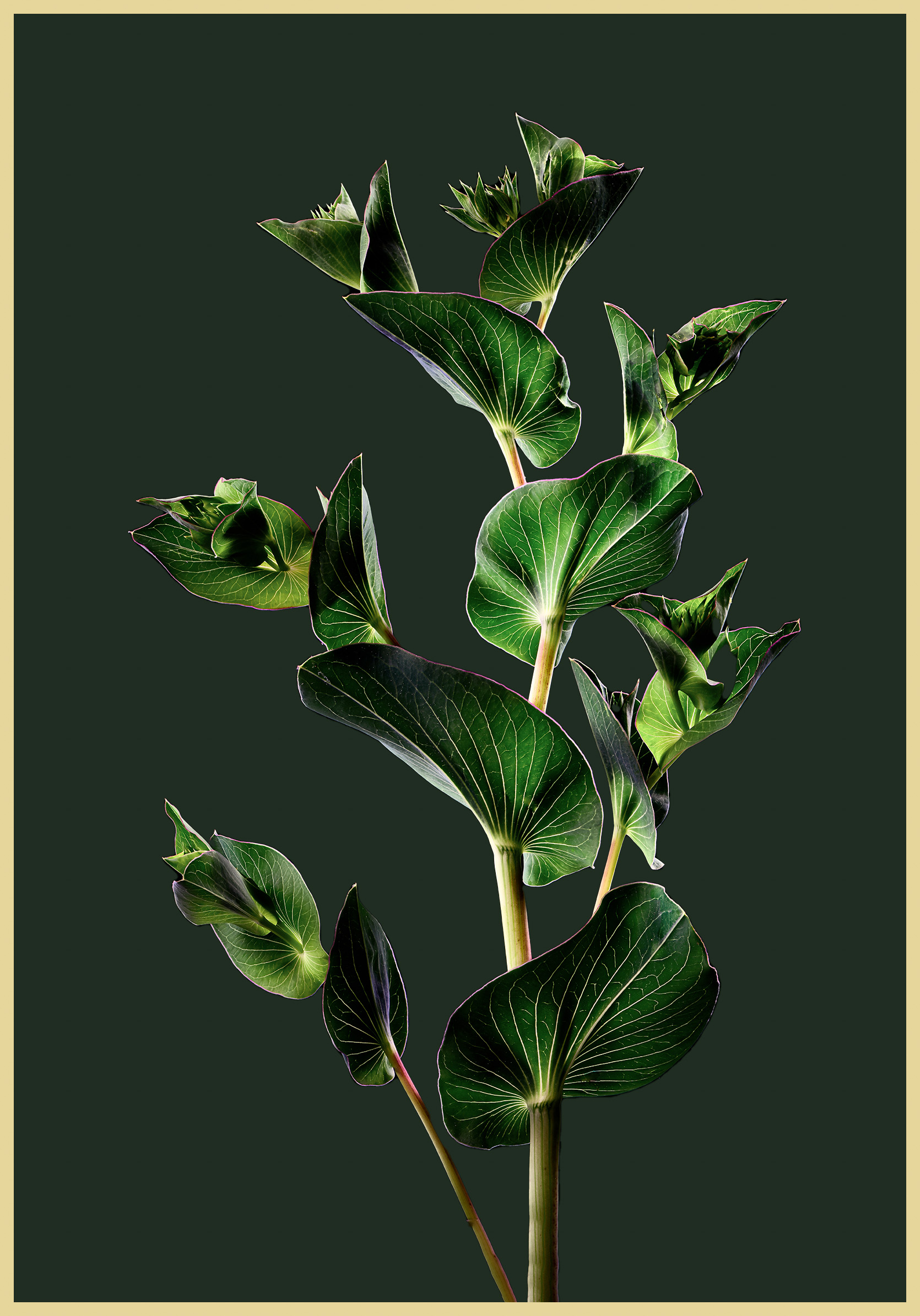
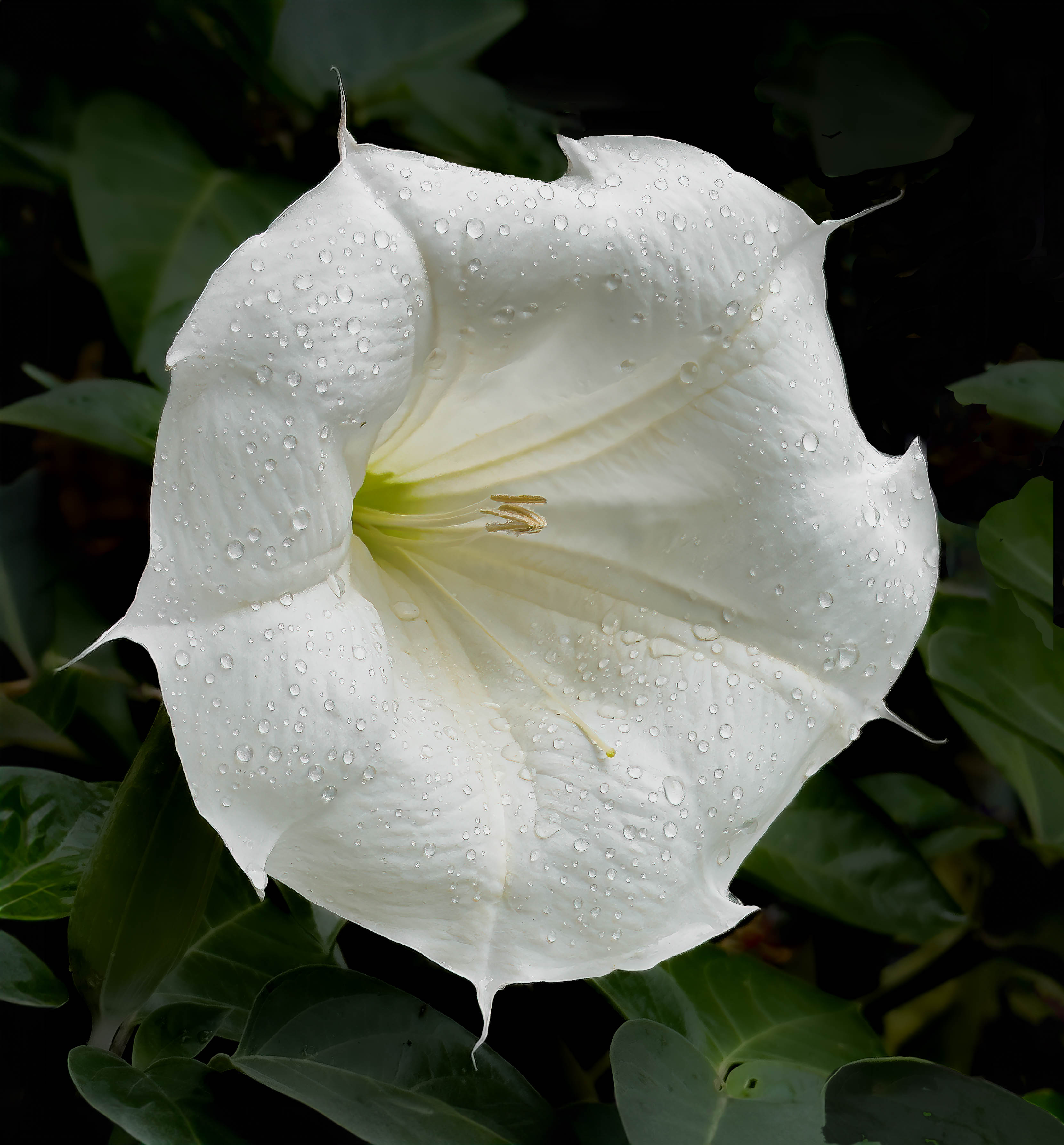
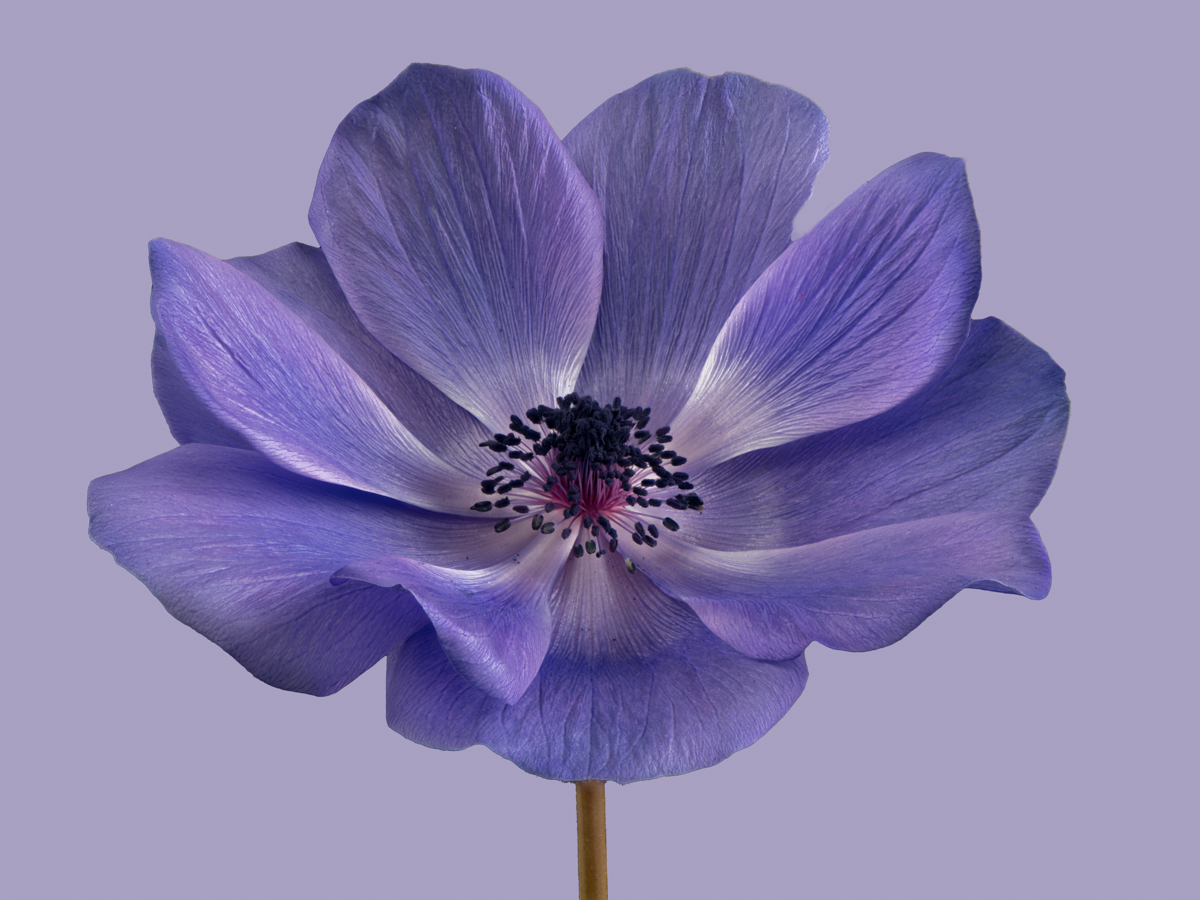
Gaetan, a wonderful flower for a photo - I agree with Murphy and Dan but also think the bottom edge is just a little too tight and I suggest cloning out the bug/ant in the lower petal. Ray |
Oct 9th |
| 75 |
Oct 24 |
Comment |
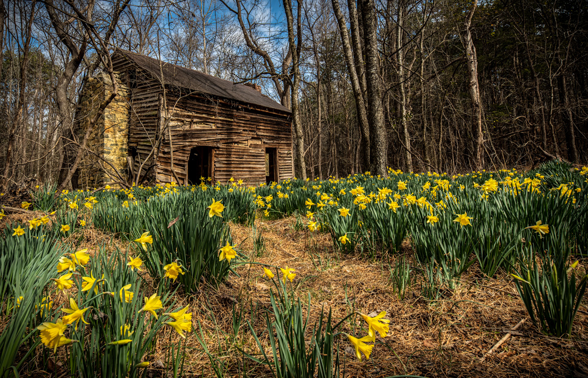
Dan, I like the concept but did wish the forget me nots were also in focus as I find the out of focus group about half way down from the rhododendron on the left distracting. Also, I wonder if the shadow area on the rhododendrons could have been lightened a bit to make the flowers eem brighter, and maybe add just a little bit more room between the flower on the right and the edge, say in PS. Ray |
Oct 9th |
| 75 |
Oct 24 |
Comment |
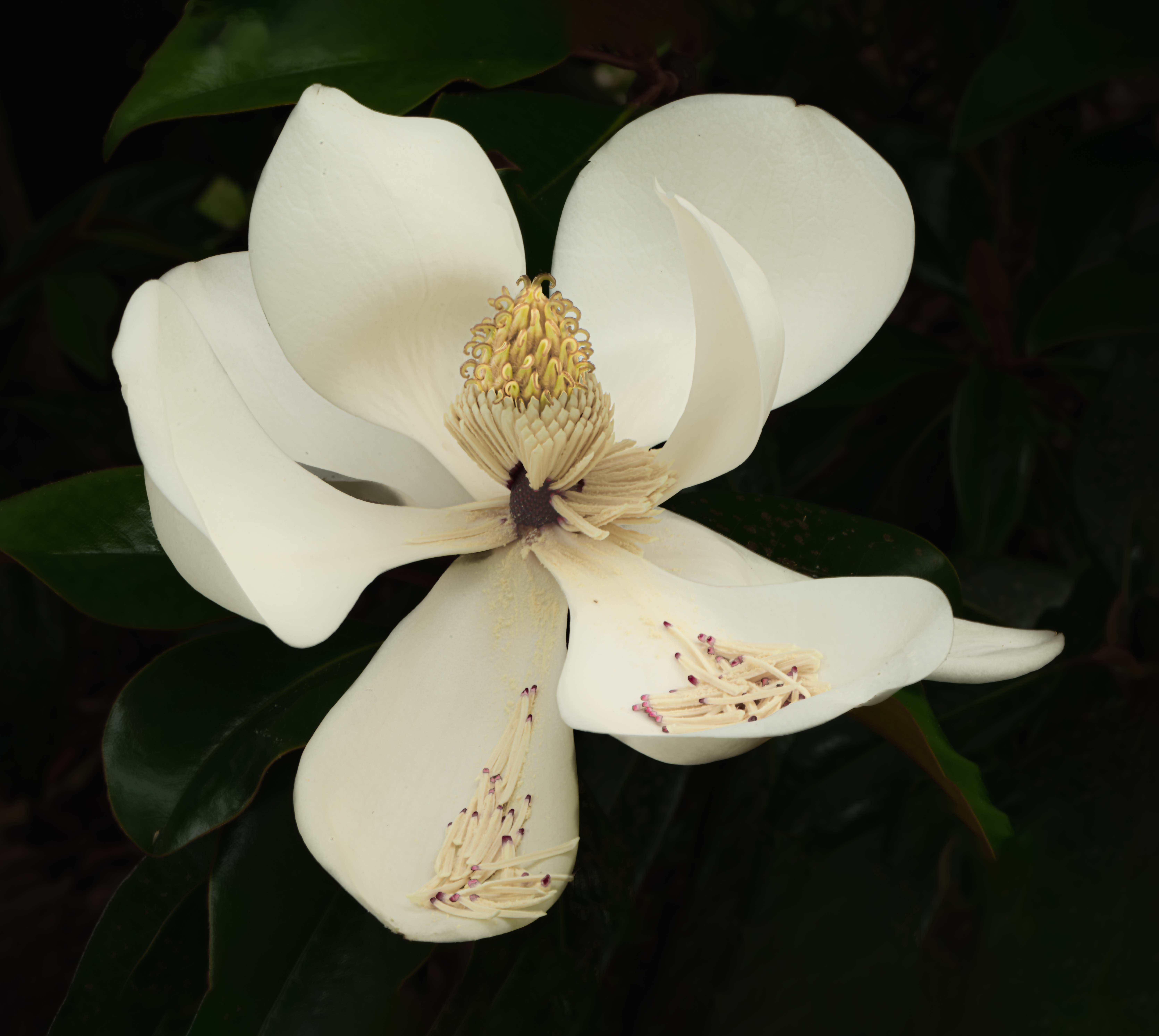
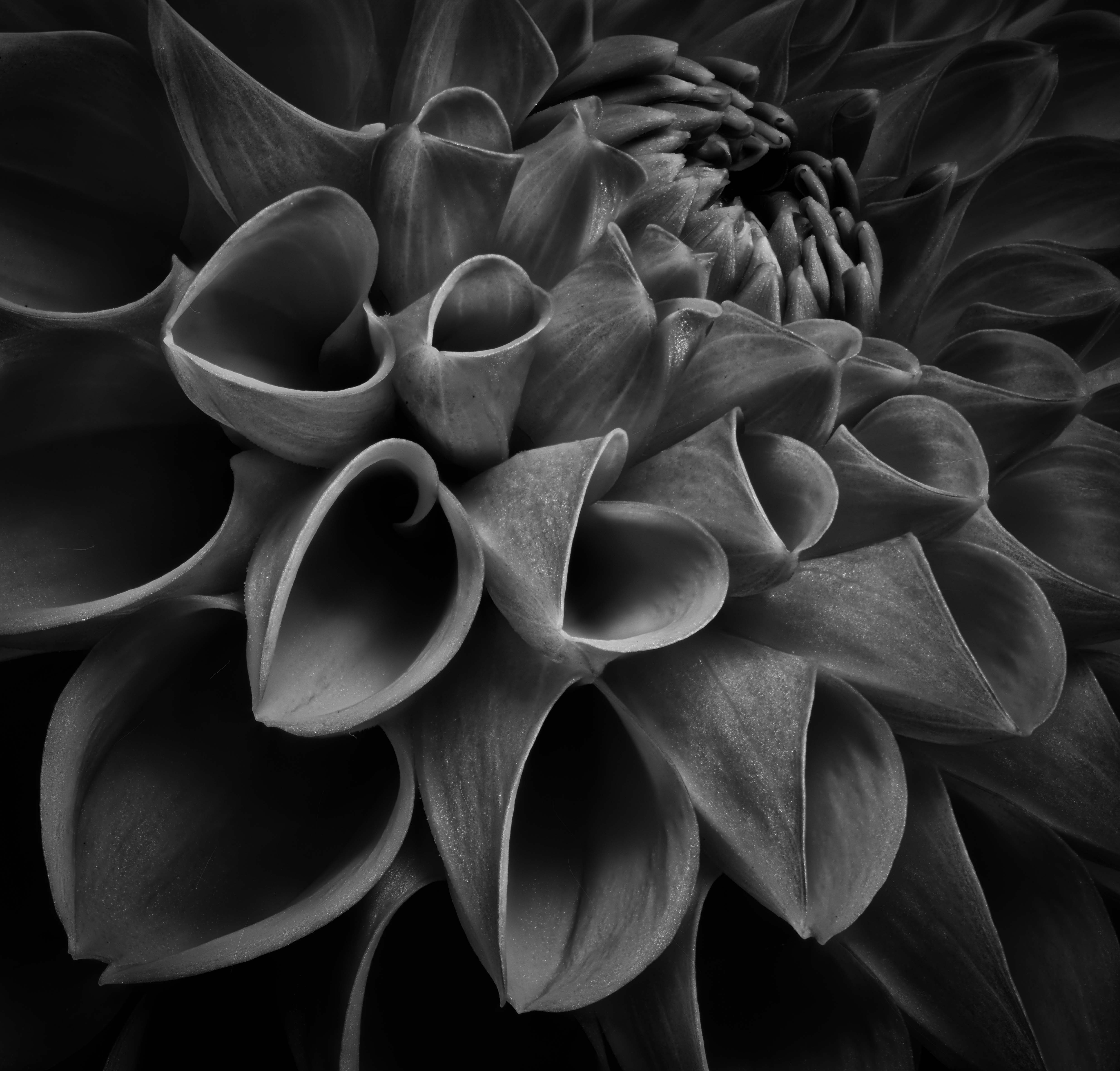
Murphy, the image surprised me. I am so involved in taking photos of individual flowers that I neglect how impactful a group of flowers might be. This photo of zinnias came out very impactful and I like the way the flowers are spaced, the vignette works well, as does the thin medium green border. It seems to me that the top edge is to close to the upper flowers but you might have been constrained by what else might have been showing higher up. Pretty image. Ray |
Oct 9th |
| 75 |
Oct 24 |
Comment |
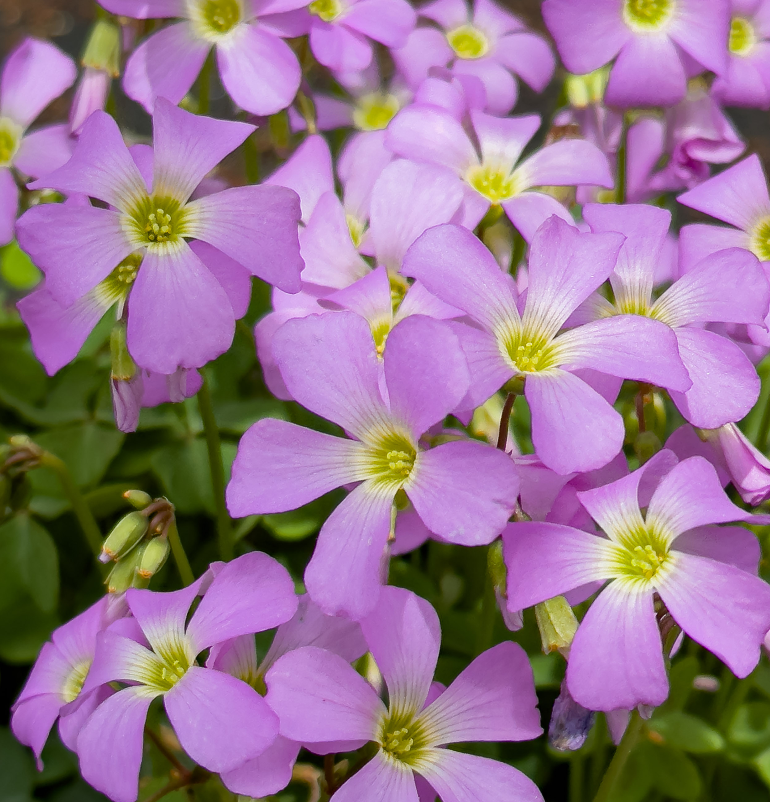
Vincent, you did well with the crop as you managed to avoid including not needed "stuff" plus you cloned out the plant at the upper right. I like the color palate and the bee adds a point of interest. To me, there needs to be a little more room on the left side (as we look at the image) to balance the image. Ray |
Oct 9th |
| 75 |
Oct 24 |
Reply |
Thanks Dan; I enjoyed making the attempt. |
Oct 9th |
| 75 |
Oct 24 |
Reply |
Thanks Murphy - am learning as I try out something new. Ray |
Oct 7th |
5 comments - 2 replies for Group 75
|
5 comments - 2 replies Total
|