|
| Group |
Round |
C/R |
Comment |
Date |
Image |
| 75 |
Sep 23 |
Reply |
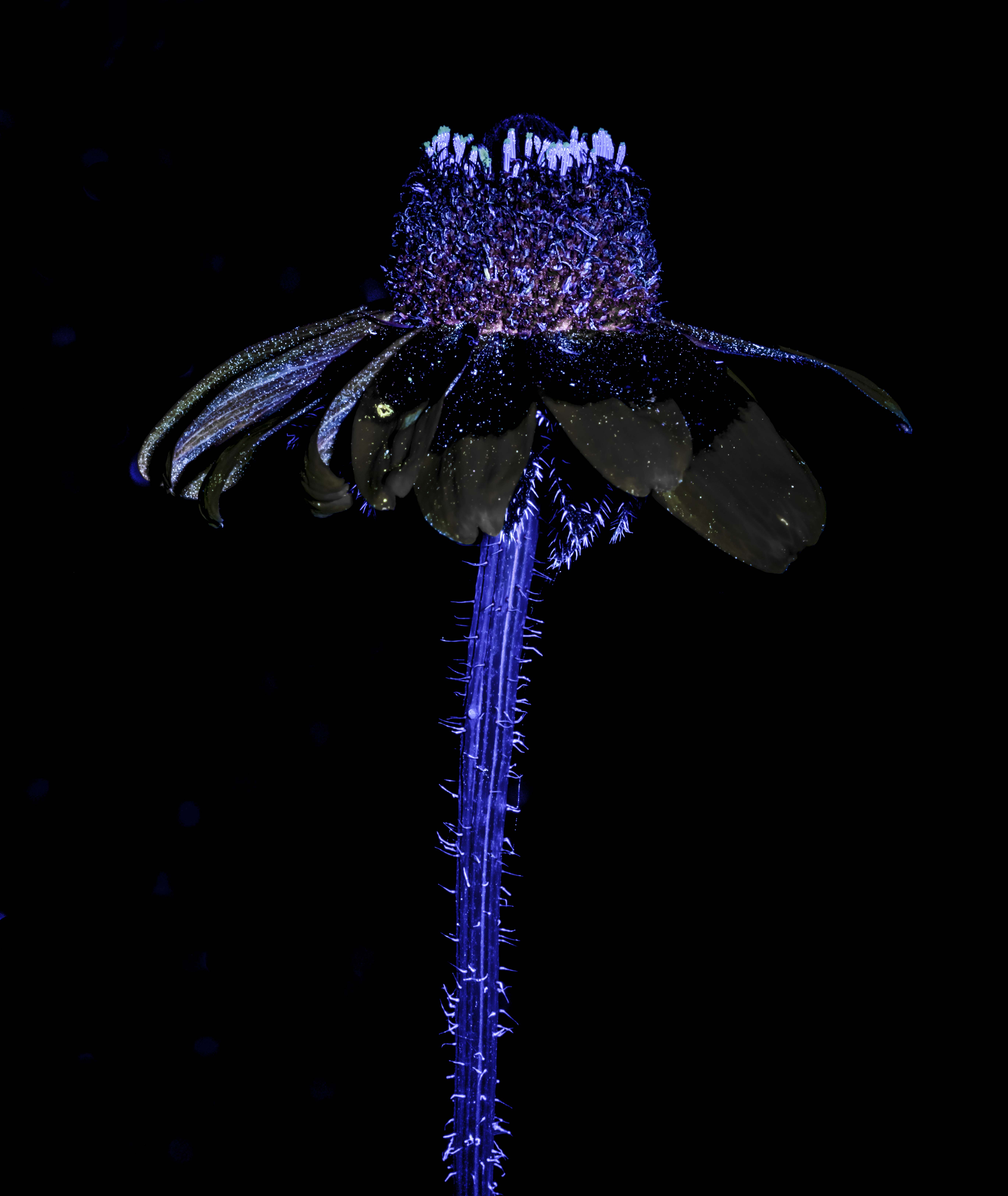
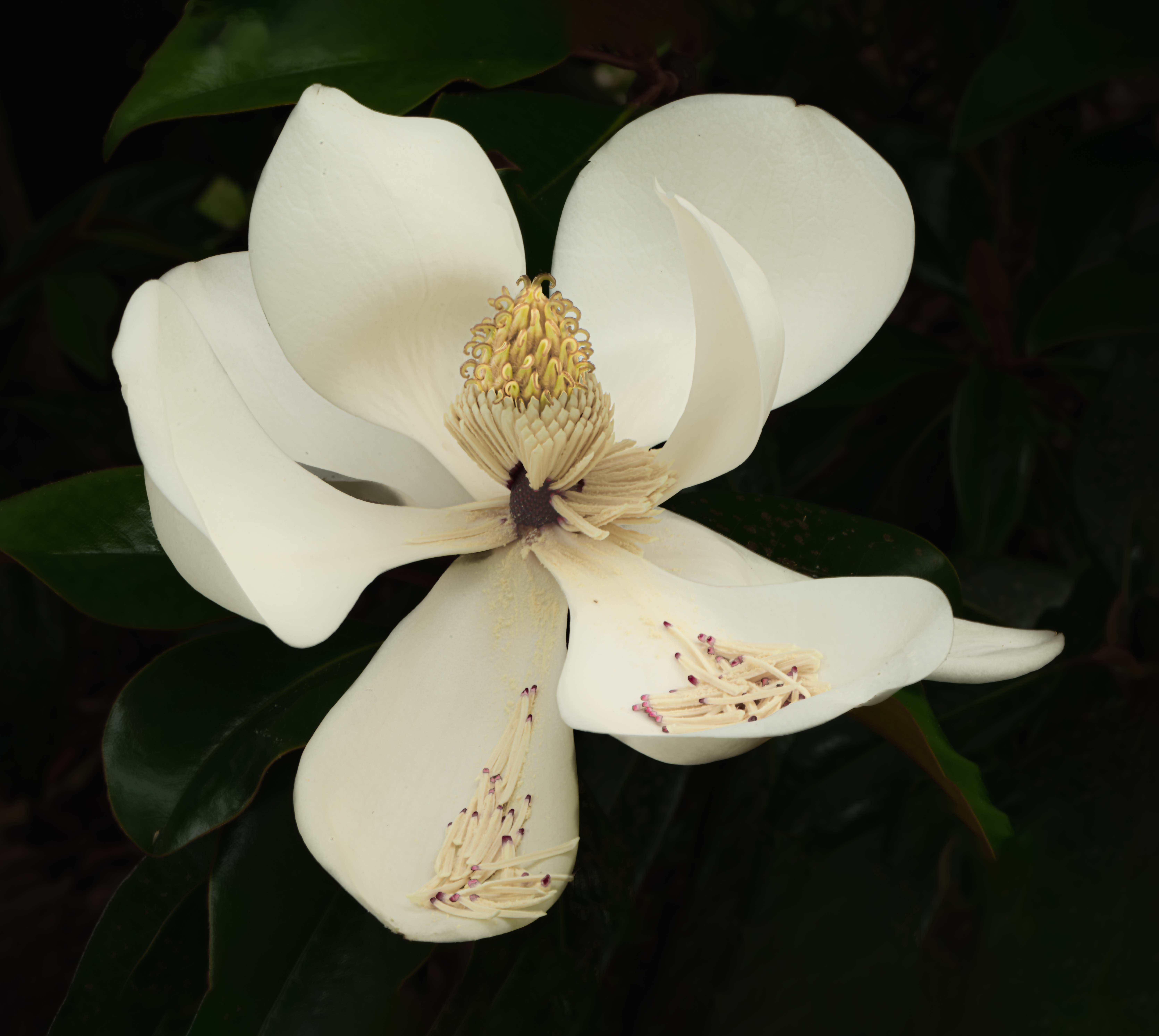
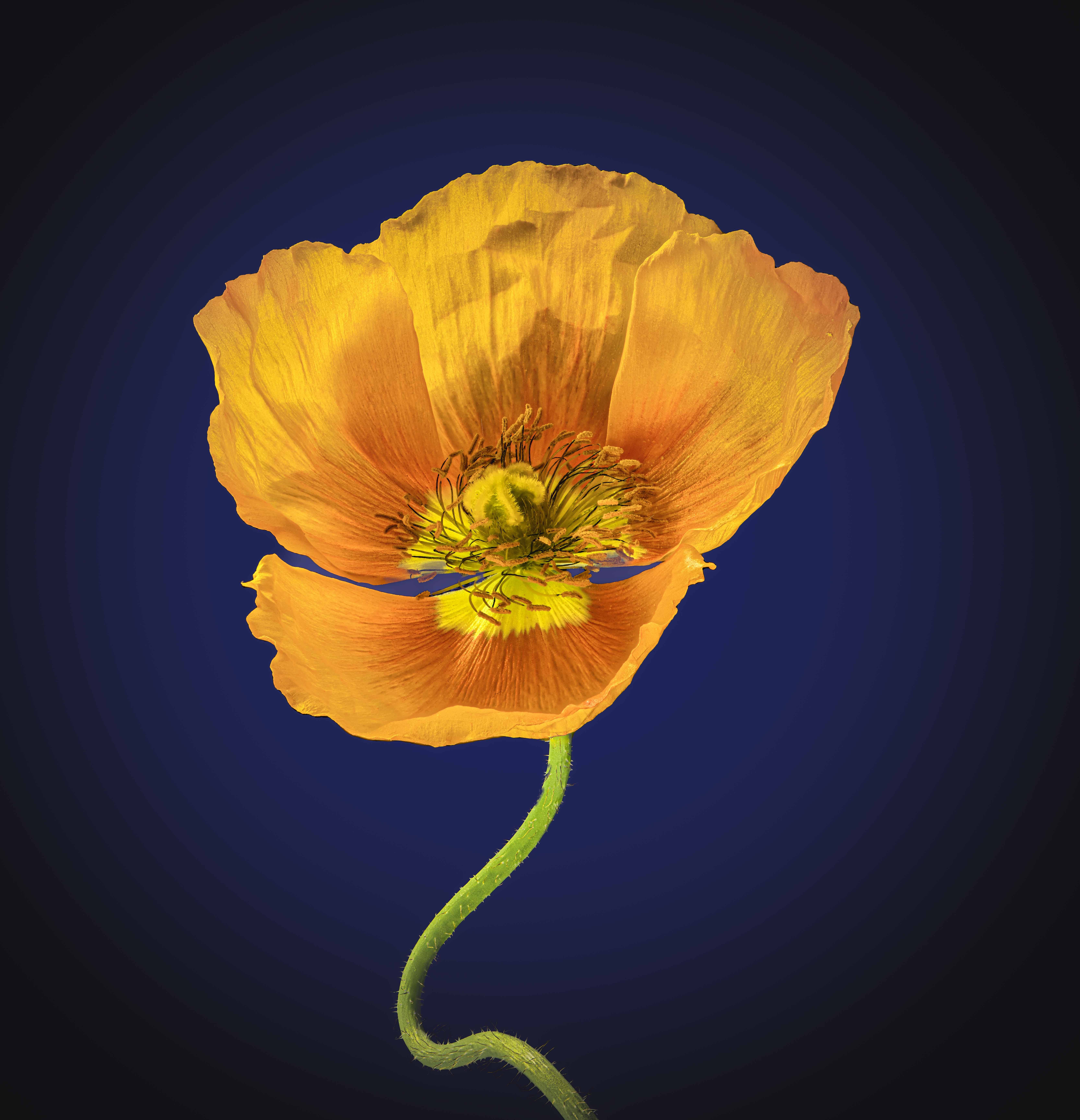
Murphy - I will see what having more of the flower showing feels like to me. I enjoyed the comments as they point out that different opinions are to be expected. |
Sep 22nd |
| 75 |
Sep 23 |
Reply |
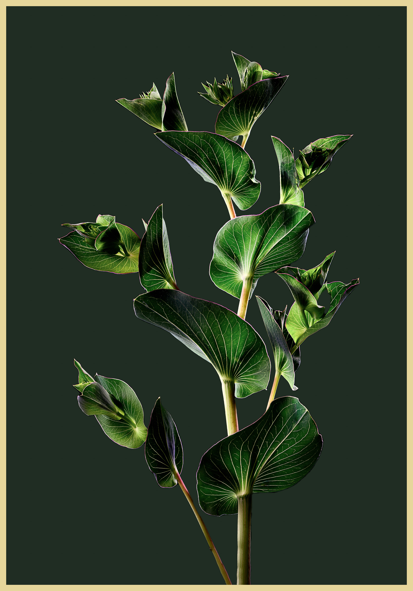
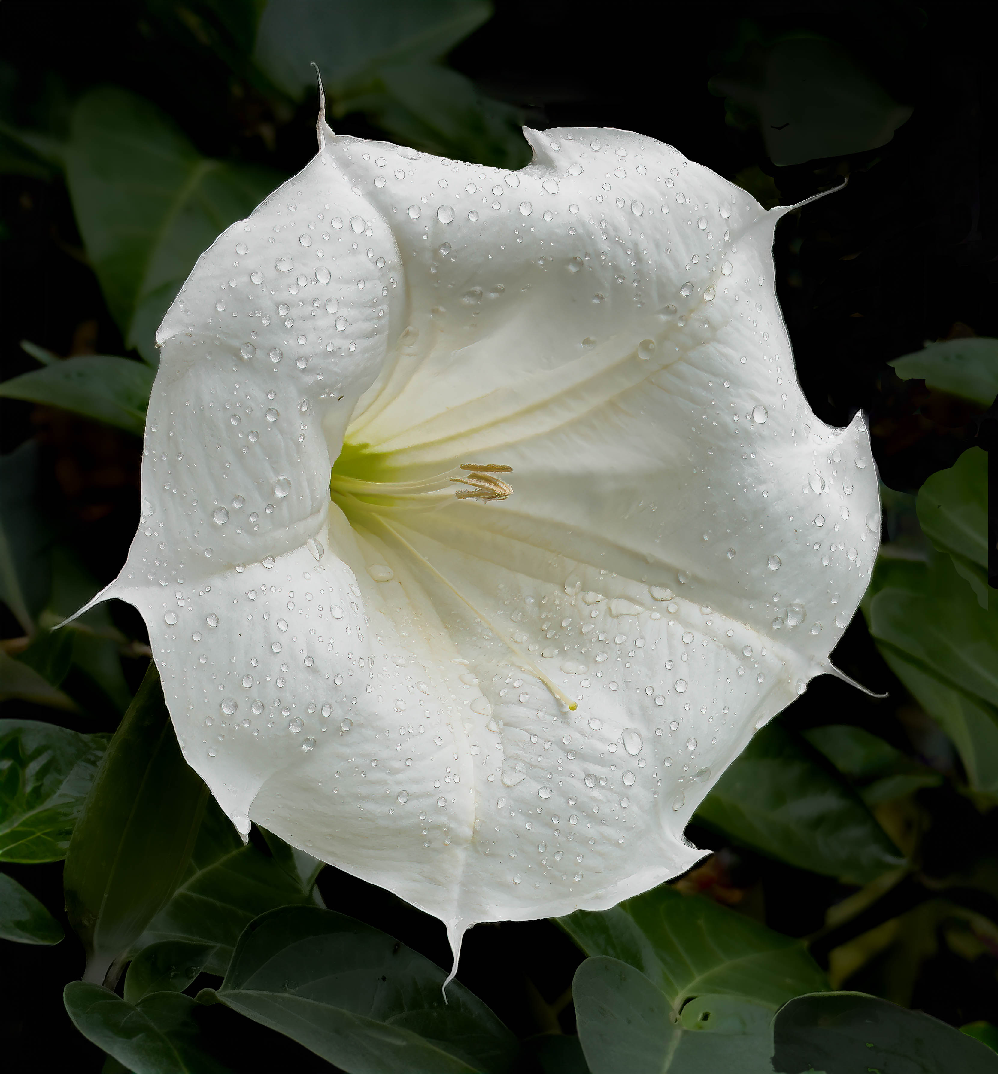
For me, the focus is on the light on the leaves and if I included the entire flower, it would have diminished that focus but I understand your view. |
Sep 7th |
| 75 |
Sep 23 |
Comment |
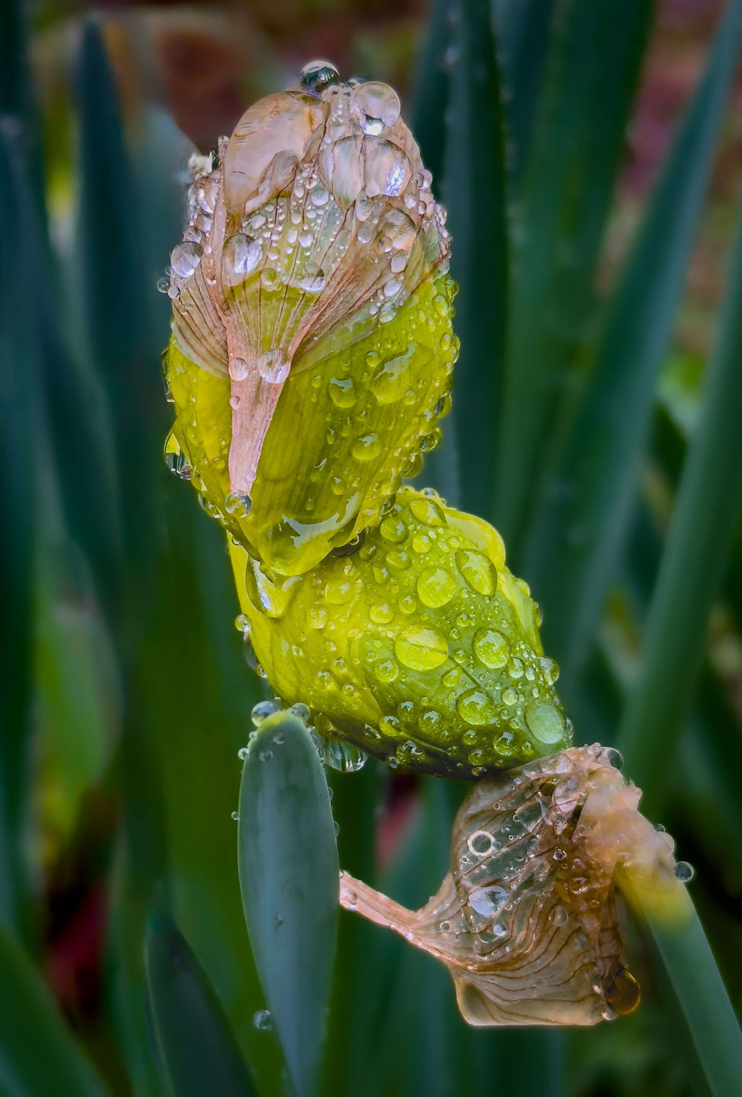
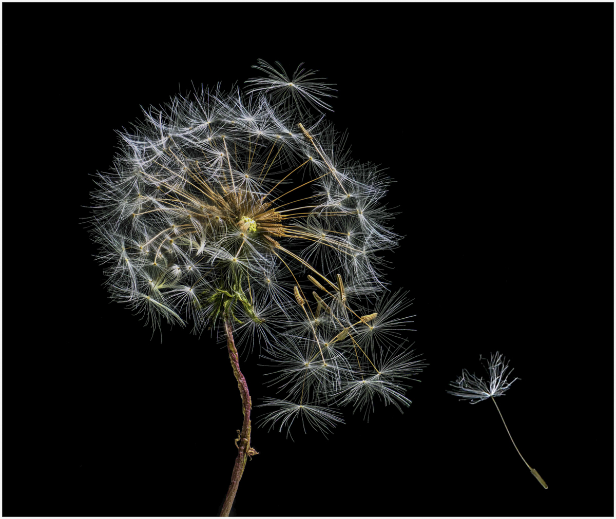
Mo, I almost don't know what to say as this is something I have not seen before so it is an eye opener - and I don't think the water droplets detract but rather add texture. I wonder if cropping a little off the top would be useful? Thanks for sharing this with us. I wonder what the future will bring. Ray |
Sep 6th |
| 75 |
Sep 23 |
Comment |
Gaetan, I would have either liked more of the glass bottom or less. I might have liked more showing with the reflection being part of the composition. I agree that making the grout lines less visible might be useful. But given those, I like the attempt and the color combination especially since it is not something I would have thought of. Great you have joined us. Ray |
Sep 6th |
| 75 |
Sep 23 |
Comment |
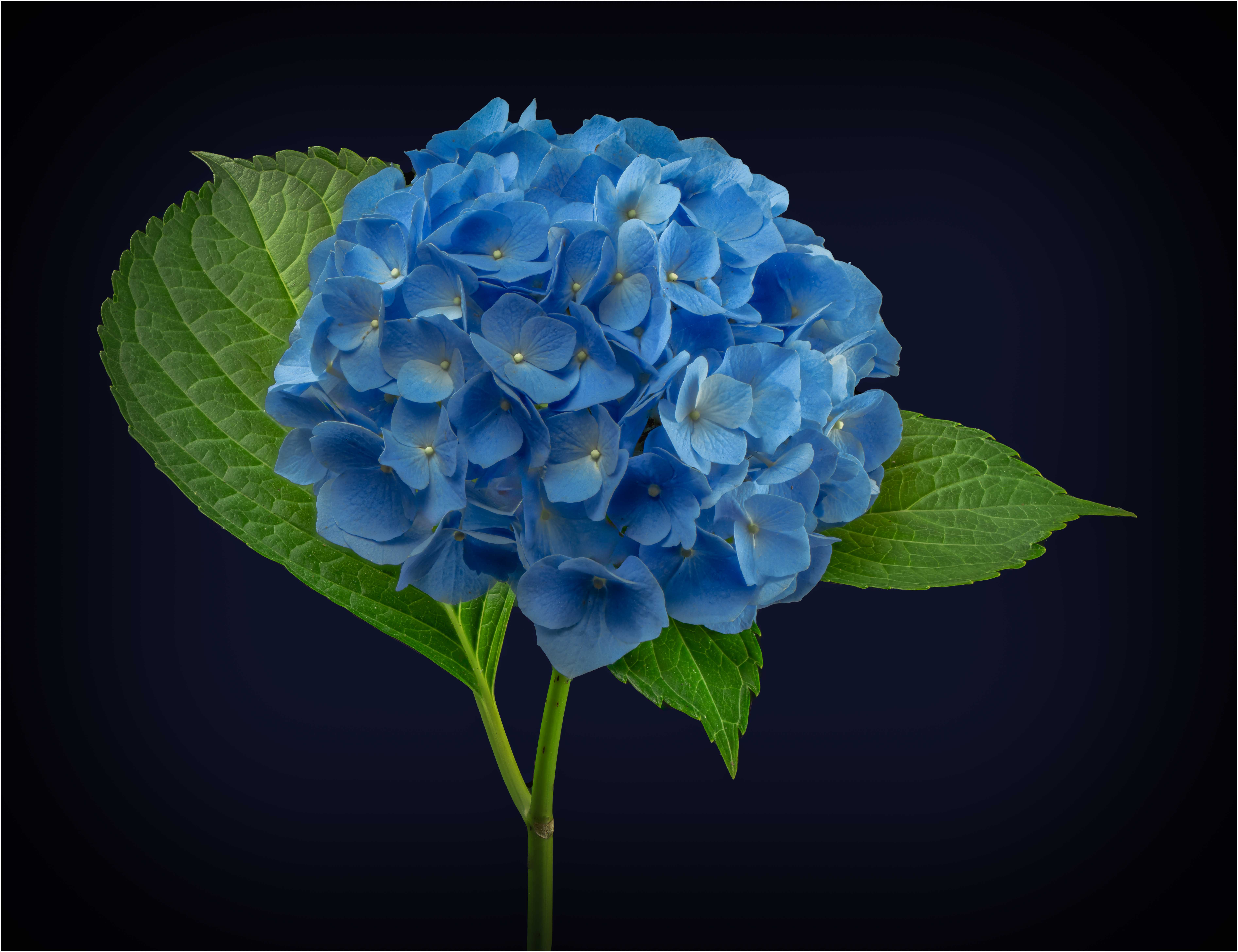
Judy, Good going with your iPhone but I agree on maybe doing a tighter crop - for me both on the left and the top with the hydrangea and the red. rose being the focus of attention. This is one of the reasons having a good cell phone is fun - just pulling it out when there is something photogenic. Ray |
Sep 6th |
| 75 |
Sep 23 |
Comment |
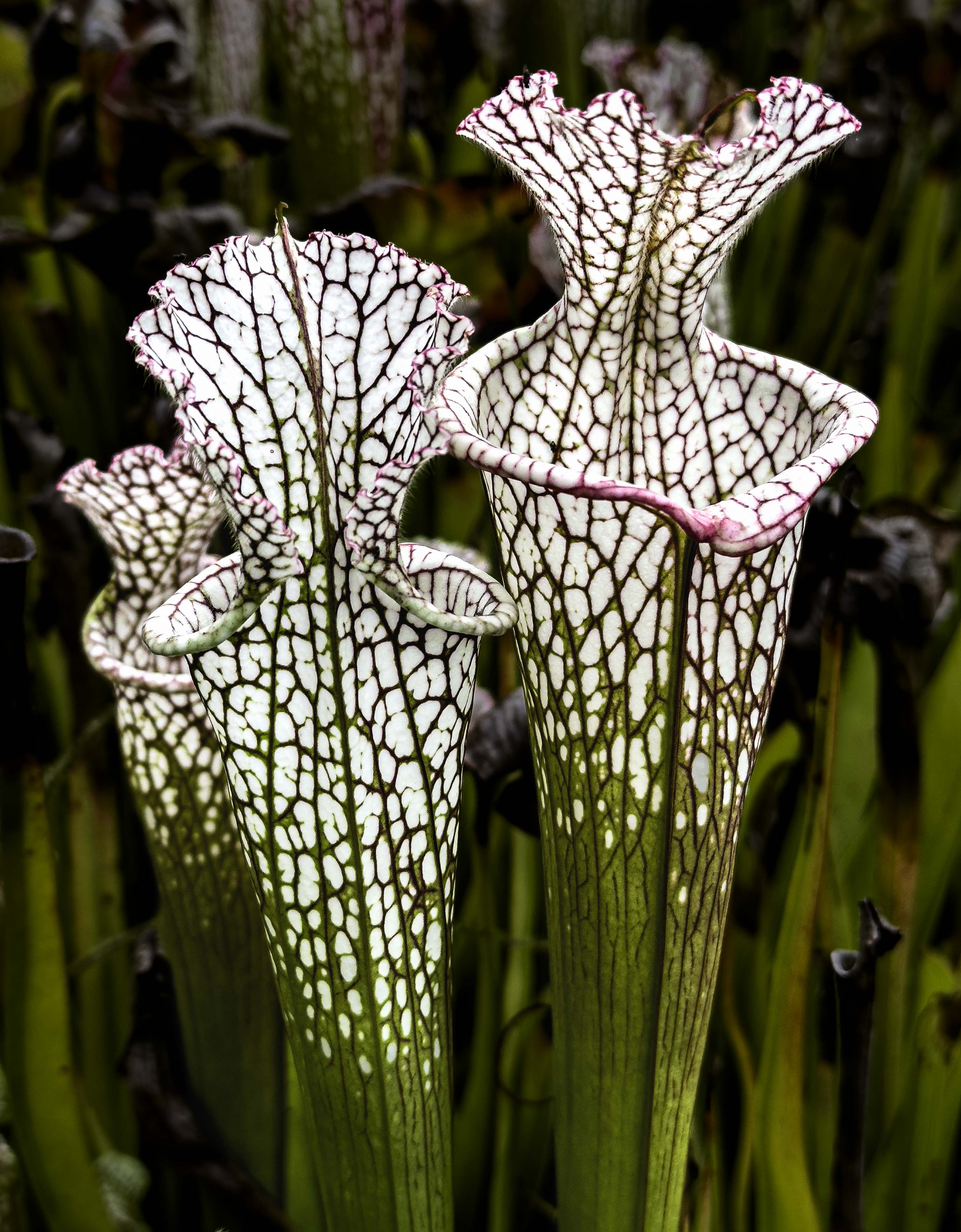
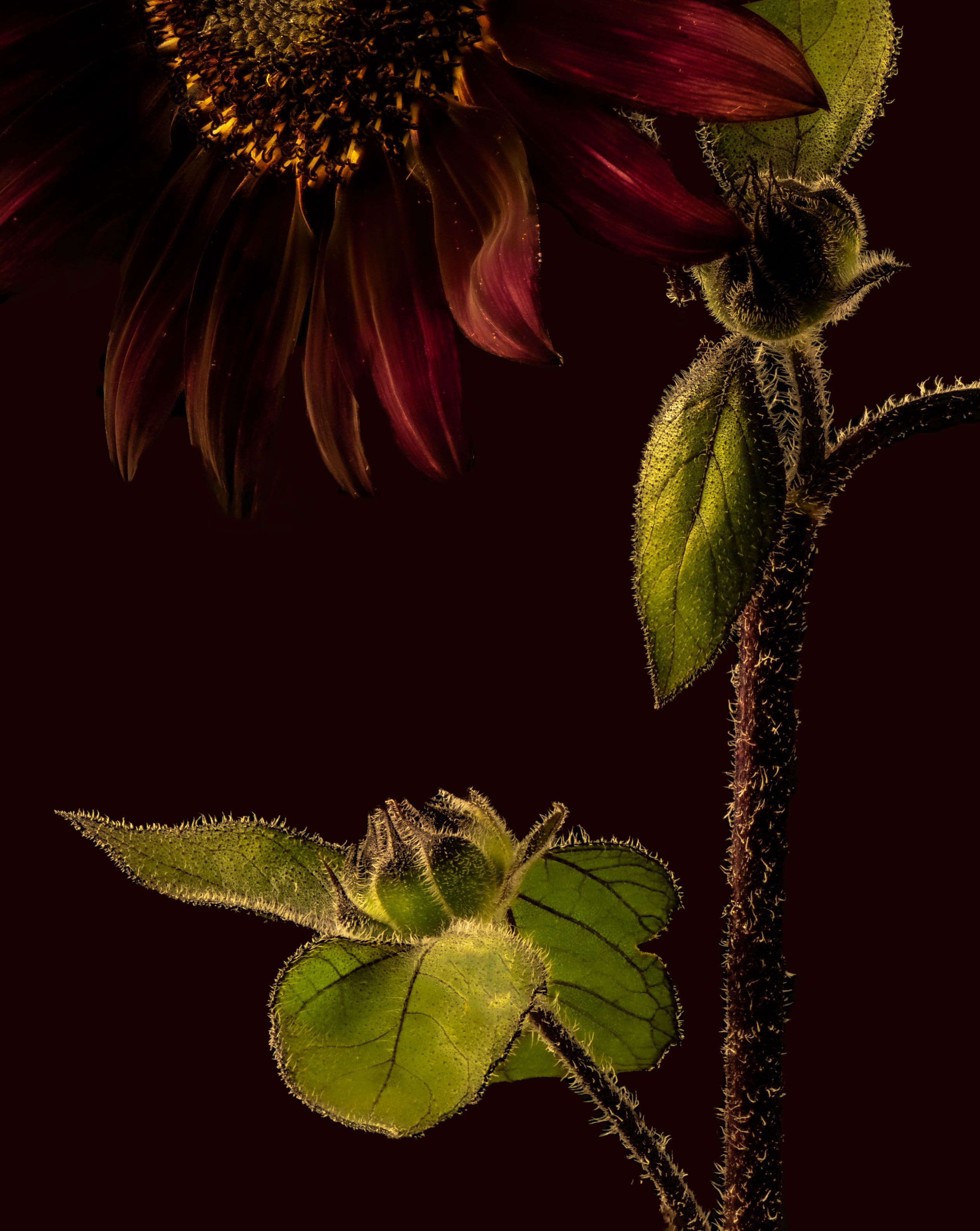
Dan, really great photo - nice colors, sharp flowers, good background, although if I can be picky, do not like the brownish glob (is this an appropriate word) in the upper right corner and I would suggest just a little more room at the top. Regardless, a fine photo. Ray |
Sep 6th |
| 75 |
Sep 23 |
Comment |
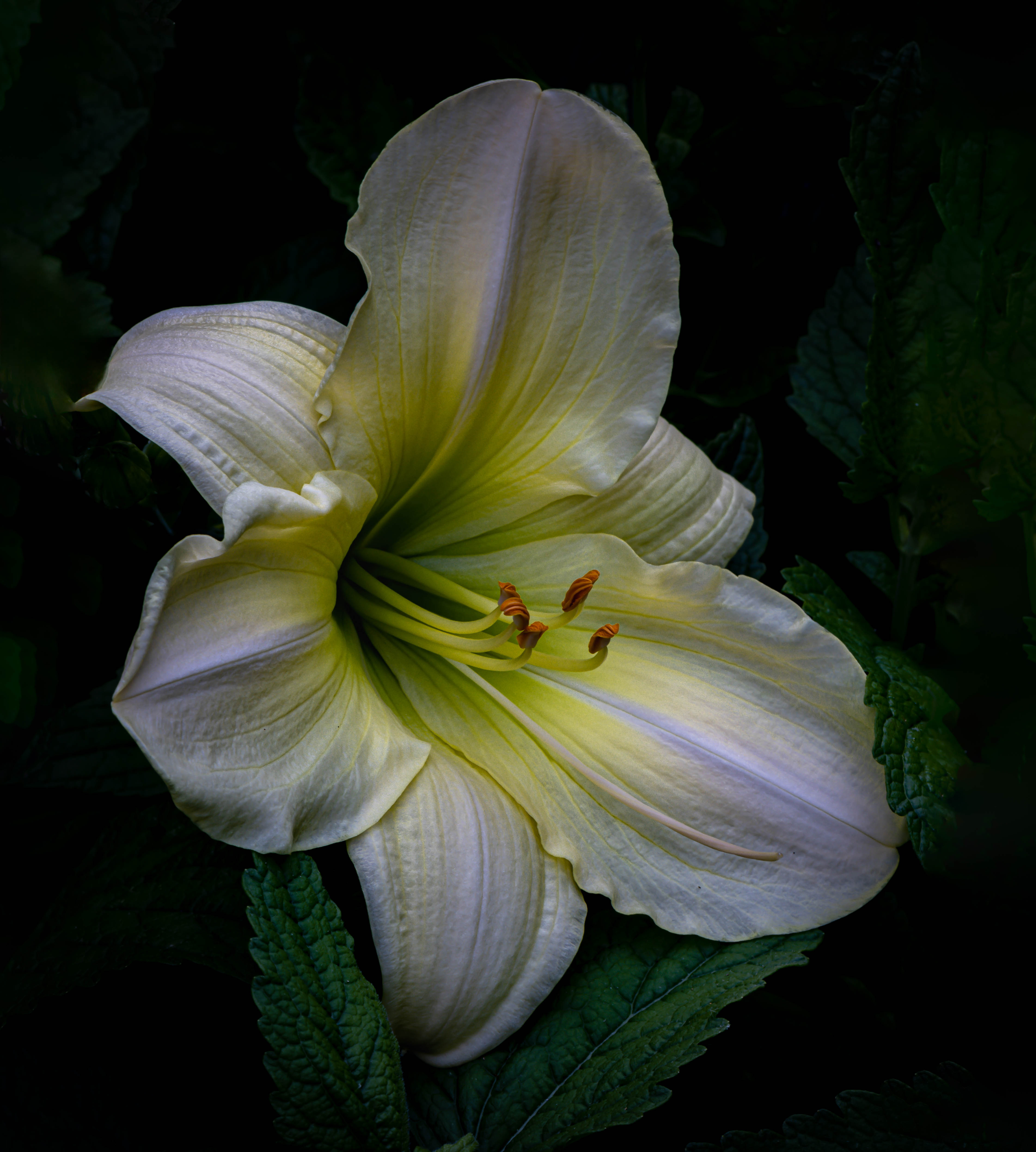
Murphy, I am another person that like orchids but admit I have yet to be happy with any photo of an orchid I have taken. I like the composition and the background works really well. Like Dan, my eye keeps going back to that perpendicular bloom so I wonder what the overall image would look like with it cloned out. And I agree that the front of the arrangement looks a little soft but I am not sure why. Good photo. Ray |
Sep 6th |
| 75 |
Sep 23 |
Comment |
Vincent - as you know by now, sometimes we provide different opinions. For me, the image evoked the passage of time given that some of the bougainvillea bracts are dying and this goes with the stems that have lost the bracts as well as the spiderwebs. For me, I favor the use of a corner and would have had the stem intersect directly with the corner rather than a tad off. I like the colors but the bracts in the back are a little soft and I am not sure whether I would have preferred sharpness throughout the flower (well, not really a flower but the term works). Ray |
Sep 6th |
8 comments - 2 replies for Group 75
|
8 comments - 2 replies Total
|